Former Mac designer finds 'substantial similarities' in Samsung, Apple GUIs
 Mikey Campbell
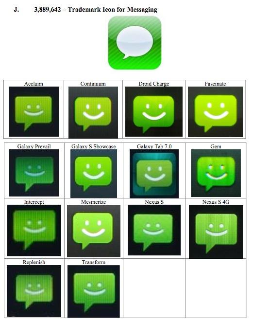
Kare, a designer credited with many of the original Mac's icons including "happy Mac," gave her testimony as an Apple expert witness at the Apple v. Samsung patent trial, noting several elements of Samsung's UI infringes on the look of Apple's iPhone home screen, reports The Wall Street Journal.
In making her comparisons, Kare studied home screen icons on 11 Samsung smartphones released after the original iPhone debuted in 2007, including the "Captivate" and "Galaxy S 4G." Among the icons studied were Contacts, Notes, Photos and Settings, which were compared to counterpart assets on Samsung devices. In addition, the grid-type layout of the iPhone's home screen is also allegedly infringed upon by Samsung's designs.
Apple owns patents regarding the look and layout of icons in iOS, as seen in the company's D'305 patent which was filed for in 2007 and granted in 2009.
According to testimony, the two companies' iconography was similar enough that Kare herself became confused at one point and mistook a Samsung handset for an iPhone.
"I mistook one for the other," Kare said. "In addition to the analysis, I personally had the experience of being confused."
Samsung countered by presenting the icon design of the messaging app featured in Samsung's "Fascinate" smartphone, an example which does not share the iPhone's rounded-square imagery. Kare agreed the specific designs are not "substantially similar" to Apple's assets, but noted the two shared the same metaphors.
"it's not 100% different," Kare said of the "Settings" icons. Apple's take displays a set of three gears while Samsung's presents one large gear.
Apple exhibit comparing Samsung messaging icons with the iOS Messages app.
Source: Apple v. Samsung court documents
Kare said that in her search for design alternatives, she found examples which "show you can do a design that doesn't look confusingly similar," referencing a UI solution from RIM. The argument of confusion is at the heart of Apple's case against Samsung and has been repeated numerous times over the course of the proceedings.
In Samsung's defense, lawyer Charles Verhoeven argued that by simply turning on one of the handsets, any customer would see the difference between an iPhone and one made by the South Korean electronics giant. To illustrate his point, Verhoeven turned on three devices to show their respective boot sequences.
On startup, Samsung's Android-based "Charge" smartphone displayed a company logo followed by a brief Droid animation, while Apple's iPhone displayed the Cupertino company's metallic logo. Verhoeven went on to explain that a Charge user needs to boot the device, unlock it and press a button to reach the home screen.
Apple v. Samsung will resume on Friday with testimony from Apple expert witnesses.


 Amber Neely
 Thomas Sibilly
 AppleInsider Staff
 William Gallagher
 Malcolm Owen
 Christine McKee

25 Comments
I applaud Apple for taking on Samsung...most American Companies and their CEO's don't give a rat's ass who steals their IP! They are giving away our jobs and now they are giving away our IP! Shameful!
Case in point...we gave China the IP to build an attack helicopter...see link! Ugh!
http://www.startribune.com/world/163828046.html?refer=y
Case in point...we gave China the IP to build an attack helicopter...see link! Ugh!
We'll see who has the most Mil-Cred (my new made up word) when China decides to invade Taiwan. There is going to be a show down sooner or later.
Charles Verhoeven: "Ladies and gentlemen of the jury, those icons may look alike, but here is a picture of Chewbacca. Think about that for a minute: that does not make sense!"
Except... how many times do you boot the phone? If it's an iPhone, close to never. Maybe Android phones need resetting constantly?
There is going to be a show down sooner or later.
Since the US has a legal claim on the island, what happens then?