The official blog of Samsung Electronics has revealed the design inspiration for its latest Galaxy S5 phone, which says involved extensive research into "appealing to consumers in their twenties and thirties," a demographic currently showing a preference for Apple's iPhone.
On Monday, the Samsung Tomorrow blog detailed the thinking behind the company's Galaxy S5, starting with its "Key Visual," or the default lock screen image as portrayed in the product's marketing.
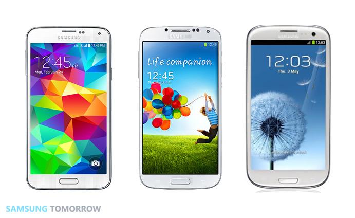
The overall design concept of the new phone is called 'Modern Flash,' which Samsung describes as "a sophisticated and youthful urban style with emotion" and represented in the completely revamped lock screen image featuring "diamond-like shapes" and a quick camera access control in the lower right (above left, next to the older Galaxy S4 and S3.
"Considering that the key UX visuals for previous Galaxy devices were image of nature, Galaxy S5 is the first time Samsung used the colorful abstractive geometrical pattern for the Key UX visual," the company explained (emphasis theirs).
The company also says it conducted several tests before it "finally selected several colors, including different shades of blue" to show off the ability of the screen to depict the colors."The designers were actually inspired by diamonds" - Samsung
"If you look at the abstractive pattern, you cannot help to think that it resembles something... Diamond," Samsung reminded its audience. "That is because the designers were actually inspired by diamonds. The 'brilliant' or diamond cut design is a design in which diamonds are cut in a distinct form with many facets, having exceptional brilliance. That's why you can see diamond cuts on the main lock screen, which adds a sense of sophistication to the Galaxy S5 to make it fashionable and unique."
Diamonds are actually a commodity mineral product long monopolized by a cartel which invented and widely marketed a romantic tradition around paying exorbitant amounts for diamond-bearing jewelry in exchange for emotional security and a sense of "investment," but which in reality have very little real value or resale potential.
Samsung stumbles upon an original design, without iOS 7-like updates
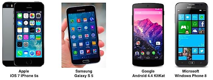
Apart from the lock screen graphic, Samsung also expresses Modern Flash in its icon designs, which are designed "to have a stylish look by creating them in a simpler fashion," as depicted in icons (below) that set the new Galaxy S5 apart from the older S3 and S4 models.
"Thus, with an easy-to-see icons and interface, you can clearly say that the Galaxy S5 is a trendy smartphone," Samsung notes. "In result, many users have been raving about the clean and neat tidy looking icons and UI compared to that of previous Galaxy products."
Samsung's approach to refreshing its design is particularly differentiated from, say, Apple's iOS 7, in the sense that Samsung only applies it to its latest, most expensive new phone.
Apple delivered iOS 7 last fall as a free update with support for existing devices dating back to 2010, potentially leaving portions of the market confused about whether every iOS 7 phone was trendy and stylish or just Apple's newest and most expensive model.
Apple's iOS 7 update was so popular that virtually all iOS users who could upgrade did so immediately. Google even hosted hundreds of iOS 7 theme downloads in Google Play for its Android users to download, too.
Andriods be like I got iOS 7 pic.twitter.com/bCPOL2biGX
— Justin hasn't (@JBfanSince09) September 18, 2013
Last year, Apple's revamped new user interface for iOS 7 dramatically simplified the original iOS appearance style, causing some of Apple's critics to ">complain that it had had copied Microsoft's Windows Phone or Google's Android.
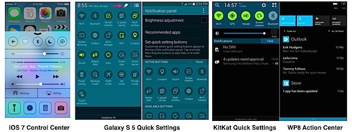
In particular, Apple was accused of borrowing features like iOS 7 Control Center, which is often compared to Android's Quick Settings buttons or Action Center in Windows Phone. Samsung has extended Android's stock Quick Settings (below) with buttons for virtually everything on the Galaxy S5, which is nothing like Apple's Control Center.
Despite Samsung having licensed the use of both Android and Windows Phone software, and having entered into special patent agreements with Google and Microsoft, the company's Galaxy S5 design doesn't appear to be primarily influenced by either Android's "Holo" appearance or Microsoft's WP8 "Metro" interface.
Samsung case designed for youth, not vegans
The company also directed attention to its original rear case for the Galaxy S5, covered in sheepskin leather rather than a wimpy vegan-recyclable materials like aluminum or glass or the "unapologetic plastic" of Apple's iPhone 5c."To make Galaxy S5 attractive especially to younger users, the designers researched day and night to find the right colors" - Samsung
Unlike previous Galaxy models, "the back cover of the Galaxy S5 is not shiny but shimmery instead, aka the glam look. In fact, to make Galaxy S5 attractive especially to younger users, the designers researched day and night to find the right colors," the company states.
"After extensive research, they found out that the luster of the color that appeared softly was appealing to consumers in their twenties and thirties."
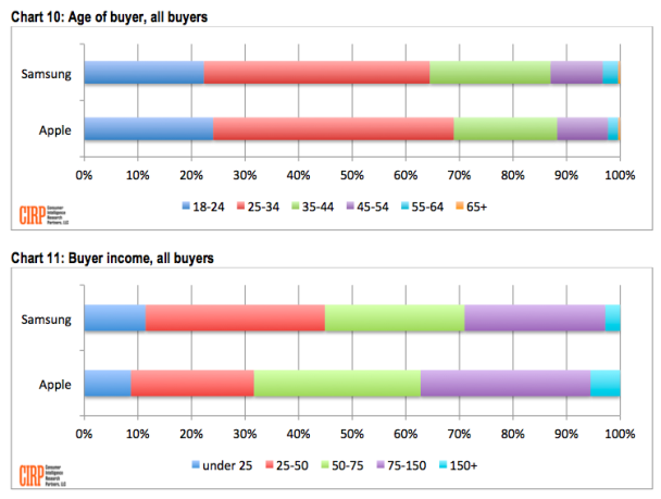
Samsung has diligently worked to shift its Galaxy-brand appeal to a new, younger demographic after reports from CIRP highlighted (below) that Samsung's actual customers were more likely to be in their forties, fifties and sixties, in contrast to Apple with more appeal among users 18-24 and 25-34.
Part of Samsung's campaign to attract youth involved TV ads from 2012 that portrayed young users bumping phones to exchange playlists using NFC as bewildered older people waited in line to buy an iPhone 4S. The youngest person in line flashed his Galaxy S III and announced that he was just holding a place for his middle aged parents.
A second ad campaign from one year ago presented befuddled, greying parents with iPhones as young people acted young and enthusiastically used proprietary Samsung features.
The Samsung Tomorrow blog posting acquired dozens of public comments that reflect an apparent skepticism about the new redesign and its purported inspiration.
 Daniel Eran Dilger

-m.jpg)



 Malcolm Owen
 Oliver Haslam
 Amber Neely
 Marko Zivkovic and Mike Wuerthele

 Andrew Orr






94 Comments
Fucking embarrassing company. [IMG ALT=""]http://forums.appleinsider.com/content/type/61/id/42772/width/500/height/1000[/IMG]
Here's more gems:
Look-y here...
The top part of this next image is a Samsung tablet with a Samsung case attached:
The one question remains is when are Sammy going to introduce the "Spark" miniature, reversible charging cable?
-Still looks like an Apple iPhone to me!
I love how this reads as if it were made up by The Onion, but it's just not. I just don't understand Samsung and their shite marketing speak, likening the screen to diamond and giving their phone a 'modern glam look.' I would be embarrassed to be walking around with a glam phone and I'm their target demographic. Further, TouchWiz is such a crappy thing to put on top of Android. DED's hint that it's just trying to copy iOS is, IMO, spot on - Samsung should move closer to vanilla Android and I reckon that would give them a far more competitive product. Otherwise, they're just trying and failing to copy the UX of the iPhone which just can't be pulled off elsewhere.
Here's more gems:
Look-y here...
The top part of this next image is a Samsung tablet with a Samsung case attached:
The one question remains is when are Sammy going to introduce the "Spark" miniature, reversible charging cable?
Every major company copies