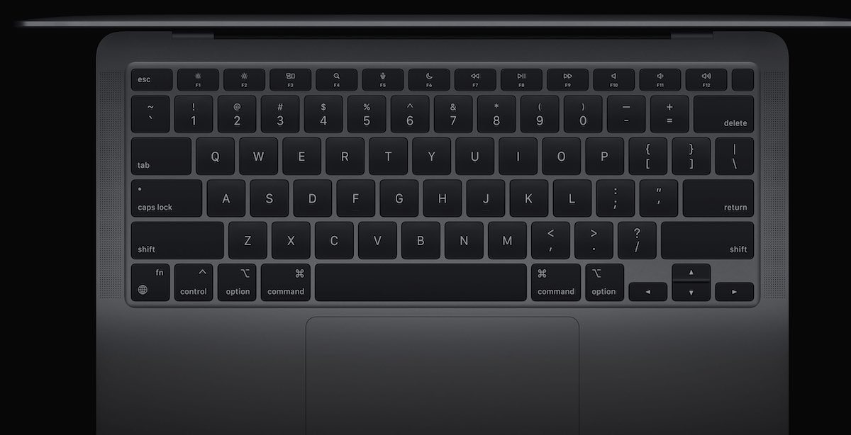
Apple has tweaked the function key layout on its new M1 MacBook Air, swapping Launchpad and keyboard brightness for Dictation, Spotlight, and Do Not Disturb.
The new function key arrangement was first spotted by Bloomberg's Mark Gurman and only applies to the Apple Silicon MacBook Air. Apple's 13-inch MacBook Pro with an M1 chip has a Touch Bar.
The removal of dedicated keyboard brightness keys means that users must navigate to the macOS Big Sur Control Center to adjust keyboard backlighting. Launchpad can still be triggered relatively easily by pinching a thumb and three fingers together on the MacBook Air trackpad.
The Spotlight search key will make it easier for users to carry out the systemwide search, while Do Not Disturb and Dictation appear to be aimed at digital health, productivity, and accessibility.
In addition to the swapped keys on the MacBook Air, Apple has also added the emoji globe icon to the function key on both the MacBook Pro and MacBook Air.
Separately, both M1 MacBook models sport Wi-Fi 6 connectivity, bringing the laptops in line with iPhone and iPad and enabling faster data transfer speeds.
5 Comments
I certainly won't mourn the loss of the Launchpad key since I haven't used Launchpad more than once in the nine years it's existed. Faster for me to use spotlight.
As for the new keys, I suppose for people like my wife who refuse to learn shortcuts this makes sense, but for the rest of us command-space, fn-fn-fn, and option-clicking the notification icon at the top right have all worked pretty well...
Well I just found keyboard backlighting is adjustable.
To my mind these are excellent decisions. I also didn’t know that the keyboard brightness is adjustable, but I use Do Not Disturb every day (turn the sound off). And I’m glad to see a key for dictation.
I mourn no Touch Bar on the Air. I use it all the time. I use the Launch Pad -- good idea like groups are in iOS.
I did buy a jacked up M1 Air. Arrival in the last week of November. Seems soon enough.
I wanted a different form factor in the middle of an iPhone, iPad Pro 12", iPad 10", MBP 15" and iMac.
I wonder what the logic is behind adding the globe icon to the "fn" key. When you look at the new keyboard (picture above), that key stands out as an outlier for two reasons. First, it uses the "techie" abbreviation "fn" instead of "function." By contrast, right next to it are the command, option, and control keys (spelled out). Second, on those other keys the weird icons are in the top right of the keycap and the word in in the bottom let; for the fn/world key this is reversed. Just odd inconsistencies I wouldn't expect from Apple. There must be a good reason for it, but I don't know what it would be.
This a deal breaker for me! /s