It's the smallest difference in macOS Big Sur, but Safari's new start page may be the improvement you see all the time — and that you can customize the most.
If you're someone who likes Safari to start up with your own website already loaded, or your company's one, or a particular news site, you can carry right on. But if you're up for a change, or if you just never gave the start page a thought, the new improvements in macOS Big Sur are very appealing.
Let's not overplay this. What's really changed is that you can add a background, and that there are more options for what you see on that start page.
Yet don't underplay it, either. That start page can hold your most-used bookmarks, and it can take you quickly to your most-used sites. It can be where you go to catch up on articles you've saved, too.
And it can be where you go on your Mac to open that webpage you were reading on your iPad earlier.
How to customize Safari's start page
- If Safari always opens to a particular site, go to Safari, Preferences, General
- Click on the option New windows open with
- Choose Start Page
- Click on the option New tabs open with
- Again, choose Start Page
- Close the preferences window
- Open a new Safari window
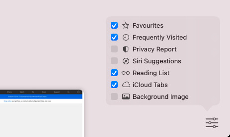
- At bottom right, click on the Settings icon
- Tick on or off sections you want on the page
- Then scroll the page to see each section and over to the right of the title
- Optionally, choose Show More or Show Less
This is all you need to do to make any changes to the page that Safari starts up with, or opens a new tab with. The Settings icon is what you'll use to include or exclude particular sections and the odds are that you may only do that occasionally.
Whereas you'll probably end up adjusting the Show More and Show Less options as you work, choosing today to expand or contract what's offered.
Change the background image
By default, if you have Safari open to its Start Page, that page will be on a plain background. You can change it to anything you like, though, by clicking that Settings icon at bottom right.
Click once to tick that feature as on, and then you'll see buttons for choosing an existing image, or adding a new one. When you've changed the image once, though, the first thing that ticking this feature on does is switch to that image.
Apple's default options
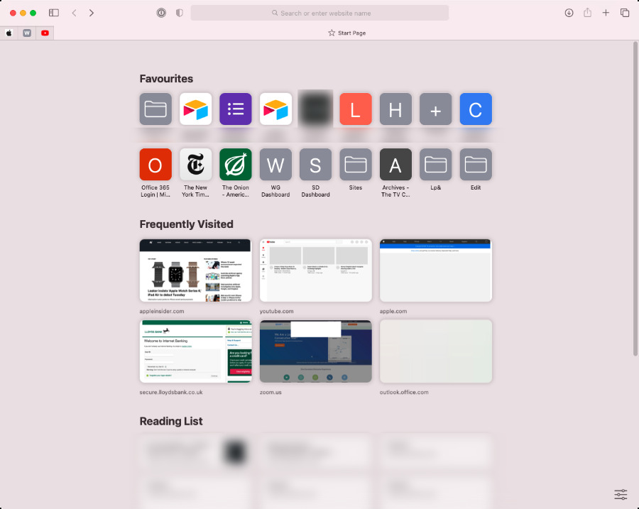
Apple assumes that if you're using a Start Page, you want quick access to your Favorite sites. It's also going to track where you go so that it can show you all of your most Frequently Visited sites.
Favorites are shown as icons, but Frequently Visited sites get a thumbnail preview of their contents as they were the last time you went to them. By default, Safari will show you six of your most frequently visited sites, but if you over to the right of the title Frequently Visited, you get an option to show more.
If you choose that, Safari will now always show you a dozen frequently visited sites. If you don't want to see any at all, click on Settings and you can untick the whole section.
Reading List is also on by default and you may not have realised that you have this many pages in your list. At first, it will show you six, but clicking Show More expands that out to very many.
If you have an iPad, and you haven't switched off iCloud Tabs in the Start Page's settings, you'll see more websites. This time it's the web pages that are open on your iPad.
What Apple doesn't include
There is no point having a Start Page that gives you all your iPad's tabs, your entire reading list, a dozen frequently visited sites and 40-odd favourites. The point of a Start Page is to get you quick access to what you need.
So even Apple doesn't switch on every option. What it leaves off, though, is useful enough that you should still take a look at it.
Siri Suggestions is perhaps the most productive. It will offer you websites that you typically go to right about now.
Whereas Privacy Report is a one-line entry on the Start Page, which lets you click through for more detail.
What we don't get from Apple
Microsoft Edge has a similar feature, but it lets you see news headlines. That would be a convenient use for the Start Page, no doubt, except if you wanted to see news, you could set the New York Times as your start page.
What would be more useful would be a way to re-order the elements on the Start Page. Perhaps you rarely bookmark favorite sites and never go to them anyway, but you do rely on the Reading List.
It would be good to be able to rearrange the sequence instead of solely being able to switch them on or off.
Similarly, it would be good to have more control over how information is displayed on the page. You can't change the frequently visited section's thumbnails to icons, for instance, nor can you show thumbnails instead of icons in the Favorites section.
Thumbnails are handy, but often what you see is a quite large box around a quite short line of text. Being able to change those icon boxes into straight lines of text would let you get more on the Start Page.
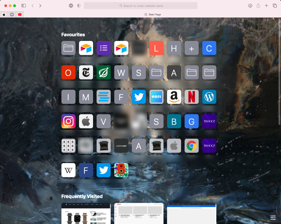
Alternatively, you can change the background to an image, and expand the sections that are of most use to you
Revolutionary
The Start Page is not revolutionary, except that you may come to look back on previous versions of Safari and wonder how you got by without it.
For instance, while everyone's mileage will vary, some AppleInsider writers found that they'd accrued many favicons that they stored as tabs in Safari. With the new Start Page, it was easy enough to move these favorites into the page and free up room on the tab bar.
Keep up with AppleInsider by downloading the AppleInsider app for iOS, and follow us on YouTube, Twitter @appleinsider and Facebook for live, late-breaking coverage. You can also check out our official Instagram account for exclusive photos.
