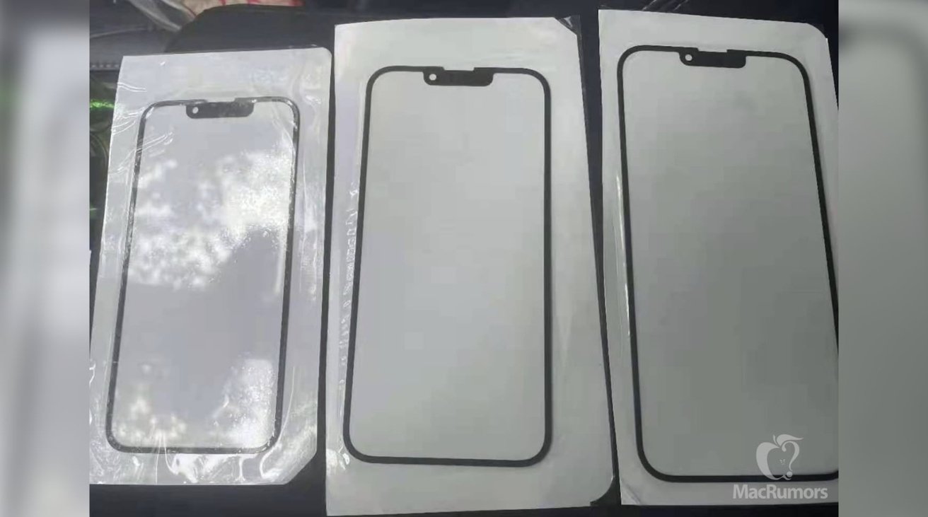
Apple could reduce the size of the notch in the "iPhone 13" by slightly shifting the earpiece into the bezel, images of alleged front glass panels apparently depict.
The notch at the top of the iPhone is a signature element, but also one that many people have complained about in the past. Rumors since its introduction have claimed a smaller notch will be used in future models, a claim that resurfaced on Tuesday.
Images supplied by repair service iRepair and provided to MacRumors shows a trio of what appear to be glass panels. It is claimed the panels are intended for use in the "iPhone 13," and will be the same 5.4-inch, 6.1-inch, and 6.7-inch sizes as the current iPhone 12 models.
Key to the image is that the notch at the top is much smaller than in previous versions. To accomplish this, the glass simply shifts the earpiece section up from the notch and onto the top edge.
While feasible, the image is highly dubious for a number of reasons. For a start, the image is sourced from a repair outfit, a firm that wouldn't necessarily receive components for an unreleased smartphone over six months before its release.
It is more likely that the glass panels are screen protectors. Accessory producers do produce prototypes of products ahead of Apple's launches to make sure that they have adequate stock at the time of the iPhone's release.
Such prototypes also typically rely on rumors rather than data from the supply chain or from Apple directly, due to the highly secretive nature of Apple's manufacturing processes.
The exact same rumor was made about the iPhone 12, with an April 2020 image leak claiming the TrueDepth sensor notch would shrink in size. Again, the earpiece shifted upwards into the bezel to make room.
Other similar leaks at that time also showed a smaller notch. In October 2019, speculation on the 2020 iPhones offered the idea of hiding the entire TrueDepth sensor array within the bezel.
Supply chain sources in January 2021 claimed there would be notch changes for the "iPhone 13," including the shifting of the earpiece to the edge of the display.
