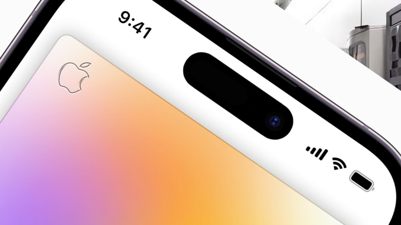
Android fans have mocked Apple for not shrinking the Face ID notch to a hole punch for years, but now its new Dynamic Island leaves rivals stranded.
Until the iPhone 14 Pro has shipped and is in users' hands, there is only Apple's information to go by, but already the Dynamic Island looks compelling. It looks as if Apple has done what it so famously has done many times before in taking an existing idea and doing it right.
It did this when it moved the keyboard to the back of the PowerBook, it did it when it ditched the floppy disk, and when it dropped the headphone jack. The keyboard move was instantly admired, where the other two took longer, but all are now seen as the right way to do something.
Apple introduced the notch in 2017 with the iPhone X, and it was how the front of the phone could include sensors and a camera. Even in 2018, though, Samsung was announcing its Galaxy A8s, which fitted similar sensors into a small, circular notch.
Now after five years of arguably being left behind by phones with their smaller hole-punch-like cutout, Apple has not just caved in and followed the trend. It has a hole-punch section, it also has a wider pill-shaped cutout, and it has transformed how both are used.
Dynamic Island should be more intrusive than the notch
The familiar notch has always been placed at the top of the screen, and initially plenty of people disliked how it cut into whatever you were watching on the display.
Now the Dynamic Island is narrower, but it's approximately the same height — and it's much lower down into the screen.
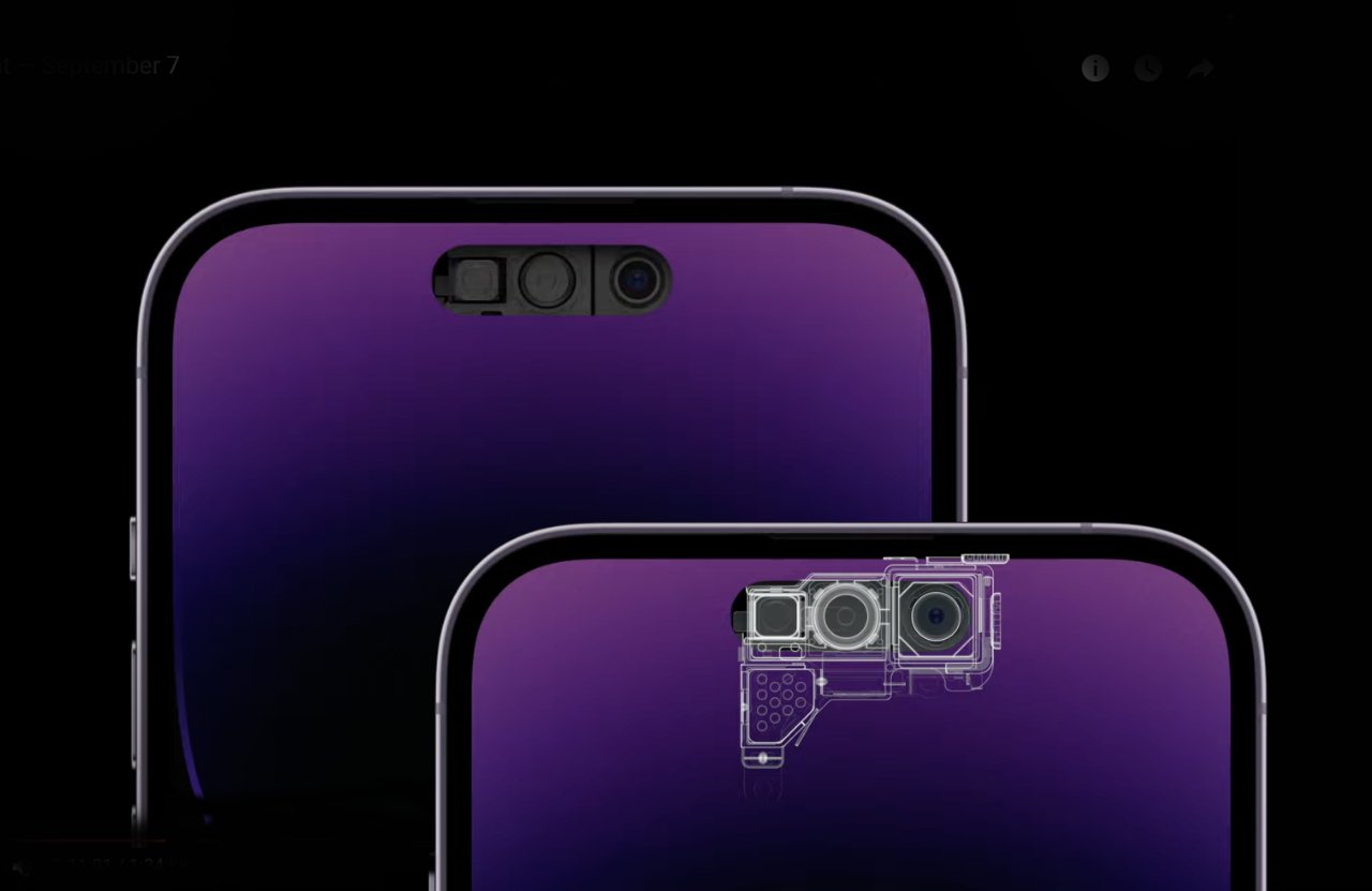
One of the reason it's narrower is that the previous proximity has been moved. This is the sensor the iPhone has always had, which registers when you put the phone to your ear.
To save battery power, and also to prevent your ear accidentally dialling someone, the proximity sensor tells the phone to turn off the screen.
The iPhone 14 Pro still does exactly that, but for the first time the proximity sensor is housed below the display. Since the elements of the old notch are all hardware, they can't be moved around as needed, so this is also the first time that anything could be taken out.
Equally, this is the only part that has been repositioned, so there is physically only so much width the new notch replacement can cut.
Before the launch, it was predicted that Apple would replace the one notch with two, a smaller pill-shaped one, and a hole-punch cutout next to it. Apple has done that, but it has also elected to manipulate the screen.
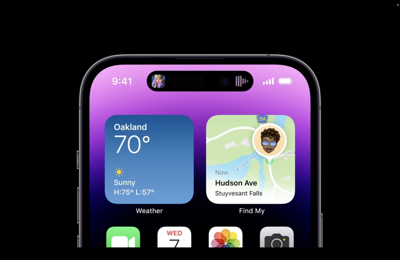
Rather than only blocking the display with the pill and the hole punch, Apple has decided to also use the space between these two. It switches off — or on — the pixels between the two, and that is the start of the dynamic part of the name.
Lose pixels, gain functions
Apple is limited in what it can display within those parts of the new notch that have sensors. And it has total control over every pixel between them.
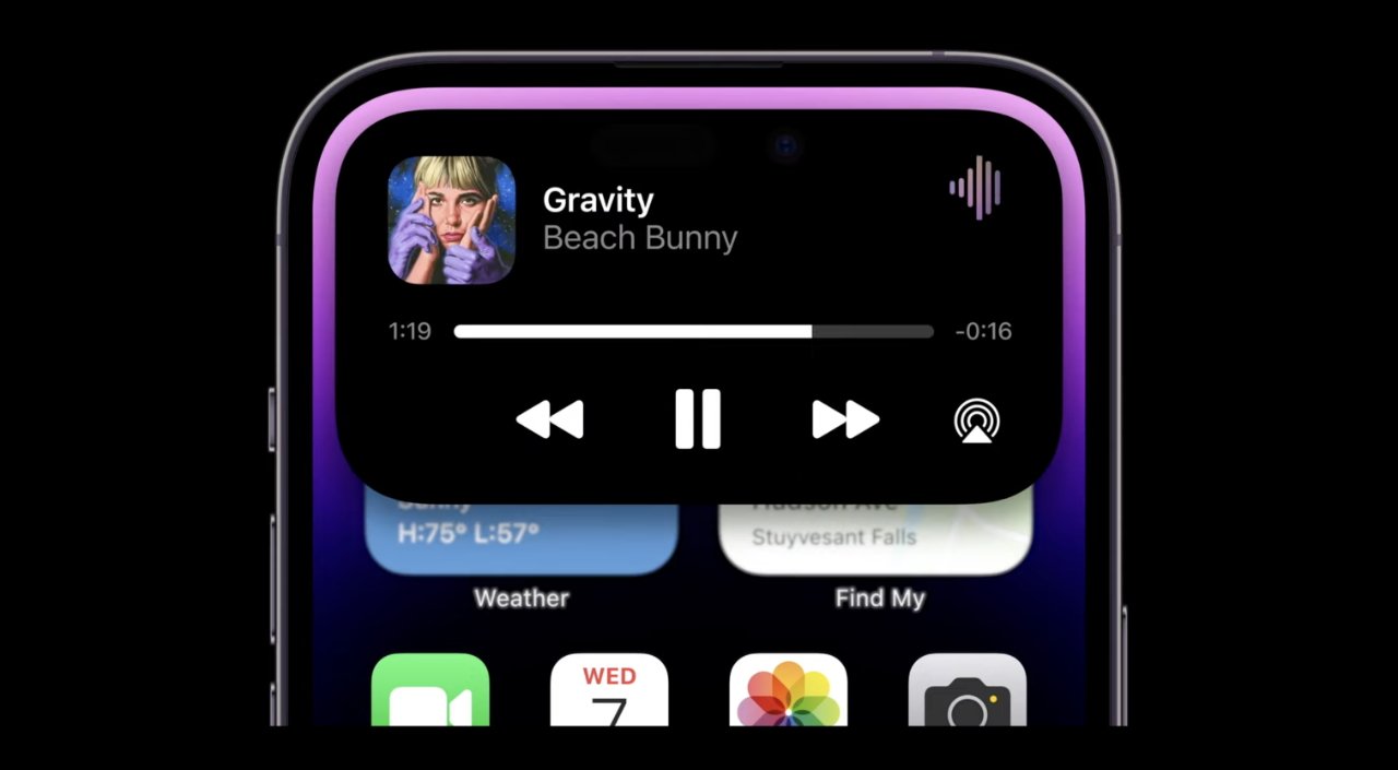
Consequently, Apple can do many things with this Dynamic Island. It can display, and keep displaying, Live Action information such as sports results.
It can show you within the island that you are, say, on a phone call even as you go to use a different app.
Or if you are using two apps in the background, say running a countdown timer as you play music, the new system can show you both. When it does, it's about the only time you can see where the pill and the hole punch physically on the screen.
Even then, though, Apple doesn't just pop one status icon into into the hole punch area, and another into the separate pill-shaped one. Instead, it animates the pill area extruding the smaller hole punch one, which then settles into place.
The Dynamic part of the name is concerned with how countless types of information can be shown in the new area. But it's also to do with that animation, how Apple appears to have painstakingly focused on making every change, every move, vibrant and, well, dynamic.
How Apple implements the Dynamic Island
The Dynamic Island's features will be available to all app developers to use, but Apple has a set of defined animations and styles that we're going to get very familiar with.
Most of the time, we'll see the Island with a couple of icons, such as album art when playing music, plus an animated waveform. When you invoke Siri, though, the narrow band cutout changes to more of a square shape, with the Siri logo in the middle.
When the phone rings, the narrow little island expands out in all directions to show who's calling, and to offer answer and decline buttons.
Then there is a third size, where an app can present about as much information, in about as much space, as a regular iOS widget.
Developers may already have made iOS widgets, so that's probably the size notification we're most often going to get.
Speaking of developers, though, Apple is this year making them split their efforts. All iPhone 14 Pro users will expect the new Dynamic Island — and no user of the regular iPhone 14 can get it.
So a developer's app is going to have to simultaneously take advantage of the benefits of the new system, and yet still work with the old.
In time, though, this new system is going to be in all iPhones — and probably a lot of Android ones, too.
That's because it is one of these Apple designs that's so right you can fathom how no one had thought of it before. Apple thought of it and then it did it.
