Apple's upgrade to iOS 17 may make it easier to select your iPhone's next wallpaper, with a new grid that can display up to nine wallpapers at the same time.
The inbound changes for iOS 17, expected to be shown during the WWDC keynote on June 5, is believed to include quite a few changes to the lock screen and for personalization. According to one leaker, that may include a change to how you select the wallpaper.
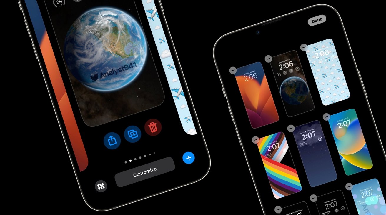
In a Sunday tweet, "@Analyst941" on Twitter claims there to be a new "grid view" for wallpapers in iOS 17. That view will provide small thumbnails of nine or more wallpapers stored on the iPhone, giving users more visible options to choose from.
This is the new grid view for Wallpapers in iOS 17.
— 941 (@analyst941) April 29, 2023
All new Grid-view displays 9+ wallpapers at once.
Delete wallpapers quickly within the grid-view.
Rearrange the order of wallpapers in grid-view.
Share or duplicate wallpapers by swiping up in single-view. pic.twitter.com/BUMugPKb1v
The view will also allegedly allow users to delete wallpapers within the view, using tiny minus buttons in the top left of each thumbnail. The order of wallpaper will also be user-manageable, and users can even share and duplicate wallpapers with others by swiping up in a single wallpaper view.
The new apparent leak arrives days after a Weibo leaker made similar personalization claims, including new lock screen settings, font size adjustments, emoji wallpaper, and sharing options.
While encouraging, the details from the leakers are not guaranteed to be on the way, especially without much in the way of corroboration at the time of publication. It's entirely possible that what Apple introduces at WWDC may not necessarily have these features, or have something in the same ballpark.
So far, rumors for iOS 17 include Apple laying the groundwork for sideloading apps, altering notifications, adding active widgets, and improving CarKey, among other elements. It has also been claimed that the release won't include many groundbreaking new features, with Apple instead intending for it to be a quality-of-life release.
