Jump to a different section
AppleInsider spent upwards of 50 man hours on this six-page review of Apple's new MacBook Pro. Therefore, the report is quite lengthy. Readers looking for information on specific topics can use this jump menu (below) to easily navigate to the relevant segments.
Position in the MacBook family
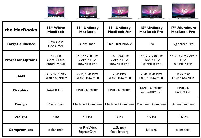
The new 15" MacBook Pro and its smaller 13" MacBook companion have rejiggered Apple's notebook lineup. In particular, the company has redefined the features it regards as "Pro." The new MacBook Pro is distinguished by its high performance dedicated GPU, the availability of Firewire-800 (Apple now regards FireWire as a Pro-only feature, having ceded the consumer market to USB entirely), an ExpressCard/34 expansion slot (only ever offered on Apple's Pro notebook line), and the larger display sizes and faster CPU options only offered on the MacBook Pro.
The company has pulled the entry level MacBook up into the MacBook Pro's standards in many aspects, including graphics performance suitable for playing most games, a backlit keyboard option (on the high end MacBook), and the same high quality aluminum physical design, moving the MacBook from being an iBook replacement to a scaled down MacBook Pro, albeit lacking FireWire.
Both new notebooks also now aligned alongside the MacBook Air, adopting its same lines and rigid construction while increasing the internal space to allow room for the features the Air cut in its efforts to pare down its weight and size.
Missing from Apple's lineup is a small Pro notebook; Apple assumes that if you want a screen smaller than 15" you're either likely to be looking for the thin and light, highly mobile MacBook Air or are primarily looking to save money, and willing to give up some of the Pro features to do that. The two new models Apple introduced this month also reveal that the company is aiming broadly at the most valuable targets in the retail-oriented notebook market, rather than trying to please everyone with a scattershot array of scores of models from $600 cheapies to $3000 game notebooks (as Dell and HP offer), or only selling to a narrow niche of high end mobile users (as Apple was doing just a half decade ago).
For comparison shots of the new MacBook and MacBook Pro, see: High-quality photo comparison: the new unibody MacBooks
Apart from being scaled up, the unibody MacBook Pro is otherwise identical in build to the new consumer MacBook and significantly different than the MacBook Pro it replaces, both in design and in features. We'll detail the changes first, then provide a review of which features are welcomed improvements, which are cost cutting disappointments, and which are just differences users will have to apply their own subjective opinions on when considering the new model.
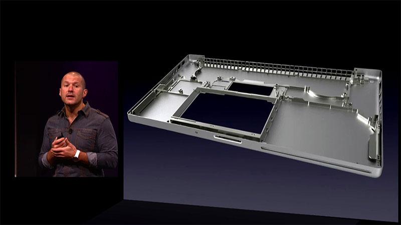
Rather than using a thin aluminum pan outfitted with an internal skeleton to provide strength and rigidity, covered by a thin top panel (as the previous MacBook Pro and Aluminum PowerBooks have used over the last half decade), the new unibody MacBooks are machined from a block of aluminum to create a strong, single-piece shell that is covered in back by two thin panels, one of which is screwed down, the other of which pops open easily to present the now internal battery and the much more accessible hard drive.
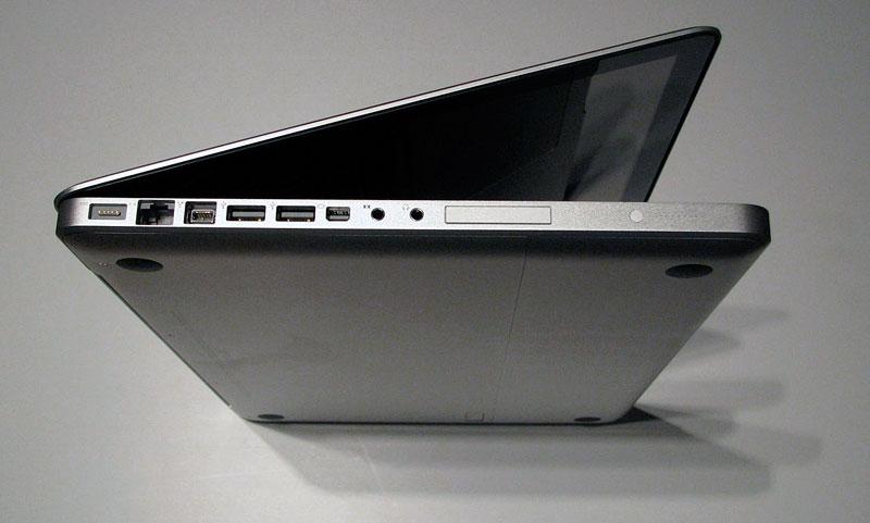
In addition the to new case design, the unibody MacBooks borrow a number of design ideas that first debuted with the 2006 MacBook: a recessed keyboard frame that backs the keyboard into the top surface of the machine, allowing the lid to shut without the screen hitting the keys; a lid that now shuts with magnetic attraction rather than using physical latches as the previous MacBook Pro; and a new internal layout: the ports on the MacBook Pro are now all aligned along the left side, following the top-left corner logic board layout of the original MacBook, which similarly placed the optical drive up in the top-right corner and put the battery and hard drive along the front edge for easy access from the rear cover.
Also new to the MacBook Pro is its black keyboard that extrudes through the top palm rest surface as separate keys (the previous MacBook Pro had a silver-colored, single panel keyboard); a larger multitouch trackpad that acts as a single physical button as well as being programmable to serve right and left button features and multi-fingered gestures, a thinner lid that presents a display fit behind a sheet of glossy glass surrounded by a black margin (as opposed to a silver-colored, metal margin as the previous Pro and as the current Air uses); and a redesigned hinge, which is not only distinguished in the same stark black outline as the margin around the display and on its backside edge, but also behaves differently, as we describe below.
For more information on unibody construction process, see: Apple details new MacBook manufacturing process
Appearance, body fit and finish
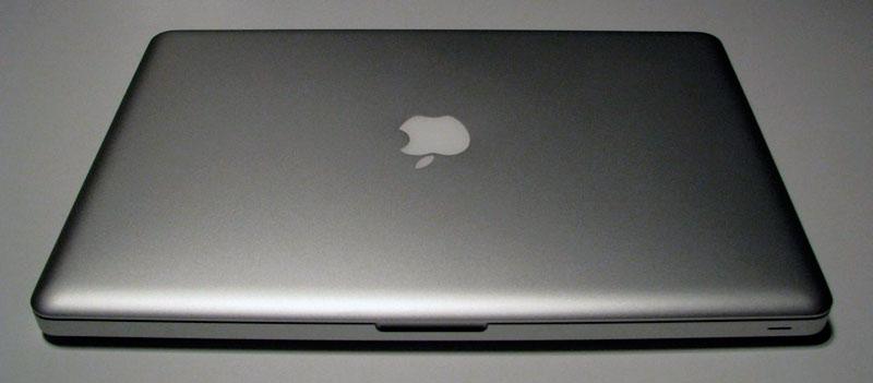
After five years of Aluminum Powerbook/MacBook Pro speed-bumps and minor updates within the same case design, the new unibody construction premiered by the MacBook Air promises to stick around for at least that long. It's a very welcome change. As we noted in regard to the MacBook Air, the new MacBook Pro is absolutely rigid, not just in its flex-free body, but even in its ultra thin lid.
The new machined construction also bumps up the fit and finish dramatically. We were fairly pleased with the appearance and construction of the old MacBook Pro, but the new unibody model simply blows it out of the water and makes it look clunky and fragile in comparison. It's really that much of a difference. If you're not in the market for a new notebook, you should avoid looking at the new models or you will seriously risk falling out of love with your current machine.
The entire case of the new unibody MacBook Pro is once piece from the top palm-rest surface though to the thin bottom cover. That gives the machine an ultra solid feel with smooth rounded corners, precisely machined ports that lie behind 3mm wall of solid metal rather that floating in a plastic shell suspended behind the thin aluminum skin, and lacking the plastic gasket rimming the edges of the body and lid as the previous model had.
The new body certainly isn't indestructible, but drops or dings are less likely to bend the case out of alignment. The fragility of the previous MacBook Pro is particularly evident around the unit's front corner optical drive slot, where any blow to the front edge of the machine can warp the thin metal pan so that the slot doesn't line up well enough to spit out a disc properly. Even normal wear and tear can flex the old case, lid, and internal components to the point where things don't line up.
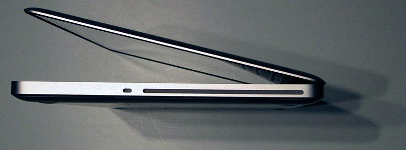
The new machine puts the optical drive on the top-right corner, where the more rigid shorter side of the unit is also bolstered in strength by the fact that the drive itself is positioned behind a much thicker and stronger shell opening. While one could probably smash the opening closed with a hammer, the likelihood of bumping the slot out of its precision alignment with the drive mechanism seems far less likely.
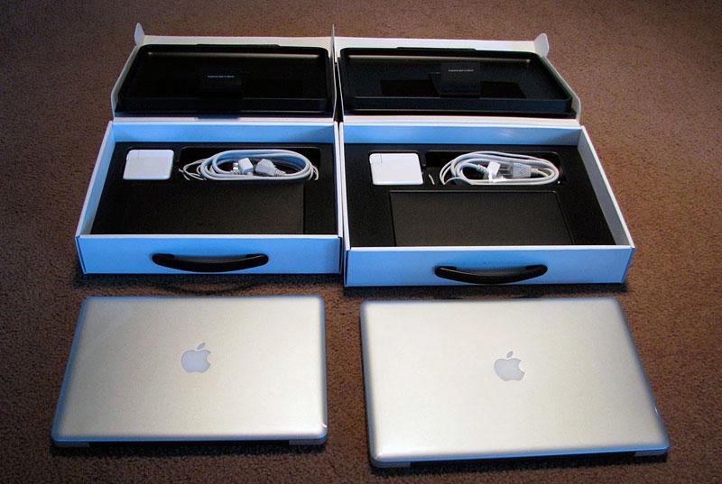
For comparison shots of the new MacBook Pro and its aluminum predecessor, see: High-quality unboxing photos: late 2008 15" MacBook Pro
On page 2 of 6: The Air-tight display lid; The glossy screen; & The extruded keyboard.
Jump to a different section
The display lid and hinge is similarly built tighter and stronger, resembling the design of the MacBook Air. It's not much (if at all) thinner than the previous model in the middle, but its sharply tapered edge gives it a much thinner feel and appearance. On previous MacBook Pros, the lid had considerable 'bounce flop' in the amount of slack it will move before the hinge catches up and adjusts to a new angle. The new model has a far more precise feel that seems to lack any slack bounce at all. The lid also opens significantly wider than the previous model, another welcomed change.
The lid also acts heavier however, so if you hold the body perpendicular to the ground, the lid will fall shut by gravity. That means if you're laying in bed and hold the screen closer for examination, the lid will fall shut and smack you in the face. The previous model's lid has more resistance to closing; its open screen will stay open when held at any angle.
The new lid does close with a more pleasing, smooth action (as long as your face isn't in the way), and shuts precisely with an invisible magnetic latch action that sticks the lid shut but offers no resistance when you want to open it. Previous models used physical latch mechanisms that reached down to grab ahold of the body case, and required pressing an uncomfortably thin release button to open up the display.
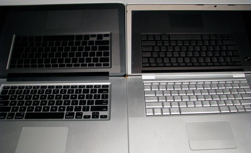
The display's black border makes the LED-illuminated screen appear to really snap with vivid, high contrast color, but the new design also pushes the glossy glass screen right to the corners of the lid. The screen with its black margin covered by glass is identical in design to the iPhone, but because the MacBook Pro's screen area is so much larger, it can also be harder to position it so that you're not getting background glare. With the display backlighting turned off, the screen turns into a mirror. Seriously. It's far shinier than even the previous glossy notebooks Apple has shipped.
While the bright screen does help cut through any glare from background light sources behind you, the shiny black margin around the screen picks them up like a mirror. The display looks phenomenal as long as you aren't positioned with your back to bright light sources, but if you're not a fan of glossy, you'll not be pleased that extreme gloss is the only option. On the other hand, Apple reports that users overwhelmingly prefer the glossy option (it knows because it previously offered both versions). Glossy not only looks more pleasing but is actually more color accurate than a flat matte screen, which diffuses light, providing a softer image. Those plusses tend to overshadow the annoyance of reflective glare.
In addition to glare, the new glossy black margin also picks up fingerprints. It's easy to smudge up the margin area when adjusting the angle of the screen from the side. Once you grow weary of wiping off the smudges, you'll quickly teach yourself to grab the lid by the metal rim. While the glossy expanse of glass is easy to mark up, it's also easy to clean, as there's no abrupt edge between the screen and the frame as with earlier models; you can wipe the screen off from edge to edge.
Is the new screen too glossy? Our first experience with glossy screens on PC notebooks left us thinking that high gloss was an unsophisticated gimmick. Since then, we've softened that outlook and ultimately selected a glossy screen Mac when the option became available. We've now grown accustomed to using a glossy MacBook Pro to the point where it's hard to use a matte-finished Cinema Display connected next to it; the non-glossy screen is that much less desirable to look at. The new MacBooks are now even glossier. The more shine there is on the screen, the more vivid the contrast between white and black and the brighter colors appear. At some point, we expect high gloss to reach a point where it sends us into a diabetic sugar coma, but the new MacBooks aren't there yet.
Yes, there is glare, and yes it is now more distraction given the black, mirror-like frame, but even sitting in the garden window with lots of bright natural light, the new MacBook isn't really so dangerously shiny as to be unusable, although one might need to take light sources into account more, something that notebook users have always needed to do. It will be interesting to see if Apple can manage to keep things at a decent balance between distractingly shiny gloss and vivid display pop.
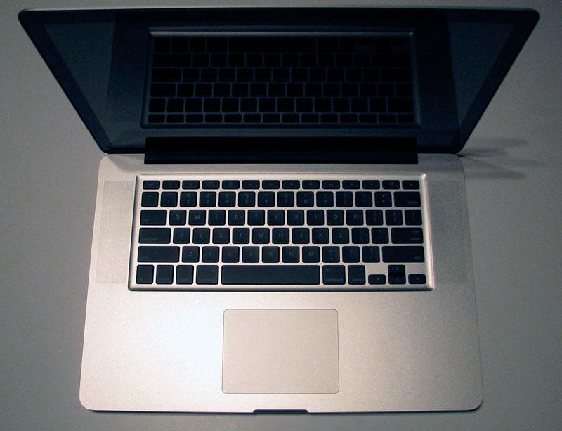
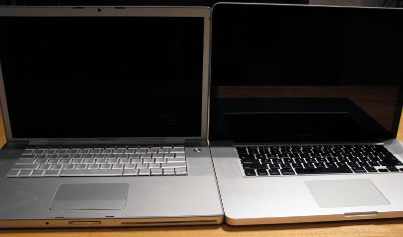
Outside of the shiny black-framed display, the most apparent difference over the previous model is the new black keyboard and larger trackpad. The keyboard ties in visually with the black screen margin and hinge, creating a distinctive, high contrast look compared to the uniform aluminum color of the previous model. Whether you decide you like the black on silver appearance or not, it does seem to help disguise the fact that the new model is actually about half a finger wider and deeper than the old model.
It appears that the slightly larger case is required to accommodate the same 15" screen while allowing for a thinner taper around the lid edge. Despite being bigger (and only slightly thinner), the color contrast and the unit's rounded, tapered edges make the new model feel lighter, tighter, and if anything, more compact.
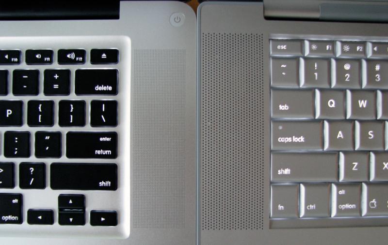
The flat black keyboard itself looks plasticky and cheap at first glance, compared to the silver metallic look of the old model. The previous notebook's keyboard was plastic too though, and the new key action isn't at all worse. The keys feel slightly lighter and more "tappy" as they make more of an audible click when typing. The previous model's keyboard actually feels mushier and soft but slightly quieter to type on, which some users might prefer.
After some experience with typing on the new keyboard, it feels no better nor worse than the previous model, although there is enough of a difference for users to hold a preference. The black keys certainly help the white labels to stand out, making both the letters and the revised new F Key shortcuts (including volume and audio playback buttons, Exposé and Dashboard buttons, and screen and keyboard illumination controls) easier to identify at a glance. With illumination, the white on black keys are also more readable in dim light compared to the white on light-silver keys of the old model (below).
On page 3 of 6: The glass trackpad.
Jump to a different section
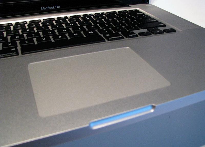
The MacBook Air debuted a larger multitouch trackpad earlier this year, but the new MacBooks now supply an even larger, single unit trackpad that doubles as a button. In other words, rather than providing a separate button below the trackpad, the entire surface of the trackpad functions as a button. More accurately, the bottom 80 percent of the trackpad surface acts as a clickable button while the top edge is fixed.
The new glass surface of the trackpad doesn't really look or feel like glass, but it does offer less resistance to your sliding finger when compared to the previous MacBook Pro's trackpad. As you slide your finger across the surface, there is less resistance than regular window glass; the new surface is even slicker than the polished face of the iPhone or the notebook's glossy glass screen. It feels like highly polished metal, or perhaps an enamel-glazed surface.
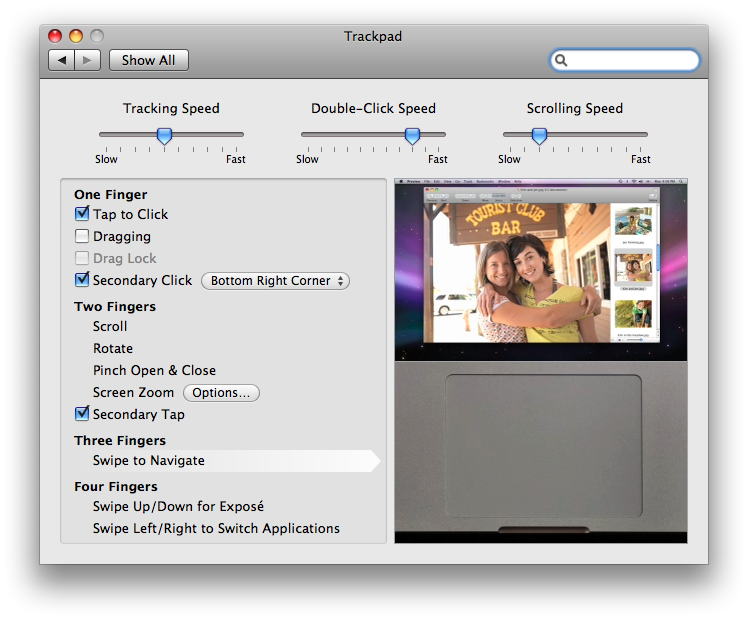
The trackpad gestures (below) build upon those new two-and three-finger gestures introduced with the MacBook Air. Using all four fingers, a quick swipe upwards reveals the desktop via Exposé, a swipe down presents all windows tiled in Exposé, and a four finger swipe to the right or left brings up the app switcher (identical to hitting Apple+Tab). The new gestures sure make it easier to rapidly bring up those features without a second thought about which key combo to hit on the keyboard.
Additionally, one can define the "secondary click" to be the bottom-right or bottom-left corner. This setting seems a bit odd because it is not very natural to right-click by rotating your thumb under your hand to target the lower right corner (if you're right handed; or vice versa if you're not). The demo video Apple displays in System Preferences indicates a finger right-clicking by touching the lower right corner. Who does that? Many PC users might be more accustomed to hitting a trackpad button located above the trackpad surface, but there's no way to define secondary click to the top-right or left areas of the trackpad (which do not function as a physical click button, but do register with 'tap to click' turned on).
Also missing from the configuration is any way to reassign the keyboard gestures, such as setting up a hot corner to invoke Dashboard. From Exposé settings in System Preferences, hot corners can only be associated with pushing the mouse cursor into a screen corner, but not tapping a given area of a trackpad. The new trackpad also provides no programmable support for a third, "middle mouse button" as Apple's Mighty Mouse software does.
Adding too much complexity to the finger gestures of the trackpad would certainly make it easy for things to get out of control, and Apple is cautiously introducing new features rather conservatively. In the future, it seems likely that the trackpad could be replaced entirely by a secondary LCD panel that provides immediate visual feedback on the options available, enabling more options to be presented at once. Without any display feedback, the trackpad functions are easy to overload, so Apple's hesitancy to push too much complexity into trackpad gestures makes sense.
Because users likely give less conscious thought to the intuitive gestures they make on the trackpad than even the keyboard when touch typing, the differences and greater complication will likely throw most users for a loop as they get used to the new behaviors. There is potential for confusion when you tap the lower third button area with your thumb while your finger is pointing; if your thumb is firmly in the lower area of the trackpad, the system should recognize that as a 'one finger touch and one thumb button,' but if your thumb wanders upward, it becomes very close to the gesture used to pinch and zoom: 'two fingers on the pad, moving apart.' With new gesture support for actions like pinch-to-zoom, and the ease of accidently grazing a third finger along the trackpad surface, you can easily experience a variety of unintended actions
For example, we didn't even know that Safari supported "pinch-to-zoom text" until the text size of web pages began to enlarge or shrink, seemingly at random intervals while scrolling around through web pages with two fingers. That's because two finger scroll works only if your fingers stay in close alignment, otherwise the system has to assume you're performing a pinch action as your fingers spread apart, another action that is easy to accidentally register.
There's no way to turn off the two-finger pinch, rotate or scroll features, so you just have to learn to do certain things differently. Finger coordination for clicking to select text and then dragging the text to a new place requires keeping your thumb in the lower edge of the trackpad, as the system is constantly evaluating whether you are intending to tap and click, or whether you have two fingers on the trackpad for other reasons.
We also discovered some weirdness with right and left clicking. It was hard to determine if the system was just behaving badly (it did seem to stick between settings at some points), or if we were just engrained with two finger right-clicking instincts picked up from the earlier MacBook Pros, which becomes a 'pinch and click.'
With both the 'tap to click' and 'two finger right click' feature turned on, it's painfully easy to accidentally 'right click and randomly select' some action from the contextual menu. Two finger tap makes inline spell checking particularly easy, but again it's also often just too easy to accidentally hit two fingers at once on accident and end up inadvertently pasting in text from the clipboard randomly. Apple leaves those features off by default.
The system is usually intelligent enough to figure out that 'two fingers in the upper area tapping' is not the same thing as 'a thumb at the bottom ready to click, and a finger tracing around above.' There is clearly a lot of smarts involved in anticipating what you must be wanting to do. At the same time, a simply normal click is often frustratingly difficult to perform; it appears the trackpad software needs an update, because frequently an audible click of the panel does nothing and the click gets ignored. This makes it almost requisite to turn on 'tap to click.'
On earlier Mac models, tap to click has never seemed to be usable. It's hard to explain why, but tap to click on PC notebooks seems to work better than tap to click on Mac notebooks, perhaps because the dual physical buttons on PCs are so much worse that trackpad tapping is a better alternative. Tap to click is usually on by default on Windows PCs, and off by default on the Mac.
It's often just too easy to inadvertently tap to click, which can be particularly annoying when editing text and trying to position the cursor. One false tap and you're potentially selecting a line or typing into the wrong paragraph. Bottom line: virtual click taps seem to be improved while the "entire trackpad as a physical button" idea seems to have inconsistent and flawed behaviors, although this might only be an early adopter software flaw that can be fixed.
As with any input device, the new trackpad takes some getting used to, and the highly configurable settings should help most people find their happy place between gesture complexity and feature completeness. Users who want a very simple trackpad may be frustrated with the inconsistent mechanical click action (which again appears to be a software problem that can be fixed, not a hardware limitation), while extreme power users might be disappointed that the trackpad's gestures don't go far enough or allow enough customization.
On page 4 of 6: Expansion ports; & The battery and drive bay; .
Jump to a different section
Unlike the MacBook and its missing FireWire, the new MacBook Pro retains everything from the previous model, with some key differences. There's now no longer a separate FireWire 400 and FireWire 800 port; only the faster one. This may result in some users having to invest in a few bucks to get a FW400 to FW800 cable, but the daisy chain architecture of FireWire prevents the single port from really being a problem. FireWire can also be used with a hub to support lots of devices. The faster speed of FW800 makes it nice that Apple kept the jack on the Pro model, although many users would have liked to see a MacBook Pro in the 13" size as well.
All ports are now on the left side, so rather than having one USB port on each, there's two next to each other. The other difference in port arrangement is the new Mini DisplayPort, which replaces the much larger DVI port on the previous model. All of the MacBooks now use the Mini DisplayPort apart from the unchanged 17" MacBook Pro and the carried forward White MacBook. Future iMacs, minis and Pros will also get the new port, likely making it common enough to find straight cables rather than having to use a dongle to connect to DVI or VGA. It's disappointing that Apple didn't just come out with a series of Mini DisplayPort to VGA or DVI cables rather than the dongles, but this should be addressed by third parties.
The new models apparently provide no support for audio over a Mini DisplayPort cable (as can be supported in the specification), so unlike Apple TV there's no way to output both audio and video over the same cable in the manner of HDMI. That necessitates also using the headphone audio output or a digital optical toslink port for audio output to a TV display. The MacBook Pro retains the excellent audio in and out functions that supply both standard line-in and headphone audio as well as digital optical mini S/PDIF connections.
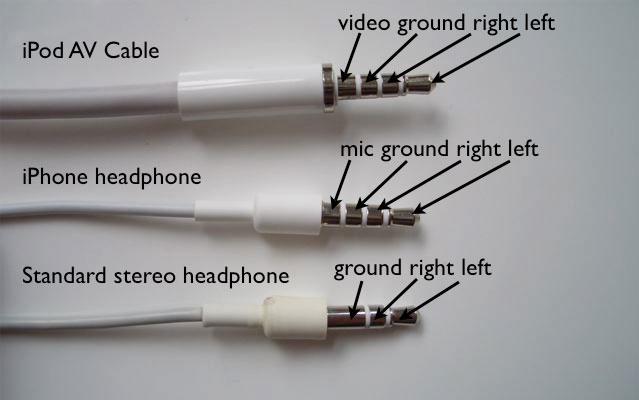
The headphone jack now also supports iPhone-style headphones with an integrated mic and a playback control button. That's a great feature for anyone doing iChat audio or video conferencing or using another VoIP program on the go, as the built in microphone makes it hard to isolate background noise, and most mics and headsets designed for generic PCs lack the higher line level output required by the Mac's mic input port.
For more information on FireWire features, see: Jobs responds to outrage over MacBook's missing FireWire
For more information on audio and DisplayPort features, see: Inside the new MacBooks: Audio and Video
For more information on iPhone-style headphone jacks, see: Using iPod & iPhone Video Out: Background and In-Depth Review
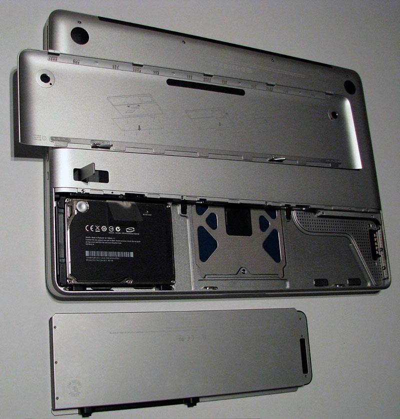
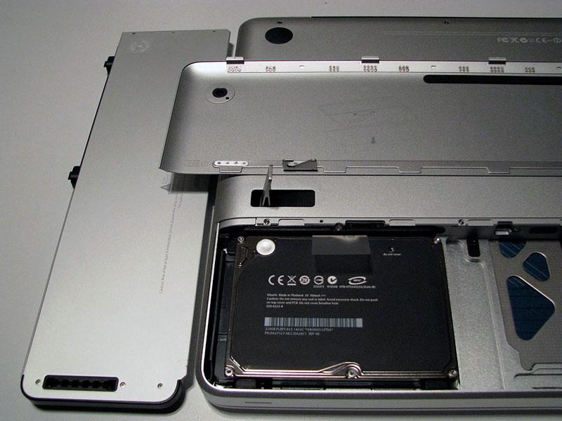
Removing the battery is nearly as easy as previous models. Rather than unlatching two catches, you flip a lever on the back to remove the cover and simply lift the battery out. The cover also provides some additional protection against casual battery theft, as an attached locking cable prevents the back cover from being removed. The battery cover panel is extremely thin, making it fairly easy to bend out of precision alignment. It feels slightly thinner than the back panel of the Titanium PowerBook.
The battery unit is smaller and therefore lighter, which contributes to the new model only weighing a tenth of a pound more than the previous model, despite its heavier aluminum shell. The advance of using NVIDIA's controller for graphics, rather than a dedicated GPU by default, also pares down the battery demands of the new model enough to retain its same rated battery life.
On the other hand, the battery simply has less capacity (50Wh versus 60Wh), so you're more likely to need to carry a spare, particularly if you hope to enable the higher performance of the dedicated GPU. The internal battery now presents a signal level on the side of the unit, with eight LEDs rather than five on the previous model's batteries, offering some additional accuracy. However, loose batteries now lack any built-in indicator to show if they are charged or not.
The MacBook Pro's battery bay hard drive is now removable with a single screw, rather than requiring the entire back to be taken off first. Apple offers a 250 and 350GB hard drive as standard, respectively, on the good and better models. It also offers upgrade options to a faster 7200 RPM hard drive or a smaller capacity, but much faster and pricier SSD.
Above the battery bay cover is the main cover held in place by eight screws. Once removed, you can access the optical drive and RAM. Since the MacBook Pro comes with 2GB and maxxes out at 4GB, this somewhat limited access to RAM probably isn't a significant issue. RAM access on the previous model was a bit simpler, only requiring the removal of three screws. Another internal change over the previous model is the optical drive, which is now SATA. That holds out the potential for an aftermarket bracket for mounting an additional SATA hard drive in the place of a removed optical drive, for users who want extra storage more than access to optical discs.
On page 5 of 6: Performance overview: CPU and RAM; % Performance overview: graphics.
Jump to a different section
New MacBook models are usually identified by their slightly faster CPUs, RAM, and other components. This upgrade is all about the physical design, but also offers a minor CPU performance bump over the MacBook Pros released earlier in the year. The new 15" MacBook Pros use the 2.4GHz P8600 and 2.53GHz T9400 "Penryn" Intel Core 2 Duo and offers an upgrade option of a new 2.8GHz T9600 on the high end. Only the 2.4GHz MacBook Pro use Intel's more power efficient 25 watt P series Penryn CPUs announced this spring; the faster machine uses a 35 watt T-series CPU.
The 17" MacBook Pro, which has not yet adopted the new unibody construction, uses the same 2.5GHz T9300 and offers the same 2.6GHz T9500 option as the previous "early 2008" generation of MacBook Pros, although the old 2.4GHz T8300 "good" model is no longer offered on the currently selling 17" model.
Last year's "Merom" Core 2 Duo CPUs (which were the first 64-bit CPUs Apple put in its notebooks) ranged from 2.2 to 2.6GHz, and even the "Merom" CPUs from the late 2006 MacBook Pros ranged from 2.16 to 2.4GHz. There has certainly not been a massive increase in terms of clock speed over the last two years, but clock speed isn't everything; the last year of Penryn CPUs have also enabled additional CPU instructions including support for SSE4 multimedia acceleration.
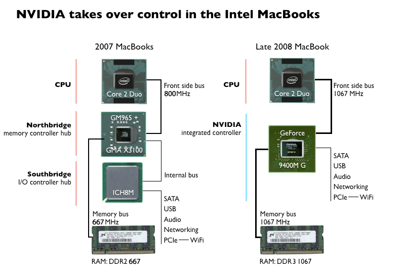
Another advantage of the Penryn version of the Core 2 Duo CPU is its ability to talk to higher speed RAM over a faster Front Side Bus (FSB). Merom CPUs limited the MacBook Pro (and other Core 2 Duo Macs) to DDR2 667MHz "PC2-5300" RAM components. The new CPU in the MacBook Pro (as well as the new MacBook and Air) supports faster DDR3 1067MHz "PC3-8500" RAM.
The previous run of MacBook Pros using Penryn CPUs (described as "early 2008" models) continued to use slower DDR2 667MHz RAM and an 800MHz FSB because Intel's own controller chipset, part of the Santa Rosa platform, did not support the faster FSB of the Penryn CPU. The 17" MacBook Pro continues to have the same limitation because it also uses the same Intel controller chipset.
The new 15" MacBook Pro (along with the new 13" MacBook and revamped Air) pairs Intel's Penryn Core 2 Duo CPU with NVIDIA's MCP79MX controller with integrated GPU, which Apple calls by its marketing name: the 9400M. That chip also provides chipset controller functions (such as RAM, PCIe, SATA, and USB interfaces). This allows Apple to now use the faster DDR3 1067MHz "PC2-5300" RAM, as well as allowing the entire system a faster 1067MHz FSB for communications between the CPU, RAM, the integrated GPU, and the secondary high-performance NVIDIA GeForce 9600M GT dedicated GPU.
For more information on how the NVIDIA chipset compares to previous architectures, see the article Inside the new MacBooks: FireWire, USB, and the NVIDIA Controller.
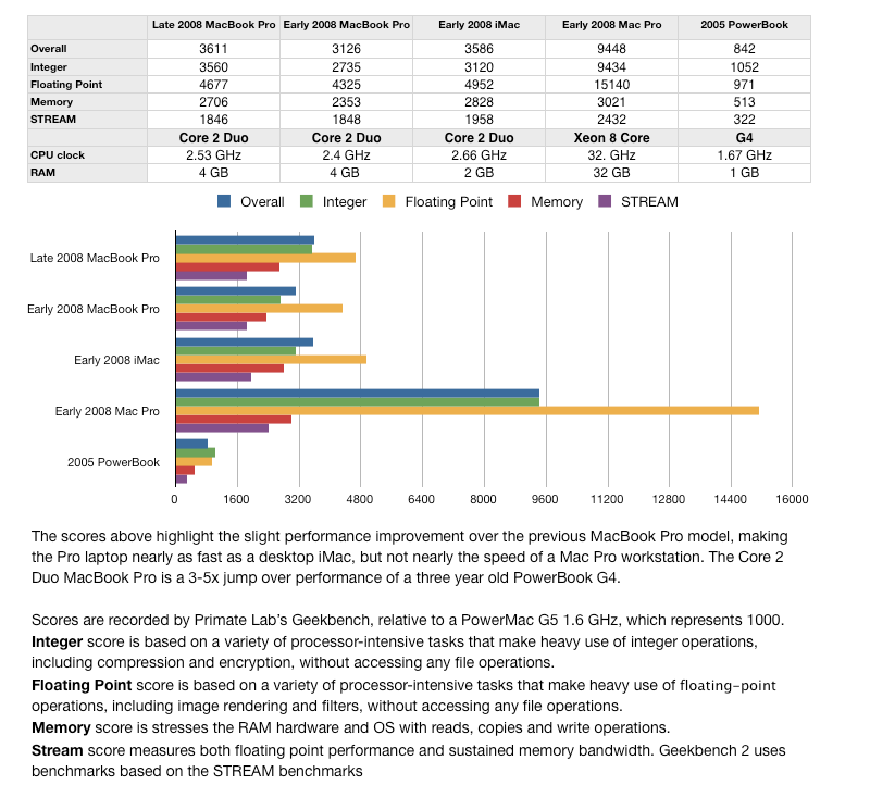
The performance numbers presented by Primate Lab's Geekbench (below) indicate that the new MacBook Pro is not that much dramatically faster than the model it replaces, although it does inch closer to the existing iMac, even beating it in some respects. The new laptop certainly can't compare with a the Mac Pro desktop however. Longer bars are better.
Performance overview: graphics
The new 15" MacBook Pro's graphics benefit from a faster dedicated GPU, faster access to both CPU and RAM from the faster Front Side Bus, and the option to swap between the higher performance dedicated GPU and the more efficient integrated GPU that is part of the controller chipset. The 13" MacBook and the MacBook Air have the same advantages, minus the dedicated GPU. The 17" MacBook Pro lacks all of these advantages because it continues to use the slower Intel chipset, although it too has a fast, dedicated NVIDIA GPU.
According to NotebookCheck.net the dedicated NVIDIA GeForce 9600M GT GPU used in new 15" MacBook Pro runs the 3DMark benchmark 43% faster than the 8600M GT used in the previous "early 2008" MacBook Pro. Even running from the integrated NVIDIA 9400M GPU, Apple reports that the new machine's graphics are 80% of the speed of the previous model's dedicated GPU.
Unfortunately, the 15" MacBook Pro does not currently have the ability to switch between GPUs on the fly. NVIDIA's Hybrid SLI architecture is designed to allow notebooks to switch between processors, and additionally use what the company calls its "Hybrid SLI GeForce Boost" to team both GPUs together for greater speed.
Both features are available under Windows using NVIDIA's software. Mac OS X has never needed to swap between primary graphics interfaces on the fly before, nor has NVIDIA ever delivered the full graphics drivers for the Mac as it has for Windows. The software limitations on the new MacBook Pro are likely to change as Apple adopts NVIDIA controllers across its systems and as it becomes an important customer to NVIDIA with increasingly popular Mac notebooks.
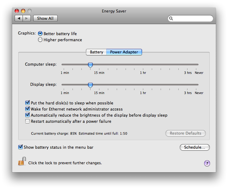
Apple currently requires users to log out and back in again after selecting the "higher performance" graphics option that enables the switch to the dedicated GPU. Mac OS X can do this within a few seconds, but it requires users to quit all their applications and save any open files, which can be a pain. Oddly enough, the Energy Saver interface doesn't make it very obvious that this is how you enable the faster GPU (below top), although once you do, a sheet drops down to prompt you to log out and back in again (below bottom).
This logout is no doubt required because Mac OS X has to restart its window manager and run it against the other GPU hardware. Graphical applications can't continue running while the window manager dies and restarts. Whether allowing the system to transition to using a new GPU (or to team the two together) will be addressed in the release of Mac OS X Snow Leopard remains to be seen. When running under Windows, the system is always fixed to the dedicated NVIDIA GeForce 9600M GT GPU, and there's no way to select between them, although it also appears the Windows is using both.
The second aspect of the semi-hidden GPU switch is that many users will likely never know to turn on the faster graphics potential of their system. Even those who do know of the difference will likely not switch between them frequently because of the extra step required, and instead either remain in the default, more efficient mode, or stay in higher performance mode and simply work mainly from their power adapter. Apple rates battery life at 20% less when using the faster GPU: 4 hours vs 5 when running from the default integrated graphics.
The difference between the two GPU options for normal desktop operations is unlikely to be visible. Users will notice the difference in playing games or when performing demanding graphics operations.
The NVIDIA GeForce 9400M G integrated GPU is shared across the MacBook, MacBook Pro, and MacBook Air. It's the fastest integrated GPU currently available for notebooks, scoring around 2000 3DMark06 points. It represents the lower end of graphics adapters for playing games; while modern games will run, most will require using limited detail and resolution settings. The new chip is far faster than Apple's previous use of Intel integrated graphics, but the MacBook Pro never used integrated graphics. Now it has the option to, giving it a better battery life option with little decrease in performance over the former GPUs.
The NVIDIA GeForce 9600M GT dedicated GPU is only available on the MacBook Pro. It's a decently good mobile GPU, scoring around 5000 3DMark06 points. It represents the middle of graphics adapters for playing games; modern games should run with medium detail and resolution settings. The chip is a bit of an improvement over the previous MacBook Pro's dedicated GPU, but Apple isn't selling the MacBook Pro as a serious gaming machine comparable to the ridiculous $4000 game rigs some Windows PC makers sell.
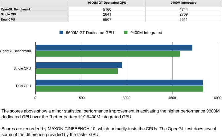
MAXON's CiNEBENCH testing shows around a 10% boost in OpenGL performance when using the dedicated GPU rather than the default integrated graphics.
On page 6 of 6: Faster QuickTime; The MacBook Pro in Review; & Rating.
Jump to a different section
Both GPUs support NVIDIA's PureVideo HD, for hardware H.264 and MPEG-2 acceleration. The primary purpose for NVIDIA including this on the GPU is to support Blu-ray, which the new notebooks do not support. However, Apple has now added a hardware support component to QuickTime to enable any application that uses QuickTime to play MPEG-2 (DVD Player) or MPEG-4 (iTunes) content to do so more efficiently. Farming video decoding off to the GPU rather than the CPU means better battery life and cooler operation.
The new notebooks ship with a new version of DVD Player: "5.02, framework 5.0.5" compared to the "5.01, framework 5.0.4" that ships for existing Macs. They also provide a new build of QuickTime and Quicktime Player: both are still listed as version 7.5.5 but the QuickTime build is 995.22.3 compared to 990.7, and the QuickTime Player build is 249.24 versus 249.13. As NVIDIA's new generation of controllers makes their way into other models, as is expected with the iMac next month, Apple's hardware optimization of QuickTime should provide a nice boost to a variety of applications that spend time on encoding, from iMovie to GarageBand.
Applications that don't take advantage of QuickTime to do their encoding, such as HandBrake, which uses open source libraries to rip DVDs and transcode MPEG-2 into H.264 for mobile playback, won't be able to automatically take advantage of the hardware until GPU support is added to those libraries by the open source community.
The improvement in QuickTime performance (and decreased load on the main CPU) has been attributed to "QuickTime X," a feature associated with the release of next year's Mac OS X Snow Leopard. This is not the case; QuickTime X is streamlined H.264 playback software that was created for the iPhone, and is announced for inclusion in Snow Leopard as an alternative to using the existing QuickTime architecture for simple video playback.
QuickTime has long supported the idea of adding hardware accelerated support components, but Apple simply hasn't taken full advantage of this because it has been moving between ATI, NVIDIA, and Intel graphics, making it difficult to standardize on built-in support for any specific technology. With what appears to be a standardization on NVIDIA GPUs from the low end embedded to the higher end dedicated GPUs across its systems, the cost-benefit ratio of building custom support for NVIDIA's H.264 technology has become more favorable. With its increase share of the notebook business, Apple also now has more leverage to ask for NVIDIA's help in bringing support for custom features to the Mac.
Another component of Snow Leopard, OpenCL, will help abstract the differences between different GPU architectures and make it easier for programmers to put more work on the GPU, which is quickly outpacing the CPU as the fastest engine in the computer. AMD (which now owns ATI) has already voiced support for the OpenCL standard, having dropped its own effort to introduce a general purpose GPU programing architecture like NVIDIA's CUDA. OpenCL may also be able to harness the power of both GPUs in the MacBook Pro to accelerate computationally intensive operations, but this potential has not yet been announced.
The new unibody MacBook Pro is much better built, more attractive, thinner, stronger and more rigid, with a nicer feel to the display lid and easier access to the disk and internals. It chooses a nice balance between weight and performance, using a smaller battery but compensating with greater overall efficiency to retain the same battery life as previous models.
The glossy screen will not appeal to some users, but the display itself looks great, and is a significant jump up in quality compared to the smaller MacBook. The new keyboard is great and the new trackpad offers some welcomed improvements, although it also presents some frustrating annoyances due to its differences. You'll have to get used to it.
This model doesn't offer a major jump in performance in either the CPU or GPUs, but does give Mac users the first taste of GPU choice in terms of efficiency or performance, boosts overall speed a bit with a faster RAM architecture, and seems to run cooler and quieter overall than the previous MacBook Pros.
If you're in the market for a replacement MacBook Pro, the new model makes a great, well rounded upgrade. If you've recently bought a new MacBook Pro, the new model certainly won't blow you away in terms of greater performance.
Compared to the 13" MacBook, the choice is pretty simple: a smaller and cheaper 13" unit (losing FireWire, ExpressCard, faster graphics, and a better screen), or a considerably more expensive, larger, but compromise-free 15" model.
Rating 4 out of 5
Pros:
Greatly improved construction
Flexible graphics options
Bright, high quality screen
Easier to access internals
Little compromise
Cons:
Limited increase in performance
New trackpad is not yet flaw-free
Glossy screen may be too much for some
Where to buy
Amazon.com: (1,994.00 to 2,494.00)
MacMall ($1,894.00 to $2,844.00)
