Apple Vice President of iOS Software Scott Forstall acknowledged on Monday at the Worldwide Developers Conference that notifications in iOS 4 had several problems. In response to customer and developer requests for an improved notification UI, Apple has developed the Notification Center solution for iOS 5.
Forstall touted the new solution as going "far beyond" simply resolving customer complaints about notifications in iOS. Apple has also tied in its new Reminders app to work smoothly with the Notification Center, allowing for due dates and location-aware alerts.
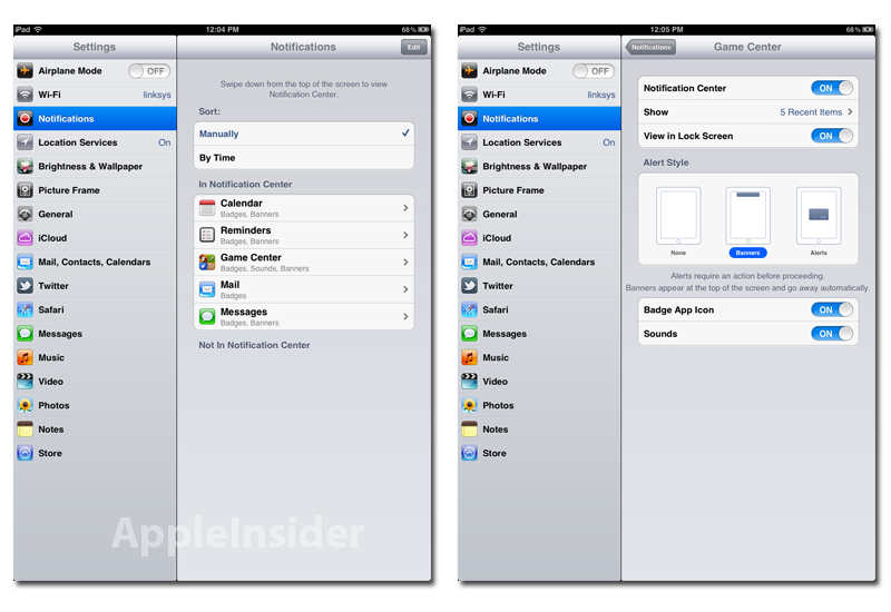
As before, notifications can be managed within the Settings pane of iOS. Users can choose whether applications can send notifications to the Notification Center and the lock screen. Apple also continues to offer the older alert notifications as a choice alongside the new banner notifications.
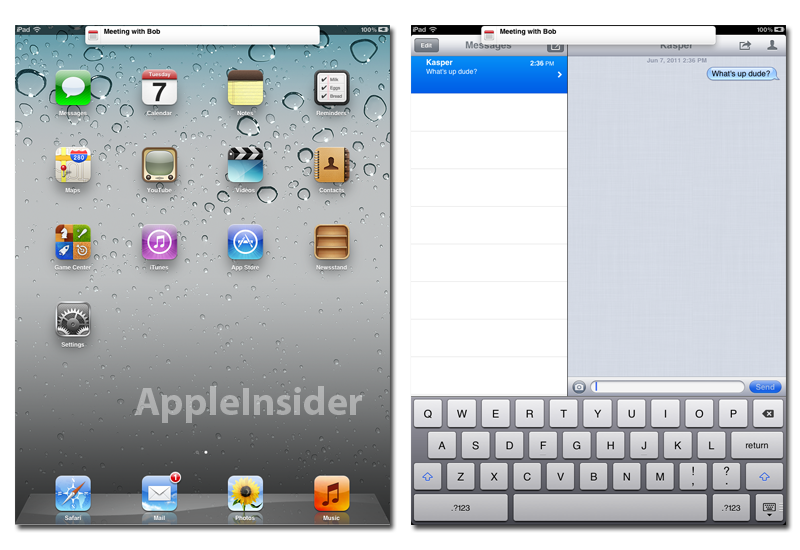
Banner notifications are fairly straight forward. Tapping the banner will open the corresponding app directly to the related message or alert.
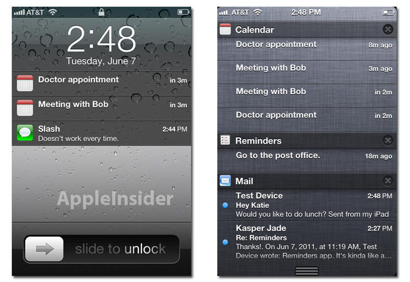
The lock screen on iOS 5 now displays a list of recent notifications. Users can swipe a notification to be taken straight to the app from the lock screen.
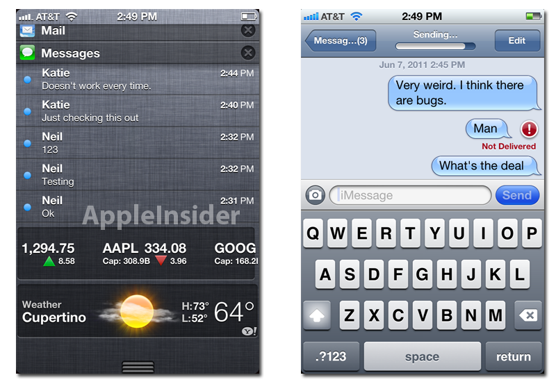
Swiping down from the top of the screen opens the Notification Center, which sorts notifications by app. Apple has built a location-aware weather display and a stock ticker into Notification Center. The new iMessage feature, which allows unlimited messaging between iOS 5 devices, also makes ample use of notifications, though the feature appears to still be in development.
iOS 5 sports 200 new user features and 1500 new developer APIs. In addition to Notification Center, notable features include PC Free setup; updated mobile Safari with private browsing and tabs on the iPad and integration with iCloud for wireless syncing. The update wil be compatible with the iPhone 4, iPhone 3GS, iPad 2, iPad, iPod touch (fourth generation) and iPod touch (third generation) this fall, though some features may not be available on all products.
 AppleInsider Staff




-m.jpg)

 Charles Martin
 Christine McKee
 Wesley Hilliard
 Malcolm Owen
 Andrew Orr
 William Gallagher
 Sponsored Content



22 Comments
The bar at the top would look a lot cleaner if it just covered the status bar as well as the top UI navigation bar.
The bar at the top would look a lot cleaner if it just covered the status bar as well as the top UI navigation bar.
I've been using iOS 5 since this morning and I must say that I do love the new notifications, however, that notification bar is slightly annoying because it does cover your content (while leaving the uinavbar half there but still touchable) but it's awkward to attempt not to press it when you don't wanna jump to the notifying app but need to go back in a menu nest. I wish it operated like the extended status bar and pushed content down instead of just laying over it.
The bar at the top would look a lot cleaner if it just covered the status bar as well as the top UI navigation bar.
I thought the same too. It also need to cover the whole width and not just 2/3 of it. Make it customisable with the colour much like Growl bubble.
On another note, judging from the third screenshot, we now know Kasper's doctor is Bob. A dodgy one from the look of it if you asked me.
I think iOS5 is wonderful. But today as I was reading around and checking if there was anyword on snoozing of reminders or calendar tasks, I was disappointed. But I guess I'll be ok. I hope this makes it into iOS6.
Anyone using iOS5 found out if you can ditch the weather and stock ticker. If you aren't into stocks it is a waste of space and there are better weather apps (for Australia anyway)