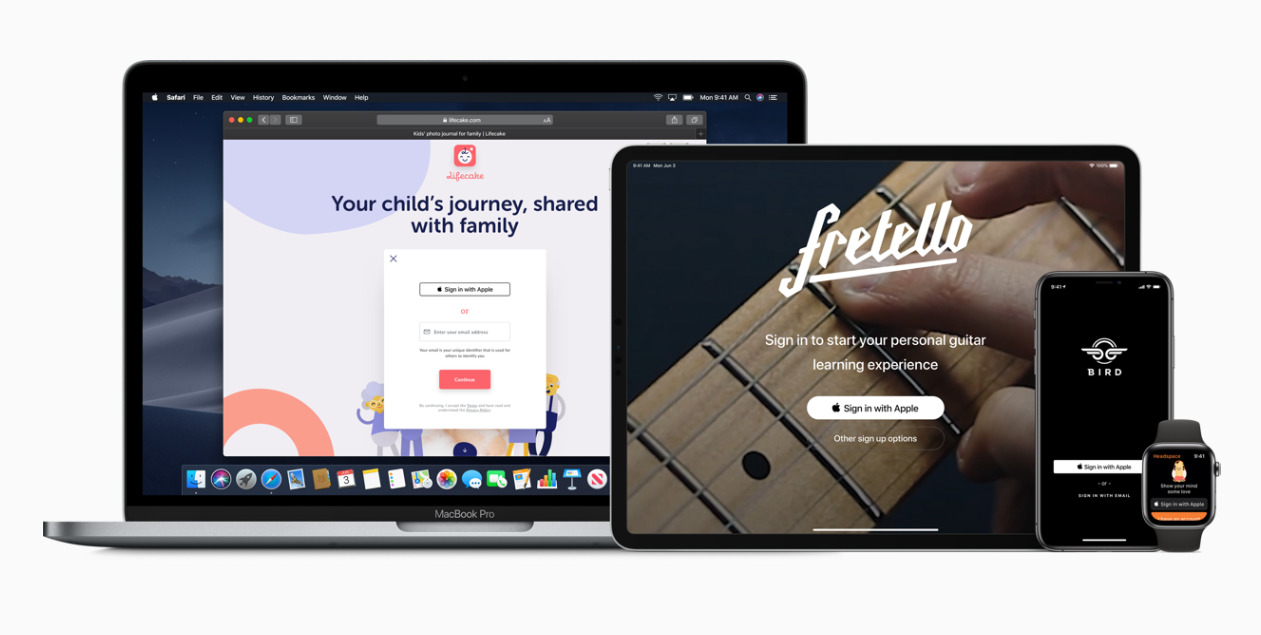
Apple's rules for the upcoming "Sign in with Apple" feature in iOS 13 include urging developers to put its button above any social media alternatives, according to official Human Interface Guidelines.
To position the button "correctly" in a stacked layout, developers should "place the Sign In with Apple button above the other buttons," the company says. Apple also recommends making its button "the same size or larger" than competition.
Though those particular rules aren't obligatory, the company has already come under some critcism for making "Sign in with Apple" mandatory if apps intend to offer rival sign-ins via services like Facebook, Google, and Twitter. Apple's button is intended as a response to those options, eliminating tracking concerns through privacy-oriented policies and the use of spoof forwarding addresses for email, allowing people to shut off connections on the fly.
Testing of "Sign in with Apple" will begin later this summer ahead of iOS 13's fall launch window.
Initially Apple's rules don't seem to create obstacles for apps with native login systems or those that avoid third-party sign-on buttons, Reuters noted. Even on the Web, though, Apple is still asking developers to make "Sign in with Apple" the most prominent button.
The company could come under pressure to drop any mandatory inclusion given antitrust scrutiny by the U.S. Justice Department. CEO Tim Cook has called this examination "fair," but insisted that Apple doesn't have any sort of monopoly, even though it bans iPhone and iPad developers from selling apps anywhere but the App Store.


