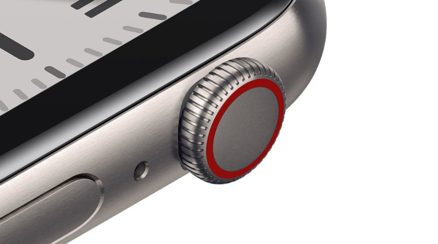
The Apple Watch Digital Crown might be more flexible in the future, as Apple has come up with a way to turn the smartwatch button into a simple joystick by moving the rotational crown element laterally.
The Apple Watch offers users with a number of different interaction methods, including voice control, the touchscreen, the side button, and the Digital Crown. The latter is already a multi-purpose device, with it able to be clicked, rotated, and used as a contact point for ECG readings, but Apple thinks it could be improved further.
In a patent granted by the US Patent and Trademark Office on Tuesday titled "Capacitive gap sensor ring for an electronic watch," Apple suggests the Digital Crown could be turned into a form of joystick or directional controller.
The Digital Crown could be created from a cap or shaft that can be moved in multiple directions. This is then covered by a selection of capacitive elements across two surfaces, where one rotates and moves within another, such as a shaft within a socket or a ring.
By detecting changes in capacitance for each of the capacitive elements, namely where elements touch, it could be determined where the physical position of the internal element is in relation to the outer version. Therefore this informs the device of which direction the user has pressed the crown in.
The measurement largely relates to the values detected by the capacitive elements on the fixed-in-place structure, regardless of orientation of the other section in terms of rotation. It is plausible that some form of measurement could be used to detect which element of the central part is making contact with the outside section, therefore detecting how the crown is rotated at the time of contact.
Using multiple rows of the capacitive elements could also enable the detection of how far the crown is pressed into the smartwatch. On a basic level, this would be whether it is pressed in or not, but adding more rings of capacitors could provide more granular detection.
In a similar manner to joysticks and other control schemes, a return mechanism is employed to bring the central element back to the middle of the available space, in preparation for the next input attempt by the user, and to avoid constant inputs when not in use.

An illustration of a digital crown moving, changing the electrical values of elements on the inner shaft
Apple proposes that, unlike the existing Apple Watch user interface that doesn't use a cursor, there could be graphical elements that are manipulated by the joystick-like lateral control of the crown, with vertical and horizontal movements translating into similar adjustments to the screen's interface.
The patent lists its inventors as Apple product designer Tyler S. Bushnell, sensor hardware design and integration engineer Collin R. Petty, and product design engineer Adam T. Clavelle. The trio have previously worked together on a similar patent, albeit with the slightly different name of "Capacitive gap sensor ring for an input device," again intended for the Apple Watch's Digital Crown.
Clavelle also has patent filings relating to wireless charging systems in portable devices, machining ceramic components, and an "wearable electronic device with electrodes for sensing biological parameters," all of which closely relate to the Apple Watch. Bushnell's Watch-related patent filings include "Sensing contact force related to user wearing an electronic device" and an "electronic watch with obscured sensor for detecting an applied force."
Apple files numerous patent applications on a weekly basis, but while the existence of a patent indicates areas of interest for the company's research and development efforts, they do not guarantee the existence of the feature in a future product or service.
Other filings relating to the Apple Watch include how EMG sensors could be used to measure muscle movements, the use of automatically-adjusting Watch bands, bands with hidden power sources and sensors, and gesture-based and hands-free tilt controls.


