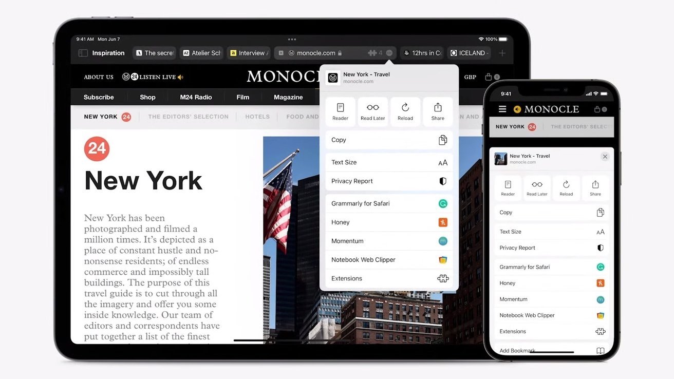
Apple has made a major change to Safari tabs in the latest macOS Monterey beta, reverting the design back to a more familiar layout after receiving feedback from beta testers.
In macOS Monterey, Apple introduced a new tab system that allowed each individual tab to act as a search and URL field. It also nixed the standard URL and search bar that's long been a part of Safari.
However, it appears that Apple is now walking back on that design choice in the third beta version of macOS Monterey, which was released Wednesday. The latest version features a dedicated URL and search interface at the top with tabs arranged beneath it.
Users who are a fan of the Monterey-style search bar can still enable the user interface design in the View menu.
In addition to the interface change, Apple also made several other updates to Safari across its other operating systems. In iOS 15, for example, Apple has refined the Safari search UI and added the ability to initiate a page refresh by long-pressing on a tab bar.
In addition to UI changes, Safari will receive extension support on iOS and iPadOS and new user interaction changes exclusively for mobile.
Keep up with everything Apple in the weekly AppleInsider Podcast — and get a fast news update from AppleInsider Daily. Just say, "Hey, Siri," to your HomePod mini and ask for these podcasts, and our latest HomeKit Insider episode too. If you want an ad-free main AppleInsider Podcast experience, you can support the AppleInsider podcast by subscribing for $5 per month through Apple's Podcasts app, or via Patreon if you prefer any other podcast player.


