The Home app has been redesigned with a focus on simple navigation and improved controls in iOS 16. Here's what's new.
As Apple improved its support for more device types in smart homes, it did little to change how the Home app interfaced with them. User's homes would grow and quickly become difficult to manage given enough devices, scenes, and rooms were added.
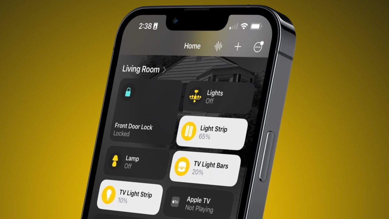
This has finally been addressed in iOS 16 with an all-new Home app focused on managing large groups of devices. The Rooms tab is gone, with everything related to controlling your home's accessories found in the Home tab.
The old Home app
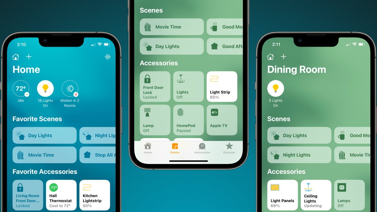
The original Home app was designed assuming users would have a handful of devices that were controlled via scenes or single-tap buttons. This is exemplified by the Home tab's focus on favorites and little else.
The Home tab could be quickly overrun since every new scene or device is automatically shown as a favorite, and users are expected to remove the ones they don't want. Once manually curated, the Home tab was useful but still didn't provide a good overview of the home like the tab's name suggested.
Users had to navigate to the Rooms tab to control specific devices that weren't favorites. Once the tab was selected, a single room would take over the entire interface, and the user had to swipe between rooms to access different accessories.
If your home had more than a few rooms, it was a tedious task to swipe through every room to turn on a hallway light. Siri could perform this task faster if you knew the exact incantation to turn on the desired light, but that feature was often hit or miss.
Overall, the app wasn't well thought out, and Apple seemed to assume users would use Siri anyway. More serious smart home users with dozens of devices would have to figure out all the hidden menus to get everything customized just right.
The Home app in iOS 16
Apple addressed nearly every problem with the Home app in the iOS 16 update. While some issues still exist, like a lack of device icon options, organization and control have significantly improved.
The Rooms tab is removed entirely, with its functionality baked into the new Home tab. Now, users get everything they need to control their home in one tab — the Home tab.
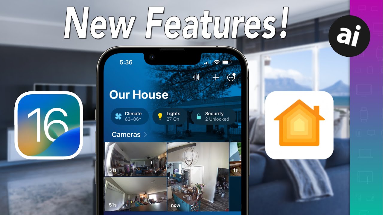
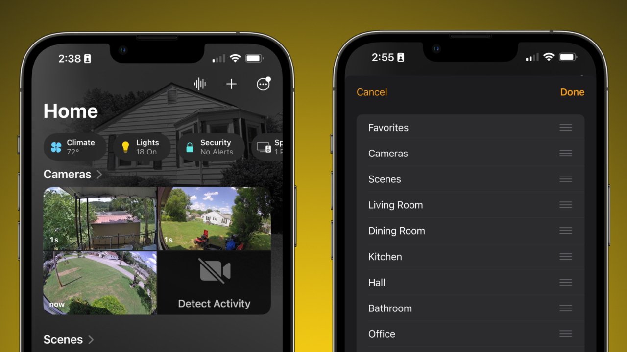
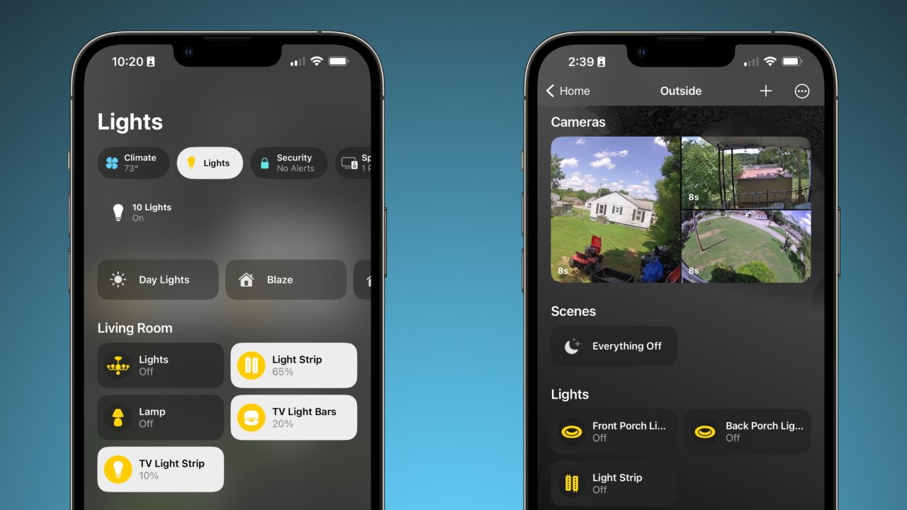
Every device, control, sensor, and room shows up in the Home tab. It is broken down into different sections, starting with Favorites, Cameras, and Scenes, followed by a section for each room.
Everything is shown on this list by default, but a user can press and hold on a device to hide it from the Home tab. Once all devices are hidden, the section is removed but not deleted.
To navigate to any room, even ones hidden from the Home tab, use the ellipses in the top-right corner. These options allow the user to display every control they look for regularly without losing key organization features provided by rooms and zones.
The top section with live statuses for each product category is also much more useful. Sections for Climate, Lights, Security, speakers, and water offer quick access to any device in those categories.
The Home tab is also fully customizable so that each section can be ordered however the user likes. Speaking of customization, Apple has also introduced new room wallpapers, but we've grown fond of the Home Paper app for making our own.
Apple did add a handful of new icons for devices like lights, water, and blinds, but the selection is still bleak. It isn't clear why Apple doesn't offer more device icon options or at least give HomeKit devices the ability to have custom icons added by the manufacturer.
Scenes have a much wider variety of icons and can have colors added similar to Shortcuts. However, it is still a paltry handful of icons compared to the extensive icon library owned by Apple within the San Fransisco font.
Matter and what's next
Apple didn't spend much time talking about Matter, but it is a standard expected to launch in the fall alongside iOS 16. It is a standard based on HomeKit and will enable a much wider variety of accessories to be added to an Apple Home.
The full implications of Matter aren't yet known, but it may open up the possibility for new accessory types and controls in later updates. For example, robot vacuums could soon be a recognizable HomeKit device thanks to Matter.
None of the implementation details of Matter are visible to the user in iOS 16. Once iOS 16 launches and Matter exits beta, Apple could announce new product categories and further updates to the Home app.
