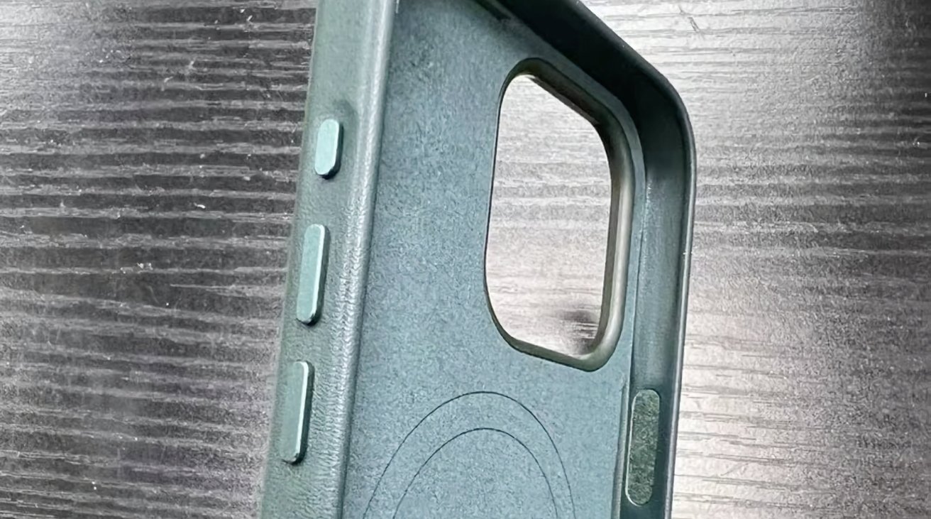
Photographs of cases purportedly for the iPhone 15 Ultra goes along with rumors Apple is replacing the mute switch with a third "Action" button on the side of the smartphone.
Rumors have spread for quite a while claiming that the days of the mute switch are numbered and that it will be replaced by a multi-function "Action" button. A Sunday photo leak showing what could be Apple cases for the inbound highest-specification model certainly leans into those rumors.
The photographs from serial leaker "Majin Bu" on X are identified by the leaker as being for the iPhone 15 Ultra. The cases, consisting of green, black, and dark blue variants, appear with Apple branding on the rear, insinuating that they are actually Apple products.
In a clarifying tweet, the leaker does state "It's a replica, it is not an official product." That means there's a chance the cases may not necessarily be sourced from an Apple supplier, and may not actually be real products.
However, as the leaker has a fairly good record when it comes to Apple-related leaks, it seems more plausible than not.
Apparently the cases of the iPhone 15 Ultra models show a third button that should replace the old mute switcher pic.twitter.com/6XIKgBMJVN
— Majin Bu (@MajinBuOfficial) August 6, 2023
The images show the cases with three buttons on the left-hand side, with two lower buttons being slightly larger than an upper and slightly recessed third button, which also happens to be a bit smaller. This third would be the rumored Action button.
The other photographs of the cases show that there's a continuation of Apple's normal design language in use, including the soft lining, the tell-tale ring for MagSafe, the small lip around the camera bump, and the recessed Apple logo on the rear.
While seemingly plausible, there's no guarantee that the photos depict a legitimate product, and that no-one outside of Apple truly knows what the company will unveil this fall.
The Action button does seem to be coming in the iPhone 15 Pro or Ultra models, with code references in iOS 17 mentioning how a button can be personalized to perform various actions, such as activating a camera's autofocus with a light press and taking a photo for a full press.
7 Comments
Wow. I am absolutely non-plussed.
I don't see Apple demoting its "Pro" phones to second-best status by introducing an "Ultra" phone above them. Also: it's already very difficult to meaningfully upgrade the Pro phones each year--and if Apple were going to reserve its best new feature(s) for the Ultra, what would that leave for the Pros as an upgrade? A new color? This just doesn't make sense.
If we look to the Apple Watch Ultra as a previous example, a couple of things are clear. First: there was no existing Apple Watch Pro line, it was just the watch in different metals. Second, the Watch Ultra is a completely different direction for an Apple watch. It's not inherently "better" than the existing Watch -- many people don't like its appearance and don't want that kind of bulk on their wrist. The Watch Ultra promotes itself to the adventure watch buyer, a very profitable watch market segment for which Apple previously had no product. An iPhone Ultra would be nothing like this--it would simply create a new tier of higher expense to acquire Apple's best features that now go into the Pro line. And that will force Pro buyers to ask the question: why am I paying all this money for the second best phone? Seems like a really dumb consumer strategy to me.
At the risk of thread jack, one of my frustrations with iOS (and every other OS Apple produces) simply has way too many "features" that can't seemingly be disabled. I'm all for additional features and capabilities, but I'd really like to be able to turn some of this stuff off, as I simply have no use for it (I'm look at you, stage manager...) The worst offender is padOS: don't know how many times i've accidentally triggered a screen...thing...with no idea how to undo it, how I activated it...and how to turn it off so it doesn't interrupt me again. I would actually be in the market to buy new iPads for some family members, but then I become their IT guy. "Why did it <insert some feature>?" What is needed - not kidding - is "moron mode": a grouping of basic functionalities that are simply disabled.
I'm guessing this is the polar opposite of the assistive technologies that are very desirable to some. I'm all for that. But I say a lot of bad words when i accidentally bump my magic mouse and the screen rolls and scrolls in some uncommanded fashion. Boy would I like to turn all that stuff off. Give me an "action button" to activate moron mode.
I’m definitely not a fan of adding more buttons to the iPhone. Maybe it’s just me, but I have a difficult enough time sliding my iPhone 14 Pro Max into or out of my pants pocket without pressing at least one of the side buttons. Perhaps it’s because I always try to avoid touching the screen and have to get a firm grip on the edges of the phone. Too often I find I’ve turned the phone’s volume all the way down or I see a faint glow emanating from my pocket.
To Eightzero’s point, some of the iPhones’ default swipe behaviors are annoying as hell. The swipe to bring up the photo app is a constant annoyance, which is compounded by my reaction to swipe it away resulting in the photo app ending up in a mode that I don’t want, like video recording rather than photo capture.
There was a time when UX/UI designers ran test labs and observed live users using the product to go through a series of common tasks. I’ve sat in on these for software I’ve developed and was a test dummy for other people’s products. It seems like some of these annoyances would have been culled from the final design or reworked in response to this kind of live testing. I suspect that, like the company I worked for, they shut down these labs due to the cost.