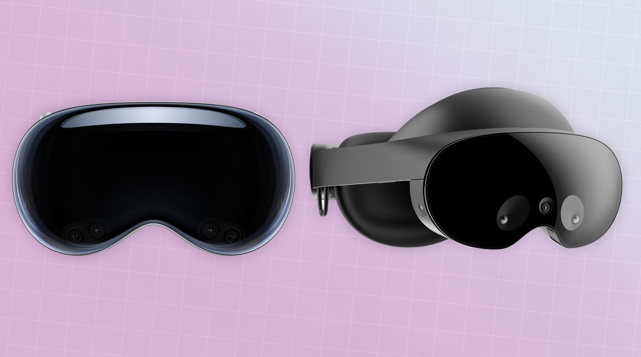
The Apple Vision Pro and Meta's existing headset efforts vary not just in hardware, but in philosophy. Here's how the approaches vary.
Apple's first step into the mixed-reality space, the Vision Pro, is a big one for the iPhone maker. After years of rumors and speculation, it's finally joining the headset party and producing a whole new platform that departs from its existing roster of mobile devices and Macs.
The move has, obviously, caught people's attention, with promises of a high-quality AR experience and an easy-to-navigate system. High-resolution displays for viewing content, and even an outward-facing version for other people to see.
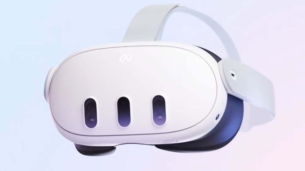
One place that certainly has paid attention to Apple's motions is Meta, which has started to combat Apple's headset. Days before WWDC, Meta attempted to steal the thunder away from Apple with a tease of the Meta Quest 3.
After Apple's announcement, Meta CEO Mark Zuckerberg dismissed the Vision Pro to employees that Apple doesn't bring anything new to the tablet that hadn't been "already explored" by Meta. He also pointed to Apple using people "sitting on the couch by themselves" repeatedly, insisting that while that may be Apple's "vision of the future of computing," it's not "the one that I want."
Zuckerberg also went on to say to his workers "I think that their announcement really showcases the difference in the values and the vision that our companies bring to this in a way that I think is really important."
An examination in how the headsets of each company are made, as well as their usage, can certainly demonstrate some of the differences in thinking between the two companies, as they fight to dominate future eyeballs in the space.
Apple vs Meta - Headset design
The most obvious way to see how each company feels about the mixed-reality space future is in the design of the headsets themselves. While essentially very similar, they're also much, much different.
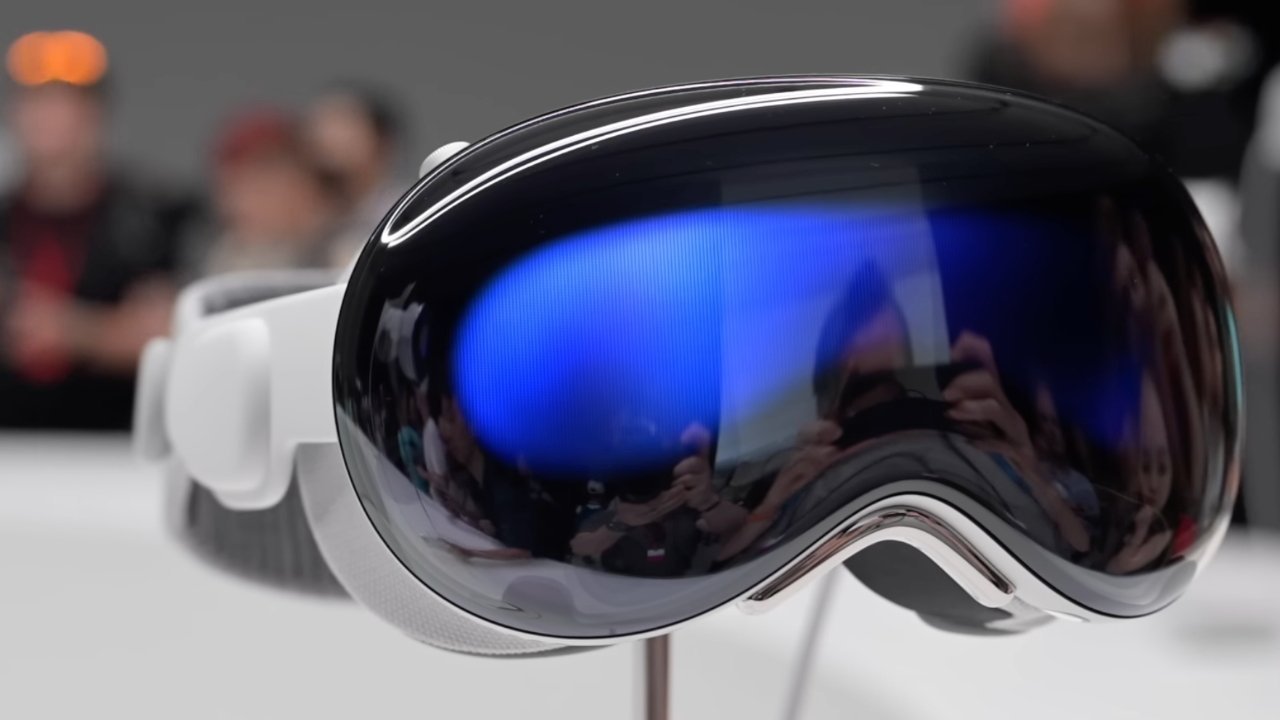
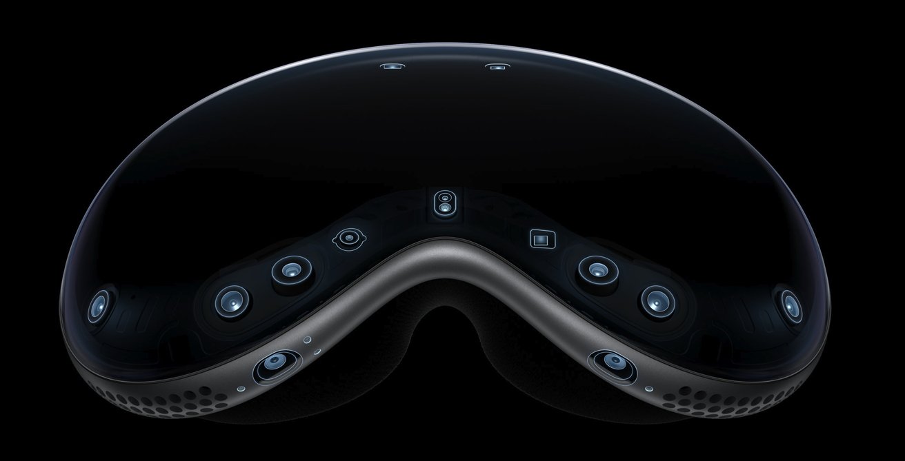
From the outside, the Vision Pro appears to be a very premium bit of kit, with its three-dimensionally-formed laminated glass attached to an aluminum alloy frame for a sleek appearance. The use of woven materials for the Light Seal, as well as the replaceable Head Band with a Fit Dial for customizable comfort, also fit into the same style.
These are hallmark elements of Apple's design language, making it very unmistakable.
By contrast, Meta's headsets are less about a premium offering and more about building features while trying to keep the price low, or at least attainable to consumers.
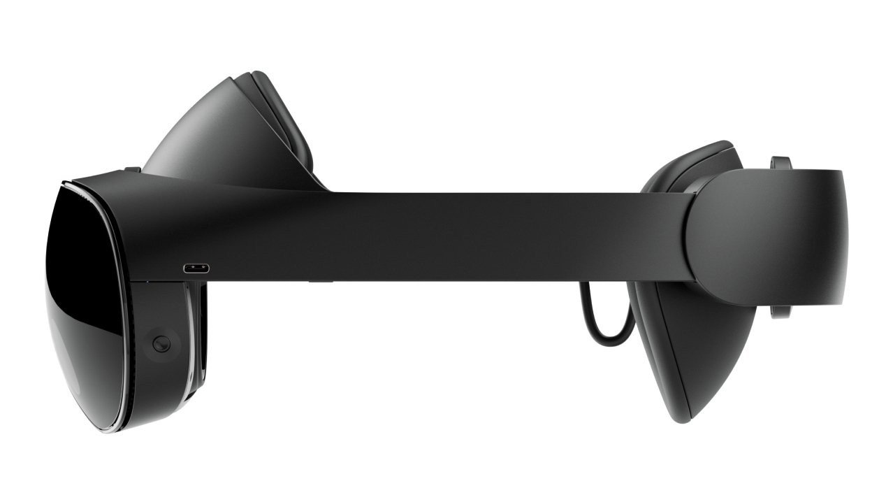
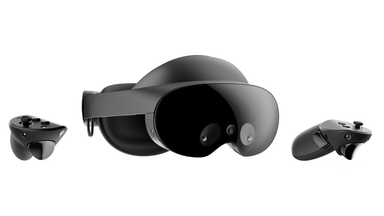
The Meta Quest Pro does have a large front shield, but attached to a plastic-laden construction that goes around the head to a rear element. Plastic does make the headset light to wear, but it tends to feel cheap, and there's no escaping that.
The Meta Quest 2 and the announced Pro go one stage further, in giving up on there being a shiny glass-like front at all. Obviously, there's no utility in the shiny shield of the Meta Quest Pro's one aside from holding sensors, but there's no pretense at all for the lower-cost consumer-grade editions.
The cheaper models also rely on simpler elasticated straps to keep the headset on the user's head. Adjustments are possible, but you're still looking at the cheapest-way-possible approach to accomplish the task.
Where Meta does succeed is in the Quest Pro's battery placement, as it's included in the rear element at the back of the user's head.
While the Quest 2 and 3 embed the battery in the main headset body, this adds weight to the front of the device, which makes wearing the headset for longer periods less comfortable. The Quest Pro's shift of the battery to behind the head doesn't eliminate the weight of the power component, but it does balance it out so the headset isn't pressing down as much from the front.
The Apple Vision Pro sidesteps the battery placement problem because it's one that doesn't fit into Apple's usual design narrative.
Other Apple hardware has embedded batteries, which would lean towards the design styling of the Meta Quest 2 and 3. However, since that can cause discomfort and weigh down an already potentially heavy device due to its use of glass and aluminum, Apple had to think about putting it elsewhere.
It could've gone down the Quest Pro route with its battery, but Apple didn't do it. Instead, it went against its usual design language and added a tetherable battery, intended to be put in a pocket.
This is an inelegant solution from Apple, especially when Meta seemingly has the right answer with the Quest Pro's version already available. Of course, the ever-present Apple accessory market may step up to the plate and make a holster for the headband that can hold the battery, but it's something that Apple could've avoided.
Apple vs Meta - Displays
It's fair to say that newer and more expensive devices tend to have better display systems in general. It's basically the same for headsets.
Meta's specifications for the Quest Pro list two LCD panels that provide a resolution of 1,800 by 1,920 pixels per eye, with local backlight dimming to improve the picture. Custom pancake lenses are used to get the optimal picture for the user, but that's to be expected considering it's affecting the user's vision to see something an inch away as if it's multiple feet in the distance.
Weirdly, the resolution of the LCD panels isn't much different from the Quest 2, which lists its LCD displays at 1,832 by 1,920 per eye.
Apple hasn't offered many specifics about its internal display system, other than its use of a micro-OLED display panel for each eye, with two panels feeding over 23 million pixels combined to the user.
The use of micro-OLED gives Apple a serious advantage, in that OLED is self-illuminating for each pixel. This saves Apple from needing a backlight, as well as offering excellent picture quality compared to LCD-based systems.
As for the resolution, 23 million pixels is about 11.5 million pixels per eye. Given a 4K TV offers up about 8 million pixels, the 11.5 million per eye is obviously considerably higher.
This can mean issues such as the "Screen Door" effect some displays can suffer from can be lessened considerably. Not to mention allowing for crisp visuals that can give users more of a sense of immersion than anything with a marginally pixelated outline.
However, this isn't all when it comes to displays, at least on Apple's side.
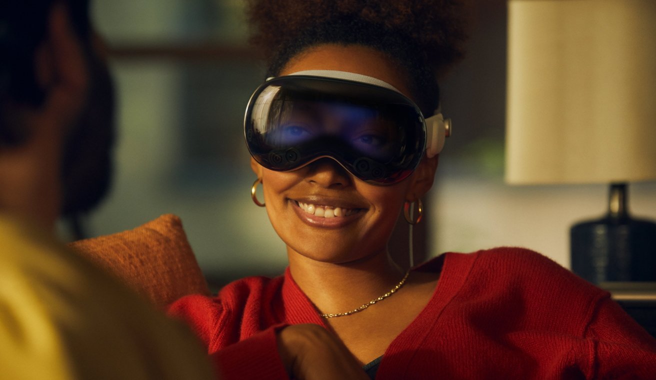
On the outside of the Vision Pro is a larger OLED panel, facing out to the public. It's lined up to where the eyes would be if the headset wearer is looking at others. Using some machine learning trickery and generating a digital form of the user, it is used to display the user's eyes and to show where they're looking when they're focused on things in their local environment.
This is a bit of a flex for Apple, given that it's already done considerable work to make sure the core user experience is as good as it can be.
Apple vs Meta - Sensing the room
A modern headset has a lot of external sensors and cameras in order to function properly. It needs to capture the room and its contents, as well as the user in some cases.
There's obviously a lot of crossover between the devices, but also some considerable differences.
The low-cost Meta Quest 2 has a few small sensors that can capture the environment, as well as the user's hands for finger tracking. The controllers have embedded infrared LEDs that help keep them in the right position in the virtual world.
However, you're not going to get a proper AR view, as all experiences result in a greyscale and not entirely pretty view of your surroundings.
Meta's Quest Pro improves on this by using high-resolution color cameras, enabling a much better experience in AR situations. There are also eye and face-tracking sensors, which are chiefly used for avatar functions.
For the Vision Pro, Apple has gone down a similar route, including a pair of high-resolution cameras to provide the main image. The remaining sensors cover elements including head and hand tracking, and real-time 3D mapping.
As part of the arrangement, Apple says a front-mounted TrueDepth camera is used, with there also being mentions of a LiDAR scanner and infrared flood illuminators for improved low-light performance.
Apple has done a lot to hide the sensors, keeping most of them hidden under the surface of the front glass, but there are two prominent downward-facing sensors used to track the hands.
On the inside, LEDs and infrared cameras surround each eye to project and read invisible light patterns, powering its eye-tracking capabilities.
To process this mountain of information, Apple uses two chips inside the Vision Pro. The M2 is used to handle main rendering and app-related processing, but the processing of all of the inputs is handed off to a new R1 chip.
Since it's designed to process inputs from cameras, sensors, and mics, the R1 helps cut down the processing to minimize input lag down to as little as 12 milliseconds.
Meta handed off processing duties to another company's solution, rather than coming up with its own. The Quest pro relies on Qualcomm's Snapdragon XR2+, a chip designed for use in VR and MR experiences.
While we cannot really compare the Snapdragon against Apple's two-chip solution, it seems that Apple's decision to make an extremely involving experience with a need for high performance justifies its multi-chip system's existence.
Apple vs Meta - Controls
One big way that the two companies differ is in how their devices are controlled. How the user interfaces with each is an important element of MR as a whole.
Meta still relies heavily on controllers, with left and right-hand controllers used with both the Meta Quest 2 and Quest Pro. The Quest Pro pair are laden with sensors to determine positioning for themselves while the Quest 2's are more like beacons that are directly tracked by the headset.
In Meta's case, the controllers are the main way of interacting, but they're not the only way. The onboard sensors are capable of detecting the user's hands, allowing for some form of hand tracking to take place.
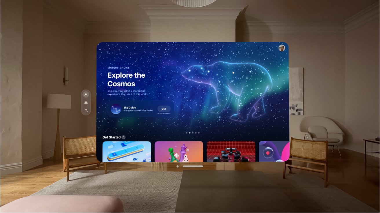
By contrast, Apple is taking a controller-free approach, relying more on a combination of hand and eye tracking. The Vision Pro can detect the user's hands, determine what they're interacting with, and act accordingly, for a start.
With eye-tracking enabled, the Vision Pro can determine interface elements that are actively being focused on by the user's eyes. The hand tracking can then take a quick pinch command as a confirmation to select what the user's eyes have chosen.
This seems like a more intuitive interface overall, since you're not thinking about moving your hand in place, you're just looking instead.
As for managing the immersiveness level, Apple arguably has a cleaner system in place with the Digital Crown. Users can turn it to granularly switch between AR and VR viewpoints, so they have as little or as much awareness of their environment as they want.
This granularity isn't available in Meta's platforms, though there are ways to switch between AR-like views of the environment and the main app in use.
Apple vs Meta - Consumption and productivity
A lot of the things you can do with each headset in terms of tasks and applications are pretty much the same across the board. It's hard to disagree with that, as the ecosystem is very well catered for in general.
It's when you look at how each platform handles the tasks themselves, in how they're used, that differences in ethos come to light.
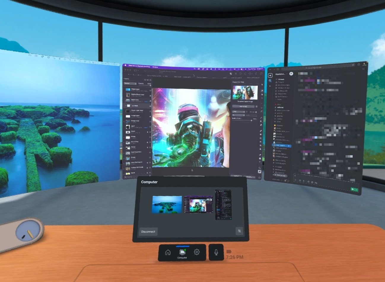
Take for example using a computer. Yes, it's entirely possible to hook up each to a desktop Mac and to use the Mac desktop itself, but each does so differently.
Meta relies on a server app to run on the Mac, and for displays to be presented in a virtual environment. There are some allowances due to technical constraints, such as Horizon Workrooms on Quest 2 largely involving putting the displays in a cartoon-like environment rather than the real world.
You are very conscious that you're still working on the device itself, and that you're simply using the headset as a conduit for the view from the Mac. This is largely from having to consciously establish the connection beforehand.
Apple's solution starts with the high-quality AR view, but then quickly allows you to pull the display up from the Mac into virtual space. Unlike the Quest 2, which makes it hard to interact with your peripherals since they're not visible or obstructed by a grainy AR window into your desk surface, Apple instead allows you to see the keys unencumbered if you wish.
When communicating with others in a video call, you want to be visible but without showing the headset at all. Again, here, there's a difference in opinion.
Meta relies on cartoony avatars of the user to be their representative in such communication, which is fine but not ideal. You're not going to get as personal a connection as you could if people saw your actual face.
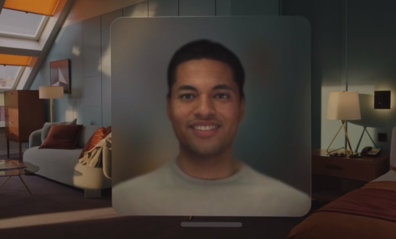
Apple's alternative is a Persona, a digital recreation of the user's face made using the front TrueDepth camera. Once made, the Persona appears for the user as a realistic-looking approximation, complete with the eye, hand, and head movements detected by all of the onboard sensors.
It's not cartoony, and it's not perfect, but for a FaceTime call, it's better than watching a cartoon avatar or someone in a headset.
One area that we cannot easily cover is gaming and immersive apps. While we know a lot about what Meta's Quest lineup can offer in gaming, Apple provided very little in terms of what to expect with the Vision Pro in that field.
It's possible that third-party developers could end up making a lot of apps for the Vision Pro, in part due to Apple's assurances that iPad apps could be converted to it fairly easily. Many of them can be games, too.
But for the moment at least, it seems that Apple's leaning more on the productivity side of things, especially when it involves collaboration with others.
Apple vs Meta - Meatspace management
One place that Apple takes the lead on is in allowing the user to deal with people who are in their physical presence. VR and AR headsets are not designed to be used in public, even standalone devices, and for a few good reasons that each company tries to solve for themselves.
For a start, you may not necessarily be able to see the outside world all that well, even in an AR view. The Quest 2 is a grainy grayscale world where this isn't a possibility. The Quest Pro does better with its higher-quality cameras, but the Vision Pro's 3D mapping systems, as well as displays, should result in a better standard view before you take into account apps.
Being able to see the world is essential, for reasons ranging from personal safety to simply being able to acknowledge someone is in the area.
The ability to see out is not necessarily the same as being seen by others, and this introduces another problem involving other people.
A typical AR-enabled headset will allow the user to see their environment, but unless they provide some outward acknowledgment, such as saying "Hi" to a visitor or turning their head to face them, the other person won't necessarily know the user's looking at them. Even a head turn isn't that useful, since it could be viewed by an outsider as part of the app experience and may not necessarily be intentionally performed for them.
Apple's EyeSight, the external screen, is a way that Apple's fixing this problem, by providing visible feedback to the nearby person. By presenting a Persona version of the user's eyes, complete with elements to show where their eye line is via eye-tracking, the external display can at least give awareness to the outsider that the user knows they're there.
There's even a level of privacy built in too, as when the user's focused on an app instead of the environment, the Vision Pro can instead show a pattern. But, as soon as the user engages with nearby people once again, the eyes return.
These externally-visible eyes may seem like a throw-away feature, but it's actually crucial to using the Vision Pro in public.
To other people, the Vision Pro wearer isn't just someone seemingly blind to the world. With EyeSight, people know that the user is engaged in the environment instead of being in their own little world.
Not only can the Vision Pro allow users to get off their seats and to use their environment, unlike Zuckerberg's commentary, but in opening a digital version of the user's eyes to the world, it makes it easier for everyone not using the headset to work with those wearing it.
You could say that this gives the Apple Vision Pro the feature of human connection. Something Facebook has arguably failed to provide to the world.
It's still early days
While in a normal comparison article, AppleInsider would declare one side better than the other, we simply don't have enough information to go on at this time. Normal comparisons rely on swathes of specifications, and Apple simply hasn't released enough data.
It's likely that, closer to the time of its release in early 2024, we will have a better picture of the specifications and capabilities of the Vision Pro, beyond what Apple has carefully stage-managed in its demonstrations and launch.
What we can say, though, is that Meta and Apple are in the same pool, but swimming in different ways.
With a level of certainty, it's clear that Apple has the technological lead with the Vision Pro.
But Meta has a strong lead of its own: that it's been in the field for quite a few years already. It has the light time with real users to know what they want or need a headset to do, and it has also put considerable sums into developing new generations of headset.
Though Apple stands on the metaphorical shoulders of giants and Meta itself with its headset, it's still a first release that prices most people out of buying one.
It's also reasonable to believe that Apple's next headset release is in development, and will be more consumer-friendly in price than the $3,499 Vision Pro.
What Apple has done is demonstrated that it knows what it's talking about in the VR and AR field. It's made waves in introducing its first attempt at a headset, and future releases will probably be just as important.
It may also force Meta and competitors to up their game, and to seriously rethink their own development efforts.
Apple may have already changed an entire industry with one product, and it's still over half a year from getting it out the door.
 Malcolm Owen



-m.jpg)



 Christine McKee
 Marko Zivkovic
 Mike Wuerthele

 Amber Neely
 Sponsored Content
 Wesley Hilliard


38 Comments
Got 2 identical notices for this article. Cut it out.
Yeah whatever Zuckerberg. The game is on.
Tried wife and I both using our AirPod Pros to watch AppleTV. Screen indicated that with two users using Pods simultaneously (sharing), that Spatial Audio was disabled. Sure hope that gets fixed with AVPs. Would be a bummer not having that cool sound feature when watching with others. Guess you could use on board speakers, but that would disturb others nearby who are doing other things.
This feels the same way as when the iPhone was launched: all the other state of the art devices at the time felt instantly obsolete and clumsy. I have used the Quest a couple of times and was not impressed. I haven't used the Vision Pro of course, but just from the keynote and the reviews, it feels like you don't want to be one of the other guys. I can only imagine how they are rushing to catch up.
What’s a “Heatset”?
Meatspace!? I like that new word. Leave it.