The forthcoming Stage Manager in macOS Ventura promises to streamline your working in multiple windows, but the current Spaces tries to do that too. Here are the benefits of each.
Two window management tools, both alike in dignity — and in how they are close to great but not quite there. Not yet. There are just the smallest little hiccups and clunks in both Stage Manager and Spaces, but at least those in Stage Manager may get fixed.
That's because Stage Manager is in the beta of macOS Ventura and we already know Apple is working on improvements, at least for its iPadOS version. Whereas we've had Spaces for 16 years and it's still only almost great.
It is quite possible that when you can use either Stage Manager or Spaces that you find one you prefer. But there's nothing to stop you using both.
The promise of Stage Manager
With a couple of clicks, Stage Manager in macOS Ventura will shove all of your application and document windows over to the left. It will hide everything on your desktop, and put your current app front and center.
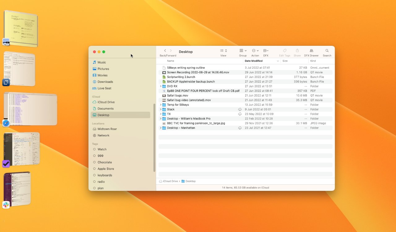 Stage Manager. The Finder is the active window, but it's replace instantly as you click on any window in the column to the left
It's almost like using an iPad where you tend to concentrate on just one app at a time. Except on a Mac, you're more likely to be using multiple apps and this is where Stage Manager and Spaces are already starting to overlap.
You can take a couple of apps, or maybe apps and certain documents, and have those work as a group. Each time you call up any of them, you get them all.
Each time you click over to the column of Stage Manager app icons on the left, you dismiss all of the ones you've just been using. And you can go back and forth between one app, ten apps, five apps and three documents, whatever you need.
If you have a wide monitor, it's irritating how Stage Manager — in the beta so far — centers the frontmost app and makes it quite skinny. But you can resize and rearrange the window and that positioning is remembered.
Stage Manager pros
- Anything you're not using is out of sight
- Everything you are using is grouped together
- It's very fast to get into
Stage Manager cons
- At present, it takes twice as many clicks to get out of Stage Manager as in
- When you leave Stage Manager, apps are rather dumped in the center of the screen
- It's best for smaller monitors
There is also this to be said for Stage Manager — Apple is promoting it. The feature is so promising and, even in the beta releases, already works so well that it also gets a lot of attention.
Whereas it's probably more common for a Mac user to have never even heard of Spaces.
The promise of Spaces
If you already know and use Spaces, it's hard to see that the very concept is difficult for new users to grasp. It isn't necessarily easy even for longtime users who just don't happen to have used Spaces before.
That's because we are all so used to our Macs having a desktop. There's wallpaper, there's all of the documents you haven't tidied away yet, and then there are all your open windows.
But if you swipe upwards with three fingers on a trackpad, you first get Mission Control. This slightly grandiose name is for a feature that also helps you cope with multiple open windows, but if you keep swiping up to the very very top of your Mac screen, there's more.
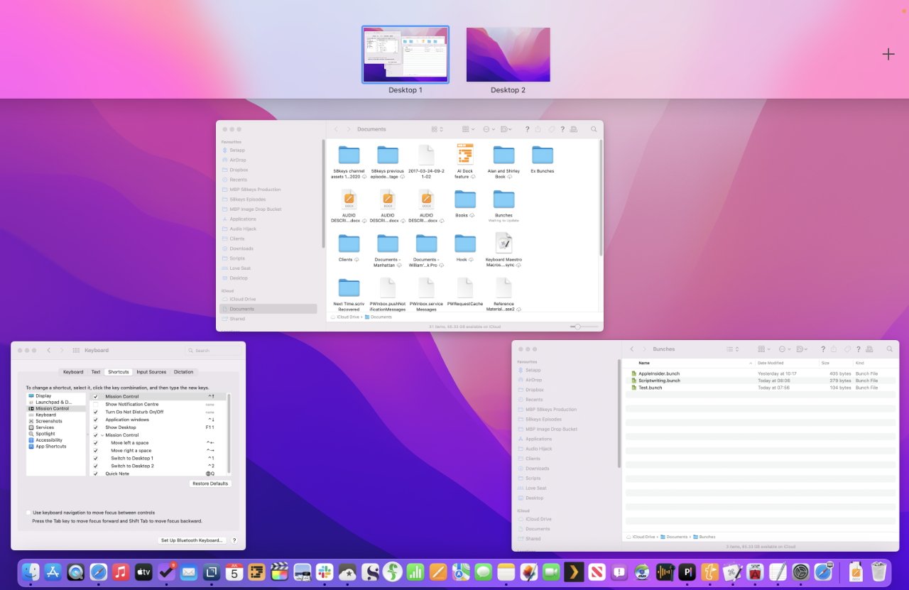 Swipe up to see multiple desktops (or to create them with the plus sign at far right) and then drag windows to where you want
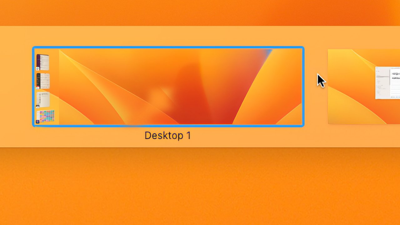
At the top you get a thumbnail image of your desktop with all its open windows. And at the very far right by where your menubar clock is, there will now be a Plus sign.
Click that and instead of a thumbnail of your desktop, you've got two. And the second one is completely blank.
You can switch to that blank desktop and open an app or a document. It will open in that desktop, and you can switch right back to your old one.
That old desktop has all the apps open you already did, it has all of the documents, and it has no sign of the new app you've just opened. Not until you switch to that desktop and now you can see the new app, but none of the old ones.
Once you've set it up, then you can swipe left and right to move between these sets of apps or Spaces as Apple calls them. Once you've set it up, it's fast and smooth.
And it also does the same thing that Stage Manager does — it helps you focus. Just hiding away what you're not using is enough to really help you concentrate on what you need to be doing.
All in all, then, Spaces is a superb feature and it has got better since Steve Jobs demoed it in 2006. Now, for instance, you can have one Pages document in one Space, and another in the next.
Now you can click on the Pages icon in your Dock and switch to your second space, then click again to move back.
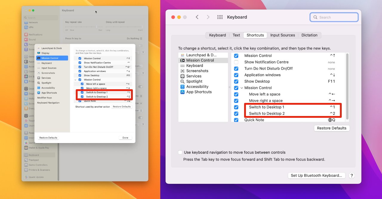
There are now also keystrokes. You have to turn them on in System Preferences, but you can have it so that pressing Control-1 takes you to the first Space, Control-2 takes you to the second.
Really Spaces has become far less clunky that it was. The only real problem left is that you can't automate Spaces.
You could, for instance, open Pages once and — by right-clicking on the Dock icon - select that you want the app to open in a particular space. But you can't say you always want your Great American Novel to open in this space, and your Great American Screenplay to open in another, not unless they are in separate apps.
And if moving between Spaces is so easy that it's practically fun, moving apps and documents between them is a little less so. You have to swipe up with three fingers, then when the two or more thumbnail Spaces are shown, you drag the app or the document window over to it.
If you want to move two or more apps and documents, though, you have to do the whole thing two or more times. Swiping up, dragging, then do it again for the next app or document.
Spaces pros
- You've already go it
- Anything you're not using is out of sight
- Everything you are using is grouped together
- It's very fast to switch between Spaces
Spaces cons
- You can spend a lot of time arranging windows and Spaces
- You can't have specific documents open in specific Spaces
- You can't automate Spaces to position apps where you like on startup
You can't name them, for instance, they are initially titled "Desktop 1," "Desktop 2."
They do get names if you open an app full or half screen the Space. Then they adopt the name of the one app or jointly of the two apps in that Space.
It's not entirely true that you can't automate Spaces, but it's fiddly. There is no way to create a new Space other than manually, for instance.
Or if you want to start up your Mac and have Pages in the first space, Final Draft in the second, you can assign apps to Spaces. Switch to a Space, open the app, then right-click on its Dock icon.
Choose Options, Assign To... This Space. Then forever afterwards, that app will open in the Space you choose.
Therefore, in theory at least, you could have a Shortcut or a Keyboard Maestro macro that takes you to a particular Space just by launching that app.
In practice, Spaces doesn't seem the most reliable feature in this way. Especially if you ever delete a Space by accident — you can't just create one again by opening that particular app. You have to make a new Space, and then drag the app's windows into it once more.
Using Stage Manager and Spaces together
So both Spaces and Stage Manager are for clearing your head of everything but the task at hand. They both also aim to get you back into another task pretty much instantly.
You can use them together.
- Open the apps and documents you want in your first Space
- Click on the Control Center icon
- Then click Stage Manager
- Now swipe up with three fingers on a trackpad
- Click the Plus sign at very top right of your screen
- Now click on the thumbnail for the new Space
- Open the apps and documents you want in your second Space
Because you've already chosen Stage Manager in your first or regular Space, it's on for all of them. And when you turn it off, you are turning it off for all of them.
So what you end up with is a Mac desktop that has you focusing on just the apps and documents you need for your current task. Most other items you use are there in the Stage Manager column of icons and so are a click away.
And an entire new set of apps and documents is a swipe away in a second Space.
Stage Manager on its own looks to be the easiest to grasp and the least fiddly. But if it and especially Spaces take some thinking about and planning of what you want to have open where, it is all worth it.
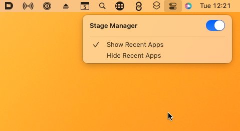 Switching out of a Space is just a matter of a swipe or a keystroke, whereas Stage Manager requires four clicks
You have to spend more time considering whether to use Spaces, Stage Manager, or both. You have to think about opening this app in that space, and that space in the other.
Really you have to think about all this more than you'd want to for features that are meant to leave you concentrating on your work.
But once you have thought through it, once you have set them up, they are very, very hard to do without.
 William Gallagher


-xl-m.jpg)


 Malcolm Owen


 Amber Neely
 Andrew Orr


