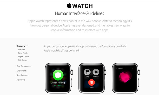
Apple on Monday updated the Apple Watch Human Interface Guidelines website with a refreshed look and new software design resources for app developers.
Mostly a rearrangement of its original Apple Watch HIG page, the new version is easily navigable with a persistent menu bar and interactive elements mimicking the look and feel of Apple's most recent Web designs.
Like Apple's previous HIG page, the revamped version is broken up into five categories: Overview, App Components, UI Elements, Specifications and Resources. Each section contains useful suggestions pertaining to general user interface guidelines, navigation, specific graphical elements and much more.
In Resources, Apple provides a number of templates to help developers create apps that are uniform in use and style. Among the resources available are Photoshop templates for bezels, buttons, notifications and more, while Photoshop Guides help devs lay out individual app elements.
Finally, developers can download Apple's San Francisco typeface, which was designed specifically for small form factor devices. Apple Watch uses two variants of San Francisco, one called Text for basic in-app content and a larger version called Display.
The assets are a welcome addition to Apple's Apple Watch HIG, which many developers have turned to in lieu of receiving actual hardware. With Watch demand far outstripping supply, third-party developers have had to make do with virtual test beds.
To deal with the issue, Apple extended a limited number of Apple Watch Sport models to developers, promising a ship date of April 28. While some received their Watch on time, others reported that Apple did not meet its self-imposed deadline and are still waiting for their test unit to arrive.
 AppleInsider Staff



 Wesley Hilliard
 Andrew Orr
 Malcolm Owen
 David Schloss
 Christine McKee
 Amber Neely



8 Comments
The general consensus I've seen is that most third-party apps are terrible so far. Hopefully they improve now that devs have hardware.
Speed is the biggest issue. I'm sure this will get addressed with updates soon enough (both from the Watch OS and 3rd party apps), and even more dramatically when we have native apps.
Speed is the biggest issue. I'm sure this will get addressed with updates soon enough (both from the Watch OS and 3rd party apps), and even more dramatically when we have native apps.
I find that the native Weather app is incredibly laggy (the native Stocks app is a close second). Apple needs to optimize the performance of both. Maps could be a bit faster too.
Third-party apps are slow as molasses and (mostly) poorly designed, and I have got rid of the ten or so I downloaded. I'll wait for updates.
All the other native apps are reasonably snappy.
Incidentally, it would be nice to have an indicator on the home screen -- in red or some such color, similar to that on an iPhone -- that shows the number of unread emails and text messages. It could even be designed such that the whole icon turns to a different color, with the number of unread messages displayed. Right now, one has to tap on the Messages icon and the Mail icon, and wait for it to update to see if there are new messages and how many (while Messages updates very quickly, Mail is a tad slower).
And Apple just announced a Made for Watch program for 3rd party bands. :smokey: https://developer.apple.com/watch/bands/
And Apple just announced a Made for Watch program for 3rd party bands.
https://developer.apple.com/watch/bands/
Yup. Inductive charging bands are a no-go. Most interesting bit is this :
These lugs look identical to the classic buckle lugs, and there is a video (that I won't link to because it was made by the tool that started bendgate) showing how to attach a conventional watch band to the Apple Watch. I would love to see these become available to the general public or, barring that, used on an otherwise cheep band that one wouldn't mind buying simply to harvest the lugs.