Apple's annual Worldwide Developer Convention is now over, but the event revealed a year's worth of insight into what the company is doing with the Macintosh, OS X, iOS and iCloud.
OS X's planned longevity
Apple made it very clear that there's no end in sight for OS X. Anyone concerned with the company "running out of cats" to code name its desktop OS versions can breathe freely knowing that Apple can effortlessly shift its naming gears.
Having shifted from cat names to famous California locales reflecting its "Designed by Apple in California" signature, Apple has extended a decade of additional runway for launching major new OS X releases. There are a lot of famous places in California!
Microsoft's "Vista" and Google's Android "Honeycomb" also seemed like odd names when they were first released, but nobody cares about them now.
If you're not familiar with great surf beaches or California's San Francisco Bay Area, you might be concerned that "OS X Mavericks" initially reminds you of a failed US presidential campaign. Microsoft's "Vista" and Google's Android "Honeycomb" also seemed like odd names when they were first released, but nobody cares about them now.
Remember, too, that just three years ago, there was a vocal contingent of columnists and online hecklers that thought "iPad" reminded them of a feminine hygienic product. Not anymore. It's now the worldwide brand for tablet computing.
Speaking of which, remember back when certain disgruntled PowerBook owners complained about Apple's plans to rename its notebook the "MacBook"? Some even insisted they would refuse to recognize the change, as if Apple were some democratic association of Macintosh aficionados.
There have been some truly terrible product names such as Zune or Xoom or XYBoard or Galaxy Tab 2 10.1 or Surface RT, names that nobody will remember or be using in three years. More important is the fact that given names don't really matter as much as the reputation that forms behind them.
iCloud emerges
And while a lot of companies have to change their names at regular intervals to hope their customers forget about the past, that's not a problem Apple has with OS X.
It's only a problem Apple has had with iTools, .Mac and MobileMe. Over the past two years of iCloud, it appears Apple has finally nailed down where it wants its online services to go: providing the wireless glue that binds its desktop Macs with its mobile iOS devices.
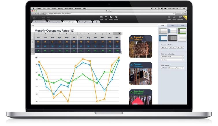
iWorks for iCloud demonstrates that Apple's vision for iCloud is a bit more expansive than many observers expected.
With iWork for iCloud (Numbers spreadsheet in a browser, below), Apple is now venturing into new competition with both Microsoft and Google in its online productivity offerings, even as it adds value to both its OS X and iOS platforms.
OS X not merging with iOS
Pundits have long been calling for Apple to "merge" OS X and iOS, as if the company is struggling toward this goal the same way Microsoft essentially spent a decade trying to get its DOS/Windows 3.1/95 user base to switch to its much more modern Windows NT platform released in 1993. That didn't begin to occur until Windows XP shipped in 2002. Merging OS X and iOS makes as much sense as BMW merging with its Mini brand in order to have one platform for selling moderately-sized vehicles.
Apple leaps technical hurdles a lot quicker. It aggressively moved its users from the Classic Mac OS to OS X just one year after releasing OS X 10.0 when Steve Jobs dramatically placed OS 9 in a casket on stage at WWDC 2002.
Similar transitions from PowerPC to Intel, and more recent updates to annual new OS X and iOS releases are orchestrated rapidly, increasingly via automatic updates.
In reality, merging OS X and iOS makes as much sense as BMW merging with its Mini brand in order to have one platform for selling moderately-sized vehicles. Which is to say: it is simply conceptually preposterous and asinine. It seems like lot of people who write about tech don't seem to be forced to ever read their own work.
Taking away your number and giving you a name
It's also noteworthy that Apple's Mac marketing no longer prominently addresses the underlying 10.9 version anymore, the opposite tack of what Microsoft is doing in shifting from Windows brand names (XP, Vista) to version numbers (7, 7.1, 8, 8.1).
Apple doesn't need to increment the "X" in OS X because it doesn't need to keep up with anyone in version numbers. Were it interested in such a contest, it could switch to Darwin version numbers, which harken back to NeXTSTEP. Internally, OS X Mavericks is Darwin 13. That pedigree outdates not only Windows, but Solaris and Linux to boot.
The de-emphais on OS X version numbers may be a reflection of the fact that changes now occurring to OS X are not flashy, cyclical shifts designed to sell to a mass market audience (as they formerly have been in past releases) Instead, the focus is now on fundamental enhancements to the platform.
Mac is now Apple's high end luxury brand
That is, incidentally, how you market high end luxury products, as opposed to the showy, feature-centric marketing of more pedestrian, high volume products targeted at the mass market.
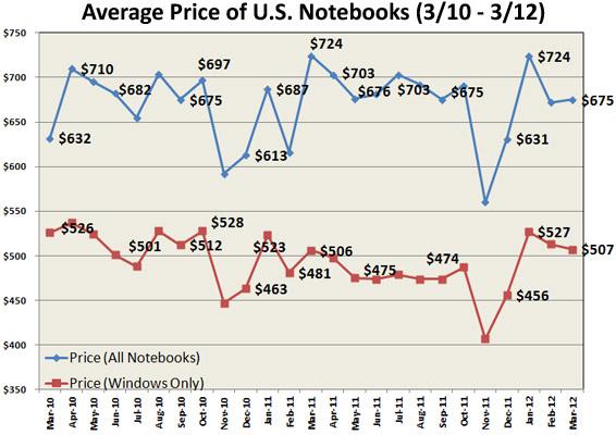
Have you noticed that, apart from the Mac mini, there are now no Macs that sell for less than $1000? This is particularly notable given that the average selling price of Windows PC notebooks is now around half that much, according to NPD Group. Including Apple actually raises the average significantly.
If you think PC makers are happy to have a half-price advantage over Apple in the notebook market, think again. Look at what they are really trying to sell: higher end MacBook Air copies (aka "Ultrabooks"). They just aren't finding much traction in the market for their higher end offerings.
Apple has captured 90 percent of the PC market for machines over $1000 since 2009. And given the rapid collapse of the PC market (at the hands of Apple's iPad and smartphones), that's a pretty sweet segment of the market to own. Ask any real estate agent if they'd rather sell luxury houses to the affluent or cardboard boxes to homeless people.
Volume sales at low prices is not always where the money is at, because each percentage point of market share is not necessarily equal in value.
The Mac Pro halo
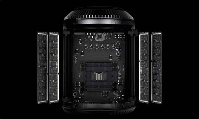
At WWDC, Apple continued this trend with the new Mac Pro. This doesn't look like something designed to sell across a wide set of price points. It's high end and luxurious, an echo of last year's release of the Retina Display MacBook Pro.
Both products were not intended to sell in volumes of millions of units per quarter. They are intended to establish Apple as the maker of the world's most incredible computing products.
And notably, rather than creating a new luxury brand (as most car makers and many PC makers do) Apple simply labels its high end Macs with "Pro," a move that better casts a glowing halo over its other Mac products instead of relegating them into a lesser brand tier.
Luxury in technology products means something different than luxury in markets such as automobiles. A luxury car might easily cost several times what a more basic car of the same class might.
Macs aren't really priced significantly higher than generic PCs of similar build qualities and specs. It's just that in computers, Apple is refusing to race to the bottom to deliver the cheapest bucket of RAM and CPUs, as virtually everyone else in the industry has been doing since the first IBM PC compatible boxes began arriving in the early 1980s.
iOS sells hundreds of millions of devices, billions of apps
Apple isn't leaving any money on the table however. Alongside the Mac, Apple now has a relatively new brand that sells mass market devices at extremely competitive prices (if not always at every price point), due to the vast economies of scale the company now has in sourcing memory and other components in its multibillion dollar, long term contracts.
At WWDC, Apple positioned iOS as everything the Mac isn't: firmly in the consumer market with prices well below $1000 and loaded with flashy, exciting and fun features that dazzle and pop rather than simplify and enhance.
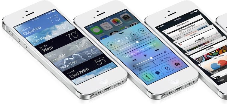
Layered, moving, translucent and luminescent, iOS 7 is designed to delight the mass market, not to edit feature length movies or sequence genomes or organize document metadata or work across a workspace of multiple displays.
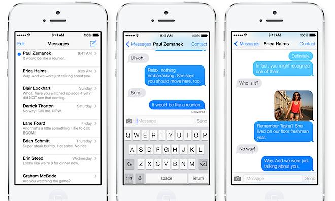
And specific to WWDC 2013, the new design of iOS 7 aims directly at the broadest segment of the market. It does so by focusing on apps. The clear focus of the new design of iOS 7 is to provide more deference and clarity to the platform's apps and to users' content.
Pay no attention to the apps behind the curtain
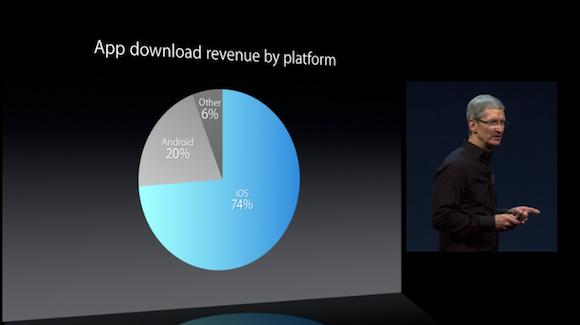
Some of the same pundits who don't understand Apple's platform strategy are pouncing on aspects of Apple's new overhaul of iOS 7 in an effort to invent their latest CrisisGate.The fact that iOS has now generated $10 billion for app developers, three times the revenue that Android and every other mobile platform combined ever has, should prompt journalists to fact check their belief that Android plays on the same level as iOS.
They're trying to recycle the vocabulary presented prior to its unveiling (particularly "flat design," which Apple made no obvious effort to follow) in rather desperate efforts to give Google's Android and Microsoft's Windows Phone Metro most of the credit for Apple's latest design direction. But they couldn't be more hopelessly wrong.
The general tech media has been cheerleading for non-Apple clones of Apple products for the last decade. Just look at the "editors choices" they've selected year over year: a dismal group a devices that far more often than not have failed in the market.
A lot of Apple's success in mobile devices comes from thinking of practical applications for the hardware. For iPods, this was often the functionality in iTunes. For iOS devices, it's more obviously apps running on the devices themselves (although iCloud is also now offering a sticky layer of applied utility to Apple's devices as well).
WWDC in particular focuses on something no other mobile platform (from Google's Android 4.x to Microsoft's WP8 to Samsung's Tizen to Mozilla's Firefox OS to the world's second largest mobile platform behind iOS: Android 2.x) has: a rich, vibrant and functional ecosystem of apps and developers.
Google and Samsung (and everyone else) would love to have developers making novel, exciting and exclusive apps for their platforms the same way that PC makers would love to have customers for their MacBook Air clones. But in both cases, their alleged copying of Apple hardware hasn't resulted in a duplication of Apple's core competency, which is developing vibrant platforms.
Opening a store doesn't build a vibrant platform
Apple's criteria for a vibrant platform is set so high that the company's own Apple TV is still regarded as a "hobby." There are companies that sell equivalent numbers of a device they regard as their principle platform (such as Microsoft's Surface RT).
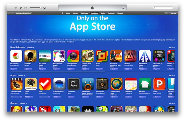
Apple disappointed some WWDC observers by not opening an App Store for Apple TV features, but if just "opening a store" was the way to create a functional, vibrant platform, we'd have more than one functional, vibrant mobile platform, and webOS would still be in the running alongside Symbian, BlackBerry and Windows Mobile. They all had stores.
Additionally, the pundits who compare the "library size numbers" of Google Play's ringtones, wallpapers and ad-supported smartphone apps against the App Store's iPhone and iPad optimized apps (and other content that people actually pay for) seem to fail to see details that are obvious to many of the same pundits in other markets.
Take console video games. If Sony's PS3 had zero exclusive games and only got Xbox 360 titles several months after Xbox players had grown tired of them, I don't think there would be a widely communicated notion that both platforms offered the same scope of software, as many journalists like to generalize about Android and iOS.
Just the fact that iOS has now generated $10 billion for app developers, three times the revenue that Android and every other mobile platform combined ever has, should prompt journalists to fact check their belief that Android plays on the same level as iOS in terms of the breadth, width and depth of apps available.
The new direction of iOS 7
Much has already been written about Apple's new design direction for iOS 7. Some thoughtful comments and critiques, some purely ridiculous drivel such as the collections of randoms tweets of non-noteworthy people, attributed to "professional designers." As if making something your line of work automatically conveys upon you some sort of expertise in your field.There's no possible way Apple could avoid any design direction that could be compared to some derivation of "Android."
Most puzzling is the idea that many are trying to seed: that everyone at Apple is so entirely out of ideas and vision that they must copy from Android. There are definitely bits of iOS 7 that could remind you of Android. But there's no way that could not be the case, because "Android" is both everything and nothing, a term applied so broadly it is now meaningless.
The largest fragment of the Android "platform" (2.x, dating back to 2010) has no specific appearance at all. Generic Android devices often have as much appearance and functionality in common with Apple via borrowing from the WebKit project as they do with Google for incorporating code from Android, which is to say: very little at all.
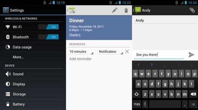
Even Google's more recent efforts to standardize on its "Holo" appearance in Android 4.x include a light appearance, a dark alternative, and a mixed middle ground (shown below).
Google delivers stuff that looks monochrome and stuff that looks like a rainbow. And every Android licensee makes efforts to layer on its own distinct skin to stand out from the monotony of "pure Android."
There's no possible way Apple could avoid any design direction that could be compared to some derivation of "Android." The reality is that Apple doesn't actually care what Android looks like, as long as its licensees aren't ripping off features it has invented and patented specifically to add value to iOS.
On the other hand, Google has created a web page of instructions for Android developers to avoid looking like "other platforms," which Google illustrates with iOS screen shots.
Apple's new iOS 7 violates every one of the half dozen design elements Google tells its developers to avoid to remain "pure" to its platform, demolishing any notion that Apple is examining Android for rules of successful design the same way Samsung spent months harvesting iOS for insight on how make Galaxy products people would want before launching its series of purposely infringing products.
iOS 7 and Android 4
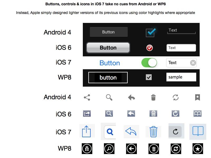
Apple's new borderless buttons and other controls in iOS 7 look radically different from earlier iOS releases, but they look nothing like Android's 1990's Windows appearance or elements from Windows Phone 8, which look borrowed from Macromedia Flash. Apple's other icons are lithe deconstructions of iOS standards.
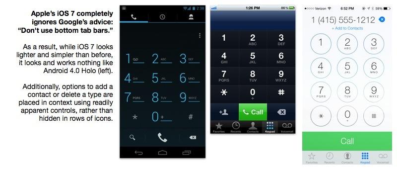
Apple’s iOS 7 completely ignores Google’s advice on the use of bottom tab bars. “Other platforms,†Google says of iOS, “use the bottom tab bar to switch between the app's views. Per platform convention, Android's tabs for view control are shown in action bars at the top of the screen instead. In addition, Android apps may use a bottom bar to display actions on a split action bar.â€
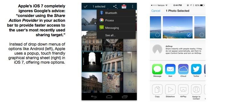
Rather using pull down menus from an "action bar," Apple's iOS presents more options with more clarity via a sharing sheet.
On the other hand, as you peruse Google's design pages for Android developers, it sounds overwhelmingly borrowed from Apple's Human Interface Guidelines from the 1980s, apart from a few arbitrary changes related to terminology and concepts that arguably are different just for the sake of being different, rather than being readily apparent usability enhancements.
This is the exact same thing Microsoft did after copying the Macintosh desktop experience for Windows. And just like Microsoft, Google replaced the one simple desktop with two buckets of software: a directory of all installed software, and a Program Manager / Start button listing of links to apps that you could arrange.Rather than adding new layers of convoluted chrome for users to diddle with, iOS 7 simply extends the existing iOS Home screen with a clearer presentation of apps.
Android does the same thing with its All Apps and Home screens. It also distinguishes between apps and limited functionality apps it calls widgets, another dubious feature Apple's iOS 7 makes no effort to copy.
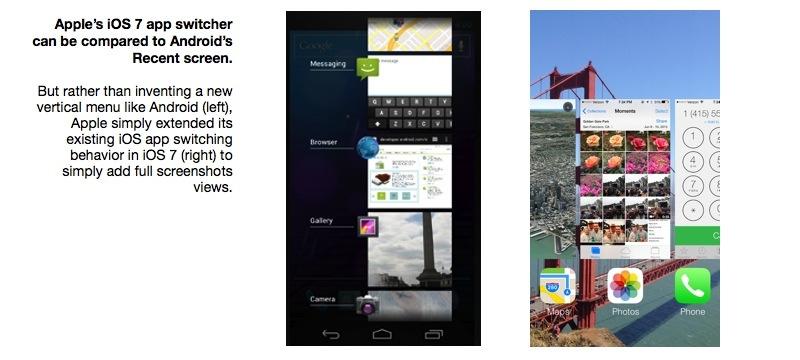
Rather than adding new layers of convoluted chrome for users to diddle with, iOS 7 simply extends the existing iOS Home screen with a clearer presentation of apps. Double click the Home button to see background apps, and instead of getting iOS 6's popup of app icons under the Home screen, you get a presentation of your apps' icons and full screenshot thumbnails.
This can be compared to Android's Recent Screen, which shows a strangely cropped portion of each apps' screen in a vertical menu. Apple's implementation is clearer and focuses on easy and rapid navigation through your open apps, rather than cramming in more content at once.
And despite the criticism aimed at Apple's revised app icons, they are readily apparent at smaller sizes due to their simplicity and strong use of color. Android's icons often look borrowed from a 1990s Windows desktop, and muddy in smaller sizes.
There's one thing iOS 7 won't change: it won't suddenly make Apple the volume leader by shifting handset sales in developing countries to iOS. But Apple hasn't ever been the handset leader in terms of global volumes, only in terms of profitability.
What iOS 7 does have the potential to do, if executed properly, is to shake up iOS development, encouraging new efforts by developers to adopt enhancements to the existing interface designed to clarify, simplify and add vitality to the user experience. iOS 7 has an overall lighter, more precision feel.
Its combination of the new Control Center, AirDrop and Siri enhancements promise to make utilitarian tasks such as accessing settings and sharing files easier and more obvious, enhancing the platform for app developers.
Also: some other stuff that would pass for major new startups on their own
Lastly, a few other strategic notes were dropped at or around WWDC this week. A new range of 802.11ac wireless products, expanded device management for Macs, iOS devices and (now) Apple TV; new controller support hinting at a continued push into gaming; new automotive integration for iOS and new expansions of Apple's other side businesses that many in the media like to refer to as failures: iAd, Maps and iBooks.
If iAd were really a failure, it's curious why Google, the web's biggest advertiser, looks to be copying Apple's iAd Producer and overall strategy verbatim with its upcoming Google Web Designer.
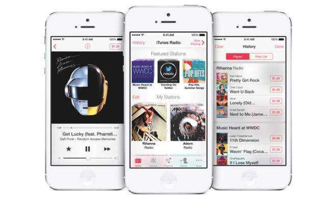
Apple's iTunes Radio is also showing what new services Apple can support with its own in-house iAd program.
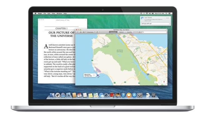
Apple Maps on a Mac is absolutely incredible.
And iBooks on the Mac is also going to be important for education, as well as Apple's focus on building and deploying dynamic textbooks with iBooks Author (and enhanced with dynamic elements crafted in iAd Producer).
If you set iAd, Maps and iBooks as the baseline for failure, how many new products and initiatives from Google and Microsoft over the last decade have done a better job of reclaiming market share, boosting revenue or simply delighting users?
Throughout the rest of 2013, the final release of OS X Mavericks, iOS 7, iWorks for iCloud and the new Mac Pro will flesh out Apple's offerings and pave the way for new mobile devices. And when those arrive, WWDC's developers will be ready with new apps to take full advantage of them.
 Daniel Eran Dilger



-m.jpg)


 William Gallagher
 Chip Loder
 Marko Zivkovic
 Malcolm Owen


 Christine McKee
 Andrew O'Hara


-m.jpg)



142 Comments
Very good points about the many "versions" of Android and all the various skins placed on top. Does anyone know what "Android" really looks like? There are so many things in OEM Android phones that have come from sources other than iOS (like Palm, Symbian or even Windows) that the Android fanboys seem to think Android invented every single mobile interface. Android didn't invent them all, but they sure as hell incorporated them all.
BTW, waiting for all the anti-Dilger people to post again. Oh, and the inevitable new accounts fuming at the thought Apple didn't really copy Android as much as they think.
CrisisGate.... I love it.
I would like to comment on the following statement: "Macs aren't really priced significantly higher than generic PC's of similar built qualities and specs." It is not quite true, but in a different direction that one may think about. About four years ago when I switched from Windows PC to a Mac, a move I regret only for not doing it years earlier, I went on Dell's website and built a similar quality PC compared with the Mac Pro I had purchased. The Mac Pro was $100 more expensive, which compared to the $3000 something price is only 3%. This difference was a result of not being able to choose the 8GB DDR3 RAM memory for the Dell machine, only DDR2, since DDR3 was not available in the spring of 2009 for Dell. If I would have been able to choose DDR3 RAM memory for the Dell PC the price difference would have been probably nil. Half a year later I purchased an additional Apple computer, a 17 inch MacBook Pro. I did the same "exercise" as for the Mac Pro and my Apple laptop came out $100 cheaper than the comparably configured Dell laptop. So, my conclusion is: there is no price difference at all between Machines running the Apple OSX operating system compared tp machines running the Windows operating system. Or, if still there is, it's non significant.
Loved the perspective this article provides. Analyzing this year's WWDC really shows that Apple does have a vision for where they want to take the company in the years to come. It's really a positive sign that Apple still has a lot of innovation left in them.
I'll note that with this article, DED more or less schooled me on my hasty Apple-Android comparisons that were prompted by iOS 7. Well done, sir.