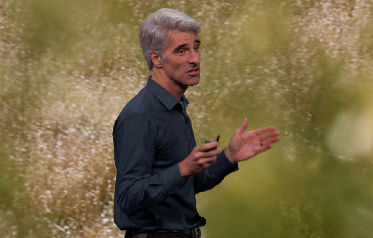
Following the Worldwide Developers Conference keynote, Apple executives Craig Federighi and Greg Joswiak went into more detail about Monday's announcements, including how the Mac Pro had to be 'something special,' and how iPadOS is less of a marketing ploy and more something that was needed for iPad as a platform.
Federighi and Joswiak spoke with Daring Fireball's John Gruber on Tuesday in a special WWDC edition of "The Talk Show" podcast.
Mac Pro and Pro Display XDR
Probably the hottest topic of discussion from the WWDC keynote was the introduction of the Mac Pro and the Pro Display XDR. On the subject of the unique perforated case design that is also used on the display, Apple VP Greg Joswiak insisted "we knew we had to create something special."
The optional wheels for the Mac Pro were also raised as they were briefly mentioned during the keynote. Apple SVP Craig Federighi declined to state how much the wheels would cost, but joked the price would vary based on the number of wheels, and that there would be installment plans available for the add-on.
The Pro Display XDR also received some attention for considerably beating reference displays on price, with Joswiak highlighting how Apple's version is better than a version that costs over $43,000.
The design decision to add a nanotexture to the screen of the Pro Display XDR was done as the normal matte processes used for such screens causes a sparkling effect. "This is a process unlike anybody's done before," insists Joswiak. "It handles the glare in a way that no one has done before, it's an incredible process that we invented to do that. To make it clear, the standard display has industry leading anti-reflective coating, so it's wonderful in the base config, but if you really want the matte, the nanotexture is just nuts."
iOS 13 and iPadOS
On the subject of the new operating system launches, Federighi's main goal with iOS 13's Photos app changes is to make it easier for users to see images for events and occasions in their life.
"You just never have these experiences in a sea of photos," Federighi claims, advising of how the team behind the inner workings of the app have advanced over the years. "What's the arc of a meaningful event for you? What were the big events that were important to you?"
The unveiling of iPadOS was unexpected, but Federighi explained it is more than just a "marketing thing," with engineers feeling "very strongly" about its creation.
"What do you want to do with a device that has these kinds of characteristics?" Federighi said, referring to iPad. "What's the right kind of interaction model and things like Split View and Slide Over and drag-and-drop and Apple Pencil started to be a factor, and then you start to see Apple and third-party developers really start to take advantage of that — start to tailor the experience."
"When we think about a platform, when you think about a name — what makes tvOS tvOS? I mean under the hood there's a lot of iOS in there, why don't we call that iOS for TVs or something like that," Federighi said. "Because it defines the experience. tvOS means there's a ten-foot experience, watchOS means it's an experience optimized for your wrist. iPadOS has evolved to have an experience that has its own distinct nature to the point that it deserved to be recognized in that way. And when you put some of the next set of changes on the path that we are steadily on, we felt like we just crossed a point where it was just silly to no longer say this is its own thing."
The changes to gestures in iPadOS and how text is treated was due to it being "one of those areas in the past where we felt like this is harder than doing it on a Mac," according to Federighi. The iPhone's introduction of text selection, copy, paste, and undo was an extremely instructional interface by comparison to what Apple offers now in iPadOS.
"Getting to the right solution here, I'll tell you, it's been something we have taken runs at for multiple years and come back and felt like we don't yet have it." Federighi continued. "And those are things where you don't just throw it against the wall — I mean internally you throw it against the wall — but externally we wanted to get it right and it took a lot of careful craftsmanship to get it right."
"You have this problem where, 'OK, I'm going to tap on it, so my finger's now covering the evidence of the thing that I did, where does the cursor go if it hops up above the finger, then it's not where I thought it was. If it's under the finger and then I try to move down where I'll never see it,'" he said. "So if you start to study the subtleties of what we had to do to make it work like you'd expect, the actual mechanics are pretty tough but I think we got it."
Project Catalyst, Sidecar and Accessibility
Formerly known as "Marzipan," Project Catalyst is an evolved form of Apple's effort to make it easy for developers to port iOS apps to macOS, via changes to Xcode.
"It's a fully native framework and we have an appropriate set of controls so you can build a really distinctive experience," according to Federighi. "If you just push the Mac button you'll get some degree of Mac-ification. You don't have to rewrite all of the code to do that. You can have one code base and one team who understands one set of frameworks to do that work."
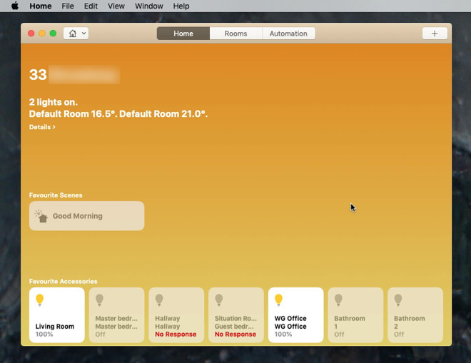
Federighi defended the initial wave of Apple-produced apps that transferred from iOS to macOS last year, including Home and Apple News, noting some of the concerns "placed a certain amount on the technology that was really some design decisions we made."
"So there were certainly some things that were underlying technology behaviors, but there were other just pure design choices about sizes of items in the sidebar and where was the search field and all of those kinds of things that were different design teams pushing the bounds of what is the right future for media oriented design on the Mac," Federighi insisted. "I think we're finding our balance now, pulling back in some areas there, and the underlying technology is much refined."
On Sidecar, the upcoming Catalina feature that allows users to use their iOS 13 iPad as a second display, Federighi commented on design decisions that allowed Apple to bring the desktop Mac experience to a touch display.
"We don't think you take an arbitrary Mac user interface with feature sizes and so forth that were optimized for running precise input with a mouse and throw it on a touchscreen that you're going to get a great experience there. So we're making clear that your Mac app is to be used as a Mac app," Federighi said.
He went on to describe the impact voice control in macOS will benefit users who are unable to utilize traditional means of input like a keyboard and mouse. With Voice control, users can command Mac using nothing but onscreen prompts and their voice, which is processed through new detection technology.
"It works phenomenally well," Federighi said. "It's one of those technologies you just see and use and not only are you amazed by it, but also just realizing what it could mean to so many people. And thinking about the passion that went in to members of the Accessibility team and the Siri team and everyone who pulled that together, it's just awesome."
Machine Learning and Privacy
The increase of machine learning on a mobile device is slowly becoming important for Apple's competitors, especially Google, but they may have more difficulty in pulling it off due to the diversity of products on the market. "You'd be surprised to see they've started to say 'on-device machine learning," Federighi proposes. "They're actually seeing the light on that topic."
Federighi took the moment to poke at Google's reliance of cloud servers for AI processing, and their track record on privacy. "Having your phone know you is cool. Having some cloud person know you is creepy," he posits.
The competitors are disadvantaged in Federighi's view as "part of what makes this possible is building this great hardware and the integration of hardware and software. Pulling this off between a random fleet of devices is really just impossible."
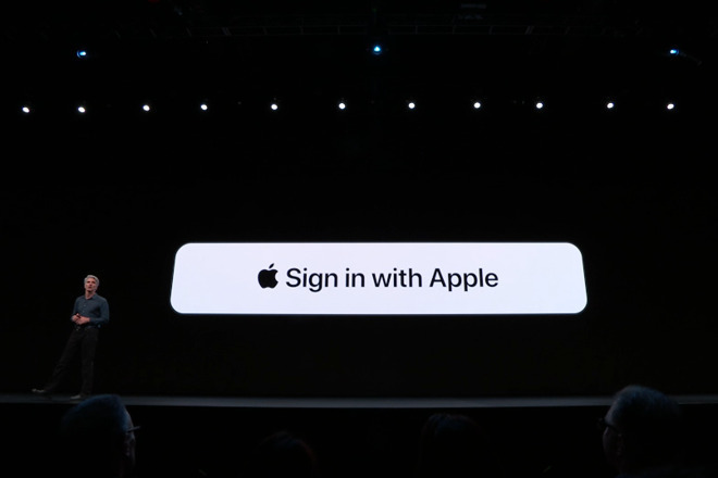
In discussing Sign in with Apple, Josiwak highlighted users "want transparency and control. You want the customer to know what information are they giving to somebody and they want the control to do that or not. And in the situation of these buttons, there's no transparency. People had no idea what kind of information was flowing through that single tab, and so what we wanted to do was provide that transparency and control."
Joswiak went on to underline Apple's privacy credentials, boasting, "We've been doing privacy since before it was popular."
"We're building stuff that we would want for ourselves, our families, our children," stated Federighi. "I don't want to be tracked. I don't want my family to be tracked. So we've always been wanting to build this stuff because we think it's the right thing to do. And there was a time when people were saying, 'Privacy is dead, and you guys are so naive, and why do you care about this, and is this advantaging you.' And, no it's just right."
 Malcolm Owen


-xl-m.jpg)


-m.jpg)


 Thomas Sibilly
 Wesley Hilliard
 Christine McKee
 Amber Neely
 William Gallagher

 Mike Wuerthele



11 Comments
I’m glad they’re actively still thinking about how text and editing works on touch, because it’s definitely a problem. Not just on iPad. It’s a problem on iPhone as well.
The thing I just cannot understand is why they still have not addressed the egregious bugs in the current implementation of text editing. Bugs, not design. I have repeatedly reported these bugs as they slowly morph from one bad behavior to another. I’ve watched it change from an occasional issue, to a serious issue, to a differently serious issue. Each iOS release has changed some of this behavior but not actually fixed the fundamental bugginess and inconsistent behavior. Some things got better (highlights don’t jump around anymore) but It has overall gotten worse. Selections make pages scroll maddeningly and inconsistently. Selections fail to provide context menus, and then may or may not disappear when tapping on the selection. Selecting is still clumsy overall (seemingly reacting to invisible parameters and non-user-driven events). The magnifying lens has stopped being centered where it was designed to be centered. Undoing typing sometimes results in a mess of duplicated and choppy blocks of text. 3D Touch for text handling is garbage.
here I am STILL looking at autocorrect not capitalizing the first letter of the first word on a new line on this forum’s text edit view (and maybe just being disabled entirely, as also happens in the middle of typing a block of text for no apparent reason).
Why??
None of this was an issue in iOS 6.x. iOS 7 broke the hell out of iOS and it’s been over SIX YEARS that this crap hasn’t been fixed.
WHY??
Did they only just recently decide to examine this broken mess? What the hell were they so busy with elsewhere that these problems have been left to worsen for THIS LONG???
It was a shame the iPad OS didn't get a very good demo by that guy that came on for a series of screw-ups. I could see the guy was nervous but
Side note, I’ve noticed and many have commented on text editor issues on this AI forum text box. Since it doesn’t happen elsewhere on other websites, I’m fairly certain it’s related to javascript event code on the textbox in this website. I don’t run into these issues in Notes or other app or websites. Right now it’s often impossible to hide the keyboard tray after taping Like or writing a post.