Apple's latest refresh to the Mac line this week claims a victim — the 13-inch MacBook Pro, and with it, something we're actually quite sorry to see go: the much-maligned Touch Bar.
While there were rumors and some speculation that Apple might refresh the 13-inch MacBook Pro, it seems in retrospect like an obvious casualty. Apple's laptop line has gotten quite complicated and needed trimming.
Apple positions the MacBook Air as the cost leader, with the M1-series 13-inch model starting at $999, M2 models available in 13-inch and 15-inch livery, and the MacBook Pro now in 14 and 16-inch sizes exclusively, showcasing the M3, M3 Pro and M3 Max processors.
With the MacBook Air encroaching the MacBook Pro for screen real estate with the 15-inch model, something had to go. The 13-inch MacBook Pro seems like the odd one out, so we're not surprised to see it removed from the lineup entirely.
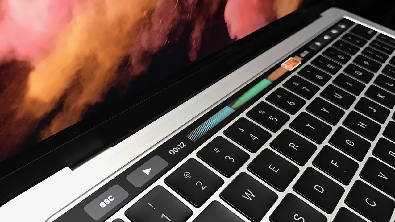
The Touch Bar made its debut with Apple's 2016 model refresh. It was a thin strip of an OLED panel covered by a thin glass digitizer that made it possible to tap and swipe reconfigurable controls, in place of the keyboard's traditional function key row.
By replacing physical function keys with a reconfigurable display, Apple sought to provide the first novel keyboard experience on the Mac since its debut more than three decades before. The Touch Bar offered a dynamic and reconfigurable area that could change based on context, providing users with easy to access features that they'd otherwise have to learn menu bar operations or key commands to access.
Great concept, but it became apparent even during its introduction that Apple itself wasn't all-in on the Touch Bar. It was unique only to specific MacBook Pro models, never gracing any other Mac systems. Desktop Macs and the MacBook Air never saw a Touch Bar.
That severely limited the utility of programming Touch Bar support in apps, although some did. We were always surprised and pleased when we launched a new app to see Touch Bar support included. But they were few and far between.
Apple made a critical error out of the gate by replacing the physical Esc key with a Touch Bar equivalent — a problem they corrected. But by then, Apple and its critics had made up their mind about the Touch Bar, and it really never saw any evolutions or innovations after its debut. Adding haptic support seemed to be an obvious path, but Apple never went in that direction.
The Touch Bar was the victim of awful timing. It appeared at around the same time that Apple introduced a redesigned keyboard for its laptops that used a butterfly switch mechanism that Apple said was thinner and more stable than its predecessor.
Apple's butterfly switch keyboard design was unquestionably awful. The keyboards were prone to breakage and failure if even the slightest debris got under the keys.
Apple iterated that design for several years, and even covered replacement of those keyboards under extended service programs and a $50 million class-action lawsuit settlement. Apple would abandon the design entirely around the same time it replaced Intel chips inside the Mac with its silicon.
None of this, of course, is the Touch Bar's fault. But by then, the Touch Bar would be relegated only to the 13-inch MacBook Pro. It survived that model's evolution from M1 to M2, but that was the end of the line.
We suspect the Touch Bar is a significant cost sink for Apple when it comes to post-sales service. It's routine, for example, for service techs to swap out top case assemblies when Mac laptops run into keyboard and trackpad problems. Touch Bar-equipped MacBook Pros introduce additional component complexity and higher parts costs for Apple.
Touch-typing Mac users may have found the Touch Bar to be an unnecessary distraction. Accidental contact with the Touch Bar is a key complaint for many, and something we had to train ourselves out of doing.
But for visual typists and those that need accommodations to be able to type effectively, the Touch Bar could be a godsend. We found it especially handy for some games and utilities, saving us from having to free up limited executive function to remember new command key chords and complicated menu operations.
In the end, we accept the Touch Bar was flawed. Apple's own inertia over its support and the limited scope of its deployment doomed it almost from the start.
The Touch Bar was a bold experiment in redesigning the keyboard, a fundamental part of the Mac user experience that had largely gone unchanged since the first Mac debuted in 1984. Maybe we'll even see a similar innovation on the iPhone someday.
We just hope it doesn't take Apple another three decades to take another chance with something new.
