The Settings app in iOS 18 has gone through some big changes, but once you get used to them, it'll be easier to manage your iPhone.
The Settings app is a very important part of iOS and iPadOS. Most users will be familiar with accessing it regularly to change settings or to manage their iPhone storage capacity.
Each update to iOS can also introduce changes to the Settings app, and that's precisely the case for iOS 18.
Here are the main changes to watch out for in the Settings app when moving from iOS 17 to iOS 18.
Apple Account
Right after opening Settings and seeing your name, you may spot a difference in wording. Under iOS 17, there would be a mention of an Apple ID, but that has gone in iOS 18.
It was rumored back in March that Apple was updating the branding of its account system, from Apple ID to Apple Account. At the time, it was believed the change was to help users understand it was an online account system, which may have been lost by the usage of "ID" previously.
Section headings
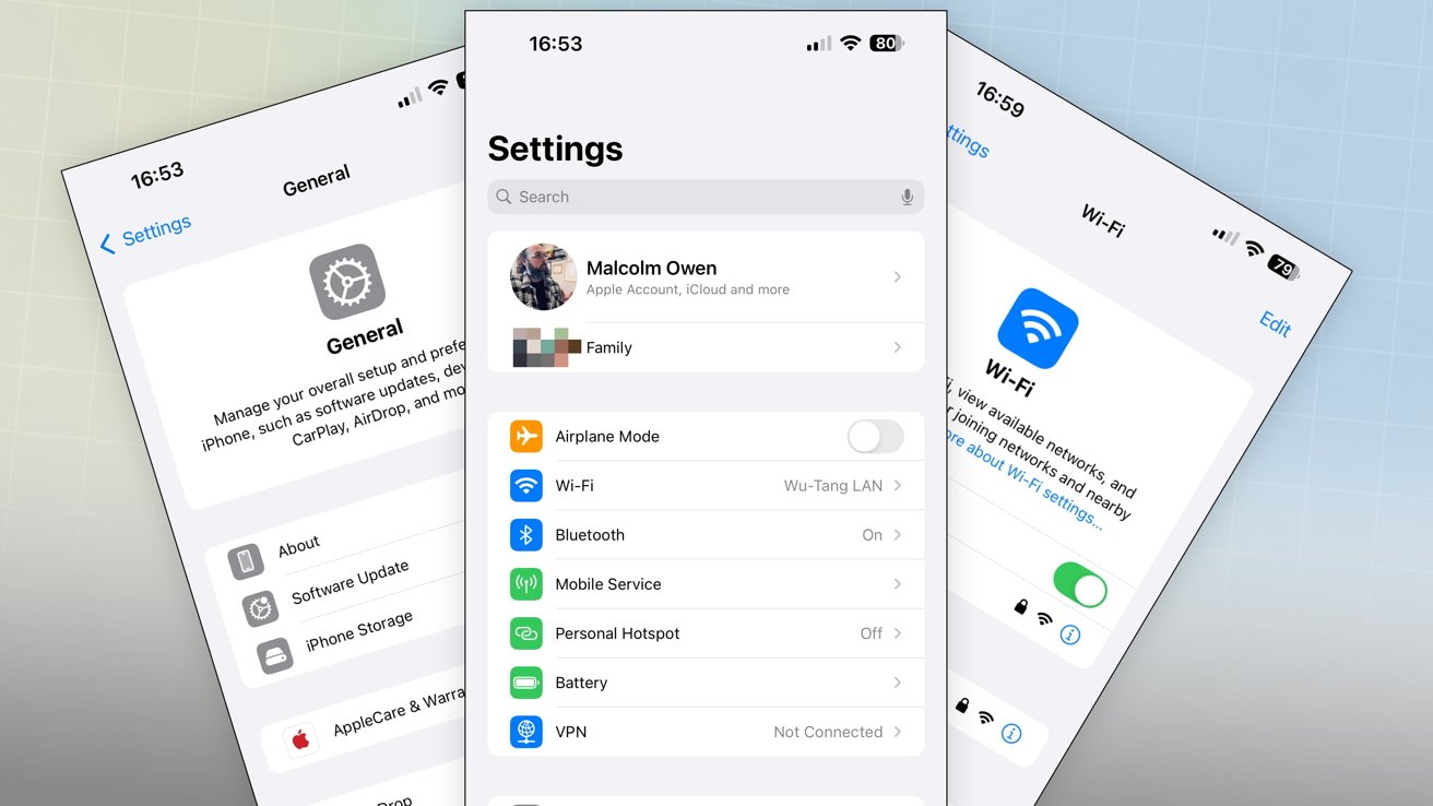
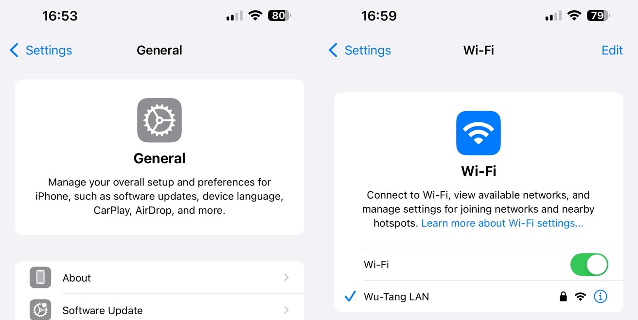
As users navigate the Settings app, they will discover that each of the sections they enter will have a header.
While the sections can be quite self-explanatory in nature, such as "Bluetooth" or "Wi-Fi," the headers will give a brief description of what the user can change within that particular section.
In some cases, the header will have the most essential setting options underneath the description. For example, Wi-Fi has the on-off toggle and the currently-connected Wi-Fi network listed.
Ordering
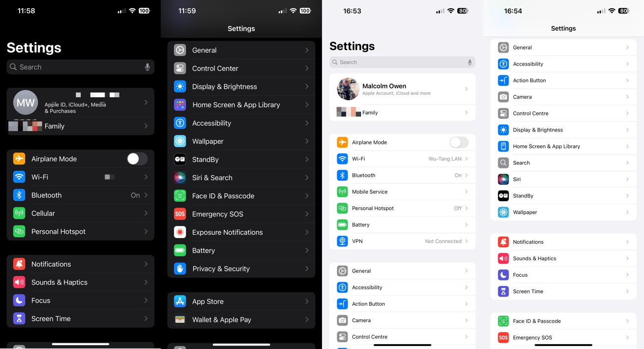
The order of items as they appear in the main Settings list has also been refreshed as part of the update.
At the top of the list is the main account profile and Family settings, if applicable. That's followed by a section containing Airplane Mode, Wi-Fi, Bluetooth, Mobile Service or Cellular, and Personal Hotspot. Battery is moved up to this collection too, while VPN is a freshly broken-out item.
Notifications, Sounds & Haptics, Focus, and Screen Time remain the same grouping as before. However, they are pushed down from their high location in iOS 17 to further down the list in iOS 18.
The larger group starting with General takes its place. The group has listings for Accessibility, the Action Button, Camera, Control Center, Display & Brightness, Home Screen & App Library, Search, Siri, Standby, and Wallpaper.
The options for Face ID & Passcode, Emergency SOS, Exposure Notifications, and Privacy & Security are in a separate group further down.
App Store and Wallet & Apple Pay are still together, but are accompanied by Game Center.
Apps
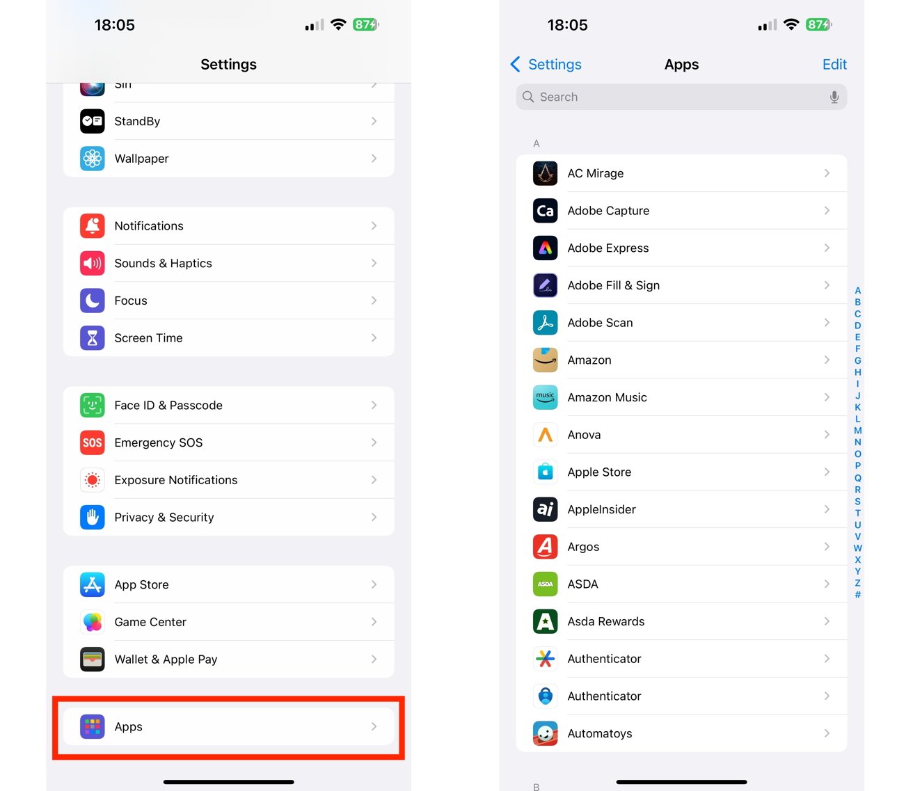
The main Settings page is often a long and sprawling list for users, as the bottom includes settings for individual apps. In iOS 18, this is not the case.
To shorten the length of the initial Settings page, Apple has finally included a catch-all section for Apps. Selecting it brings up an alphabetized list of app settings, including a search box at the top to save time finding the right option.
 Malcolm Owen







-m.jpg)



 Christine McKee
 Amber Neely
 Andrew Orr

 Sponsored Content

 William Gallagher





6 Comments
So, if I want to modify a particular setting for any app that relates to that setting, I now have to go through a list of every app to turn that setting ON or OFF? Rather than go to the setting and see what's using it ? Like, say Camera or Microphone access?
How the "Apps" box organizes app settings is going to be key. Does it just alphabetize the Apps, or the setting functions?
Will Siri be able to produce a list of "every app requesting access to my Photos library" ?