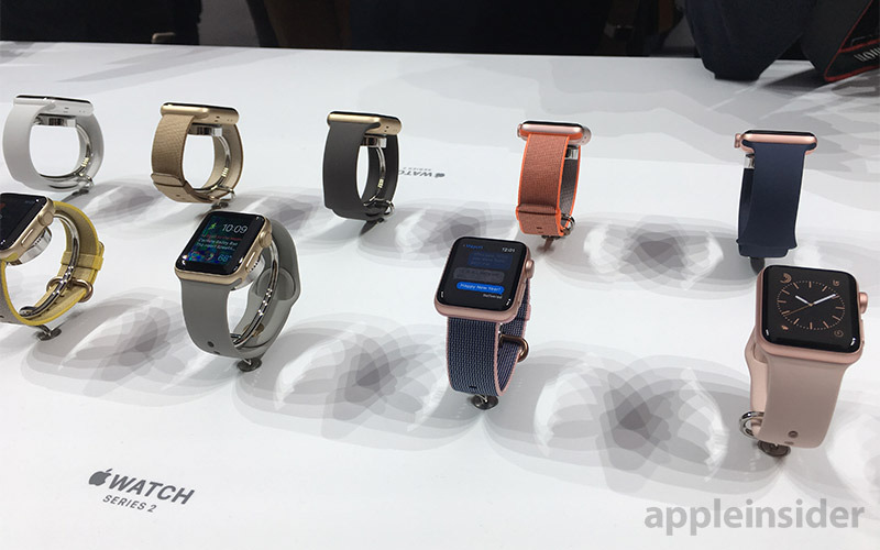
Apple's second generation smartwatch enhances overall performance, expands its usability to swimmers with better water resistance and to runners with GPS support, and improves upon both battery life and screen brightness. However, the massive enhancements made to watchOS 3 improve things sufficiently for existing Apple Watch owners, to the point where last year's watch is still fresh and relevant. Here's a deep look at the smartwatch state-of-the-art that Apple dominates globally.
Apple Watch year zero
The full picture of what Apple recently introduced in what it bills as "Apple Watch Series 2" is understandably only in the context of the original Apple Watch and the market it launched itself into in the spring of 2015.
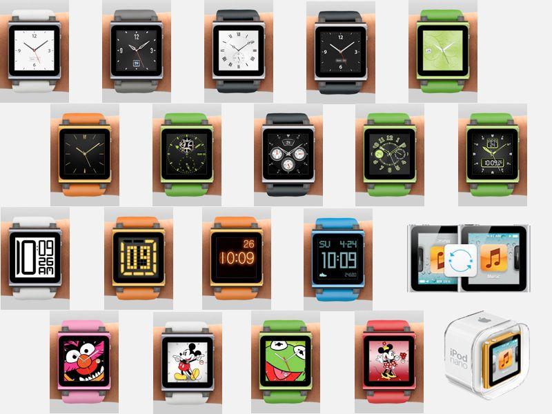
Despite immediately becoming the world's best selling smartwatch, Apple Watch wasn't anywhere close to being the first wrist-worn computer. Apple Watch wasn't even Apple's first watch offering; back in 2011 the company refreshed its already one year old, square iPod nano and basically admitted to having stumbled into the watch world on accident.
Phil Schiller, then Apple's senior vice president of Worldwide Product Marketing, introduced the refreshed 6G iPod nano while noting the availability of third party wrist bands. He stated that the company "thought that was really fun," so it added 16 clock faces users could choose between when wearing it as a watch.
"Why not, right?" Schiller asked the crowd.
A year later, at the end of 2012, the "6G iPod nano watch" mysteriously vanished, being replaced with a new Bluetooth iPod nano — just prior to Apple's equally mysterious hiring of Adobe's chief technology officer Kevin Lynch.
At the time, Lynch was best known for his public rebuke of Steve Jobs in an online spat concerning the future of Adobe Flash and Apple's strident refusal to support the troubled web middleware under iOS.
We now know that Lynch was tasked with developing what would become the Apple Watch platform — a far more powerful, sophisticated and fashionable device than the $129-149 iPod nano and its basic bands, simple watch faces, rudimentary software and archaic 30-pin connector and analog audio jack.
The development of Apple Watch vs Google's MOTOACTIVE crash
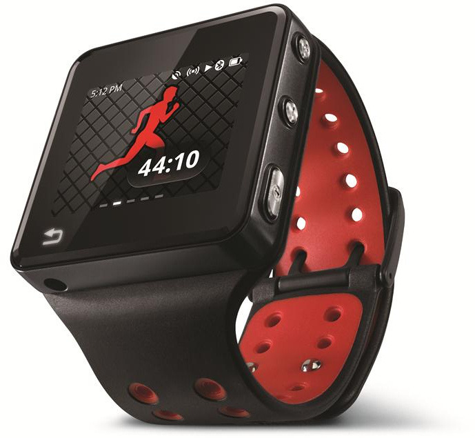
Had Apple merely continued the development of the existing 6G iPod nano as a basic, boxy watch with conservative, incremental "evolutionary, not revolutionary" efforts, it would have ended up with a product virtually identical to the MOTOACTIVE, the Android-based wearable Motorola introduced shortly after being acquired by Google in 2011, alongside its Droid RAZR phone (just months after Schiller's watch face intro above).
Despite Google's efforts to promote its new Motorola sport watch— and a rather enthusiastic reception from the media for what was essentially an Android 2.3 Gingerbread-powered 6G iPod nano with a $110 price premium, along with more expensive versions that cost as much as $400— the Motoactive never sold well. By the next summer, Motorola slashed $100 off its asking price and it was officially discontinued in 2013.
Apple followed a different strategy. Less than two years after hiring Lynch, Apple was ready to launch an entirely new product that included a water resistant case (the company's first submergible computer) crafted in three advanced materials; a scaled down iOS-based logic board reduced down to a single S1 "system package"; a series of new band types and styles in a variety of luxury materials that Apple had never previously used (several priced higher than an iPod nano itself) and an entirely new third party software development platform for creating new ultra-mobile apps.
There were also a variety of other new features that were huge leaps past the 6G iPad nano: a pulse oximeter, Bluetooth and WiFi with Continuity integration for relaying phone calls to an integrated mic and speaker system that also supported Siri voice commands, a Retina-dpi class OLED screen equipped with Force Touch, sapphire covers for the display and rear, wireless induction charging, NFC for Apple Pay and a precision Digital Crown controller (all seven of which were first-ever technology efforts for the company).
Suddenly, Apple was not just selling a new watch that reestablished a demand for iPod-class devices smaller than an iPhone, but had increased the stickiness of its App Store ecosystem and expanded itself into the world of high fashion, courting the attention of A-list designers and the luxury industry while selling interchangeable, seasonal bands in handcrafted leather, precision metals, and in new partnerships with fashion house Hermès and other MFi licensees.
In contrast, Google was busy divesting itself of involvement with Motorola after several years of losing billions of dollars on positively reviewed products few real people wanted to actually buy.
The press corp's desperate juicing of Apple Watch
Even if Apple Watch hadn't generated incredible billions of entirely new revenues — at substantial profit margins — in its first year of sales, it would have been worth the initial investment purely as a luxury halo reflecting a glow of desirability over Apple's other existing products.
However, a series of pundits, research groups, statistical fallacy propaganda outfits and even mainstream, supposedly unbiased journalists have worked relentlessly since the product's launch to characterize Apple Watch as a failure, a waste of time and a distraction.
They've bent facts inside out to claim — as IDC repeatedly has — that the multiple billions of dollars from quarterly Apple Watch sales were somehow trumped by the market share of $390 million dollars worth of Fitbit products sold per quarter, as well as the roughly $77 million worth of basic exercise bands shipped by China's Xiaomi.
It would be hard to invent a better, more comprehensive array of evidence— providing clarity beyond any reasonable doubt— supporting the idea that Apple's critics and the tech media in general are purely savage in their unbridled contempt for the company's ability to innovate and successfully develop and market new blockbuster products, pioneer new opportunities for developers on new platforms and pursue significant new markets well outside of its familiar comfort zone. Within just calendar 2015, Apple Watch sales generated around $7 billion in revenue at high margins. That's comparable with the performance of the highly regarded Amazon Web Services cloud business.
Within just calendar 2015, Apple Watch sales generated around $7 billion in revenue at high margins. That's comparable with the performance of the highly regarded Amazon Web Services cloud business. By itself as a product, Apple Watch is already far more valuable than the entire hardware businesses of Amazon Fire, Google Nexus, Alphabet Nest or Microsoft Surface.
Yet last summer, perennial Apple nag Brian X. Chen printed an absurdist report voicing "skepticism" about Apple Watch because it lacked third party app support from specific developers that really had no reason to port some of their apps to a watch.
That included Facebook, an app expressly designed to trap users and waste their time while throwing ads up in front of them. Curiously, Facebook couldn't think up a functional port of its primary business model to a device designed to engage the user for just a few seconds. It did, however, port a version of Messenger, which does translate well to a watch.
Chen was also puzzled that Snapchat — another app designed specifically to captivate the attention spans of young people via self destructing video chats with iChat Theater-style filters applied and interspersed with sponsored content and advertising perusable in the labyrinth of its inscrutable user interface — didn't have a way to translate itself into a glanceable watch app on a device without a camera.
Despite writing that piece for the New York Times, Chen also failed to mention that The New York Times itself had launched an custom headlines app for Apple Watch three months earlier. That didn't fit the preconceived narrative that developers in general were "skeptical" about Apple Watch prospects.
Apple's multibillion dollar courage of conviction
However, before you begin weeping over Apple's ill treatment at the hands of its most embittered detractors, consider that the company has never really complained about a media/blogger conspiracy seeking (however ineffectually) to derail and demonize Apple Watch. It's like the company is not even afraid of what these people have to say.
In fact, before Apple Watch even went on sale, the company rather confidently expressed a courage of conviction in its business plan that involved a novel shift in accounting in which Apple announced it would not release any details on how many Apple Watch units it would sell. This was a big shift for Apple, but inline with the rest of the hardware industry, where no PC, smartphone, tablet, watch or other vendors have ever regularly reported device unit shipments in their audited reports to the SEC.
Only Apple has ever transparently reported its Mac, iPod, iPhone and iPad figures. Starting in fiscal 2015 however, iPods, Apple TV and Apple Watch would all be thrown into the Other category, explicitly to prevent competitors from understanding how many products the company was selling. This reduced transparency could easily be blamed on the media's earlier willful misrepresentation of Apple's iPad sales.
What iPad said about Apple Watch
Five years earlier, Jobs had introduced the new iPad as Apple's latest big new product category. It too was met with seething contempt by the general tech media and bloggers aligned with display advertising and that large paid-placement search engine that was preparing its own tablet initiative for launch in 2011.
In his Walter Isaacson biography, Jobs expressed being "annoyed and depressed" with the distain and scorn heaped on Apple's new tablet by clickbait authors online. "I kind of got depressed today. It knocks you back a bit," Jobs told Isaacson.
Jobs was eventually consoled by the fact that iPad would go on to absolutely crush Microsoft and all of its partners within just the next year. At the launch of iPad 2, Jobs noted that his company had already sold more tablets than all of Microsoft's Tablet PC partners had ever shipped over the past decade of trying.
Over the next year, Jobs watched as Android 3.0 Honeycomb tablet licensees— including Samsung— incompetently failed to gain any real traction. iPad 2 also steamrolled Microsoft's Windows 7 tablets, HP's webOS TouchPad and RIM's PlayBook, all of which were aggressively promoted by members of the media and various shill organizations.
Apple's iPad continued to expand its sales and its installed base grew dramatically over the next two years, slowing only after Apple introduced its first large screen iPhones. While more tablets are sold globally containing some version of Google Android code and Oracle's APIs, Apple remains the largest tablet vendor in the world and the only really profitable tablet maker.
The company's iPads also maintain a ironclad lock on the enterprise tablet market— a massive reversal of fortune from the days not too long ago when Apple's computers were effectively locked out of the business sector by Microsoft, outside of some niche roles in creative markets.
While the media has worked tirelessly to proclaim the End of iPads, Apple's executives know that if they had simply named iPhone 6 Plus as the "iPad nano," two of the most grave concern-troll stories incessantly nagging Apple (that it sells too many iPhones as a percentage of its revenues, and that it doesn't sell enough iPads anymore) would simply cancel each other out and vanish like the threat of ghosts at the end of every episode of Scooby Doo.
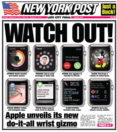
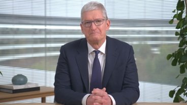
Today, there's no evidence that Cook or other Apple executives have experienced the malaise Jobs felt from the media's rather predictable reaction to Apple Watch. Instead, Cook has focused on positive coverage (he held up the paper below when speaking to shareholders in 2015) and simply shrugged off concern-troll journalists who pressed the company for some metrics they could twist into a depiction of failure.
Clearly, Apple can't possibly care too much about what gets written about Apple Watch in the clickbait media and blogs, given how little impact these same antagonists have managed to exert in their historical efforts to marginalize iPads and aggrandize Android tablets, Surface 2-in-1s or Samsung's various Galaxy Tabs.
Apple makes it clear that it is focused on winning — in terms of "user sat" as Cook likes to say, and also in terms of billions of dollars in profits as Cook likes to report — rather than creating an illusion that it is winning, a idea Microsoft, Google and particularly Samsung have been diligently trying to cultivate for themselves.
No, Apple Watch Series 2 wasn't a year late
As we recently noted in our Apple Watch Series 2 Review Roundup, "just about everybody [is] claiming that the new [Apple Watch] version is the watch that should have been released in 2015."
However, this very tired "should have been released last year" phrase is just a thread-worn cliche serving as a weak substitute for an incisive observation on the true level of accomplishment Apple has achieved in the smartwatch sector.
Anyone repeating this idea should be ashamed. It's simply an ignorant, vapid placeholder for a real opinion. It not only makes no real sense, but also shows an egregious lack of understanding about how the tech industry delivers advancements to the state of the art.
Imagine if every new scientific discovery were met with a pouting reply that the latest new cancer drug or new understanding of the cosmos "should have been discovered last year." When fashion labels employ a new high tech fabric to deliver a more comfortable or easier to maintain garment, nobody who can be taken seriously ever says that this "really should have come out a year ago."
And really, nobody ever says this about technology products outside of Apple, where for some bizarre reason, this is repeated ad nauseam. So please stop, pundits. It's just asinine to keep repeating this as your boilerplate Apple "review" every year.
Did Apple really show up with a weakly feeble watch offering last spring, and was it embarrassingly forced back to the drawing board to come up with something better, the way Google's Android button phone was in 2007, or Microsoft's Slate PC tablet was in 2010? Not even remotely.
Smartwatches before Apple Watch
Prior to Apple Watch, Google had a year-long head start with Android Wear, and two years of prior experience with the Motorola MOTOACTIVE before that. Samsung had introduced multiple waves of its Galaxy Gear watches in parallel, and a variety of other firms had been experimenting in that space, including Pebble and Fitbit.
In fact, smartwatches date all the way back to at least 1994 with the Microsoft co-developed Timex Datalink.
Microsoft next took a shot at smartwatches with the late 2002 announcement of its SPOT initiative. However it didn't follow up by delivering a watch the next year that "should have been released" in the previous year.
Instead, in 2003 Microsoft's Bill Gates first showed an actual SPOT watch prototype and announced plans to partner with conventional watchmakers including Citizen, Fossil and Suunto to build it. However, it wasn't until 2004 that Microsoft's partners first began delivering actual products consumers could buy, starting with Fossil and then expanding to Tissot, Swatch and others.
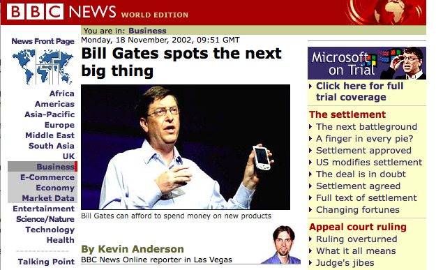
Microsoft wasn't roundly criticized for failing to bring an actual watch to market for more than a year after announcing it. Instead, as Kevin Anderson reported for the BBC back in 2002, the company was broadly assumed to eventually accomplish something because, despite losing over $200 million per quarter on its other mobile devices and on its Xbox game consoles, Microsoft was earning almost $4.4 billion from Windows and Office licensing!
Anderson optimistically stated, "With billions in the bank, Microsoft can afford to lavish money on projects that would bankrupt lesser companies."
By 2008, SPOT watches were dead. But the rampant, delusional credulity voiced by a previous generation of journalists regarding Microsoft's potential to affect mobile computing and reinvent watches is suspiciously missing today from those covering Apple.
Unlike Microsoft a decade ago, today's Apple has not only never significantly failed in any major new product category over the past decade, but has instead consistently turned formerly dreary, dead-end technology cul-de-sacs (like tablets, digital music downloads, mobile software and now smartwatches) into massively profitable multibillion dollar, world-leading enterprises.
Also, rather than bringing in $4.4 billion in quarterly licensing profits as Microsoft was back in 2002, Apple most recently reported $7.8 billion in quarterly earnings. And compared to Microsoft's $5.12 billion in cash & equivalents back then, Apple now has $21.5 billion "to lavish money on projects that would bankrupt lesser companies."
Perhaps Apple can survive being the largest and only profitable smartwatch vendor for long enough to develop Apple Watch into a major business? I mean lets offer some benefit of the doubt, because really, Apple Watch is already a major business, even if the media desperately insists on calling it a flop.
Apple Watch launch year
After years of Microsoft throwing tons of money it could "afford to lavish" down a rathole of smartwatch failure, followed by more recent speculative investments in wearables by Samsung, Google and others, the smartwatch category remained an unprofitable curiosity through 2014, when Apple first announced its plans to introduce Apple Watch at the September launch of iPhone 6.
Rather than spending more than another year to bring the product to market like Microsoft had with SPOT, or launching beta-quality devices with grievous design flaws and a completely unfinished platform (like Samsung's Android-based Gear that it later swapped out with Tizen, or barely-usable Android Wear devices like the Moto 360), Apple actually launched its first watch models the following April to immediate commercial success.
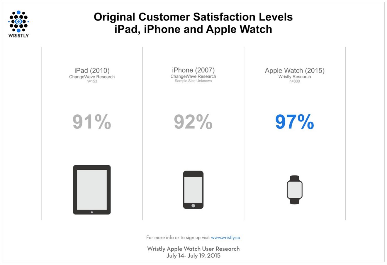
Further, as Cook likes to brag, Apple Watch achieved an incredibly high 97 percent user satisfaction rating among users right out of the gate, higher than the original iPad and iPhone. Within six months, Apple followed up with the launch of watchOS 2, adding some significant new features (such as Time Travel, tether-less WiFI and new developer APIs).
That's not to say the platform didn't have drawbacks. The most obvious was that while Apple Watch worked as advertised, it wasn't initially very good at running third party apps. That was something Apple didn't emphasize to consumers at launch; it did focus developers' attention on watch apps at both its 2015 and 2016 WWDC events however.
It wasn't until the new, dramatically faster and revamped watchOS 3 shipped (earlier this week) that third party apps became fast enough to be plausibly useful.
However, Cook originally defined the new Watch— not as a blank slate platform for apps (as iPad was from its launch, and as iPhone quickly became in its second year)— but rather as "being a beautiful object," and "the most advanced timepiece ever created, a revolutionary new way to connect with others and a comprehensive health and fitness companion."
A variety of web critics have taken issue with Cook's original billing of Apple Watch, particularly in comparison with Jobs' historical introduction of iPhone in 2007, which was hailed as being "a wide-screen iPod with touch controls, a revolutionary mobile phone and a breakthrough Internet device."
Judging Apple Watch as a timepiece
For example, John Gruber of the Daring Fireball wrote that "the 'watch' in Apple Watch isn't really its purpose for being," arguing that "Cook's phrasing oversold the Apple Watch as a watch" because unlike a conventional watch, the new device aggressively turns off its screen making it "worse for glancing at to check the time."
I disagree. The primary purpose of a watch is to readily access the time, but every advanced watch also provides other information as well. My memory is so frustratingly ephemeral that I often have to be reminded of the date, something even mechanical watches have been capable of providing for centuries via ornate "complications." Many also show moon phases and expose chronograph features.
Digital watches and smartwatches go even further, providing access to weather data or calendar events. These are all "watch" functions that were enhanced to the point of being effortlessly easy to use and simply beautiful on Apple Watch from the very first 1.0, truly making it "the most advanced timepiece ever created."
There is no mechanical watch at any price (and some of the most sophisticated ones reach into the millions of dollars) that can do everything Apple Watch could do at its launch related to time keeping, chronology and tracking the celestial bodies that define our sense of the duration of time.
The company made it very clear that Apple Watch wasn't just a wearable computer, but instead used horological terminology including "Complications" to reinforce the idea that Apple Watch was principally designed to be an advanced, fashionable timepiece.
The fact that the screen blanks when not in use reminds me of ancient LED watches from the early 1980s that didn't stay illuminated for identical battery conserving reasons; you had to press a button to see the time. However, Apple Watch addresses this limitation using accelerometers that automatically activate the screen when you raise your wrist. This works quite well.
It's far easier and faster for me to activate the Apple Watch display with a wrist movement than it is to read the complex face of intricate data presented by a series of mechanical hands and moving complications on a typical non-smart luxury watch. I fail to see a real problem here.
Another nutty criticism thrown at Apple Watch — as a watch — is that it fails to offer the option of a round display. Google in particular has stoked this line of reasoning ever since its engineers described how they arrived upon the essential need for supporting circular Android Wear models: they asked a child what a watch should look like. Another nutty criticism thrown at Apple Watch— as a watch— is that it fails to offer the option of a round display
Oh come now.
Mechanical watches and clocks have historically been round because they use a central axel to drive physical hour and minute hands. There is no functional reason for making an electronic watch round apart from nostalgia for the past. Imagine if Apple built its Mac keyboards as deep boxes presenting keys at a 45 degree angle because that's the way physical typewriters with moving typebars had been built for decades. That would be insane.
There's no value in clinging to such legacies of the past. A rectangular display on a smart watch is vastly more efficient in terms of size (including the shape of the screen and battery) and presentation of information.
 Moto 360 with bizarre flat tire display. Source: Android Authority
This isn't the first time Apple has narrowed down the most important aspects of a computer's design in stark contrast to its competitors holding on to old design decisions made for reasons that are stuck in the past or not yet attainable in the present.
When Apple introduced the Macintosh in 1984, it spared no expense to deliver (at the time) a high resolution screen featuring square pixels. It did not, however, attempt to deliver support for a color display (too soon) or for a conventional television screen (too archaic). Competing PCs frequently were designed to work with TVs— what a child might expect— but because TVs of the day had low refresh rates, blurry resolution clarity and rectangular pixels, the new Mac had to break with legacy conventions to be capable of delivering an accurately crisp, iconic desktop user interface.
Google — and particularly the Moto 360 — have demonstrated since launching over two years ago what a dumb idea a round smartwatch is, particularly when that quirky roundness is achieved by cutting corners on the display and processing power and battery integration and making painful compromises to the user interface. While gushed upon as being "gorgeous" by the more vapid shills of blogdom, it really just ended up looking like a snack size can of tuna strapped to one's wrist. And a can of tuna would probably be less frustrating to operate.Compare the boundlessly optimistic reception the Moto 360 got in its second design attempt
Compare the boundlessly optimistic reception the Moto 360 got in its second design attempt by reviewers such as Jon Fingas of Engadget, who called it "my pick of the current Android Wear crop" after grousing about such "quirks" as an interface that "isn't that great at surfacing the information I need at the time I need it."
"It's no longer the underdeveloped novelty that it was on launch," he observed. Even so, he never claimed it was what Motorola "should have launched a year ago."
After two years of disappointing sales, Lenovo hasn't even bothered to introduce an Android Wear successor this winter (round or otherwise). Certainly the tradeoffs to following the whimsy of a child— rather than having any real conviction of how a functional smartwatch needs to be designed to support digital timekeeping and app development— overwhelmed the bounds of sanity.
Certainly one minor drawback to Apple Watch as a timepiece is that its display does turn off and indeed sometimes it doesn't immediately come on when raised to see the time. While I have experienced this, it's not really a persistent issue. I do not feel that my 18 months of Apple Watch use have ever been troubled by not being able to readily see the time (or other information) at a glance.
Instead, I've found that I am now expecting to see the time, my calendar and other information at frequent intervals. If for some reason I'm not wearing it (I've twice been without it for a few days, once while getting it fixed, once while hospitalized without a way to charge it) I find myself frequently looking at my wrist. So often, in fact, that it really impressed upon me the new dependance I have on getting timepiece updates from a wrist bound wearable. This feels particularly remarkable because I hadn't worn a watch for years prior to getting an Apple Watch.
I quickly appreciated it as an "advanced timepiece," and actually begin to feel uncomfortable if I don't have it on. I also like the way it looks, and the way I feel wearing it, which is also a primary reason for putting a timepiece on your wrist and continuing to wear it.
Unlike Fingas' characterization of the "rough start" of the Moto 360's debut, with "all-too-short battery life and undercooked software," Apple Watch has felt like a polished luxury device from the very start, and its performance has gotten better with watchOS 2 and in particular with watchOS 3, which has made my year and a half old Apple Watch feel like a new device.
Judging Apple Watch as a communicator
Gruber also took issue with Apple's characterization of the device as "a revolutionary new way to connect with others," describing Digital Touch as "a complete bust," writing that "nobody used that stuff" and that Apple "could not have been more wrong" about the way it positioned the device's communication features.
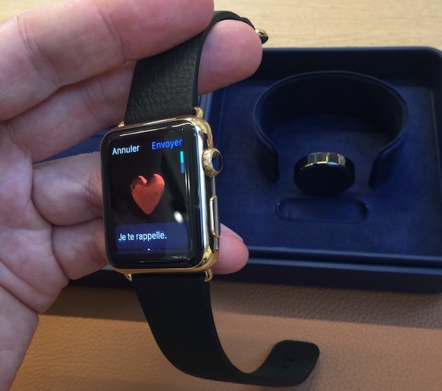
While Digital Touch (the ability to send doodles, heartbeats and taps) arguably didn't warrant a slot among Apple Watch's top three features, I believe this was in large part due to an error in making it exclusively addressable to other Apple Watch wearers.
I earlier noted that Digital Touch should have allowed Watch users to send their messages to other iOS or Mac users, the same way that the original iPhone could send emails to Macs and texts to owners of any other phone, rather than only being able to communicate with other iPhone users.
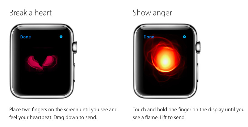
Apple has addressed that shortcoming in iOS 10, which now supports Digital Touch messages (macOS Sierra will as well). Apple has also expanded the Digital Touch gestures. You can send a tap or scribble with one finger, or hold one finger down to send an angry fireball. Tap with two fingers to send a kiss, hold to send your heartbeat, or drag both down to send a broken heart.
Further, watchOS 3 also adds the ability to Scribble out single characters (or even short 3-4 letter words) using your fingertip, which are then recognized and delivered as standard text replies. This actually works surprisingly well even on the smaller 38mm screen, although it seems to be intended for Chinese text input; for Roman character input, it might be easier to dictate texts or type on the standard keyboard.
Digital Touch isn't the only way to communicate on Apple Watch. The device also supports Continuity phone calls through your iPhone, as well as being able to send recorded audio clips (or dictations as text) in chats. From the start, this capability worked very well. It is particularly well suited to answering a call hands-free without taking out your phone, such as when driving. And you don't need to hold your watch up to your mouth for it to work.
Apple Watch had also supported messaging from other apps (including Facebook Messenger), which was probably among the best initial uses of any third party app on the device. Further, communication isn't always two ways. Certainly one of the most useful features of Apple Watch is its slick ability to deliver incoming payloads via notifications.
Being able to get (and reply to) notifications without pulling out your phone (or when your phone is across the room charging) was most certainly "a revolutionary new way to connect with others" and very much deserved to be the second pillar defining why Apple Watch was something you needed. It also continues to be in the enhanced watchOS 3.
Judging Apple Watch as a health and fitness companion
Gruber also wrote that "the best thing about Apple Watch was the fitness tracking," but cited problems with the display being not bright enough and the screen not always responding when you have sweaty hands.
Neither of those problems particularly stood out to me in my workouts, despite the fact that I'm often profusely sweaty. The only time I've experienced significant issues with the display not responding is when I've tried to use it while swimming or while taking a shower. If your hands or the display are very wet, its capacitative screen stops working normally. A quick wipe should fix this.
I have, however, experienced real issues in using Apple Watch as a fitness companion, mostly tied to its heart rate monitor. Most of my typical exercise revolves around cardio, yoga and weight workouts, as opposed to running. That means the fitness tracking features have to rely more upon my heart rate compared to figuring in the distance I've traveled or steps I've taken.
I've frequently compared the results of my Apple Watch heart rate sensor against a hospital-grade, finger tip pulse oximeter when getting my heart rate vitals, and I've been impressed that both have virtually always returned identical results. However, I've also observed Apple Watch doing a poor job of following my heart rate during floor exercises. I've frequently fact-checked an apparent nonsense heart rate number quoted by Apple Watch against my own manual, tactile throat pulse count over a period of 15 to 30 seconds, discovering it to commonly be off by a factor or 2 or 3.
I've frequently fact-checked an apparent nonsense heart rate number quoted by Apple Watch against my own manual, tactile throat pulse count over a period of 15 to 30 seconds, discovering it to commonly be off by a factor or 2 or 3: often reporting 50 bpm when my heart is beating a quick 100 or even a rapid 150, for example.
I don't know how it calculates ongoing activity or calorie burn, but clearly if it thinks my heart is running only half as fast as it actually is, and there's no real distance being achieved, my activity rate is going to be severely undercounted.
This often appears to be the case when doing intense but unhurried yoga poses where my heart is pounding and I have sweat dripping off me but I'm not actually moving around the room. It helps to keep your watch fastened snug, and the rubber sport bands are certainly superior when exercising compared to, say, the Milanese Loop. Sometimes it seems that the watch just needs to have sweat wiped off the back side.
Conversely, Apple Watch will also frequently rack up vast caloric burns, exercise minutes and even move hours if I activate a workout and then crawl into bed and sleep. While concerning, this over- and under-counting doesn't render the device worthless, it just raises questions about how accurately and consistently it's tracking my goals.
I've also hit very high heart rate peaks that are considerably higher than I understand my personal heart maximum should reach. It's concerning that the watch never throws up a "hey your heart rate is really high" message in this scenario.
Overall, I'd also like to see more guidance and feedback in general, including a built-in "workout" type for monitoring sleep at night, a feature Apple includes support for in HealthKit but does not really support in its own software (third party iPhone and watch apps can track and report this).
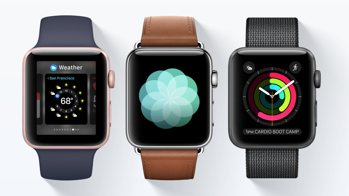
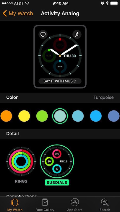
Apart from active fitness — and despite the appearance of somewhat inconsistent data collection at times — Apple Watch also acts as a overall health companion, reminding you to not idly sit for hours at a time. The fact that it is always collecting steps and heart beats also contributes to a more accurate picture of how many calories you are burning throughout the day. The new watch faces in watchOS 3 (and the iOS 10 Watch app to help configure them) do a better job of integrating your Activity circles so you can readily track your goals.
This information, combined with third party apps such as Lose It, have enabled me to take a much more active role in shaping my own health over the past year. While wearing an Apple Watch doesn't magically make pounds drop off or lower your overall body fat, it does contribute toward a mindful awareness of what you're doing.
In my case, it's helped me radically change how I feel and look, particularly appealing to my love for data and a factual verification that what I'm doing (in terms of exercise and eating) actually matters in visible and visceral ways.
Another health and fitness feature Apple didn't really target on the original Apple Watch is the social sharing of your activity goals, which is now addressed in watchOS 3. When you earn goals and achieve targets, you can now share them with your opt-in friend circle for added support and encouragement.
While Apple has also made new efforts to bring Apple Watch fitness tracking to individuals who use a wheelchair, there seems to be short shrift given to bicyclists. Apple Maps doesn't yet support any sort of bike route mapping or directions, and while there is a workout type for both real bicycles and stationary bikes, there's a noteworthy limitation on how useful Apple Watch is while you're actually pedaling a bike around.
Part of the problem is that Apple Watch assumes that you have both hands free so you can touch the screen with one arm while the other is held in front of you. This can be done while walking (if you're not too clumsy) and even driving (with I'd say less distraction than using a phone), but is rather hard to pull off on a bike. I wish there were arm-based gestures for basic navigation of the screen so you could more easily dismiss notifications and do other basic tasks while on a bike ride
I wish there were arm-based gestures for basic navigation of the screen so you could more easily dismiss notifications and do other basic tasks while on a bike ride, or say, walking down the street with a Frappuccino in your dominant hand. Currently, the best one can do is to try to tap large targets on the screen with your nose.
One automatic new fitness feature Apple has added to watchOS 3 is the use of its motion sensors to pause your run whenever to stop, such as at a red light. Without this feature, your run pace begins to fall down, so leveraging the existing hardware is smart and effortless. You can also pause a workout by hitting the side button and Digital Crown at once.
This formerly triggered a screen capture, but that's been turned off by default. If you want to restore this capability, there's a setting in the Watch app on iPhone.
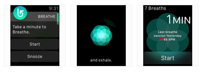
Lastly, Apple has added another new health app in watchOS 3: Breathe. Unless you opt out, you'll get prompts to occasionally take a minute to focus on your breathing and relax. The new app is simple and effortless and I like using it.
What else is new in watchOS 3
As the pure novelty of owning an Apple Watch began to wear off over the past year, I began to notice that some of the basic features of watchOS 2 needed attention. The core user interface was not as simple to use as iOS.
Apple Watch presents a miniature Home page of app icons, but most third party apps took so long to load that they weren't worth bothering with. Organizing the blob of round icons can be tedious, and by default every new app you load on your iPhone can also include a new app icon to your watch. It seems to work better to use the Watch app on iOS to rearrange these apps, which I don't feel like I need to do very often.
Glances, a minimized app experience exposed with an upward swipe, worked well enough but couldn't be accessed from the app icon Home page. That means you'd need to press the Digital Crown some number of times to get to the watch face, and whether this was once or twice seemed to be random and hard to predict.
Further, swiping to the right or left were wasted on doing nothing, while swiping down from the top pulled up notifications. This is useful until you dismiss them all (using a hard press) and the entire screen is devoted to informing you that you have no more notifications, rather than just going away. This is weird, but also the standard behavior of iOS 10.
Another bizarre oddity of watchOS notifications is that they currently take over the entire display and occur whether or not you're actively doing something.
If I'm performing some glanceable momentary task for a couple seconds, I don't want to be interrupted with a full-screen panel telling me somebody liked my Instagram picture. Also, when I look at my watch for the time, I don't want to see a full screen app logo preparing me for an eventual notification message, and I sure don't want a full screen modal dialog asking for my response sticking around until i dismiss it.
At the very least, Apple Watch should consistently work as a timepiece, unobscured by notifications. Can you imagine if Apple had designed the iPhone to sit on your incoming calls until you quit the current app, or interrupted your current call to tell you about likes or tweets? It is sort of nuts to have to point this out 18 months after it launched.
Most of these issues are addressed in watchOS 3, which finally makes the Home page somewhat useful by being able to launch apps quickly enough to actually use them, at least among apps that are well designed enough to perform some task you actually want to do. Notifications are still full screen interruptions however.
Swiping up now presents a Control Center of quick actions that's very useful, while swiping down similarly offers the notifications panel equivalent of iOS. This is not only well designed, but also contributes to a consistent experience across iOS and watchOS. I wish there were more similarity across iOS and macOS in terms of UI and system preferences.
The two big new UI features under watchOS 3 is you can now swipe right to left to instantly and effortlessly switch between your configured watch faces. This is an excellent change. Previously, I never changed my watch face because it involved slightly too much effort.
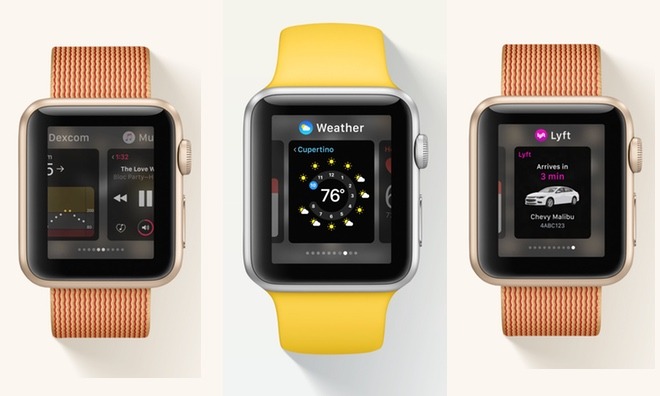
The other big change is that Glances is gone and essentially replaced by the Dock, which is now activated by pressing the side button. The Dock, like iOS or macOS, presents a fixed listing of apps you want quick access to.
Docked apps remain running in the background, and are frequently updated so that they display current status as soon as you bring the Dock up. When you launch a new app, you have to option to pin it in the Dock so it stays there. This entire feature is very well executed and makes using Apple Watch apps much more enjoyable.
The new watchOS 3 also adds a series of new bundled apps: Reminders, Home (for managing HomeKit devices, just like iOS 10), Find My Friends and a new standalone Heart Rate app to replace the old "Glance" version. There's also a new SOS emergency call feature.
Overall, performance in watchOS 3 is also a vast leap ahead on existing 2015 models, almost surprisingly so. Gruber noted that this is due to the fact that "the original hardware was more capable than the software team expected, which led them to write software that resulted in the hardware feeling less capable," in particular being "far more stingy with memory use than was necessary."
Despite being more liberal with available resources on the original Apple Watch model, I haven't noticed any decrease in battery life. It really is like getting a major new RAM upgrade on a computer. In fact, I think few existing users will be tempted to upgrade their watch to a Series 2 model unless they have a compelling need for some of its new hardware features.
Series 1, Series 2
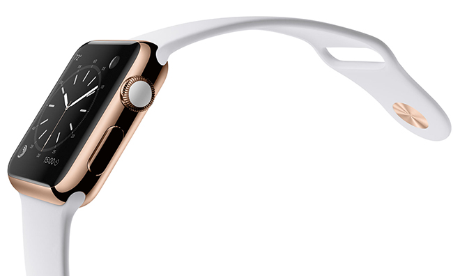
Apple has shifted the way it brands its Apple Watch models. While the initial batch referred to the lightest, least expensive aluminum model as Apple Watch Sport, the stainless steel and sapphire version as simply Apple Watch, and the heavy, expensive solid gold version as Apple Watch Edition, there are now two "Series."
Series 1 replaces the existing Sport model, but is virtually identical apart from a CPU upgrade to a dual core processor within the S1 package (now called S1P). The refreshed model is now offered at $269.
It is offered in aluminum only, and is sold paired with a variety of sport band colors. It is referred to as being "splash resistant," the same as last year's models, but should have no issues with brief immersion, showering or other basic exposure to water. It is rated as being IPX7, but Apple still recommends against "submerging" it in water.
Series 2 is the new generation of Apple Watch models. It can be ordered in an aluminum Space Grey, Silver, Gold or Rose Gold matte finish, paired with either a sport or woven band, or in a (Space Grey or Silver) Nike+ version with a unique perforated sport band and specialized Nike+ apps and branding.
The new aluminum body is 0.9mm thicker on the Series 2, and weights about 10 percent more (28.2 grams vs 25g on the original in 38mm, or 34.2g vs 30g on the larger 42mm). Note that the watch band weighs more than the watch body itself!
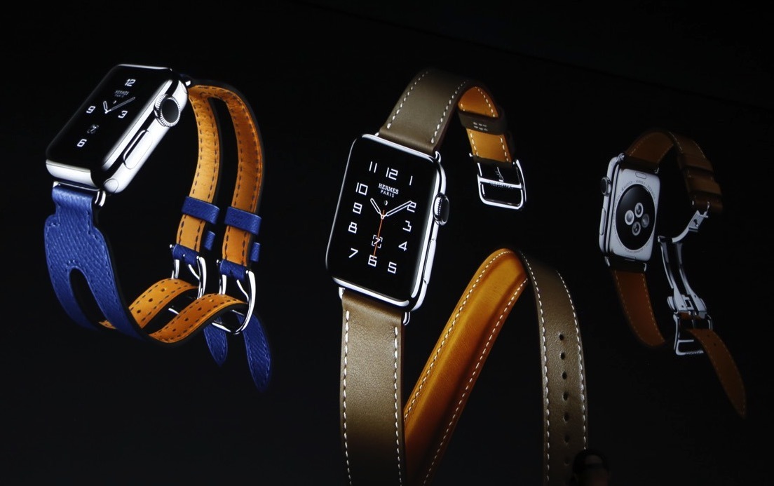
Series 2 is also available in a more substantial (heavier) and shiny stainless steel version in either standard polished steel or Space Black finishes, paired with either a sport, woven, leather (classic buckle, modern buckle, or modern loop) or metal (link or milanese loop) band, or specially branded Hermès bands (including a double buckel cuff, three variants of a Single Tour classic buckle design, a "deployment buckle" design, or two versions of a Double Tour band that wraps around your wrist twice in a figure 8).
Like the aluminum Series 2, the stainless steel version is identically thicker by 0.9mm, and that contributes to a very slight 2g difference in weight (41.9g and 52.4g, vs 40g and 50g for the two sizes, respectively). Recall that a gram is about the weight of a dollar bill, so this isn't a noticeable difference. Stainless steel models are, however, about half again as heavy as the aluminum version, which is very noticeable; the aluminum models feels very light compared to the stainless steel.
All Series 2 watch models include new GPS support for untethered location tracking on runs; improved water resistance to "50 meters" (ISO standard 22810:2010) for shallow swimming and snorkeling (it's not intended for deep immersion or scuba diving or for use in "high-velocity water activities" such as water skiing); and a "2x" brighter display rated at 1000 nits (vs the original or Series 1 rated at 450 nits).
The new Series 2 watch models are designed to shut the display off when you enter a swim exercise session, and will not wake again until you turn the Digital Crown. Once the watch is woken back up, it drives any remaining water out of the speaker cavity using sound from the speaker itself.
#AppleWatch #series2 Swim sessions lock, blank screen. Dial Dig Crown & it wakes, blows out water from 🔊 with audio! pic.twitter.com/Fz6imNHwWn
— Daniel Eran Dilger (@DanielEran) September 8, 2016
Apart from being less than 1mm thicker, there has been no change in the two case sizes (38mm and 42mm) or in their display resolutions (272x340, and 312x390, respectively) or in the design of the bands they use. That means that existing bands and new band colors or materials can be swapped between any models in the same overall size.
Apple's wireless induction charger
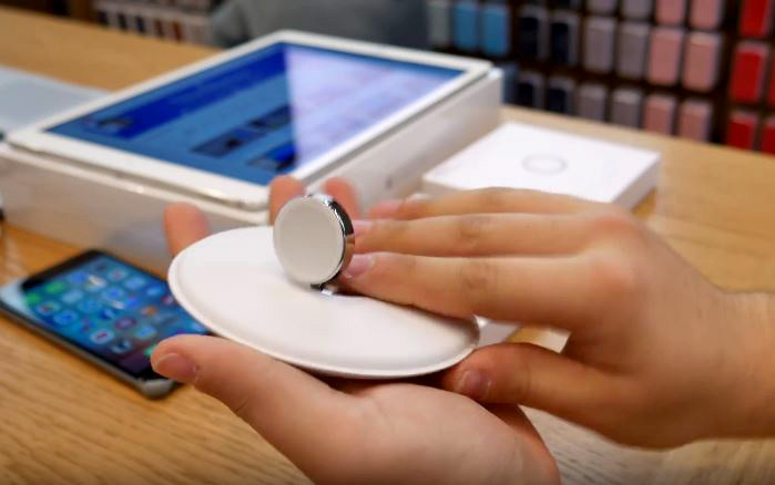
All versions of Apple Watch ship with an induction charging cable, which is the only way to recharge its battery. That means if you take an impromptu trip or end up staying overnight somewhere without your cable, your watch will probably be dead by morning. And if you do a long workout, your watch will be dead before you get home.
Premature or unplanned exhaustion of your Apple Watch battery is just as troubling as when your phone runs out of power, but there's an added element of annoyance when you're working to track Activity circles and a power disruption kills your entire progress chain for the month. I've grown extremely distressed over Apple Watch failing on me for this reason on many occasions.
I would imaging it's as irrationally upsetting as having your Tamagotchi die, failing to catch a Pikachu or getting a parking ticket because the meter failed to work properly. There's also no mechanism for appealing a failed Activity circle completion, so you just have to deal with being First World Bummed Out for the remainder of the month.
Replacing an Apple Watch charging cable is expensive ($30-40 from Apple), and it feels both somewhat fragile and bulky; it's long enough to need to be coiled up, but you can't wrap it too tightly or you'll risk damaging where the cable joins the charging disk.
I really wish Apple would offer a standalone charging disk equipped with a Lightning connector, so that when you travel you could carry one disk and one cable that you use to charge either your phone or your watch, the same way you can share a single USB power adapter between your devices.
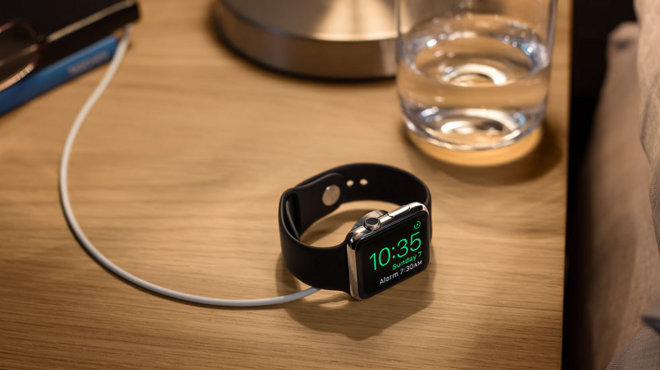
Apple does sell a $79 Charging Dock for Apple Watch, which essentially mounts the charging disk on a circular pad with a hinge that allows it to charge lying flat or on its side where the face is visible in Night Stand mode. The pad has a Lightning port and ships with a cable (but not a power adapter). It feels too large to pack with you when traveling, and it looks like it was designed for an affluent lady/dandy.
I don't know how much money Apple is saving by not shipping new models with a separate disk and a Lightning cable, but I think "customer sat" would nudge upward if it felt like the company were providing the best possible solution in the box while offering whatever other options it wants as optional purchases.
At a minimum, I'd like to be able to pay $10-20 for a Lightning Disk (or less!), and I'd like to someday be able to use wireless induction on my other devices, including the Apple TV Siri remote and Bluetooth Magic Mouse (bonus: no more complaints about where they position the Lightning port).
Apple Watch induction charging appears to be based on the Wireless Power Consortium's Qi charging standard, but Apple reportedly uses an authenticated, proprietary variant that means only its own official and approved MFi-licensed charging devices will work on Apple products (in the other direction, Apple's charger appears to work fine with Qi Android watches.)
The purely cynical will complain that Apple does this out of greed, but there's also clear evidence that non-licensed, unregulated, low priced adapters are often poorly designed and pose a risk for fire or damaging the device being charged. That's already been documented with cheap USB adapters and even with knockoff Lightning cables.
I'm not sure how confident I feel about those Ikea charging pads integrated into its cheap furniture, given that its particle board objects routinely hurt people even without involving electricity. I think I prefer a world where Apple signs off on this stuff to prevent Note7-style issues.
However, there's nothing stopping Apple from pushing to aggressively lower the cost of induction charging and broadening the adoption of "Apple Certified" Qi-type adapters that could be used to charge a variety of the company's own peripherals, as well as HomeKit and HealthKit devices, wireless speakers, battery packs, and other devices that currently require some flavor of mini, micro or Type C USB cables.
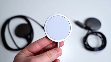
This is an issue I wish Apple would fix. The company could even brand it as a new version of MagSafe, given how much it likes to recycle its old trademarks. (Mr. Cook you can just send me a check for that idea, thanks).
Ceramic Apple Watch Edition
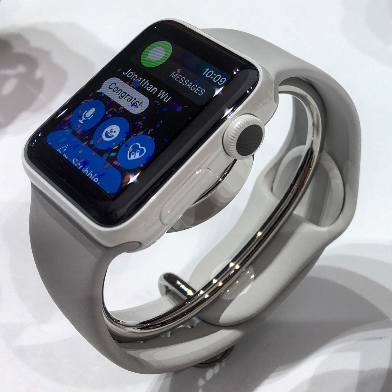
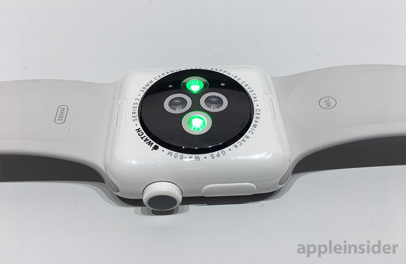
Series 2 is also available in an Edition version of white ceramic, which is as strong as steel, four times as hard (making it difficult to scuff) and slightly lighter in weight. Apple says it uses "zirconia powder that's combined with alumina," which is a fancy way of describing zirconium dioxide and aluminum oxide, the core components used in synthetic diamond substitutes and sapphire.
"Ceramic" comes from the Greek word for pottery; it refers to inorganic crystalline material with some similarities to glass (which differs mostly in being non-crystalline). In addition to being harder and lighter than steel, ceramic also doesn't block radio signals. It can also be mixed into a variety of colors, although Apple is currently only offering it in a lustrous white for Apple Watch.
The back cover of the Edition is also identified as ceramic (the black disk set into the rear of the case), which is also used on the stainless steel and aluminum models. This allows induction charging to occur without being blocked by the metal cases.
The new Apple Watch Edition includes a Charging Dock, similar to last year's gold Edition models which shipped with a charging-integrated box. It is priced at $1249 or $1299, making it $700 more than the standard Series 2 stainless steel model. The ceramic model weighs 39.6g or 45.6g, which is between 5 and 13 percent lighter than the stainless steel version.
The ceramic Apple Watch Edition weighs considerably less than last year's gold models, which were 54-67g, or about a third to nearly half again as heavy as the new ceramic or stainless steel models. It's also about 10 percent of the price of the solid gold Editions.
There has been some talk that Apple might use a similar ceramic in next year's iPhone 8, but if the case design is similar to existing models, that would suggest that a ceramic iPhone 8 would weigh something like 182 grams (6.4 oz), a substantial weigh gain of about a third (68g or 2.4 ounces) without any obvious benefit.
Gold Editions and the boutique experience
There are no longer any new gold or rose gold Apple Watch Edition models, which Apple had previously sold for $10,000 to $15,000. I believe this expensive tier was intended to cast the entire Apple Watch portfolio as being a fancy, high end, fashionable product offering, in particular to distinguish Apple Watch from previous bargain bin smartwatch devices all clamoring to be the cheapest.
When the most expensive offering is astronomical, it makes the middle look downright affordable. People who are serious about watches routinely pay much more than $10,000 for luxury watches, but that price point was atypical for Apple, so it had to recalibrate expectations of the market. It no longer really needs to do this, because it's now selling mass market numbers of Apple Watch and nobody even cares about other smartwatches that are available outside of some of the better activity bands such as the popular FitBit wearables.
In visiting Apple's boutique retail partners in London and Paris in the spring of 2015, I tried on the gold Edition models, and they were indeed impractically heavy, as if a metaphor for the oppressive burden of being way too wealthy. Some people did indeed by them, including many Chinese nationals. I watched individuals buy the product and also talked to retail staff about the demand they were seeing.
I'm quite confident Apple didn't lose any money in developing the gold models, although I also doubt it was extremely profitable, or even that Apple expected that it would be profitable to sell a limited run of Apple Watch Editions that cost more than a tricked out Mac Pro.
I also have to disagree with Gruber's opinion that the gold Edition models "arguably inflicted some small amount of damage to the company's brand, making Apple look out of touch and elitist." I think that idea only ever existed in the minds of certain podcasters who came up with it in a free association session. Also perhaps among Android enthusiasts who jumped upon another reason to not like Apple.
If I were planning to buy a basic Chevy, and happened to see a spot a fully loaded Cadillac on display in the dealership, even if that much fancier car were priced far out of my price range, it wouldn't make me think GM was elitist or "out of touch." On the contrary, it would make me think more highly of the maker of my basic car, because at least they know how to build nice stuff, even if I can't afford it.
Test driving an Apple Watch Edition at the Galeries Lafayette in Paris similarly made me think more highly of Apple's product marketing savvy, and likely influenced my subsequent decision to upwardly recalibrate my sense of what I thought I needed, resulting in my eventual purchase of a more expensive stainless steel Apple Watch paired with the Milanese Loop band that had caught my eye from the first moment I'd seen it.
I didn't buy my own Apple Watch until returning to the U.S. At the time, the only place I could even obtain one in this country required traveling from San Francisco to Maxfield's, a Melrose Avenue boutique shop in Los Angeles (which also required waiting in line).
That experience subsequently changed how I viewed my Apple Watch every day since, each day I put it on. I noticed that other Apple Watch wearers would point out that I'd purchased the fancier tier, giving me that ephemeral boost that one gets when someone complements your taste. As far as typical luxury goes, the premium I paid for my watch was virtually nothing compared to that paid by people who buy fancy clothes, nice cars or even who frequently go out to enjoy an extravagant meal.
Had Apple offered me a review model to try the product out, it would likely have sent me its cheaper Sport model paired with a plastic band. While it would have functioned identically, it wouldn't have delivered the same experience, and it wouldn't have involved any customized sense of my personal buying decision.
That sense appears to be evident in a "study" conducted over the past year where an agency rounded up a random group of people and issued them Apple Watches. Because they hadn't picked out a model for themselves, or even been drawn to the Watch on their own as customers, their responses to survey questions were detached and devoid of any real sentiment for the product.
I'm sure they were all issued the lightest, cheapest models as well. It's not surprising that the study regularly reported a lack of genuine interest in the product, but its extrapolation of its "findings," which it attempted to project across the millions of people who bought Apple Watch because they wanted one, didn't really offer any true insight into what was driving Apple Watch sales among actual buyers.
Few pundits in the tech industry have any appreciation for fashion, or the feeling you get from paying more for a product that feels and looks nicer, rather than just having higher specs. This is a huge expansion that Apple has successfully bridged into an entirely new category.
You can bet that the sales data Apple has accumulated over the last year of selling Apple Watch is incredibly valuable and will be applied across its existing product line and in new product introductions.
As you might have guessed, Apple has no interest in sharing that data with its rivals.
 Daniel Eran Dilger








-m.jpg)


 Brian Patterson
 Charles Martin


 Malcolm Owen
 William Gallagher
 Christine McKee
 Marko Zivkovic


12 Comments
Wow that was one long semi-decent article haha
DED is feeling better I see :-)
Another insufferable article. It is disingenuous to compare a part-time display to an overly complicated mechanical watch. Given a choice, I'd wager DED would take an always-on AW over a twist-n-show version.
Yes, we are now comparing the AW to a cure for cancer, except the analogy is deeply flawed. The proper analogy is that Apple came out with a cure for cancer a year after cancer was cured. Other manufacturers did have better water resistance, GPS, and battery life a year ago (see anything Garmin makes that also runs 3rd party apps). The original UI has been widely criticized as more difficult to use than other Apple products, and the new OS corrects this, so it wasn't just reviewers with an axe to grind who felt this way. Now that we have GPS and better water resistance, I am actually excited about the AW for the first time (though I need to hear more about battery life). I would like to have felt this way a year ago. Maybe that's what they mean when they say that.
Anyway, enjoy the down-vote button :-)
I don't own an Apple Watch (I've had the same Seiko lunar-phase chronometer on my wrist for 30 years), and I've never owned a mobile phone... but having read this feature carefully (I was on my second Bialetti of coffee before the final paragraph!) I have to say that DED brings more interest and enjoyment to technical journalism than anyone I have read before... probably equal to the late great Engish motoring journalist L.J.K. Setright, albeit in a completely different field.
This was a great read and was expertly written, well done! Iarrya may have missed the point regarding your cancer comparison. Which I interpreted to mean that advancement can't be measured in retrospect in the way folks seem to be doing with Apple Watch. Apple has always said they never aim to be the first to do something, they just want to do whatever they do right, and do it well. Again, don't overlook the billions in revenue that would seem to suggest they have done both.