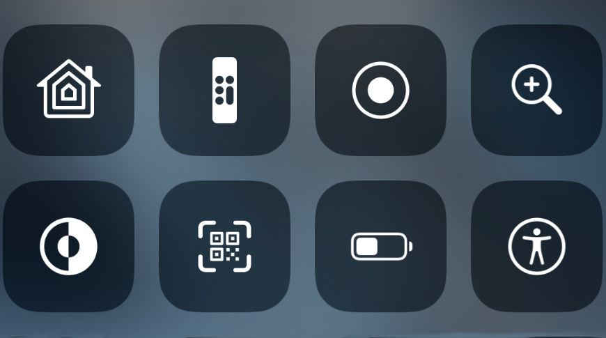
Apple continues to make Control Center more useful, with iOS 13 seeing refinements to existing tools plus a new quick-access Dark Mode control.
It's still not the clearest option on your iPhone or iPad, but even if you'd never heard of Control Center, you'd probably stumble into it at some point. Swiping down from the top right of your display is a bit specific, but you can't miss that a whole new screen rolls down when you do.
By default, too, that Control Center screen rolls down whether you're in an app or not, and even whether your iPhone is locked or not.
The aim is to get you the fastest access to the iOS features that you most often use your iPhone for — but those features are different for everyone.
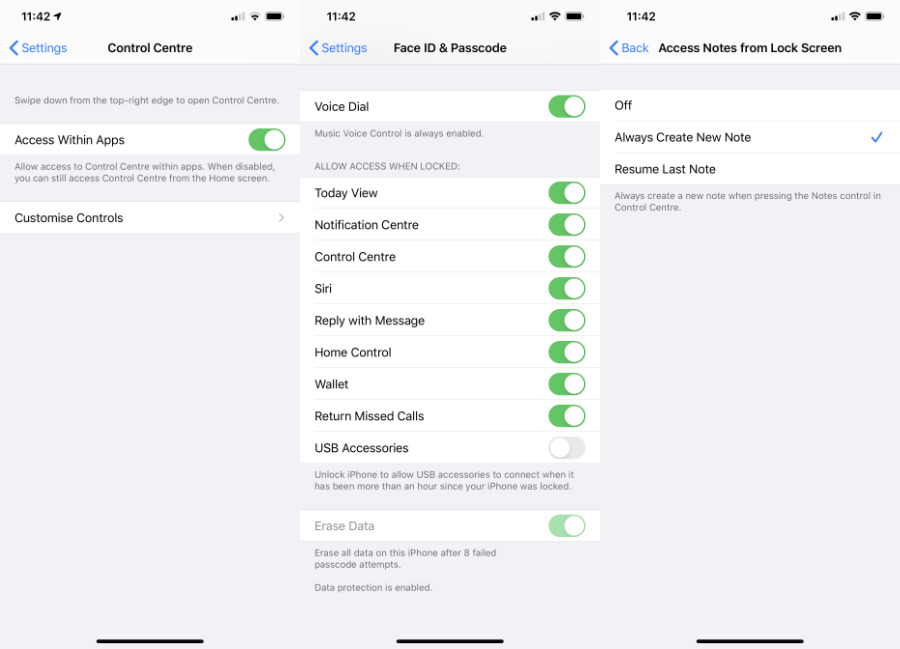
So getting the most out of Control Center means putting into it what you need. And that's surprisingly convoluted. Depending on what you want to do, add or change, you can configure Control Center in:
- Settings, Control Center
- Settings, Face ID & Passcode
- Settings, Notes, Access Notes from Lock Screen
Then there's what you can do inside Control Center itself. And if you remove certain apps like Notes from your iPhone, you naturally lose the ability to use it from within Control Center. Yet if you remove TV, say, you can carry on controlling your Apple TV inside Control Center just fine.
Each individual point makes sense — the TV app isn't a remote control, for instance — but the way options are scattered across different places makes the overall system confusing.
For iOS 14, we'd really like to see a Customize Control Center button actually within Control Center itself.
What's new
The only thing against having such a Customize option within Control Center is that this system is intended for fast and repeated access. You're probably not going to make many changes to Control Center every day, whereas you are likely to use the other options.
Such as the new Dark Mode that's come with iOS 13 and iPadOS 13.
You may well prefer Dark or Light mode overall, but then you'll be in a place where Light is too bright or Dark isn't clear enough. So you could go to Settings, scroll down to Display & Brightness, and then tap either Light or Dark to change it.
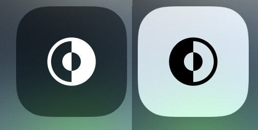
Or you could swipe down Control Center and tap the Dark Mode button. Done.
That one button is a toggle so tapping it switches on Dark Mode, and tapping it again switches it off, or rather back to Light Mode.
The sole problem is that if you just swiped down to try this yourself, you probably didn't see a Dark Mode control at all.
That's because it's not part of the standard set. You have to add it and there is no way to do that from within Control Center, you have to know to go to Settings.
Choose your controls
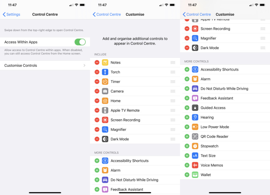
Go to Settings, Control Center and then tap on Customize Controls.
You see a two lists, one atop the other. First, there's a quite short list of what controls are currently switched on in Control Center. Second, there's a list of all the other controls that you could add.
The one thing these controls have in common is that they are all either Apple apps or features within iOS. There are no third-party apps here.
Scroll down to find Dark Mode in the second list. Tap the green plus sign next to it, and now the feature is moved up to the first list.
It's automatically placed at the bottom, but you can tap and hold on the grab handles to the right, then drag to rearrange.
You'll need to experiment with this because that list is a straight vertical one, and the actual Control Center is more like a grid of icons.
While you can move a control anywhere on the list, you can't move it anywhere you like on the Control Center grid. The top half or so of Control Center is reserved for seven permanent sections, or what Apple calls cards.
In theory there is no limit to the number of controls you add underneath these, but in practice there are two.
One is that this is meant to be fast, so if you end up having to open Control Center and then scroll a lot to reach a control before you can tap it, you're losing the benefit.
The second is that there are only so many controls available to be added. If you selected every possible control then, as well as the permanent ones, you'd have a total of 27.
If you're running a beta version of iOS, you'll have a 28th option with the Feedback control.
Controls within Controls
The new Dark Mode toggle does nothing except turn that darkness on or off. But most other controls do much more, and they are reminiscent of the Haptic Touch system we now get on regular apps.
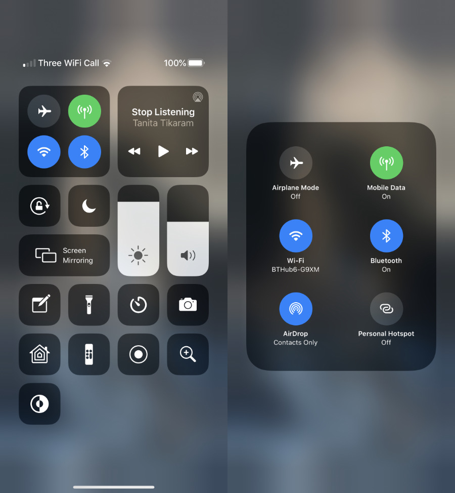
Perhaps the most significant, the most customizable, or just the one you'll most often use, is the top left card. This is where you can control Airplane Mode, Wi-Fi, Bluetooth and Cellular Data.
Or rather, it is until you press and hold in the middle of the card.
Then you also get the ability to control AirDrop and Personal Hotspot. Neither of these are quick to find in Settings, so it's a boon to be able to turn them on and off so fast.
You also, though, get more information that you would otherwise. In this expanded card, for instance, the Wi-Fi button now shows you the name of the network you're connected to.
The idea is that you can rapidly tap a control on or off, or you can press in for more and finer options.
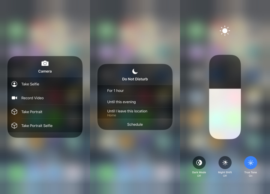
The same is true with the non-permanent cards, such as the icons for the Camera which a long press will now turn into list of options from Take Selfie to Record Video.
There are new options in iOS 13's Control Center like this. Now if you tap and hold on the Brightness icon, you get finer controls, but also buttons for Dark Mode, Night Shift and True Tone.
Add every control you think you might use, then try them out, both for how often you actually do press them, and for what happens when you long-press.
Back to configuring
If you have Apple Notes on your iOS device then one of your optional Control Center controls is Notes.
This is not like the Calculator which, when it first appeared in Control Center, meant you could move that app off your front screen and leave it in a folder somewhere. If you're a regular Notes user, you still need to keep that on your home screen.
However, for making fast notes or for adding to existing ones, the Control Center option is very useful.
Add Notes to Control Center and then tap it to go straight into a note
There are just two things about this. One is that you need to decide whether you want to always start a new Note, or you want to always open the last one you were working on.
You can see the advantages to both, and you can see that you'd like the option. And while it is not obvious, you do have the choice at any time.
Go to Settings, Notes. Scroll to Access Notes from Lock Screen. You've got three options:
- Off
- Always Create New Note
- Resume Last Note
Whichever you actually want, select Resume Last Note anyway.
Now if you don't do anything else, you can swipe down Control Center, tap on Notes and be right back in the last note you were working on.
And if, instead, you open Control Center and briefly long-press on the Notes control, you are offered these choices:
- New Note
- New Checklist
- New Photo
- Scan Document
You'll notice there's no Resume Last Note option in that list. So by choosing that in Settings, Notes, you've now got both options in Control Center.
There is one more issue
The reason that Notes control, in particular, is so useful and fast is that you don't have to unlock your iPhone or iPad to use it. You can just pick up the phone, swipe, tap and be writing.
This is less of an issue now that the odds are Face ID will work so quickly that you do unlock the device as you're picking it up, but there is still a security problem here. You probably don't want strangers to be able to leave you notes or to read your existing ones.
The way to prevent that Control Center feature is, again, not in Control Center. Go to Settings, Face ID & Passcode.
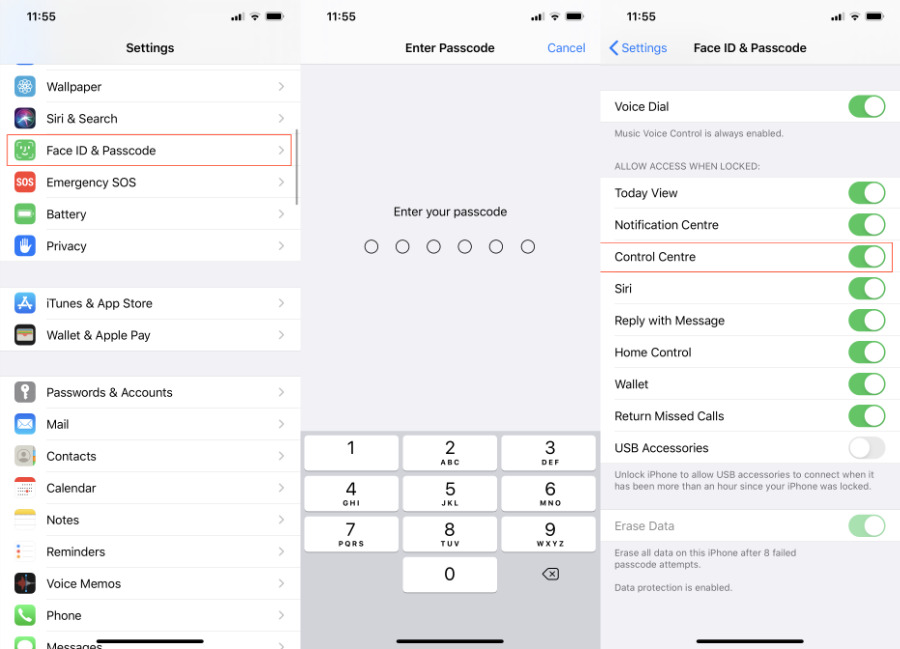
If you don't want anyone to be able to use Control Center just by picking up your phone, turn off that option here.
You'll have to enter your passcode, and then scroll down to a section called Allow Access When Locked. Switch off Control Center.
Faster than it sounds
Control Center does so much, and its options are scattered in so many places, that it takes a lot longer to describe than it ever does to actually use.
Your use is going to be different to everyone else's, but, for instance, that one-tap Dark Mode is compelling.
So is the ability to turn on Do Not Disturb with a single tap. And then if you press and hold on Do Not Disturb, getting options such as turning it on until you leave your current location, that's a game-changer.
Really, so is the whole of Control Center. Especially when you've added what features you want, this goes from being an obscure part of iOS to one you use constantly.
Keep up with AppleInsider by downloading the AppleInsider app for iOS, and follow us on YouTube, Twitter @appleinsider and Facebook for live, late-breaking coverage. You can also check out our official Instagram account for exclusive photos.
