Apple made the wrong bet when it built the Apple TV around apps and an App Store when instead, it should have focused on streamlining the TV experience like Steve Jobs promised to do.
The Apple TV was Apple's "hobby" project that saw few hardware updates from its inception in 2006 to its reinvention in 2015. It was an exciting time as Apple finally declared Apple TV was no longer a hobby in 2014, then released the updated Apple TV in 2015.
That fourth-generation model introduced an App Store and the Apple TV app, and Apple promised "the future of TV is apps." The Apple TV app would be the great unifier of content, while entertainment apps would be easy to set up and sign in at launch.
Eventually, users would not need to have accounts or sign-ins. Instead, everything would flow through the Apple TV app and its channel system. Apps would only be necessary to play games or search for real estate, not fumble around for what to watch.
Instead, the Apple TV app was mostly ignored by the major players. Netflix refused to allow its service to be cataloged or added to the Up Next system. New services launching didn't bother with the Channels system, opting for separate apps that did the bare minimum to integrate with the platform.
It didn't have to be this way.
The future of television isn't Apple TV+
Before Steve Jobs passed in 2011, it seemed he had cracked the secret to simplified TV. The third-generation Apple TV we got in 2012 didn't seem to fit whatever vision Jobs had been talking about, as it emulated other simple set-top boxes of its time.
Whatever magical idea Jobs had, it would never surface. It seemed that Apple had attempted to create a unified service with cable company deals, but those deals never came to fruition as Eddy Cue toured into exhaustion.
Instead, the result was Apple TV+, a premium streaming service with exclusive content. It wasn't the future of television, nor was it the skinny cable bundle so many had predicted or hoped for. By 2020, the Apple TV experience was very similar to other platforms.
Apple had failed to revolutionize TV, though some parts of the platform were still unique or useful compared to the competition.
Things only grew worse from there as the great entertainment consolidation drove even more publishers away from Apple TV Channels. Now, users not only have to contend with the Apple TV app and its organization, but they also have to sign into the half-dozen popular streaming services separately, sometimes with frustrating methods.
Having an App Store on the Apple TV ultimately didn't do anything to simplify the TV-watching process — which was the problem Apple was trying to solve. Developers could create their own streaming interfaces, ignore Apple's APIs for controls, and ensure that watching content was as confusing as possible when moving between apps.
The future of television isn't apps
The primary problem with Apple's approach is that it gave too much power to content distributors. There are multiple ways to watch content on Apple TV across various apps, each with its own interface and rule sets. There's nothing simple about it.
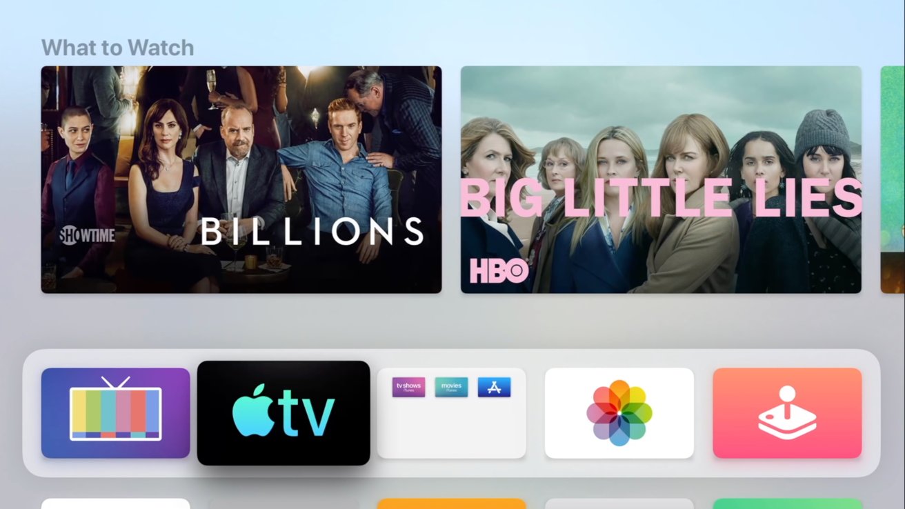
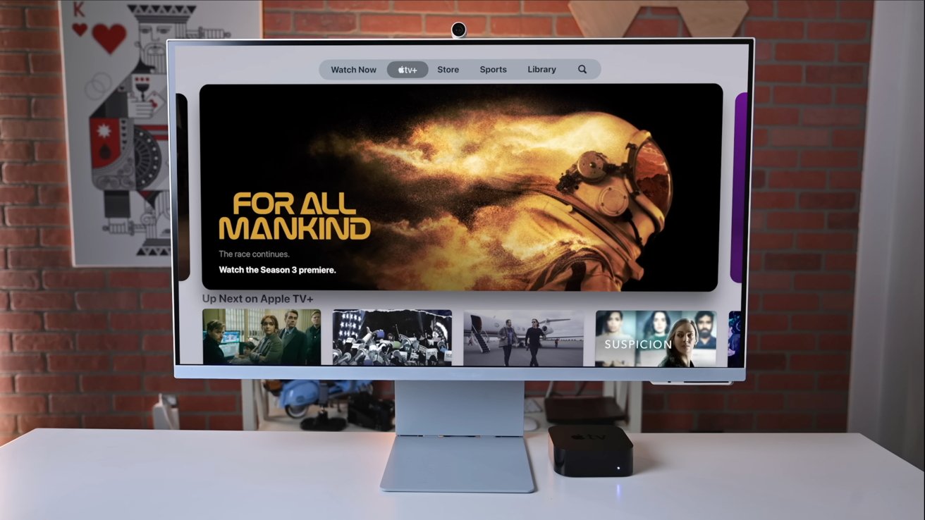
When navigating the Apple TV app, users are presented with every piece of content that can be launched from the app regardless of what service it belongs to. Tapping on content could either open another app, launch the program within Apple TV, or offer up a purchase window from iTunes.
That experience is made even more frustrating because apps like Amazon obscure which content belongs to Amazon Prime versus other streamers within the Amazon app. Users could click on a movie, see it as available on Amazon Prime, hit play, then be met with a "subscribe to HBO in Amazon" screen.
This issue is compounded by the lack of filtering or organization within the Apple TV interface. Once a content provider is added, everything that provider has in its catalog becomes integrated with the "Watch Now" tab.
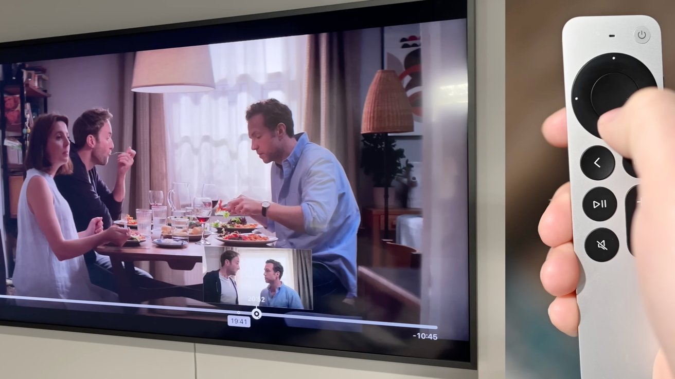
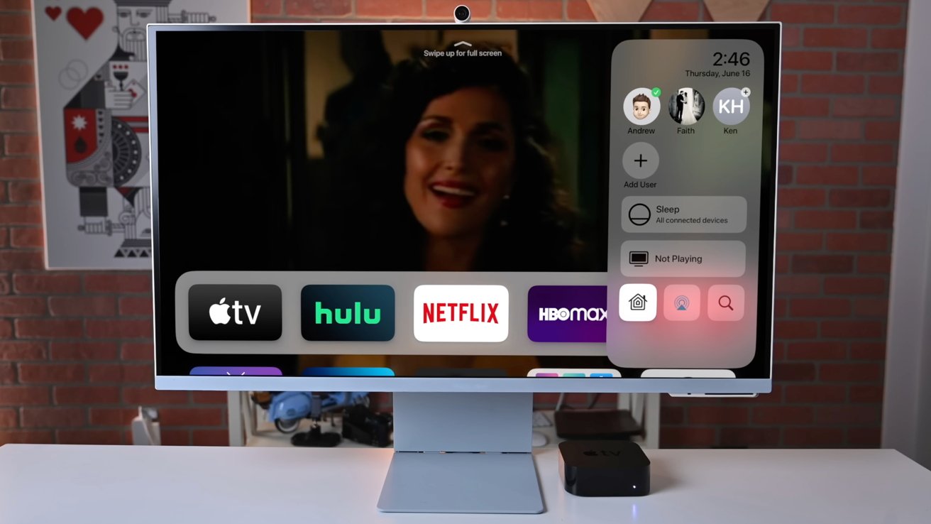
Even when everything is working right and clicking on a piece of content opens the correct app and starts playing, the interface you're met with is a crapshoot. It could be an interface that supports the Siri Remote's jog wheel function, it could have an overlay of who's in this scene when the menu is opened, or it could do almost nothing except play and pause. Every app can be different.
Speaking of apps, the differences in interface and navigation can be quite jarring. The Apple TV app was meant to prevent this, but users end up jumping to third-party apps even when selecting content within the Apple TV app. It would be similar to Apple News opening a new Safari tab whenever an article is selected instead of showing it in the News app.
Users setting up a new Apple TV will also run into some issues. Every app could potentially use a different sign-in interface. One might simply ask for a password, another will ask users to open a website on their iPhone, while others still will ask users to open a specific app on the iPhone.
Apple's sign-in interface using iPhone biometrics is the fastest and most accessible, but developers don't have to use that method.
Finally, there's the most significant problem with Apple TV — Netflix. By not having its content surfaced in the Apple TV app's Up Next or within its catalog, Netflix is now a silo. That means people will only watch content on Netflix because it is all in one place, or they will completely forget it as an option until they go to the Home Screen. A lose-lose for everyone.
The future of television is a unified experience
A lot of Apple's initial promises with Apple TV had potential, but it gave too much wiggle room to developers. Perhaps it is too late to change anything now, but one thing is sure — the future of TV isn't apps.
Having streaming entertainment spread out between multiple app silos with different interfaces makes things worse for most users. Instead, Apple should have built the Apple TV app at the center of the Apple TV experience.
The Apple TV is an app on the Apple TV hardware, when instead, it should be the center of the interface. People have to choose to open the app rather than it be how the platform works, which makes it less attractive as a platform for third-party vendors.
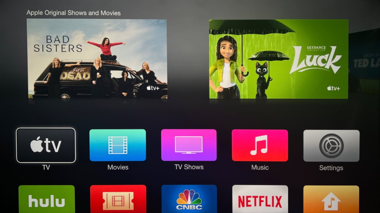
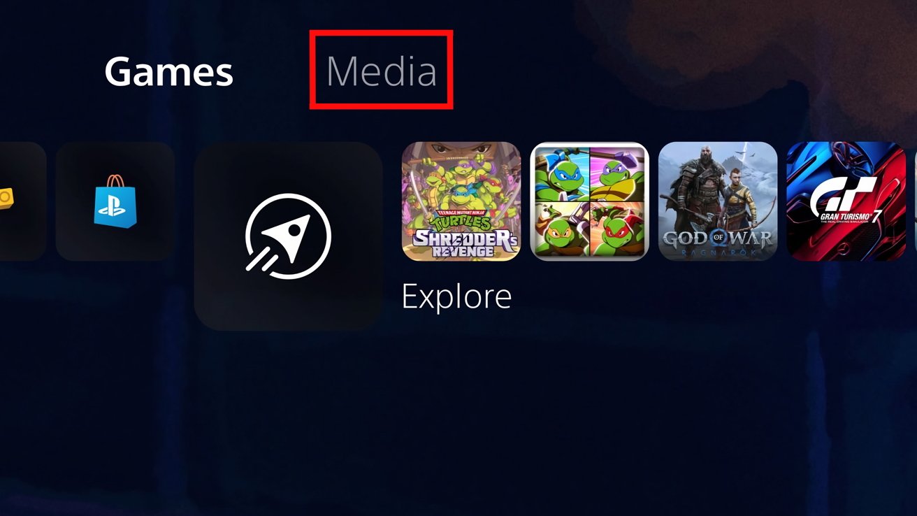
To see how Apple could refocus the Apple TV app to become the main interface, look to Playstation 5 for an easy example. Its entire interface is video games by default, but tabs at the top let users switch between gaming and entertainment contexts.
Users should turn on the Apple TV and see Apple's unified interface right away with no option to enter some third-party-designed app. Think of the Apple TV app interface as it exists today, with Channels being the "apps" in this context.
Similar to the Apple Watch App Store or iMessage App Store, there should be an Apple TV App Store purpose-built for entertainment apps. Select which entertainment apps you'll be using within the Apple TV, offer a sign-in page using iCloud Keychain credentials, then add that content to the Apple TV interface.
The individual apps could still have their content siloed within their own Apple TV app pages, but they all belong to the same unifying interface. Users would never find themselves in a poorly-designed app that doesn't take advantage of Apple's APIs, it would all just work and be uniform throughout.
Up Next should be the main screen with a single timeline of what the user is watching, then below that, recommendations based solely on that list. The Watch Now section would be its own separate tab with human-curated content.
This system would basically make every app an Apple TV Channel without locking users into Apple's payment platform. It would be a win for users since the interface and video content would remain uniform while giving content distributors access to user data through sign-in.
At the top of the interface would be separate tab groups for different modes. Users would live in the Apple TV app, but other sections would include gaming, fitness, entertainment, and settings. What is shown here would be based on what users were subscribed to, like Apple Fitness+ or Apple Arcade.
The other tabs would offer small App Stores for their respective categories. Think of it like Focus Modes, where each section is purpose-built for the type of content being interacted with.
We're not sure what Steve Jobs's vision for Apple TV was, but simplifying the interface and unifying content would likely have been significant goals. Surely, he wanted to do for movies and TV what he did for music — bring it all under a single banner like iTunes.
Apple TV hardware, the TV app, and Apple TV+ are not it. The proximate naming should be the first clue that something is amiss.
The future of television is within Apple's reach
Content distributors would surely buck up against losing access to siloed apps and interfaces, but ultimately, Apple is in control. If Apple chose to push a new, unifying interface, it could pull it off by using its weight and influence.
Of course, such a bold undertaking could trigger antitrust concerns, which may explain why Apple would be hesitant to do so. If done right, it will lower barriers and encourage users to sign up for more services, not fewer.
The Apple TV hardware would continue to benefit users with its access to other services like Apple Fitness+ and Apple Arcade. Non-Apple hardware would still have access to an Apple TV app, but one based on the new unified experience.
At a bare minimum, Apple and Netflix need to work out this silly problem so Netflix content can be surfaced in the Apple TV app and Up Next interface. It would be a win for Netflix and its users, especially at a time when the platform is seeing a lot of churn due to rising prices.
Apple should also mandate user interface guidelines and sign-in flows. Basic elements should be the same across every streaming app, and every app should just let the user sign in via their iPhone biometrics.
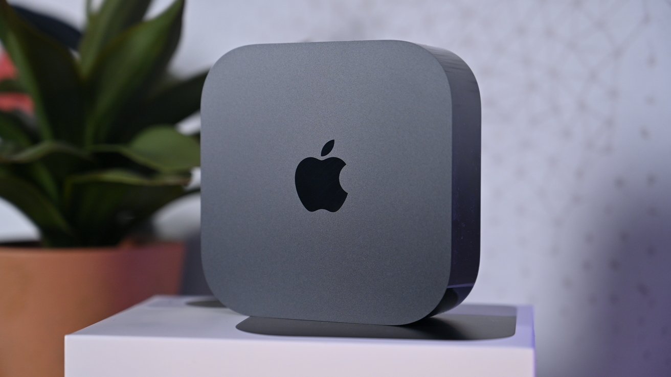
With the release of the 2022 Apple TV 4K, it is clear that Apple is committed to the existing app distribution and interface it introduced in 2015. The operating system hasn't changed much over the years, so perhaps, an overhaul is in order soon.
To be clear, we love the Apple TV and believe it is the best place to stream content today. Its fast processor and Apple-like interface make the experience much better than the ones found on Chromecast or Roku. However, Apple's experience doesn't feel unique to its platform, it's just an improved version of its competitors, and we believe Apple can do better.
