A pair of Apple executives talk Apple's new 24-inch iMac, its design elements, and the inclusion of the M1 chip in a recent podcast interview.
Apple worldwide senior produce marketing manager Colleen Novielli and engineering program manager Navpreet Kaloty recently appeared on Relay FM's "Upgrade" podcast to speak about the new M1 iMac refresh ahead of preorders opening on Friday.
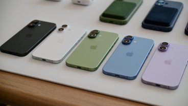
On the fact that the iMacs now come in a bevy of bright new shades, Novielli explained that the colors "are designed to bring a sense of brightness, optimism, and joy." She added that "I think we can all agree that's something everyone needs at the moment."
The Apple Mac product manager also touched on the design elements of the 24-inch iMac, including the controversial chin and bezels on the front side of the device.
"The borders are meant to complement the typical home design, for one, and blend into the background. The light gray borders are awesome. The lack of the stark contrast provides a more seamless experience for the user," Novielli said.
As for the chin, Novielli explains that Apple was able to fit the iMac's internal components within that space. She says the chin makes the iMac's color "shine," while also allowing Apple to reduce the device's thickness by a significant amount.
When asked about whether Apple would sell the Magic Keyboard with Touch ID separately, Novielli declined to comment. However, she added that the keyboard would work with any M1-equipped Mac.
On the overall design, hardware manager Kaloty said that the inclusion of the Apple Silicon chip affected every aspect of the new iMac's design. That includes the I/O on the rear of the device, which now exclusively consists of USB-C and Thunderbolt 3 ports.
The full interview contains other tidbits about the iMac's design and features, and is available to listen on Relay FM.


