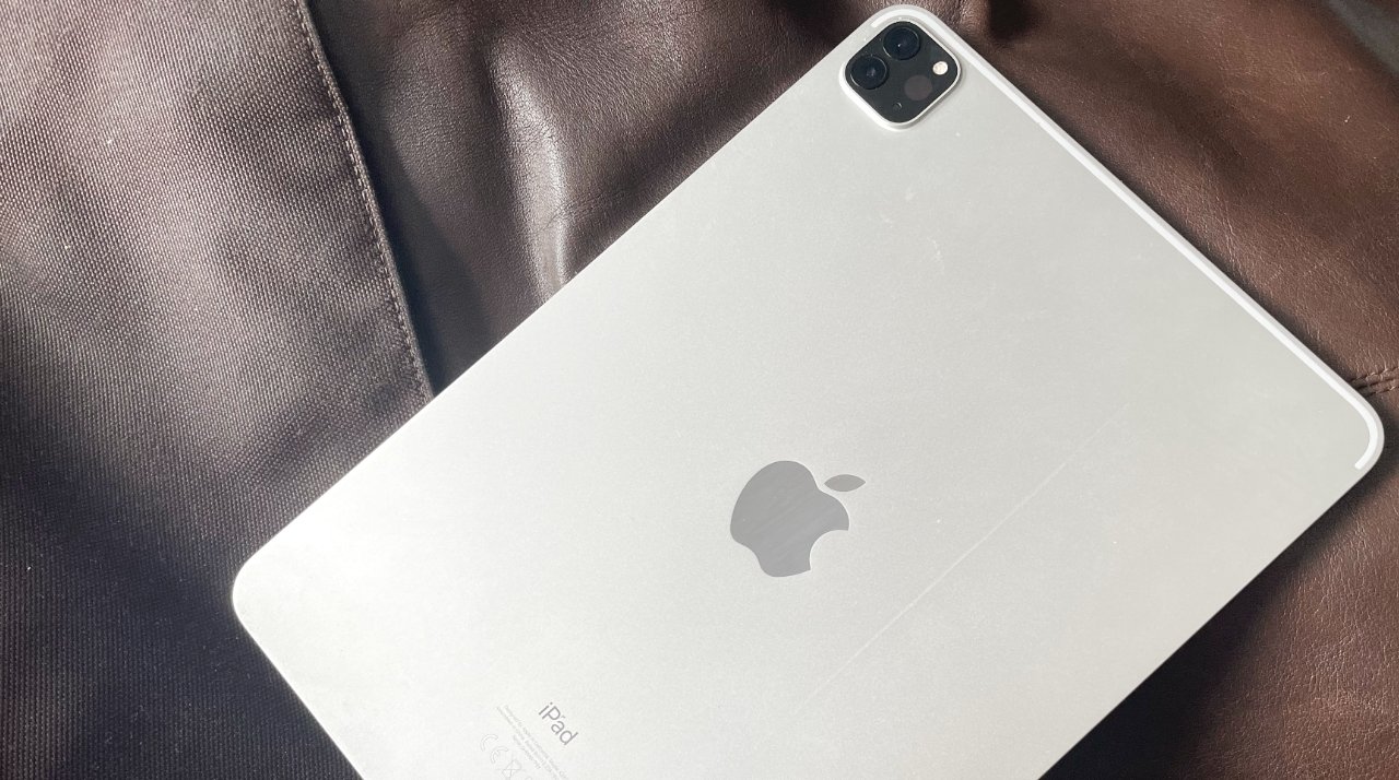
A new report claims that Apple is planning to change the iPad Pro design to feature both its camera and rear Apple logo in landscape orientation.
Leaker Dylandkt, whose track record includes accurate claims about the iPhone 13 Pro, now says Apple is planning to change a key design feature on the iPad Pro.
Future iPad Pro's will feature a horizontal camera placement and a horizontally placed Apple logo on the back. Apple will make landscape mode the default for iPad Pro usage. I have not confirmed whether the next generation model will have this feature but it is in the works.
— Dylan (@dylandkt) September 23, 2021
The iPad has always been promoted as a device that can be held in any angle, but it is not completely symmetrical. Currently iPad Pro cameras are positioned so that they are right side up when used in Portrait mode, for instance.
While users can readily hold the iPad Pro in landscape to take photos and not notice any issues, certain other apps do have problems. FaceTime, for instance, expects landscape by default, but this can be changed. The Apple logo, of course, is embossed and permanently in the orientation it ships in.
If Dylandkt is correct, Apple will be addressing this in a future iPad Pro, and also suggesting that landscape is the "correct" way to hold the device. That more fits the kind of professional workflow that the iPad Pro is being used for, as opposed to the Portrait orientation that arguably better suits users reading books.
Leaker Dylandkt was previously the first to correctly report that the M1 processor would be used in the iPad Pro. More recently, he has claimed that the expected 14-inch MacBook Pro will have the same performance as the next 16-inch MacBook Pro.
No previous rumors regarding the iPad Pro have suggested this orientation change. For the most part, they have detailed expectations about whether the iPad Pro may gain MagSafe


