You might have wanted more, especially from iPadOS 15, but what we've got with it and iOS 15 is a combination of refinements and new features that make this a particularly compelling upgrade.
More than ever, the value in Apple's latest updates is in using all of them together. Not just the new iOS 15, not just the new iPadOS 15, both both of those — and the new macOS Monterey too.
They are separate, yet they work together as a unit. They blur the lines between both what you could do on iPhone, iPad, and Mac, and also help you stop having to think about which device you're using for what. As much as is conceivable, Apple wants it so that you are thinking about your work more than you are the device, so new features range across all of your machines and let you just carry on wherever you are.
Or that's the idea, anyway. There are gaps, such as the lack of the new Quick Notes on iOS 15.
But then there are also compelling reasons to upgrade to iOS 15 and iPadOS 15 even if you've not got macOS Monterey, even if you haven't got a Mac.
The standout, visible, features of iOS 15 and iPadOS 15
You know that a lot has been done under the hood to make all of the features of these operating systems better, or faster, or more bug-free. That's not to be ignored, but it's the visible new features that are going to get you looking to update.
Chief among those eye-catching new abilities is Live Text. That's going to change how you use your iPhone because as well as meaning you can extract text from photos, it means you can pull that text from the viewfinder — you don't even have to take the shot.
That's available across all the new OSes, but it's really the new toy of iOS 15. As superb as it is, though, there is more that is going to prove to be appealing over the long term.
It's just that some of them are going practically invisible in daily use.
Tremendous invisible features
The most invisible one is Private Relay, although at launch that's even more invisible than Apple planned. It is included in all the new OS releases, but only as a beta.
Even when it's officially out of beta, you won't especially notice that it's there. But it will protect your online browsing in similar — but still significantly different — ways to a VPN.
Whereas although Focus Mode stays out of your way until you want to use it, once you've set it up, you will always use it.
Focus Mode sounds like a variation on Do Not Disturb, and it is, but it's a key feature because it's been done really well.
There were points during the beta process where it seemed to oddly fail, for it to choose not to automatically switch on at the times you set. Yet it was those failures that made you realise how much and how quickly Focus Mode had become part of your daily use of Mac, iPhone, iPad, and Apple Watch.
It makes Do Not Disturb feel a bit clunky. For now you can tell one device that you don't want to be disturbed by anyone except your partner and your boss, and it'll handle that.
On the one hand, it will handle it without you having to go further and specify that you mean your boss's email address, or your partner's phone number. If you say these people can interrupt you, any way they do it gets through.
And then on the other hand, when you turn on that particular Focus Mode on your iPhone, say, it is then automatically turned on for your iPad, Mac, and Apple Watch.
Since you can define many different Focus Modes — for work, for the evening, for the weekend — you will end up with many different ones. That does give you a long list of buttons on the iPhone and iPad, plus a long menu on the Mac, both of which get a little unwieldy.
However, you can ignore the list and the menu, and instead just have different Focus Modes switch on and off automatically. You could set your office one for 8am to 6pm weekdays, for instance, or a theater one when you get to Broadway.
Where Private Relay will just go quietly on protecting you, Focus Mode will quietly go on and off to help you concentrate on your work.
Of all the new features in iOS 15 and iPadOS 15, though, it may be the ones in Safari that will most contribute to you actually getting work done.
Safari is central to iOS 15 and iPadOS 15
Safari is not just a stock Apple app, it's a key part of the whole experience of using iOS 15 and iPadOS 15. And its new redesign is a big change that you can divide into two parts.
One part is unquestionably a success and one is so questioned that Apple rolled it back into an option instead of a new feature.
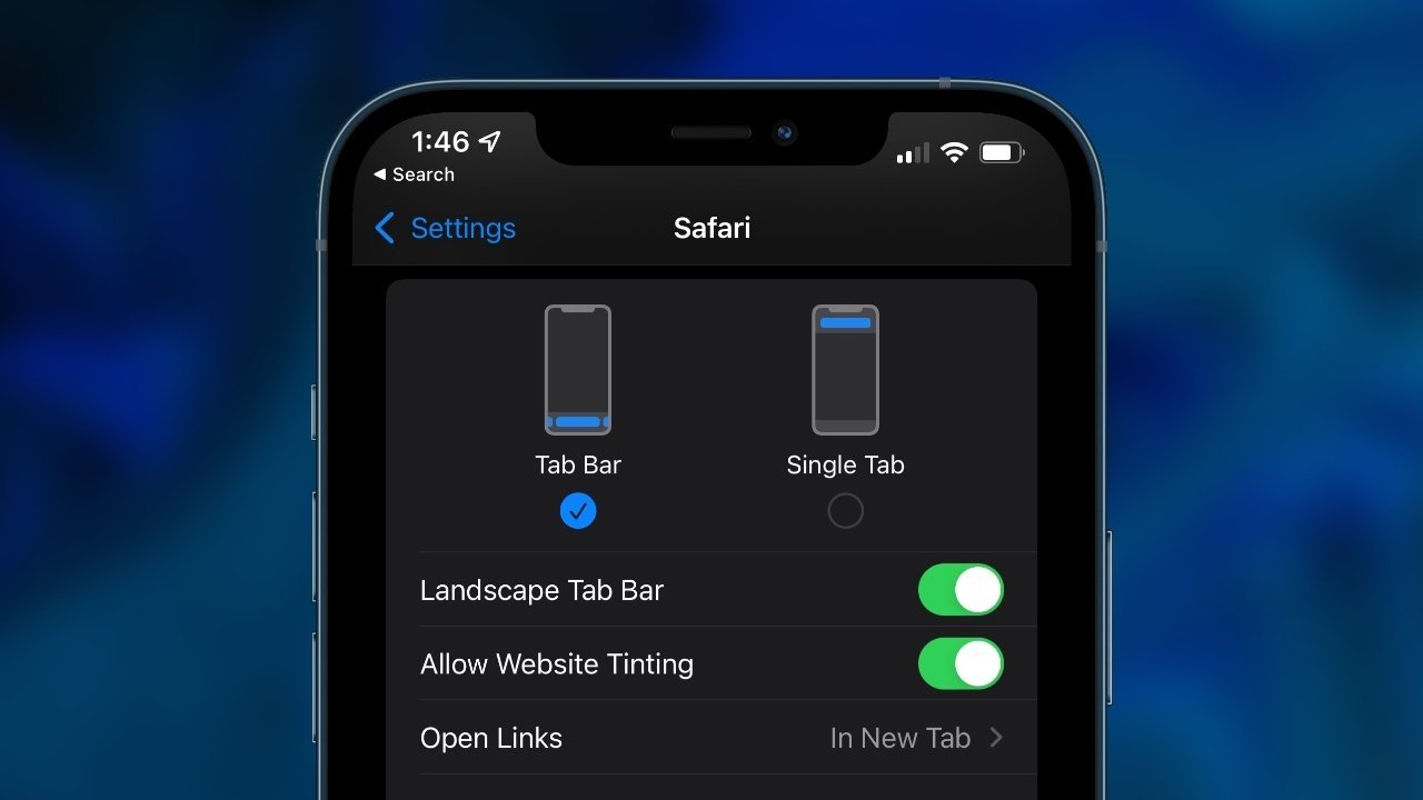
That option is to move the usual address and search field from the top of the screen to a floating lozenge tab bar at the bottom. It works fine and it makes more room on the screen for the website, for the content you're looking for.
It just requires you to unlearn a decade or more of muscle memory about where to tap when you want to go to a new site. You could get used to that, and you may well do, but it's still the case that so very often the first thing you have to do on a new site is tap back toward the top.
So you're able to see more at first. You're also able to reach the new tab more easily, without having to shift the phone in your hand or use a finger on the other one. Plus you can swipe very easily from a site in one tab to another.
Yet you're then still having to shift the phone, or use your other hand, to work on the site that appears.
That mix of new and old muscle memory fights against you getting used to this new tab design in Safari.
Whereas the also new Tab Groups feature is completely different. For one thing, you never have to use it if you don't want to, it simply never appears until you choose it.
Go choose it right now. Tab Groups are an unqualified success and can transform your work far, far more than it first seems.
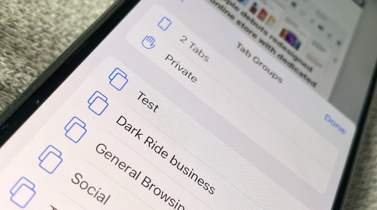
Initially, Tab Groups appears to be yet another variation on bookmarking sites, and that's all. It's a very good variation, though, as it means you can collect all of your sites to do with work in one group, then all the ones to do with your hobbies, say, in another.
Make a third group for news. A fourth for all the online banking and accounts you have to do.
Then when you need to work, click on the right group and every tab you need is right there, immediately. And every tab you do not need, is apparently gone.
They're not, though, as you can get any of them back by just tapping on the group they're in. Now all of your work tabs, say, are gone, and the news, banking or hobby ones are back.
There is an issue that you will lose track of which group a tab is in. And you'll forget that you're in your banking group when you open a tab for ESPN.
However, there is nothing to stop you opening that tab there. Plus you can then move an open tab to any group as you need. If you accidentally close a tab that's part of the group, it'll still be there the next time you choose that group.
What's transformational about it all, though, is that you'll spend far less time opening tabs and websites. You've already done it, they are all already there for you, they are always just one tap away.
So while you grow the number of tab groups over time, very soon you find yourself done. Safari is now this place that helps you concentrate on the task you want to do right now.
And it helps you across all your devices. You can set up, change, delete, or rename a Safari Tab Group on iPhone, iPad, or Mac, and know that you will get exactly the same across all those devices.
It seems odd to concentrate on a small new feature in a browser when examining an OS that browser happens to run on, but this is another point that is reason enough to upgrade by itself.
Tab Groups are also a reason why it will be hard for Safari users to switch to another browser. At least until all of those copy this.
Apple Notes is also transformative
Similarly, it's also now going to be hard for Apple Notes users to switch to one of the many, many alternative note-taking apps available. Or at least it is on the iPad, and specifically because of Quick Notes.
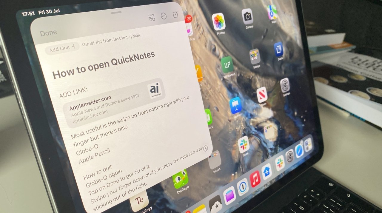
On the iPad and the Mac, you can now swipe up from a corner with your finger, your cursor, or your Apple Pencil, and get a Quick Note.
Typically that will be a new, blank Quick Note, ready for you to jot down any quick thought, note down any website link, and so on.
However, if you've been to this website before, you've used this Pages document, or opened that app, things are very different. The Quick Note that opens is the same one that you last used in this situation.
When that works, it is fantastic. It means you can make a note today, then add to it tomorrow, you can build up your research.
Sometimes it's a bit irritating because even though a Quick Note will just take up a little bit of the iPad screen when you revisit this site, or whatever, it's big enough to be distracting.
It's obviously less distracting on a Mac where, typically, the screen is bigger so the offered Quick Note takes up comparatively less room. This is one thing that changed during the beta process on the Mac, with one of last betas featuring an extremely small Quick Note pop-up.
That was actually so small that when you clicked on it, you somehow always got a brand new, blank Quick Note, instead of the one you wanted.
Overall, the process has been much more consistent, smoother, and better on the iPad. Not only has the pop-up when you have an existing Quick Note remained the same, what happens once you've opened it is better, too.
On iPadOS 15, once you have a Quick Note open, it is a single window. If you have more than one Quick Note of any description, then you can swipe between them.
And you can also tap a button to create a new note.
On the Mac, each note is a separate window and getting to more than the most recent, or new, Quick Note really means opening Apple Notes itself.
That's because all Quick Notes are automatically saved in a Quick Notes folder in Apple Notes. You may never open it, or you may find yourself forever moving notes from there to other folders you've created, but that's where they start.
What this means, most especially on the iPad, is that any app now effectively includes a note-taking feature. It is system-wide across the iPad, and the Mac, and the very first time you need to jot down something quickly, you'll be sold on Quick Notes.
Quick Notes on the iPhone
It's not entirely true that the new Quick Notes feature is reserved for iPadOS 15 and macOS Monterey, but it's nearly true. It's true enough, and Quick Notes is good enough, that you will hope iOS 16 brings it properly to the iPhone.
For now, however, you can at least open and edit any Quick Note on the iPhone by launching Apple Notes. Open that app, then tap on the Quick Notes folder, and you have full access to every Quick Note you've created on either iPad or Mac.
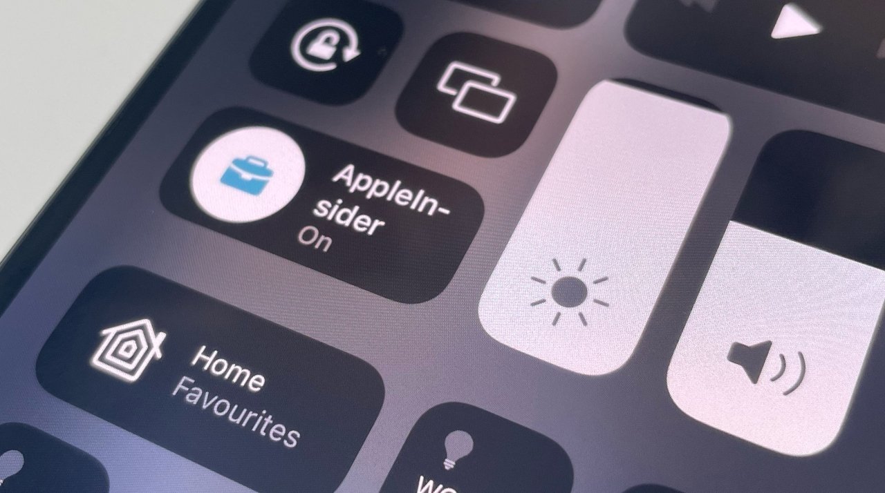
There is also now a little fudge to help you start writing an Apple Note faster, even if it isn't a Quick Note. You can add a Notes button to Control Center.
So now on iOS 15, you could swipe down to launch Control Center, tap the Notes button, and immediately be writing an Apple note.
It isn't the same as a Quick Note because you are leaving an app to do it, and you can't connect that note to that app. Plus, the new note appears in whichever folder you last looked at in Apple Notes on iPhone.
So it's not as organized, it isn't as handy, and it doesn't have the linking functionality of Quick Notes. Other than that, it's fine.
What else is missing that we expected
If Quick Notes is missing from iOS 15, at least it's in iPadOS 15 and out of the two, that may be where it's most useful.
There are other features, though, that are missing from iOS 15, iPadOS 15, and macOS Monterey. They're all features that were not only announced as coming, but pretty much trumpeted as reasons to upgrade.
As well as putting Private Relay into an extended beta, Apple has pulled its SharePlay feature from the new OSes. This is the feature whereby while you watch, say, "Ted Lasso" on Apple TV+, you can simultaneously be watching which of your friends are laughing and which are not.
Frankly, though, if watching your friends is more interesting than the show, you should be watching better shows, and you could just talk with your friends.
Which you can do more easily now that FaceTime calls are supported online. That means FaceTime calls are now available to Android and PC users too.
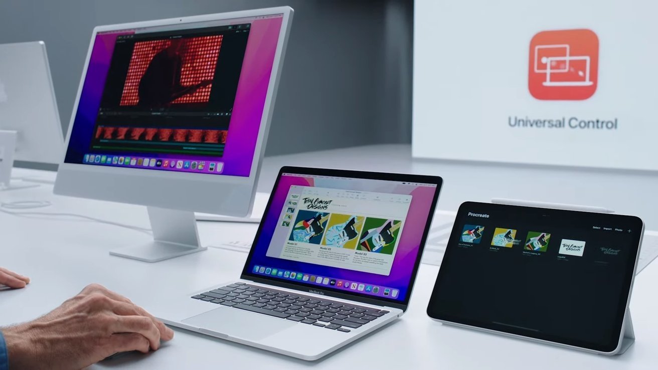
Perhaps you can talk to them about where Universal Control has gone, too. This was the eye-widening moment in the original launch of iOS 15, iPadOS 15, and macOS Monterey — the way that all could be seamlessly used together.
This feature was never officially included in a beta release of any of the OSes. It was available with a hack on macOS Monterey, but that was academic since nothing would get it working on iPad or iPhone.
What you were able to see, though, was just how smoothly operating Universal Control was. If you've ever had two monitors and used Apple's System Preferences to arrange them, you know what Universal Control is like.
Or going to be like, anyway.
Apple Maps
Apple has talked a lot about new features coming to Apple Maps across all its devices, but most are dependent on where you are in the world.
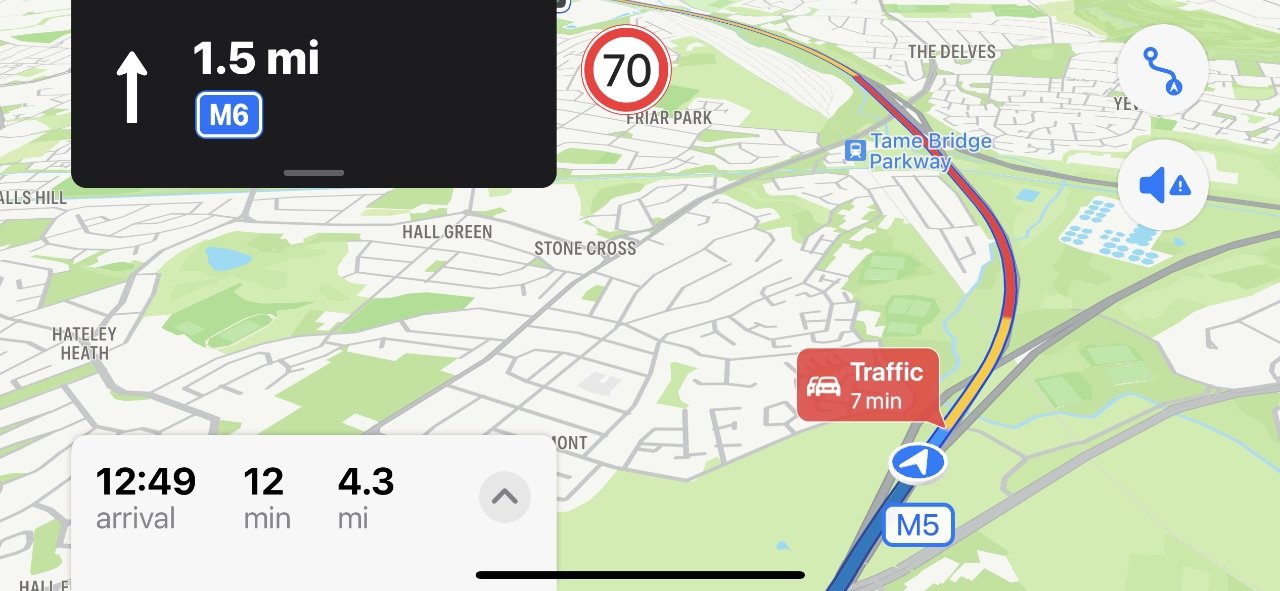
One small but particularly good addition is to do with driving directions. As before, Apple Maps will color-code routes with red meaning long delays, yellow meaning short ones, and blue meaning everything's fine.
The problem was always that you could see a stretch of red ahead of you and not have any way to judge how long it is going to be. Since the map view changes as you drive, there's no one consistent measure that would tell you this delay takes place over one mile, ten miles or so on.
Now in iOS 15, and through CarPlay too, Apple Maps will add a label telling you how many minutes it will take to get through a particular delay.
It's a little inconsistent in that it doesn't always appear, and it can take a minute or so for it to pop up. But it tends to be quite accurate, given how delays do tend to increase.
That small addition is remarkably reassuring, and will often stop you searching for alternative routes.
Disappointingly, though, there continues to be a long-standing bug in Apple Maps driving directions, that means it can get speed limits wrong.
UK motorways, for example, often pass over regular roads. When they do, Apple Maps may pick up the speed limit for that road, and so announce that the motorway is now 30 miles per hour instead of 70.
What else is missing that we wanted
There's probably nothing major that anyone is complaining is lacking in iOS 15. There will be some features on some Android phones that someone will be saying Apple should do, but nothing significant.
It is a different situation with the iPad, though. From the very earliest days of the iPad, some users have really wanted it to be a Mac and now it has the same hardware as one.
So there have been crossed fingers that key Mac apps like Final Cut Pro would be released, that iPadOS 15 would support major power software like that.
It's now true that having the M1 processor means Apple made the iPad Pro preposterously more powerful than rival tablets, instead of just ridiculously so. And the hardware performance jump that the M1 provides doesn't yet seem to be exploited by software.
Apple does keep saying it won't merge the Mac and the iPad, though. And apps like Procreate are using the new capabilities.
So the idea that iPadOS 15 would enable apps like Final Cut Pro, or Logic Pro, to come to the iPad, remains wishful thinking.
Should you upgrade?
It's hard to go back to iOS 14 and iPadOS 14. That's how good this update is, and that's not even including the missing and promised features.
Yes, but not immediately. Give it a week or three for everyone else to find the bugs, and Apple to fix them.
Most importantly, check that every one of the apps you depend on is confirmed as compatible with macOS Monterey. Most will be, but some developers will wait until the official release before completing their own updates.
Even if a small utility you use twice a year isn't working with Monterey, though, it's a pain, and means you should stay on Big Sur.
Pros
- Live Text
- Focus Mode
- Tab Groups in Safari
- Overall stability and performance improvements
Cons
- Certain promised features are delayed
- No Quick Notes on iOS 15
- iPadOS 15 can't run apps like Final Cut Pro
