Apple's latest macOS 10.15 Catalina breathes a fresh new vitality into the last seven years of Macs and macOS.
Many of macOS Catalina's new features have migrated in some form or other from iOS, including new media apps that replace iTunes; focused Tiled Window management similar to iPad; the new iPad Sidecar and Continuity Sketch; the powerful new Voice Control; Screen Time; a new Find My app, richer Reminders and shared Notes; and a whole new world of Catalyst apps from iPad and Apple Arcade gaming. There are also many other Mac-specific features under the hood.
Here's what Catalina delivers and why it's so important to the future of the platform.
Welcome to Catalina
The new macOS 10.15 Catalina takes its name from a large island off the coast of Los Angeles that was acquired by chewing gum magnate William Wrigley, Jr., a century ago in 1919. Wrigley bought the island after a devastating fire nearly destroyed Avalon, its primary outpost.
Wrigley then invested in building the infrastructure, utilities, and attractions that have supported the island's tourism over the last ten decades. Outside of glass-bottom boats, snorkeling with colorful fish, beaches, restaurants, and a landmark casino at Avalon, much of Catalina Island was purposely left untouched to support a wilderness of wildlife.
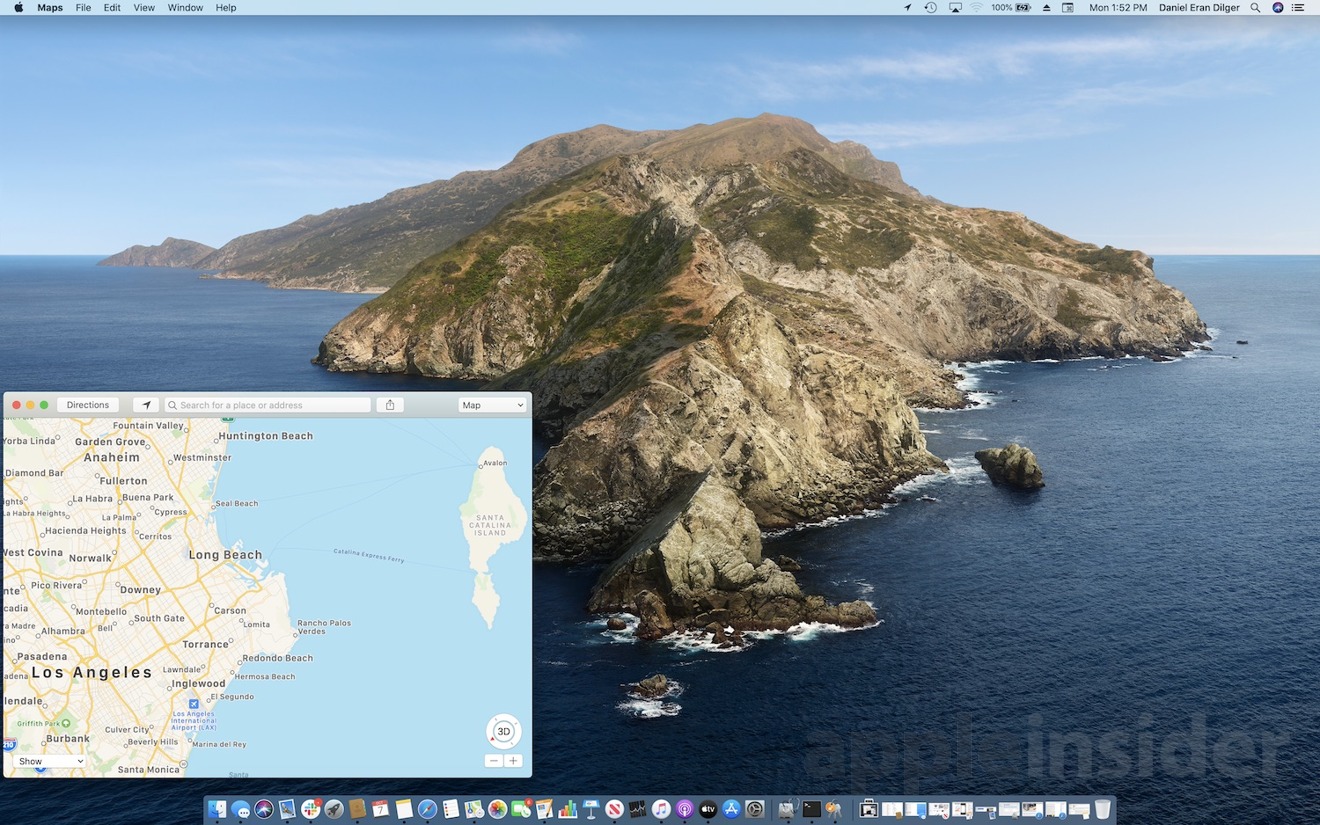
It's appropriate that Apple's 2019 update to the Macintosh operating system carries the name of a California landmark that has long served as an iconic getaway from the hustle and bustle of the city, a place that attracts talent and investment, hosts various styles of entertainment, and offers a wild frontier for exploration. Apple features that rugged coastline of the wide-open northwestern tip of Santa Catalina Island as its default Dynamic Desktop image that shifts from light to dark when set to match the time of day automatically.
Reviewers of new Apple OS releases used to offer their thoughts on whether or not you should upgrade. However, that's not relevant anymore; it's a no-brainer to upgrade to Apple's latest software as soon as practical for your situation. For more than a decade, Apple has demonstrated an ambitious yet carefully planned update schedule for its software platforms from iOS to macOS, delivering updates brimming with solid and attractive advancements.
So, let's instead review what exactly the new Catalina works to enhance on the Mac and why, then look at factors that might affect when you choose to update your Mac. We'll also talk about Apple's strategy for Catalina, showing where its plans to take its desktop OS in a world where most of Apple's billion and a half active installed base of devices are mobile iOS devices.
Catalina's rapid advancement fueled by Apple's iOS rocket
With the release of macOS 10.15 Catalina, Apple's desktop macOS X platform is now 18 years old, the same age the "classic Mac OS" was when it was officially retired in 2002. Yet, rather than coasting off to sleep around version 7.x back in the 1990s, today's modern macOS is on its 16th major version. Apple's pace of real, practical innovations and its core improvements to system security and performance have never been faster or more significant and reliable.
Back in a 1994 interview with Rolling Stone, Steve Jobs had something to say about it, following his ouster.
"The Mac was frozen in time. The Mac didn't change much for the last 10 years. It changed maybe 10 percent. It was a sitting duck," said Jobs. "It's amazing that it took Microsoft 10 years to copy something that was a sitting duck. Apple, unfortunately, doesn't deserve too much sympathy. They invested hundreds and hundreds of millions of dollars into R&D, but very little came out. They produced almost no new innovation since the original Mac itself."
Just over two years later, Apple acquired Jobs' NeXT, Inc. and put his team in charge of turning its advanced NeXTSTEP computing and development platform into a suitable replacement for the classic MacOS, as well as completely overhauling how Apple handled its R&D investments. After about four years of internal work between 1997 and 2000, the Public Beta of "Mac OS X" first arrived as the modern OS platform for Apple's Macs in 2001. Apple then delivered a series of regular advances about every two years and initially charged $129 for each major upgrade.
During this "Big Cat" era of paid upgrades, Apple shipped a series of features that ranged from solid — such as the new Safari browser that you're probably using to read this — to the whimsical, excessively ornamented but minimally useful Dashboard of widgets. Dashboard is finally going away entirely in Catalina, but Widgets are still there, they're just architecturally better and easier to access from the Today panel of the Notification Center.
Back in 2007, much of Apple's Mac platform work still was tied up in the transition away from PowerPC processors and Mac Classic software from the '90s. It was just beginning to introduce new support for full 64-bit applications.
Today, Catalina is now ditching an entire era of legacy in drawing the line at only running 64-bit software. That includes the termination of Apple's legacy QuickTime 7 and old apps that relied upon it. Thinning out all the old 32-bit apps and frameworks from Catalina streamlines its codebase and prepares the Mac for a new future of advancement in the upcoming decade of the 2020s.
Since the first iPhone shipped in 2007, the influx of new cash from high volume iOS sales has breathed new life into Apple's desktop platform. Between 2009 and 2013, Snow Leopard, Lion, and Mountain Lion took a step back from just frosting new features on the Mac desktop cake and instead began to focus relentlessly on performance and stability.
Along the way, the Mac also began incorporating many of the features Apple had created for iOS, including the App Store, multitouch gestures on the trackpad, iCloud documents and data, mobile-savvy Messages, and Notification Center. Over those last years of California-named releases that began with 2013's Mavericks, macOS also began copying the free, annual OS updates Apple had introduced earlier for iPhone back in 2007.
If you bought a new Mac in 2012, you've now been offered seven major annual updates for free in the years since, software advancements Apple once would have charged over $900 for in years when Mac software engineering had to support itself rather than being subsidized by the wealth created by global sales of well over a billion iOS devices — something even the most optimistic observers of Apple could never have imagined.
Over that time, a flurry of very valuable features began pouring out of Cupertino, largely fueled by the R&D already paid for from profits originating from the much larger installed base of iOS. Out of Apple's labs came iBooks, Maps, Photos, technical advances including Metal graphics, the fresh new 'clarity and deference' appearance of iOS 7, and increasingly tight integration between iOS and macOS through wireless Continuity supporting the Handoff of documents and phone calls, AirDrop, and Continuity Camera.
Many Mac features don't even exist on other desktop computing platforms, because why would they?
Much of what Apple showed off at WWDC19 this June involved building upon its past efforts. We saw the incorporation of more features of iOS, new shared technologies and frameworks, and a further harmonization and tighter integration with Apple's mobile platforms.
This synergy is also evident in hardware. New Macs with Apple's custom T2 silicon now support features that were originally built for iOS devices, including Touch ID, hardware-accelerated encryption and media codecs, advanced security, Hey Siri, and the dynamic Touch Bar with QuickType— which is essentially an iOS device built into recent MacBook Pros. This year, Catalina also incorporates Touch Bar functionality into its new Sidecar feature enabling an iPad with Apple Pencil to work as a markup display and sketching input device.
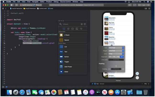
Catalina also introduces the new SwiftUI designed to accelerate the task of programming advanced user interfaces by leveraging the features of Swift; advanced Machine Learning intelligence used internally throughout macOS and in apps such as Photos and Reminders; a huge expansion of Continuity that turns your iPhone into a sketch pad as well as a scanner and document camera, in addition to upgrading your iPad into a secondary Pencil-enabled display for your modern Mac (including a few models released prior to the T2 chip); and the Catalyst frameworks created to adapt existing UIKit iPad apps to run natively on Catalina.
Catalina also brings the familiar experience of iOS media playback apps, delivering a streamlined iTunes experience that is now optimized for Apple Music— although you can still work with your existing library of media downloads and continue to buy from the iTunes Store if you like. There are now separate apps optimized for managing Podcasts, Books and audiobooks, and the all-new Apple TV app for handling TV and movie streaming, rentals, and new subscription Channels offered as an 'a la carte' cable alternative — including Apple's own upcoming TV+ channel of original programming that is set to launch November 1, for $4.99 per month.
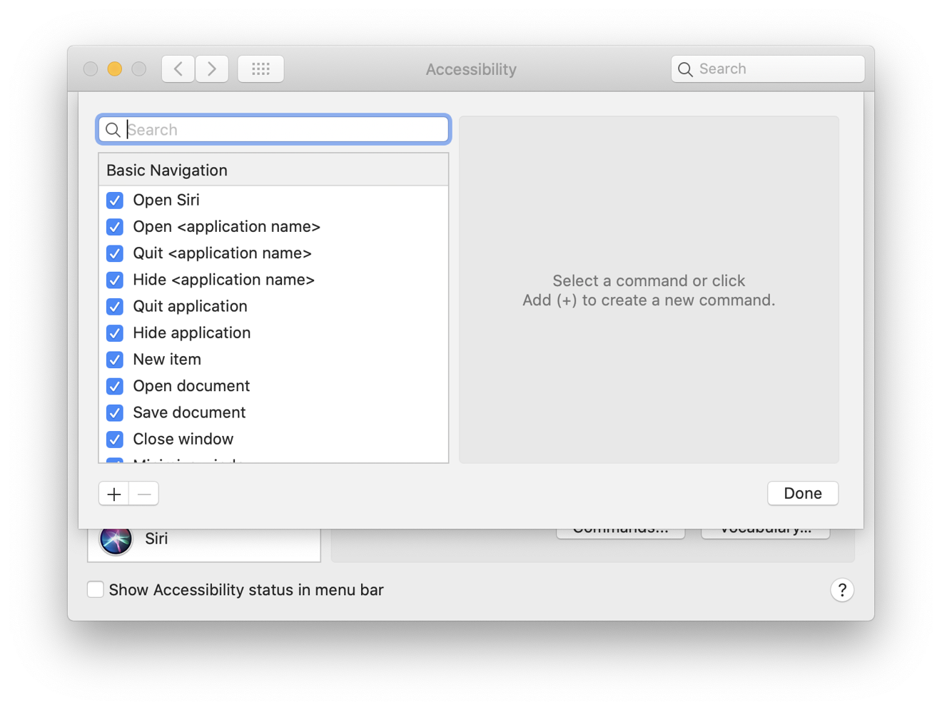
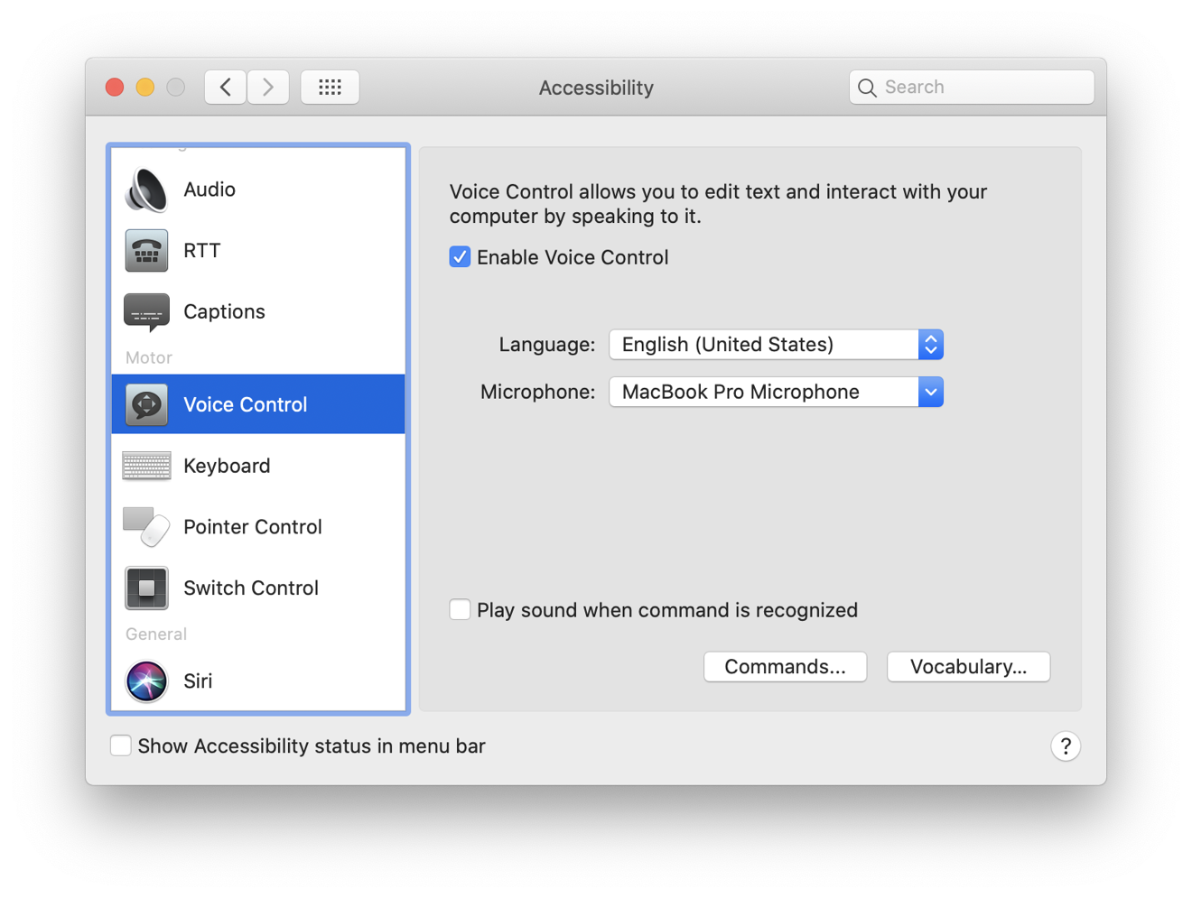
In parallel with iOS 13, Catalina also introduces the new Voice Control for navigating the system verbally. It's an expansion of Enhanced Dictation that lets you not only input text via speech, but also navigate virtually every aspect of the system with your voice.
Like other Accessibility features, it is particularly aimed at opening up the functionality of Apple's hardware to people who can't use traditional input devices. At the same time, it's also a compelling feature enabling new ways for everyone to interact with their devices. At launch, Voice Control is only supported in U.S. English.
Macs are also benefitting from Apple's push into new markets internationally. Also like iOS, there is now a Multilingual Setup for macOS that lets users choose their preferred languages for dictation and keyboard right within Setup Assistant. Apple has also added new support for Indian English Siri voices, 34 new fonts supporting Indic languages, and improvements to keyboard prediction for Japanese and for Cantonese Chinese using the Traditional Chinese Cangjie, Sucheng, Stroke, and Handwriting keyboards.
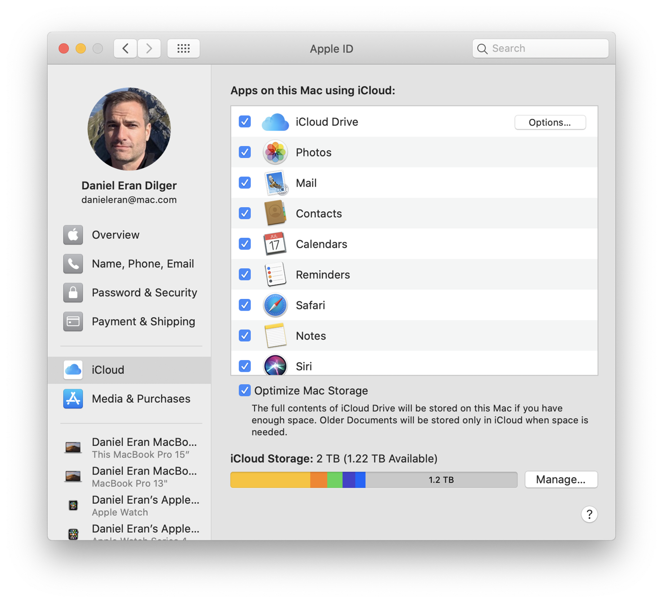
Apple has also enhanced Apple ID setup in Catalina, repositioning it at the top of System Preferences in a layout similar to iOS (above). This makes it easier to access and manage your iCloud settings and all of the information connected to your Apple ID, including Two Factor Authentication and the trusted phone numbers you can use to verify a new account login; your payment and shipping address on file; and your media purchases, including any subscriptions you're signed up for, along with the option to cancel them. It also conveniently lists all of the devices associated with your Apple ID, along with the Apple Pay accounts set up on each, and a link to "Find My" each device.
Oddly, this Find My link still takes you to iCloud in your web browser, not Catalina's new Find My app. On the other hand, Catalina's System Preferences takes you to the Mac App Store app to manage your Apple ID settings, a step that requires to you log in again— with no help from Touch ID or Keychain Access.
You're so frequently forced to cough up your Apple ID password that it's not just a nuisance, but also trains you that typing it in repeatedly is normal. That's a behavior that seems like it would make it easy for a rogue third-party app to ask users for this on the sly.
One of the problems I ran into in updating devices throughout the beta period was the constant demand for logging into my Apple account over and over again, something that Touch ID should seem capable of handling for me. The subject of authentication— balancing security with simplicity— is something Apple continues to work on.
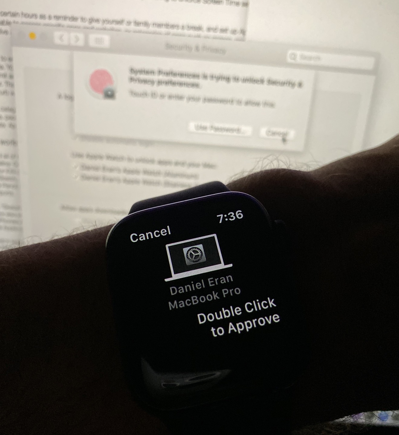
Along those lines, while Touch ID seems to be more broadly supported as a way to authenticate, there are still places in System Preferences where you're prompted to enter your password without any support for Touch ID, such as when enabling Apple Watch to unlock your Mac. However, once you set this up, it unlocks a new feature where almost any prompt to authenticate, from installing a new app to setting an admin level preference, can use either Touch ID or an alert on your connected Apple Watch.
This feature, new to Catalina, prompts a vibration on your Watch along with a message to double click on its button to authenticate. You can also use Apple Watch to authenticate in apps that support Touch ID, such as opening a password-locked note in Notes.
This brings the convenience of Touch ID authentication to Mac users who don't have Touch ID, but do wear an Apple Watch.
One of the hotly anticipated new features of Catalina is support for collaborative Dropbox-like sharing of iCloud folders. This isn't yet available, but Apple notes that it is "coming soon" in an update later this fall, which could be as late as 10.15.2 in early December. It would be nice to have this now, but I'd rather wait until Apple deems the new service as being safe, reliable, and robust enough for production use.
Another feature that was formerly held up in the betas is macOS Recovery using Time Machine snapshots. In normal operation, Time Machine backs up files to a selected external disk and also saves local "snapshots" on your APFS boot volume as space permits.
Time Machine has been saving local snapshots since macOS 10.13 High Sierra, but now macOS Recovery supports the ability to roll back your system to a recent snapshot. This could be useful if you install a software update that causes problems for one of your apps; backing up and then restoring to an earlier snapshot will roll back the update and allow you to work as if it had never happened.
This needs to done promptly, however, as the system throws away local backups after 24 hours.
Should you upgrade? Yes, but timing is an important consideration
We (and perhaps you) have been working with Apple's Public Betas all summer, running into issues and wonkiness that Apple's engineers have been working to quash in the months since the first beta was delivered to developers in June at WWDC19. Despite massive improvements, there are certain to still be some surprises lurking in the initial 10.15 release. Some of these may be inconsequential, while others may affect your particular workflow.
If you are an early adopter of technology, you've probably already loaded up a Public Beta by now. The latest GM should be nothing more than an improvement. But, if you use professional or specialized software or utilities that are not updated through the Mac App Store, including drivers for certain hardware peripherals or low-level disk imaging utilities, it's probably wisest to let others get failure data for you.
Furthermore, Apple has already made it clear that Catalina will officially end support for some deprecated software of its own. This includes Apple's Aperture, which hasn't been updated since 2014, as well as the old QuickTime 7 and apps that use it rather than the modern media frameworks Apple has replaced it with.
Added to this, Apple's new media frameworks are optimized for hardware-accelerated codecs. If you have old media files from the days of QuickTime, you might need to convert them or at least retain a pre-Catalina boot drive that allows you to work with these legacy media files in the future.
The move to 64-bits
Catalina is also the end of the road for 32-bit apps, or apps that make use of 32-bit frameworks or installers that haven't been updated to work as 64-bit code. This is no surprise — Apple has been warning its developers for years that 32-bit code would eventually stop running, so most 32-bit apps have been updated already.
If you're still trying to run iWorks 09, Office 2011, Adobe Creative Suite 5, or other ancient software that's roughly a decade old, Catalina will push you to upgrade into the present era.
If you are still using a very old version of an app that isn't automatically updated via the Mac App Store, you might need to find and upgrade these titles on your own. Examples include popular but old titles such as Transmit 4.1.7 (current version is version 5); VMWare Fusion 3.1.4 (now at 11.5); Parallels (latest version is 15); and QuickBooks 2015 (there's now a 2020 edition). Old versions of anti-virus software are also likely to be unsupported.
We've gone over how to see what's still 32-bit and installed on your system many times before. I pulled out an old MacBook I had laying around with macOS 10.13 High Sierra on it, and even it only identified a few titles that wouldn't run on Catalina. They included very old versions of Transmit, TextWrangler, SuperDuper, Dropbox, djay Pro, NetNewsWire, old Canon printer software, and the Adobe Flash Player Installer. The list also some old Apple software, including the DVD Player and InkServer for pen input.
Suffice it to say, most 32-bit software is really old stuff. The end of 32-bit apps probably isn't a real issue for you unless you are hobbling along with a museum collection of really ancient apps and games. During the Catalina installation process, any remaining apps that aren't supported will be flagged for you, but reviewing any 32-bit apps you use beforehand is a good idea if you don't want to deal with interruptions or surprises.
Drivers, Kexts, and TCC restrictions
Hardware drivers and other low-level software were formerly installed within the macOS kernel as "kernel extensions" (kexts) for performance reasons. In Catalina, that's no longer necessary. Drivers for USB devices, cloud file providers, and network monitors are now run in user space just like any other app, so if something goes wrong they can't crash the operating system.
This move may require updated driver software from hardware vendors to work with Catalina. Because peripheral drivers, cloud file providers, and other low-level software no longer requires a kext, this software can now be made available through the Mac App Store.
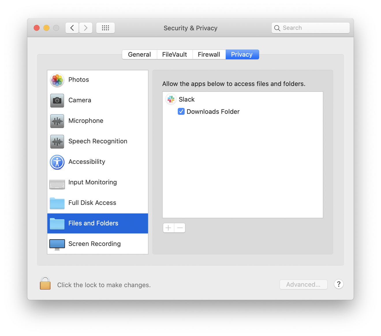
Similar to previous efforts on iOS and earlier restrictions in macOS, Catalina imposes new app restrictions that demand your approval before apps can access files in your Documents and Desktop folders, iCloud Drive, or on external volumes. Apple refers to these policy restrictions as "Data Protections" or more broadly TCC, for "Transparency, Consent, and Control," putting you in clear, aware control of what's happening on your system.
New TCC policies in Catalina also prompt you to approve any app before it can capture keyboard activity, or take a photo or video of your screen. A variety of apps have been pushing the boundaries of spying on users in the same way that Smart TVs and Android devices have turned surveillance data collection into one of their primary profit sources. Apple keeps blocking these efforts on both its Macs and iOS devices.
Not allowing TCC access to an app shouldn't cause compatibility problems, but it may prevent the app from working as expected.
The new Read-Only System Partition
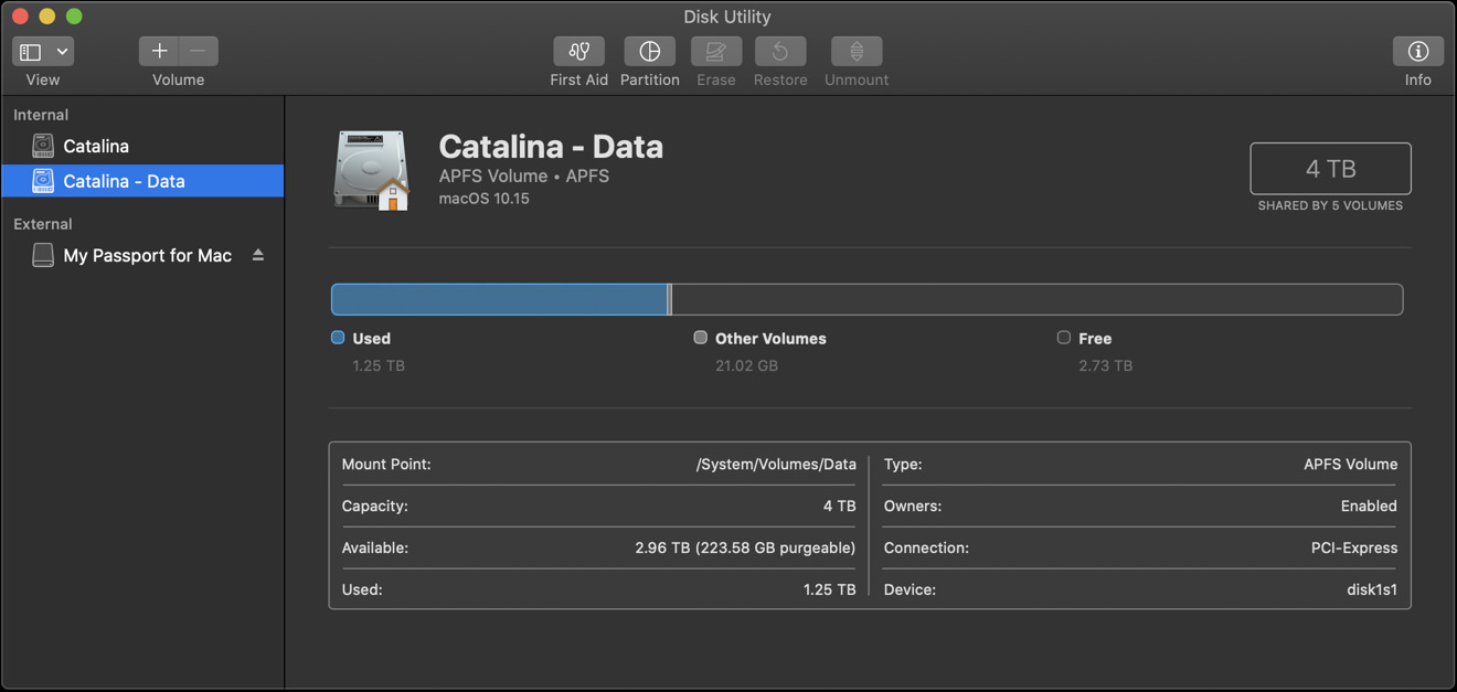
Catalina changes your hard drive's partition scheme to create a Read-Only system partition separate from the partition where all of your data is saved. This helps to protect core system software from being overwritten by malicious or buggy software and is an expansion upon the concept of System Integrity Protection that Apple first introduced in macOS 10.11 El Capitan.
This new partitioning scheme takes advantage of the Apple File System (APFS) first introduced in macOS 10.13 High Sierra, which can safely repartition a disk in place. Starting with macOS 10.14 Mojave, Apple automatically began converting HFS+ users to APFS. In Catalina, APFS is now mandatory for all boot volumes.
Apple has done the work to make sure that properly coded software won't even notice the Read-Only system partition change, using what it calls "firmlinking" to stitch the two partitions together into a "volume group." From the Mac desktop, the Finder presents both partitions as if they were still one volume.
From Disk Utility, however, you can see that Catalina resizes your drive into a Read-Only partition and creates a new Read/Write "Data" partition. This new partition is where all the apps you install are saved, as well as all of your user data.
Older low-level software that made assumptions about the location of system software may run into problems on Catalina. Mike Bombich, the developer of Carbon Copy Cloner, updated his title to work with Catalina this summer. In a blog posting, he succinctly summarizes how the new system works under the hood.
As with the transition to 64-bit apps, Apple has enforced compatibility with Catalina's new Read-Only system partition for Mac App Store titles, so the new change is only an issue for you if you use third-party apps obtained outside of the App Store.
Hedging your bets by installing Catalina on a separate volume
APFS supports the ability to create a new volume on an existing disk. This allows you to install Catalina on your Mac within a new volume, without overwriting your existing installation of Mojave. You can subsequently boot from either system using Startup Disk in System Preferences. Note that having multiple versions of macOS on your system will use up lots of extra space and that each will need to be kept updated to the latest OS version separately.
You'd only want to do this if you are concerned about Catalina being compatible with your older apps, or if you have some reason to boot back into an earlier macOS version for testing purposes. Apple also recommends this as an option for users who want to remain in the public beta program, and want to maintain these advanced updates separate from their regular system.
For most users, installing Catalina in place over your existing installation should not be a problem, and spares you the complication of having to erase your previous install volume at a later date, or waste around 20GB of storage plus any duplicated personal data maintaining a secondary macOS installation.
Waiting a point or two
There's also another option you might consider: waiting a month or two for Apple to finish its first or second point release of Catalina. For professionals who can't afford to discover and address any surprise update issues with their specialized gear or workflows involving pro apps, the new features of Catalina can be postponed until it appears safe to take the plunge. It's also common practice for enterprise users to wait some period after a major release to make sure there aren't any issues with their custom corporate apps.
Last year, Apple delivered 10.14.1 at the end of October, about a month after Mojave originally shipped, and 10.14.2 about a month later at the beginning of December. That's been the general release pattern over the last several years of macOS releases, so you can plan your update around those milestones if you are in the middle of a large project or otherwise want to delegate the discovery of any surprises to your fellow Mac users.
Also keep in mind that software update issues can occur with any new release and that important fixes can be delivered rapidly after they are discovered. Back in 2017, nearly a month after the release of macOS 10.13.1, a major security issue was discovered. Apple was already aiming to deliver 10.13.2 within about a week, but it immediately published instructions on how to fix the issue and shipped out a security update to patch the problem the very next day.
While it makes sense for some users to be cautious when making a major upgrade, unless you have real cause for concern about your specific workflow, you can be pretty confident that Catalina is safe to install now and that any serious issues that are discovered will be addressed by Apple rapidly.
Catalina requires a Metal Mac with a California macOS install
Of course, installing Catalina is also dependent upon Mac hardware support. Minimum requirements for the new macOS Catalina appear to be nearly the same as for last year's Mojave: Mac computers that support Metal. It will require at least a Late 2012 iMac or Mac mini, or a Mid 2012 MacBook Air or MacBook Pro. It also, of course, runs on any new 2017 iMac Pro or new Retina MacBooks (released in 2015), and supports all of the black cylinder Mac Pros (released since 2013).
One apparent change: Catalina does not support the 5,1 Mac Pro tower models back to Mid 2010, which were supported in Mojave if equipped with a Metal-capable graphics card. These machines are now six to nine years old, and Apple has now provided a solid upgrade path for Mac Pro users with its newest machines announced at WWDC19.
On supported hardware, you can upgrade to Catalina directly from any "California named" installation, meaning macOS 10.9 Mavericks or later. Note that Catalina will both update an HFS+ boot drive to APFS, as well as repartition the boot volume to create a separate Read-Only partition for core system data (a little less than 20GB) and a regular Read/Write partition for Data, which will grow as needed until your drive is full.
You should back up your existing system using Time Machine before performing an install. Make sure you free up at least 20GB of space in preparation for installing Catalina.
If you are running at least macOS 10.12 Sierra, you can go to About This Mac, click the Storage tab, and click the Manage button for the drive you want to install onto. This will offer options to Reduce Clutter, Store in iCloud, and Optimize Storage.
The first option identifies large files you might no longer need. The second offers to upload Desktop and Documents; Photos; and Message to iCloud and remove these from your local drive, downloading them only as needed. The third removes iTunes movies and TV shows you've already watched and gets rid of any local copies of older mail attachments you've downloaded.
Apple's "flexible, expansive, capable, and focused" computing platform
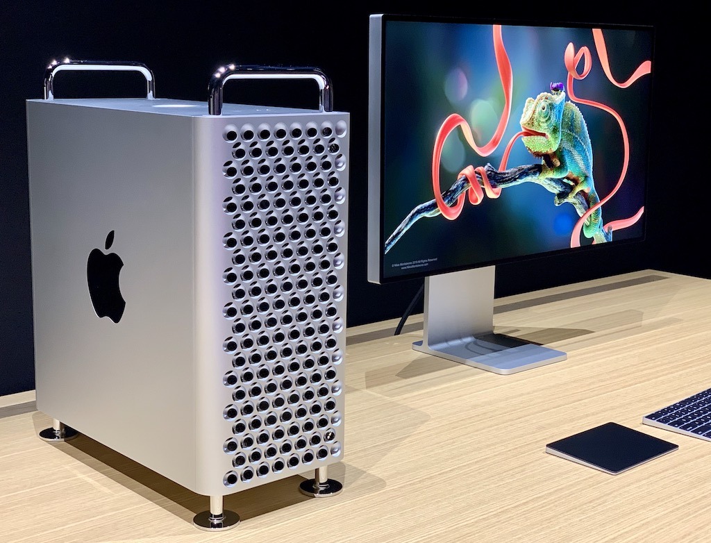
Just because Apple is bringing over technology from iOS — including new Catalyst iPad apps — doesn't mean that it's giving up on the things that have made the Mac unique and powerful. One of the clear messages at WWDC19 was that Apple was investing massively at the high end with its new Mac Pro hardware designed for extreme performance in creative and computing workflows that simply aren't possible on mobile devices. That includes running Apple's Xcode to develop software for all of the iOS devices out there.
Across the board, from the iMac 5K and iMac Pro to beefier Mac minis and high performance new MacBook Pros, Apple has positioned its Mac hardware as a premium tier of powerful computers, capable of doing complex, conventional desktop work.
Apple's push for more Mac games
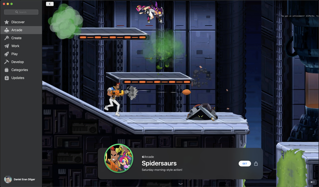
For years, Apple has struggled to woo video game developers to its minority desktop platform. Apple Arcade promises to literally change the game for Macs by encouraging and enabling its iOS Arcade partners to bring their titles to the Mac.
These aren't just simple iPad games playable in a Mac window. At WWDC19, Apple demonstrated developers' early efforts to bring titles to the Mac, showing off how games originating on iOS could easily be adapted to take advantage of more memory, larger displays, and higher performance GPUs to deliver Mac games that look and feel native. Apple Arcade will also enable gamers to move effortlessly between the same games running on their Mac, iPad, iPhone, and Apple TV, starting where they left off on another device.
Apple is emphasizing that Arcade games will be ad-free and not include (or require) In-App purchases; all game features and updates across the expanding library of titles are included in the $4.99 subscription price. Subscribers can play online or offline, meaning games you download will work even without an Internet connection, and a subscription will support play across a family of up to six players.
Families can also set playback limits with the new Screen Time, filtering out allowable games by age rating or other criteria. Privacy is also a core feature of Arcade, with Apple assuring gamers that titles won't collect personal data or track information about what games they play without their permission.
Another new aspect of gaming that Apple has addressed in both iOS 13 and Catalina is support for popular Bluetooth gaming controllers. In addition to existing MFi controllers, Apple has also expanded controller support to Sony's PlayStation DualShock 4 and Microsoft's Xbox Wireless Controllers with Bluetooth. This enables Mac, Apple TV, iPhone, and iPad players to dive into more complex and sophisticated gaming titles from the App Store and through the new Arcade.
Apple's push for more Mac software
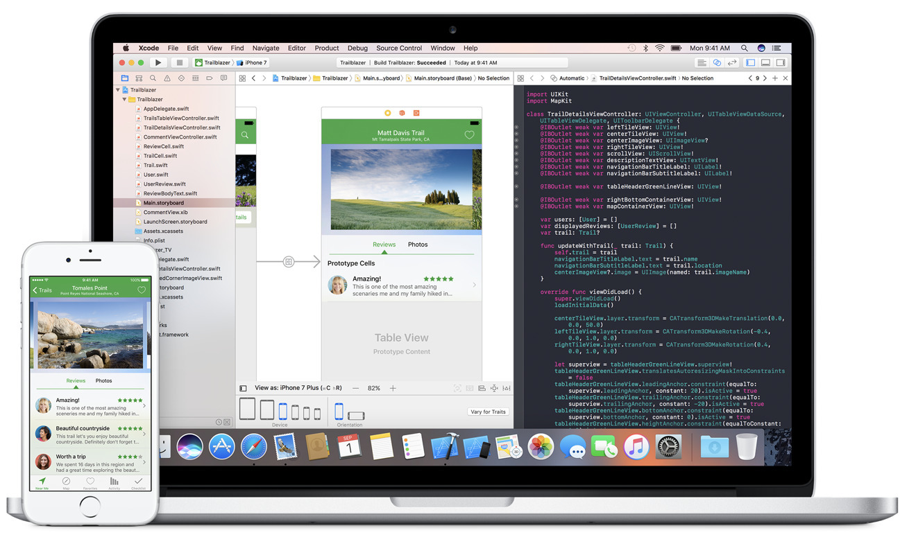
The absolute biggest new thing for the Mac this year is effectively something many end users won't directly appreciate, but they will certainly benefit from it. It's Xcode 11, Apple's integrated development environment for building and debugging the software that runs across Apple's platforms.
While many of the features of Xcode 11 are highly technical — Apple offers an accessible overview on its developer site — the new version notably provides an intelligent Assistant Editor that automatically presents relevant files for reference while you work in the primary code editor; a new minimap that presents a thumbnail view of long stretches of code so you can visually jump between regions quickly; support for SwiftUI and its new drag and drop design tools for rapidly prototyping and visualizing in real-time how UI code will look across a variety of devices; and Catalyst support for building native Mac apps from iPad code projects, complete with the power to submit the finished app to the Mac App Store or notarize it for flexible distribution independently.
Xcode 11 is important even to Mac users who never plan to learn app development on their own. That's because developers will have increasingly sophisticated tools to make them more productive and efficient in writing new Mac apps, enhancing and debugging their existing titles, and in bringing many existing iPad titles— including games— to the Mac.
Xcode 11 and Catalyst will enable more "rich app" native experiences for Mac users who would otherwise just get a web app (think of Twitter), as well as a broader selection of interactive and educational tools. At WWDC19, Apple demonstrated "Fender Play," a video-based title for learning to play guitar. Another example cited on its developer site is Proloquo2Go, an existing iPad title designed to enable people with disabilities to communicate visually. Now it runs on Mac.
Pluto TV is another developer making use of Catalyst to deliver a Mac version of its software. The Mac edition will enable desktop users to watch live TV from over 150 broadcasters including BBC, Comedy Central, and CNN, as well as streaming a library of on-demand movies and TV shows for free.
Other new apps making use of Catalyst to support Macs include Crew, a group chat, scheduling, and task assignment app designed for small business employees, and Zoho Books, an accounting program coming to the Mac with support for Touch Bar, notifications and keyboard shortcuts. Other popular iOS apps, including GoodNotes, Rosetta Stone, Post-It, Carrot Weather, TripIt travel planning, and graphics design title Vectornator are also leveraging Catalyst to arrive on the Mac as native apps.
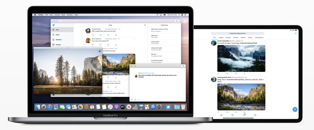
Catalyst is designed to leverage the same code across platforms, with an appropriate appearance and features
Effectively, Catalyst leverages the efforts of third party programmers serving Apple's hundreds of millions of iOS users. Catalyst makes it easy to bring their feature-complete efforts to the Mac, where there isn't as big of an installed base with the critical mass required to drive smaller niches of demand.
That's critically important to a wide range of specialty users, from corporate enterprise development teams to smaller startups seeking to reach the most users as effectively as possible.
New Mac Augmented Reality tools
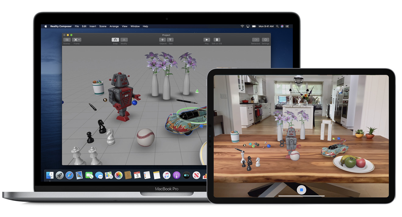
Another forward-thinking development idea being introduced in macOS Catalina is Reality Composer, Apple's new app for building Augmented Reality worlds. Apple could have named its new app "Keynote 3D," because it effectively works as a productivity tool for laying out animated USDZ 3D models in space, with attached actions and sound effects that create animated, interactive "presentations" you can view and explore from any camera angle.
You can trigger your defined animations and effects within a "Reality" world via proximity— so that an object begins to interact as you approach it— or at timed intervals or when you tap on it. This enables the creation of the type of rich, interactive AR experiences Apple has shown off at its events— such as the exploded, explorable views of the new Mac Pro at WWDC19— and at its new Apple Park Visitor Center, where iPads allow users to virtually explore around inside various buildings at its new facilities.
The new Reality Composer app produces a "Reality File" that you can preview in 3D on the Mac using QuickLook or Preview, and view in full AR on an iOS device, placing your interactive model into the camera's immediate view. Reality Files can also be incorporated into technical, educational, or exploration apps to make it easy for even non-technical authors to build interactive, animated experiences that can be experienced in AR.
Developers can further take advantage of the new RealityKit framework featuring a Swift API in Catalina to programmatically build AR scenes that feature the same kind of animations, physics, camera effects and ultra-realistic looking, physics-based rendering with drop shadows and environmental reflections that Reality Composer can create. Apple has also enhanced ARKit to apply motion blur and even camera grain to AR graphics in order to make them look more realistic when viewed through a mobile camera, composited on real-world video.
Apple is investing a lot into making the Mac into an AR creation machine. The rapid advancements in ARKit over just the past year might make it seem like Apple is throwing a lot of resources at a technology that might initially appear to be best at simply adding some extra novelty to games. But at WWDC19, two comments jumped out at me that really underlined why Apple is making AR such a priority, and why today's ARKit isn't a repeat of initiatives like Apple's mid 90's QuickTime VR— a fun, futuristic platform for creating explorable worlds that never really found its niche.
There's a real business model supporting the use of AR in commerce apps. Companies that have embraced AR as a way to demonstrate the placement of products right in a customer's home have seen an increase in sales of around three times. Money makes things happen!
Additionally, developers working in education noted that AR has been significant in grabbing and retaining the attention of young people. You might think of it as the modern equivalent of seeing the teacher roll the VHS player into the classroom. When you see young minds light up, that power of engagement in education is just as compelling as money.
It's not hard to speculate about where Apple might be taking AR in the future, from 'video AirPods for your eyes' to perhaps windshields. Whatever future hardware arrives to make AR even more relevant and engaging than today's iOS devices, Apple wants to be ready for it with a platform that can build the "reality" for AR and VR experiences. That future is arriving quickly with the expanded AR development tools and frameworks in macOS Catalina.
Mac as a Machine Learning creator
Along with AR, Apple has also made a big push into Machine Learning. iOS devices are now capable of performing local ML right on the device, enabling advanced artificial intelligence actions— from object identification to sound recognition to written word comprehension— that previously required an Internet connection and involved some grey areas regarding the privacy and security of your data.
Core ML 3 can now not only run local ML right on your iOS device, but can even personalize ML models so that your apps can learn your preferences and routines and adjust intelligently in a way that's specific to you, leveraging the same type of individual learning that let Face ID adapt to your appearance as you change your hair, glasses, and clothing. This local learning is entirely private to you, so you don't have to worry about apps building detailed dossiers about you that somehow end up on some server that Facebook or Yahoo decided to leave out in the open and totally unencrypted.
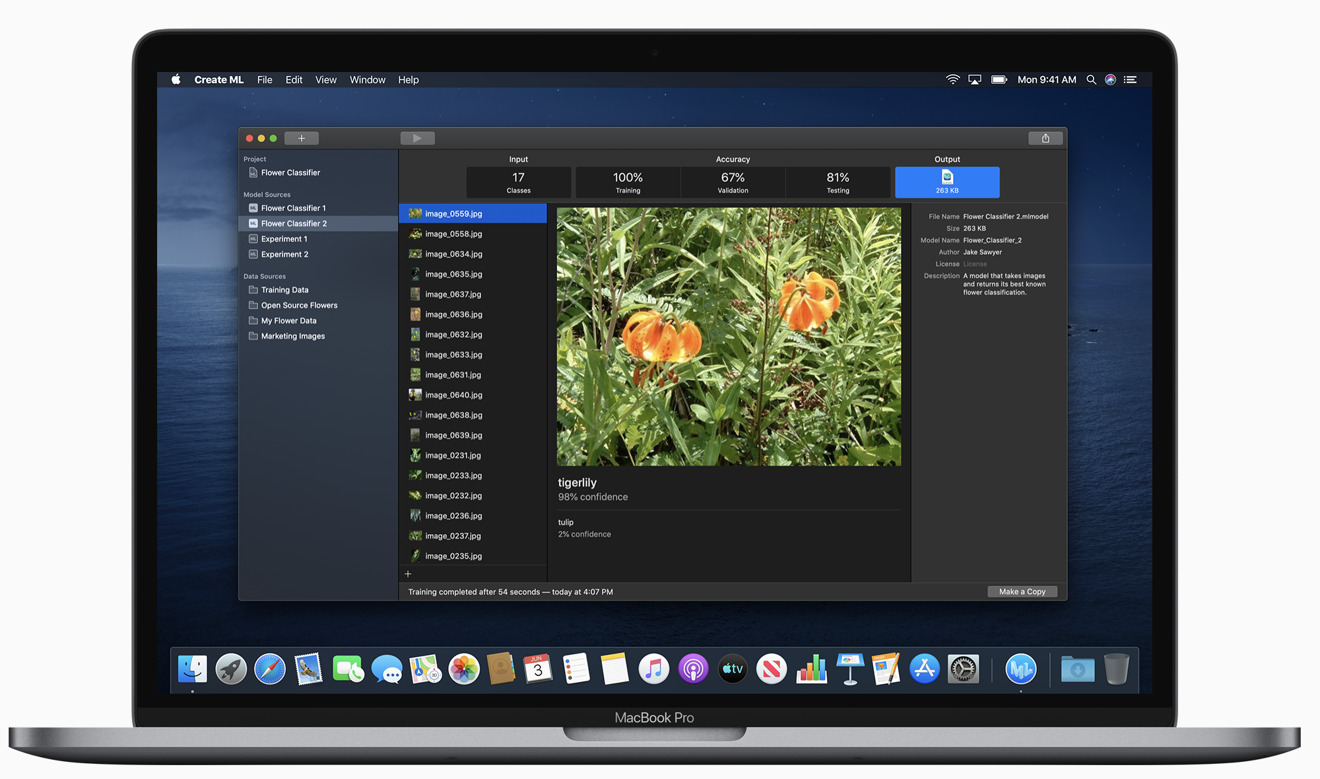
On the Mac, developers can now use Create ML to develop and train their models using libraries of sample data right on their machine, without needing to rely on a model training server. ML training can even take advantage of the external GPU support Apple recently delivered for new Macs, leveraging powerful eGPU hardware to crunch through computationally complex ML training sessions.
In parallel with ARKit and Reality Composer, Create ML is building out an entirely new creative purpose for Macs, both in developing intelligent Mac titles as well as iOS apps with super-smart intelligence that grows and develops over time. In Catalina, Apple is working to make these tools both easy to use and powerful.
Apple's revamped Photos 5.0 with advanced ML
Over the past two decades, Apple has created and evolved a series of "iApps" that it began bundling with its new Mac hardware. Catalina's Photos 5.0 introduces a series of new Mac features that are also being released in parallel for iOS 13. In fact, Photos is sort of emblematic of the current direction Apple is taking in its coordinated advancement of both its mobile devices and the Mac.
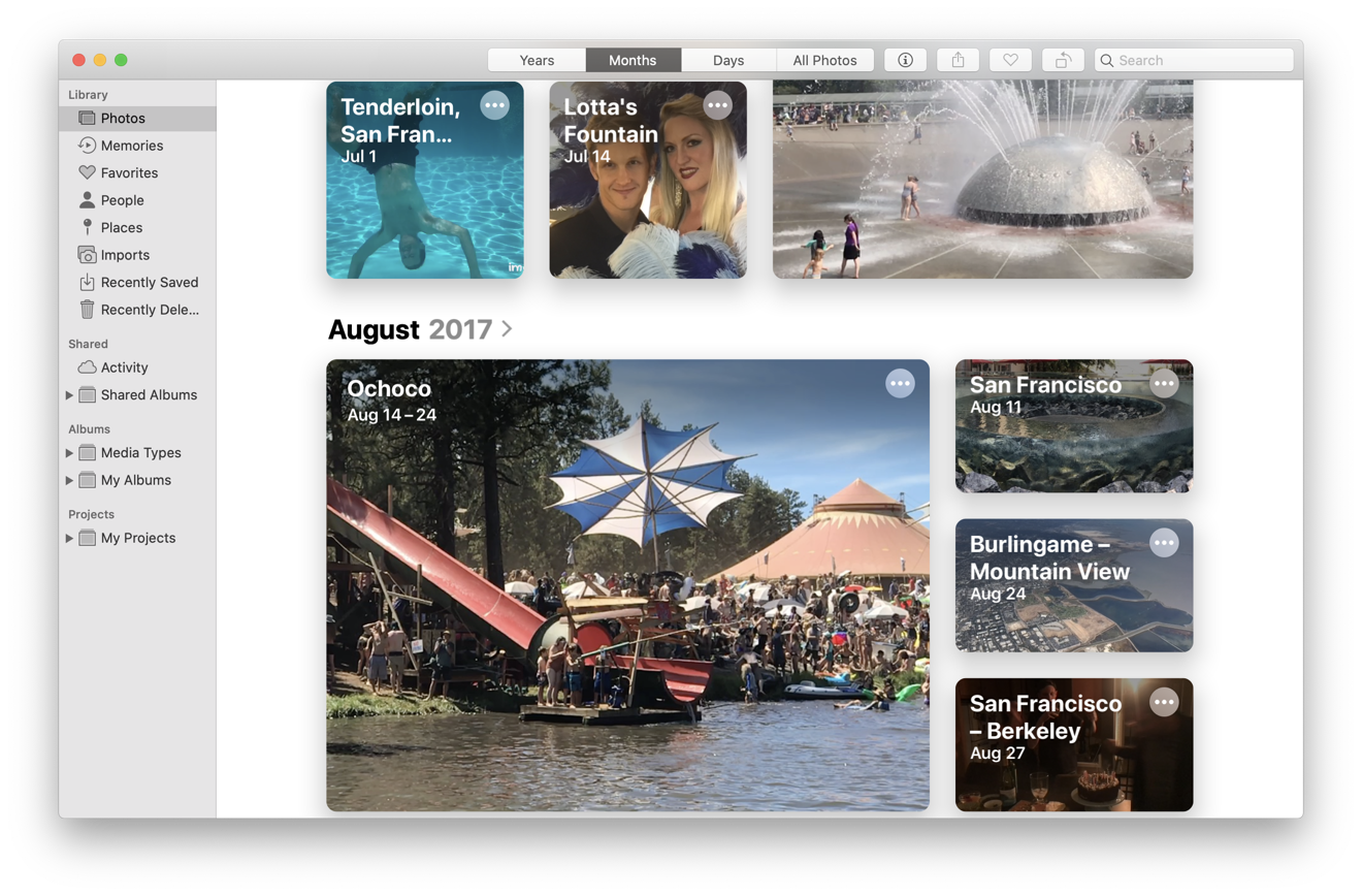
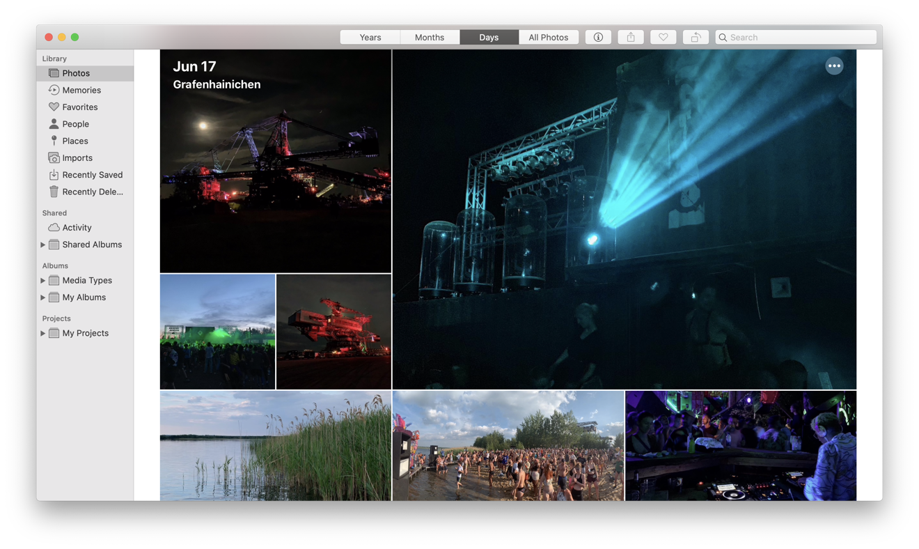
The previous "Photos, Moments, Collections, and Years" grouping of your Photos library is now more simply "Days, Months, Years, and All." The first three present contextual collections of your memories so you can review recent, significant events that occurred across the previous months and years. Photos uses Machine Learning-driven intelligence to identify your best shots, where subjects are in focus and well framed.
Internally, macOS Catalina now supports new ML Vision frameworks that can identify not just the most visually interesting photos, but also the most interesting parts of a photo, a concept Apple refers to as "saliency." The Vision framework can take any photo and intelligently create a heat map of what it thinks will attract a human's attention, such as people and faces.
This enables Photos to automatically crop and arrange your images in Days previews that appear to be professional created albums, presenting your friends, family, action clips, and landscapes in great looking previews. When you open an image, you get the full picture in its original format, and can manually crop and adjust it with non-destructive edits.
The underlying intelligence lays out various sizes of your images along with animated Live Photos and videos that individually spring to life as you scroll through them. It's even smart enough to know not to play everything back at once, creating a vibrant, visually interesting portfolio of your best shots that isn't excessively busy.
For example, in the Months view of my photos below, the Seattle Center fountain begins to animate because I shot it in SloMo, then the underwater swimming video captured using an iPhone plays back, followed by a video of people shooting off the slide at the Eclipse Festival. These sequentially timed, animated events that play as I navigate through my library of monthly photos from a couple of years ago is both nostalgic and touching, and makes me want to dive in and see more images related to specific adventures and travels from that summer.
When you review Months and Years, you see a smaller selection of what Photos deems to be the highlights of recent months or past years. Select a year image and it opens up your monthly albums from that year. Select a month image and it reveals the related top photos from those days.
However, there isn't an obvious way to edit the "thoroughly artificial" intelligent selections Photos comes up with, apart from manually hiding an image it's pulled from your collection as a major event, when in reality it's an embarrassing photo or something that you'd rather forget.
Photos can also create Memory Movies automatically from an event, so all you have to set is a title, mood, and duration. The Memory Movies you favorite are synced across your devices, enabling you to show off professional quality albums and clips on your iPhone or from a living room iPad that serves as the family album of the future.
Apple already delivered the technology to recognize people, places, objects and scenes in previous versions of Photos, enabling you to do advanced searches using this AI metadata. You can even search via Siri, such as asking "show me my photos of clowns in New York City."
Additional "personalization" features now also let you identify important moments like anniversaries, birthdays, and vacations, although sometimes the machine doesn't get this perfectly correct. In particular, the intelligence that Apple is using to build Memories might end up with some surreal results. For example, Photos created an "Independence Day over the years" memory for me, which included pictures of a BBQ with friends, shots of Apple Pie, fireworks, a mysterious image of some random cars at night, and some irrelevant selfies I'd rather not see distributed widely or shared.
It would be clever if Apple could use some intelligence to segregate your scandalous photos into a personal purgatory folder that isn't used to generate Memory Movies. It would also be nice if you could identify certain specific recognized faces as being "people I don't want to see right now."
My Photos library has over 80,000 photos, some in coherent groups and some just random ideas and experiments. Occasionally I'd see a Memory Movie suggested that was just a single random shot backed by an acoustic guitar with a Ken Burns effect applied. In other cases, such as when viewing a series of pics I took at a music festival under the Days tab — which narrows down your shots to a selection of what it deems to be the best — Photos actually automatically created a nice video sequence that turned out really well.
One of the most impressive aspects of Apple's ML intelligence magic on display in Photos is that the underlying technologies are also openly available to third parties, enabling developers to create their own intelligent apps that can analyze images, videos, text, and even read the words on signs and convert them to text to be analyzed in various ways.
Apple had a lot to say about its ML work at WWDC19, with a focus on doing all this magic while respecting users' privacy and security. So in addition to seeing "more apps" as described above, we're also going to see more intelligent apps— some of which developers already had on display months ago.
One amazing example I saw was Fretello, a guitar learning iOS app from a developer in Austria. An upcoming version uses Apple's Core ML to listen to the sounds you play to provide feedback. It even uses ML video analysis to recognize your hand and finger placement while you play on camera as it teaches you the dexterity to play chords.
Catalina's new Music 1.0
In the same way that Apple moved from iPhotos to Photos four years ago and reverted the app's version number from 9.6 to 1.0, it is now moving from iTunes 12.9 to Music 1.0, aligning the Mac's media player naming conventions with iOS and dropping the venerable but overloaded "iTunes" brand entirely.
However, the new Music app isn't starting over from zero. It appears that the new Music is effectively a renamed and overhauled version of the same AppKit iTunes for Mac codebase. That's actually good news because starting over from scratch generally means a lot of new bugs in all that brand new code, and often also a lot of missing features. The "new" Music still supports features including the iTunes Classic Visualizer, Crossfade, Sound Enhancer, and Equalizer.
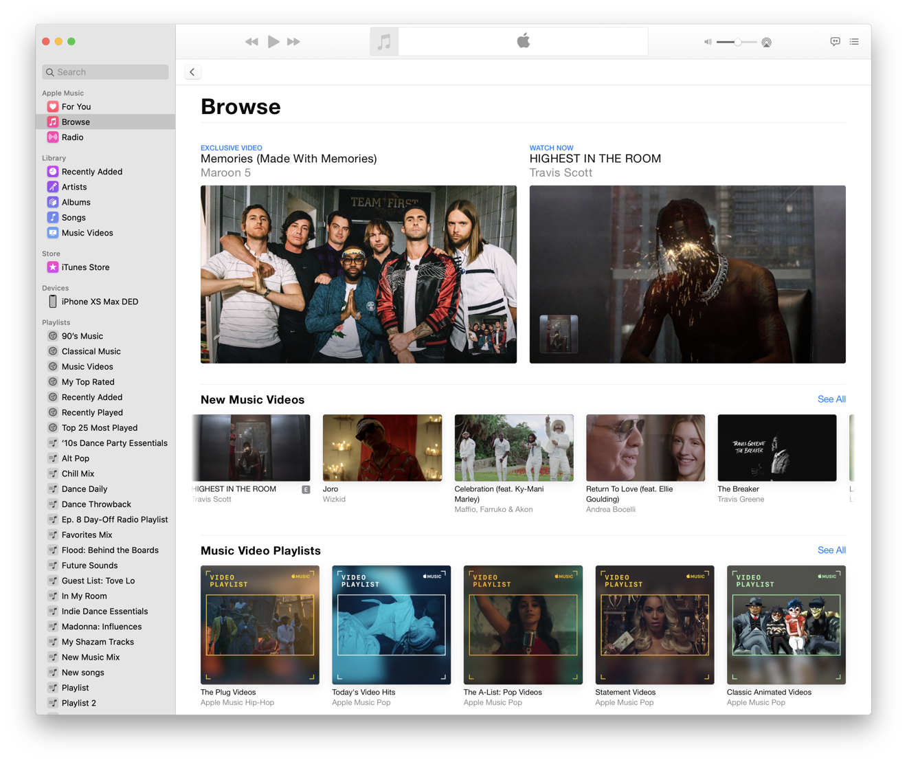
Music features Apple Music's For You, Browse (above), and Radio views; your own music library presented by Artist, Album, and Songs; optionally the iTunes Store; and your devices and playlists in the sidebar. In Preferences, you can disable either the iTunes Store or Apple Music to tailor the Music app to fit your personal style.
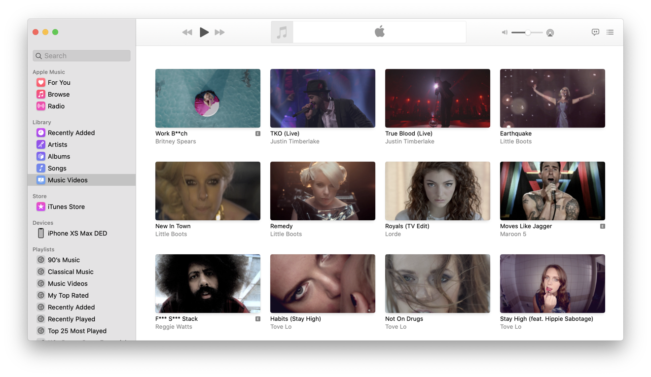
Your own Music Videos remain in the Music app and are now easier to find as a top item of your library (below). Music Videos on Apple Music now seem far more prominent under Browse.
Previously, it felt like Apple hadn't made music videos a priority in iTunes, enabling Vimeo and YouTube to serve as more popular ways to watch them. However, this appears to be slowly changing — Apple is now commonly featuring individual videos at the top of Apple Music, along with featured new videos, its own curated music video playlists, as well as some of its own documentaries and shorts.
In the Public Beta, I had a lot of problems linking to my Apple Music account, in part because the system ran into confusion between my physical location in Europe and the fact that my account is tied to the U.S. store. I could also browse the iTunes Store, but only the Germany version. The store region selection feature didn't work for the iTunes Store, and I couldn't even see an option for configuring my Apple Music region. That's now been fixed, allowing users to change their store region and login from anywhere.
My local library items always appeared to work normally, but while I could see my attached iPhone, I couldn't consistently select it to see songs I'd manually copied over in the early betas. I'm still having problems with manually dragging songs to a mobile device, even after setting up my iPhone to "manually manage songs." I don't have any issues with managing songs on my iPhone directly.
The new Music app also puts a greater emphasis on song lyrics, optionally presenting them as you listen to a song and adding a Music toolbar button dedicated to Lyrics, which were previously buried in the Up Next and playback History panel.
Mojave's version of iTunes saw iterative tweaks but hadn't been radically refreshed since version 12.0 first arrived back in 2014's Yosemite. And, that version was really just a streamlined refresh of the user interface introduced in iTunes 11, which first appeared seven years ago in 2012 with Lion.
It's a bit surprising that Apple didn't address its sprawling, monolithic mess of a mega-app earlier, considering how important iTunes has been for Apple. The way people use iTunes has changed dramatically over the last 18 years, while the app itself has largely remained the same, even as it bolted on various new features. Actually, Apple did address iTunes, it just did so only on iOS. In macOS Catalina, that same task-based, distributed app overhaul is now coming to the Mac.
Podcasts
Other non-music features of iTunes are now delegated to standalone apps. Podcasts are obviously in the new Podcasts 1.0 app, which provides a clean, streamlined interface devoted to the programs you listen to without the other clutter of iTunes. it's similar enough to Music so that it's instantly familiar.
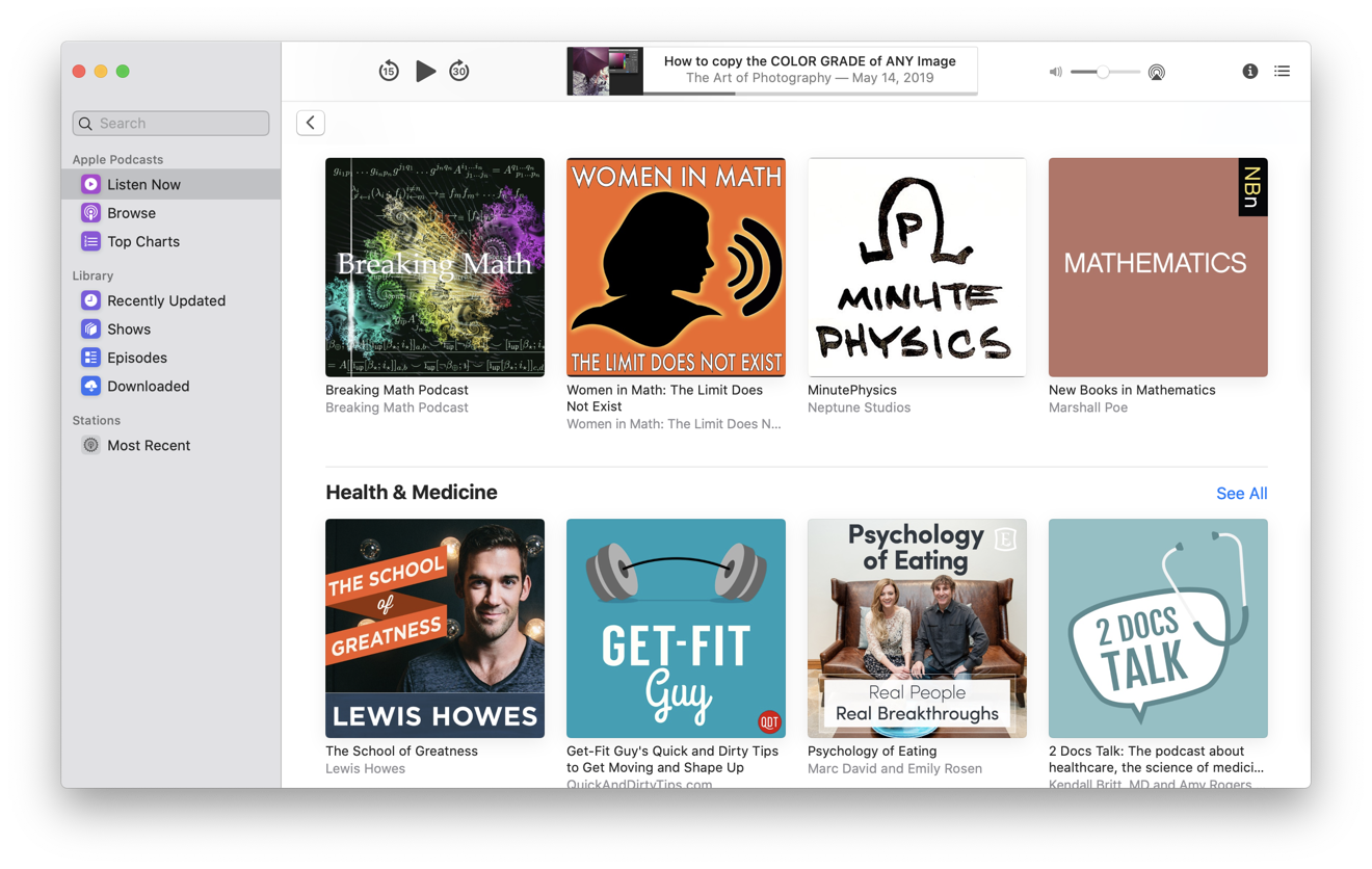
Being its own separate app now allows Podcasts to present a sidebar of items that makes sense for managing episodic radio-like content. Apple's directory of Podcasts is presented similar to Apple Music, with Listen Now, Browse and Top Charts listings. Your local library is presented as Recently Updated, Shows, Episodes, and Downloaded, making it easier to follow your favorites.
Podcast search is also being enhanced. Apple is creating transcriptions for all of the hundreds of thousands of audio podcasts that it lists. This will enable users to search for episodes by subject keywords, even if you don't know the name of the show or the episode. You'll also be able to search podcasts by host, guest appearances, and other metadata details. Podcasts also uses Siri intelligence to suggest shows similar to ones you've listened to.
The new Podcasts interface will be conceptually familiar to iOS users, as its based on the same underlying code, albeit with a UI retooled to make sense on a desktop computer. One advantage of Apple sharing its Podcast app code between iOS and the Mac via Catalyst is that it can more effortlessly introduce new features for both platforms at the same time.
It's hard to discern any difference in the look and feel and responsiveness of Music compared to the all-new Podcasts app (above), which Apple has specifically outed as a Catalyst UIKit app sharing its core code with the iPad version. That's also good news, especially in view of the rough edges apparent in last year's first examples of UIKIt apps on a Mac, which looked foreign and clearly ported from a different world.
Oddly enough, while Apple has promised to update its Stocks, News, Voice Memos and Home apps to bring them more into line with what Mac users expect of a native app, they still appear to be unchanged in the official Catalina release. The new Podcasts app feels much more like a Mac app, but still uses iPad-like panels rather than movable windows to display item details. Overall, however, the new Podcasts app looks and works very similar to other modern apps.
Catalina's new Music and Podcasts apps look so similar that they seem sort of boring. The chrome of both are basic whites in the Light appearance and flatly black in Dark Mode. This deference of the UI makes the app's content really pop, but there is none of the ornamentally skeuomorphic music player character of the old iTunes to be seen anywhere. Overall, both look a bit like the Finder with less sidebar vibrancy, although they feature a nice balance of color in their icons.
Perhaps that's appropriate, as we're no longer needing to associate the Mac's music app with a jukebox or physical media player that nobody really ever uses anymore. The clean lines of Music feel more like a web browser, where you're focused on the content, not the illusion of some olde-timey music playback machine. And while the Finder-like sidebar layout feels a bit formulaically simple, the minimal new layout of Music makes a lot more sense than the weirdness of iTunes with its 18 years of overloaded baggage that required modal popup menus to switch between Music, Movies, TV Shows, Podcasts, and Audiobooks.
Books and audiobooks
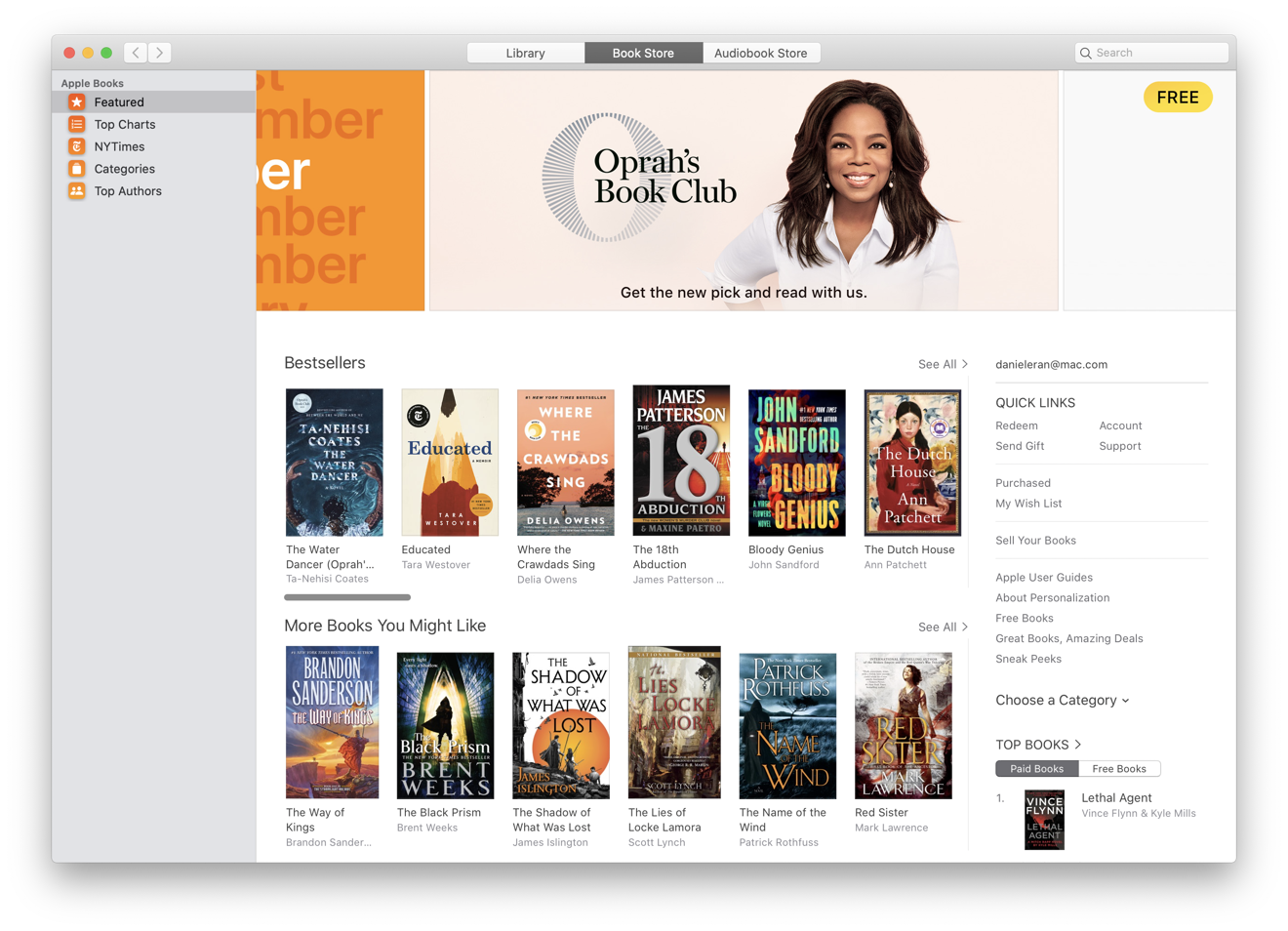
Books 1.0 was refreshed last year in Mojave, dropping the original "iBooks" name. Now, iTunes' audiobooks and the Audiobooks Store are now more logically located in Books 2.0, next to your library of standard ebooks, PDFs, and Apple's Book Store.
In the initial Catalina betas, it retained the "2018 appearance" it shared with Mojave Mac App Store that debuted alongside it. In the shipping version of Catalina, Books now has a modern appearance matching Music and Podcasts.
Books now looks a lot like Music, but the new app lacks the old iTunes' smart folders and playlists for organizing content. Books does provide Collections, which are playlist-like groupings which can be sorted by most recent, by title or manually organized. But there is no longer any way to sort your ebooks or audiobooks programmatically by rules.
TV and movies
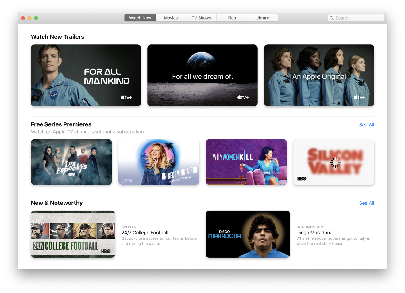
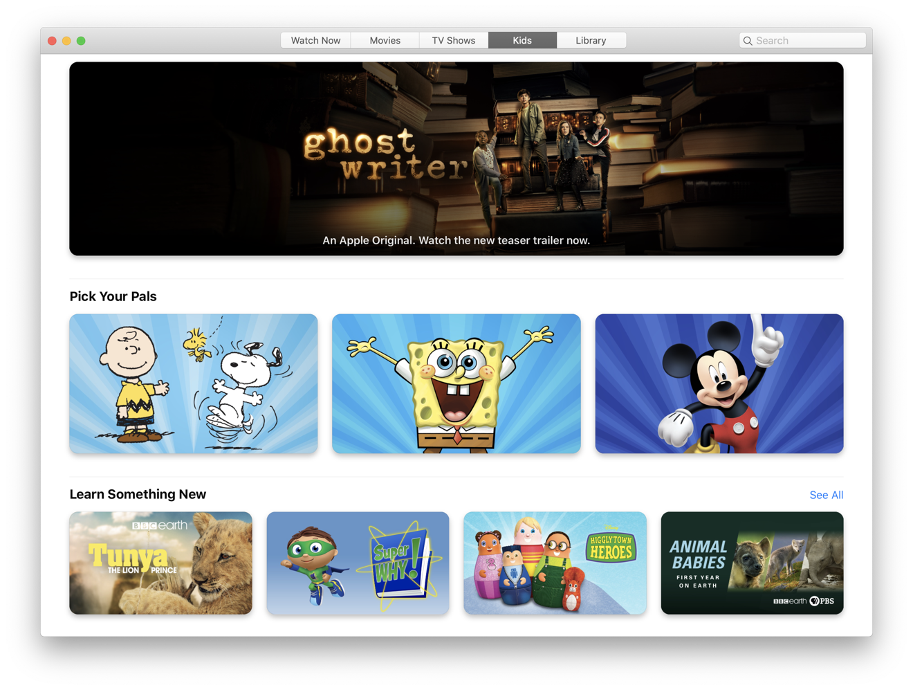
In Catalina, the TV app (above) is now coming to the Mac as the place to watch your existing iTunes video library content as well as the new ad-free streaming Channels, which vary in availability based on your geographic region. Just like Apple TV, the new TV app in Catalina presents a Watch Now tab with curated selections and personalized recommendations based on your viewing history. The Movies and TV Shows tabs detail popular and trending content, with features promoting titles in 4K HDR, films at special prices, and by genre.
There's also a Kids tab (below) featuring easy to navigate content for kids and teens, and a Library tab that presents your own content in a sidebar layout similar to the new Music and Podcasts. The new TV apps syncs movie and episode playback across Apple TVs, iOS devices, and "select" Smart TVs that can run the app. And on Apple TV 4K and T2-equipped MacBooks, the TV app now supports playback of Dolby Atmos as well as Dolby Digital or Dolby Digital Plus soundtracks.
Atmos is Dolby's advanced new form of surround sound that simulates audio in 3D space rather than just pushing different channels to right and left speakers. The T2 chip is required as it provides hardware decoding support. The new iPhone 11 Pro models also now support Dolby Atmos, using their two speakers to create a wider sound space when watching movies. The technology uses an audio virtualizer that works similar to noise-canceling mics: the left speaker cancels some of right and vice versa, creating "audio zones" that enhance dialog and broaden the virtual sound stage.
iTunes updates, backups and configuration
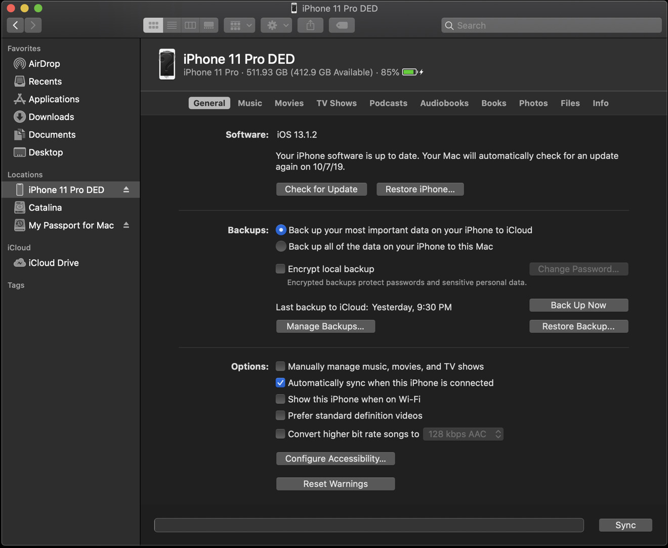
iPod and iOS device sync and backups are the last bit of iTunes functionality that's been relocated in Catalina. Those features are now integrated into the Finder version 10.15.
Most iOS users are now using iCloud to keep all their content in sync. But, if you prefer to manually sync using a cable, your device now pops up in the Finder just like any other drive under Locations in the sidebar when you plug it in.
The interface looks essentially identical to the old iTunes. The General tab lets you update your device software and restore from an image or backup. You can also configure backups to occur to iCloud or locally, and setup sync to occur automatically when plugged in or manually.
The Finder's Music, Movies, TV Shows, Podcasts, Audiobooks, and Books tabs let you configure manual sync of your entire Mac library or individually selected items, most of which is more relevant to iPods than to modern iOS devices. The Photos tab tells you that photos are synched by iCloud, and that you can manually send images to your device "via WiFi or Cellular." If it wanted to be more helpful, it could integrate AirDrop for you, or explain that you can share photos via SMS, Email, or iCloud Drive.
The Files tab presents what was sort of confusingly called "File Sharing" in iTunes: a list of apps on your device and the documents each stored in their sandbox. The presentation of these files is even a bit wonkier and technical than it was in iTunes.
There's an Info tab that presents options to manually sync Calendar and Contacts, more of the old legacy from iPod days. Apple should clarify this entire interface to make it more understandable that this is manual sync as an option to automatic, wireless iCloud updates. For many users, it might seem desirable to click the boxes to sync your data. Most of this should be hidden behind an interface explaining that iCloud is already configured to handle all of this.
What would really be helpful is for Apple to provide a panel in the Finder that offers to clear out the cruft and fix issues with iOS devices that are too full to sync or update. I know lots of non-technical users who have simply thrown out tons of their photos to download a new iOS update, simply because it was too hard to understand how to move files around or offload things that could enable an update to occur.
New in Mail 13
Catalina's enhanced Mail app lets you manage your inbox using a trio of new management features. When you're included in an email thread that is generating too many notifications, you can now mute the thread conversation, so you receive messages without a notification for each new email.
Mail also now copies a feature from Messages that allows you to block a specific sender, sending their emails to the trash by default. You can block any address directly from an email's "From" header, ensuring that you won't get their emails in the future. Within Mail Preferences, you also have the option to mark messages from that sender as "blocked" but leave them in your inbox. This will flag their emails with a red hand icon. You can also unblock individual emails from Preferences.
If you're getting emails from a list you no longer want to receive, you can also click to unsubscribe, which will send a removal request for your email address. This doesn't work with every email list, but does offer to help thin out your emails from unwanted lists Mail can identify, using just a single click.
New in Safari 13
In Catalina, Apple's Safari web browser now opens up to smarter start page that, just like iOS 13, features Favorites, Frequently Visited, and Siri Suggestions, which presents relevant websites in your browsing history, bookmarks, reading list, other iCloud tabs, and links sent to you in Messages.
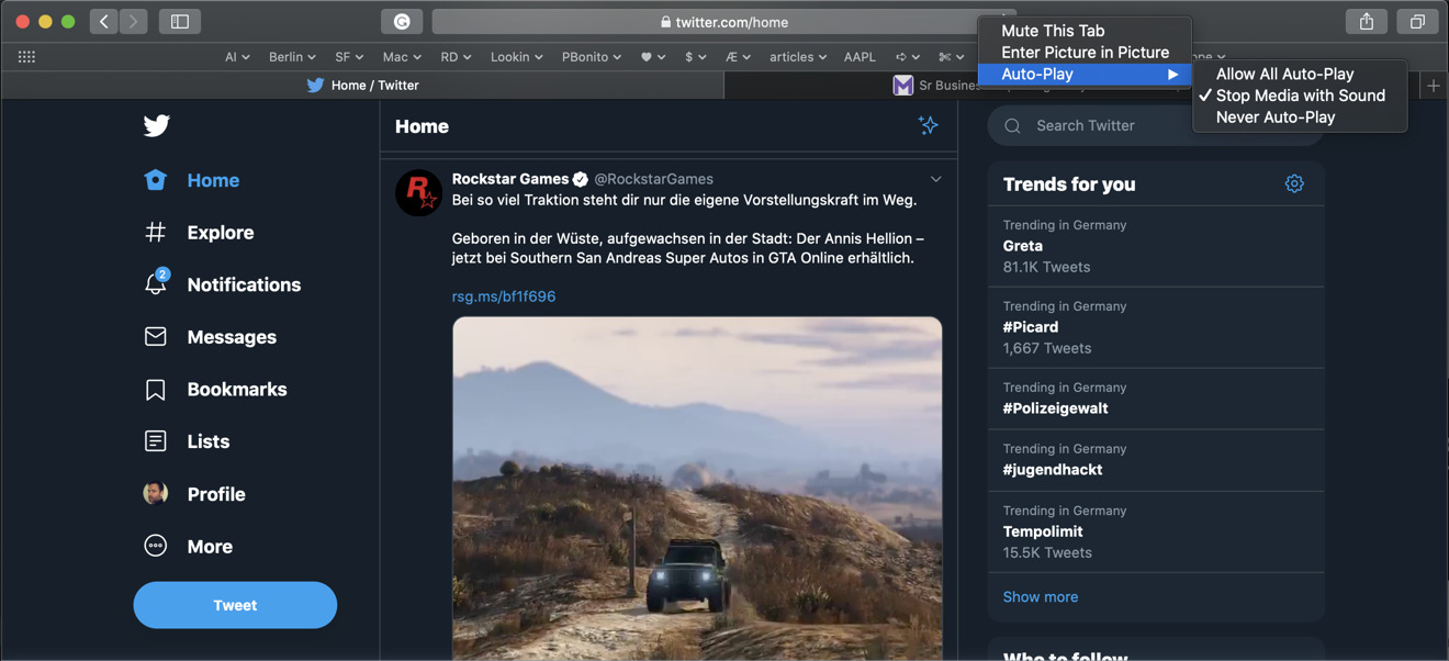
When you type a URL for a website that you already have open in another tab, Safari will drop down the option to "switch to tab," which opens your existing page rather than reloading a duplicate in a new window. Additionally, the speaker icon in a browser tab that lets you mute the audio of a website can now be right-clicked to pull up a menu that also lets you quickly open up the video in Picture in Picture (PIP). You can also use the menu to configure AutoPlay to always or never be playing.
Safari also presents a new warning when you enter a weak password. If you sign up for a new account in Safari and type an easy-to-guess password, Safari flags it and offer to create a stronger one for you. In Preferences, Safari Passwords Autofill lists your saved web accounts with flags noting where you've used an easily guessable password or have reused a password across multiple accounts.
New in QuickTime Player 10.5
QuickTime Player adds support for PIP playback, which floats your video in a resizable playback window without any window chrome on top of other windows, allowing you to watch a video while continuing to work in the background. An enhanced movie Inspector pane now shows more in-depth technical information about the currently opened media file, including the video color space, HDR format, bit depth, scale, and aspect ratio.
Apple has also reinstated an "Open Image Sequence" feature in QuickTime Player that allows you to designate a series of still images in sequentially numbered files and generate an H.264, HEVC, or ProRes-encoded movie file at a specified resolution, frame rate, and encoding quality. At WWDC19, Apple showed off high-quality time-lapse videos built from a sequence of professionally shot images using the new feature.
QuickTime Player also now supports timecode support. When you open a media file with an embedded timecode, time information is depicted in the onscreen navigation controller as a reference for identifying shots in the media production process.
It also adds support for transparency layers in videos, which are used to do things such as composite motion graphic images over standard video. While H.264 lacks support for alpha channels, QuickTime Player can preserve 16-bit alpha channel transparency when exporting from a ProRes 4444 source into HEVC (aka H.265).
New in Notes 4.7
Notes started out as a humble alternative to TextEdit, but has grown increasingly powerful. I use it to jot down ideas when mobile and to write up my huge long articles on the Mac. Last year, the addition of Continuity Camera made it easy to incorporate quick photos or scans in a note.
In Catalina, Notes gets new support for Continuity Sketch via an iOS device (more on that later) and a Gallery view that depicts your notes graphically as thumbnails rather than just by the first few words. You can also now reorder checklist items in Notes using the mouse or keyboard shortcuts. You can also now click on "uncheck' on a completed list to start over and reuse it.
You can also now collaborate using Shared Folders of notes, which allows invited users to access and add their own notes, attachments or even entire subfolders. It also introduces view-only collaboration that enables invited users to review but not make changes.
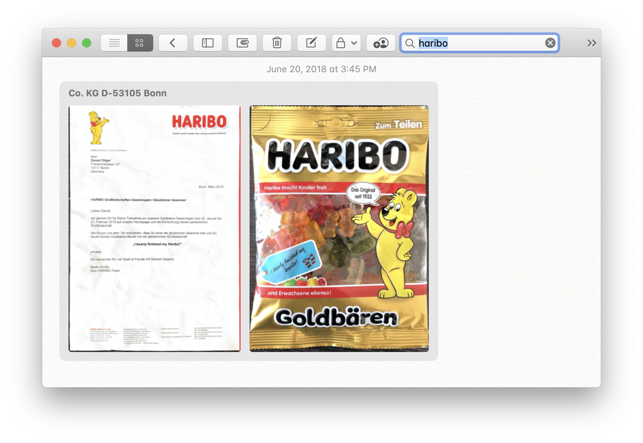
Similar to Photos, Notes also uses ML intelligence to recognize objects and scenes from photos you add via the Continuity Camera, and even search from text within scans or graphics you input. The search field also suggests searches for you as you type. Searching for "Haribo," Notes found (below) a scan of a letter and an image of a product with the name.
Some Catalina apps need an appearance overhaul
At the beginning of the Public Beta, I complained that it looked as if various parts of macOS were developed by different companies. Catalina's new Music, Podcasts, TV app, Books, and Apple News all feature a sidebar with colorful menu icons, while the sidebars in Mail, the Finder, Photos, Notes, and Safari Bookmarks, as well as the Console and Disk Utility, all use a similar appearance with greyscale icons that date back to Lion, and which now looks rather dated when compared to Catalina's colorful new Music and Podcasts appearance.
You'd think Apple could give macOS Catalina a complete appearance refresh so that all of its bundled apps use a similar sidebar style with icons in an appropriately harmonious color palette in the same size, and with consistent controls that enable users to scale sidebar icons and text to their liking. There are some complications, however, as Apple has clearly used different versions of frameworks to build its various apps over the past decade.
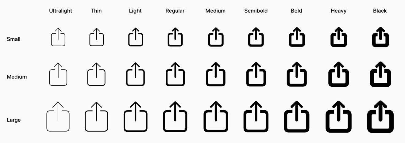
That might be changing, due to some of the new things Apple showed off at WWDC19, including SwiftUI to more rapidly create UI elements with consistent behaviors that better support features like accessibility and Dynamic Type, and the new SF Symbols system font, which offers a set of over 1500 vector-based icons that can smoothly scale up and down as well as adjust their weight from black to bold to regular to ultralight. Developers can even create their own scalable symbols. SF Symbols are all monochrome but can be tinted, which appears to be what Apple is using to liven up its colorful modern sidebars in new Catalina apps.
Apple noted that SF Symbols was created with the intent to enable app sidebar items to scale up and down, so their icon sizes match the size of text labels. We'll have to wait and see whether Apple makes it a priority to use its own tools to clean up some of the wonkiness of its older Mac apps. Historically, Apple has frequently experimented with new UI concepts and languages on its bundled apps, from the 2000's-era Brushed Metal to Unified Aluminum to the greyscale version of app sidebars that have been used over the last decade. And in fact, the company's evolving development APIs, from Carbon to Cocoa and today's latest SwiftUI, have also played a factor in how apps look and how easy it is to update their appearance.
Last year's debut of UIKit apps for the Mac, now public to third party developers as Catalyst, also threw a wrench into the works by incrementally shifting iPad apps to the Mac. How native various apps looked was a factor of how much work went into making them look at home on the Mac. This year, News has been updated to look just as "Catalina" as the new AppKit Music and Catalyst Podcasts apps.
The Home app is still stuck in early Mojave land, with popup panels that feel like an iPad. Stocks and Voice Memos are somewhere in between, with an appearance that looks more like an iPad app, but not so offensively as to demand an urgent refresh. Back in June, Apple's software chief Craig Federighi noted that Apple is working to better harmonize these early apps to make them feel more coherent with the rest of Catalina. That hasn't yet been delivered.
The all-new Reminders 7.0
Reminders, another new app that appears to be a Catalyst app, closely shares its Mac interface with the iPad version. That's not necessarily a bad thing, because just being arbitrarily very different on each platform isn't always better. In fact, you might prefer that entirely new apps are designed to look as consistent as possible between Apple's platforms, with only the native design of their UI elements changing to appear familiar to a specific platform.
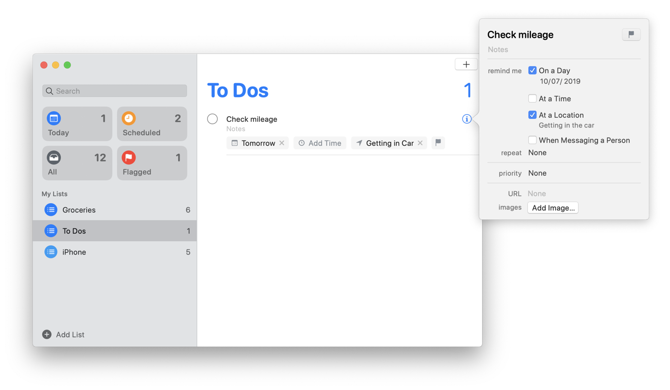
You can now add attachments to a reminder, such as an image or scan you capture from your iPhone using Continuity Camera. Catalina also lets you adjust reminders with quick edit pickers to add a date and time, assign a location, a person from your contacts, or a flag.
Siri intelligence can suggest new reminders for you found in Messages, and smart lists automatically organize and display upcoming reminders. People you tag in a reminder will also pop up in Messages as you chat with them, reminding you that you have something you may want to discuss. Despite being a new app, Apple designates it as version 7.0.
Mac gets a Find My app for friends and devices
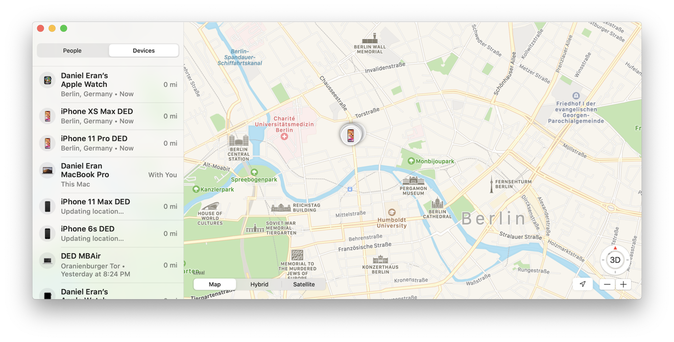
The new Find My app — which is pretty clearly Catalyst — combines two iOS apps, Find My iPhone and Find My Friends, into a single app for Mac, iPadOS, and iOS devices.
Apple previously relied on its iCloud website to provide access to "Find iPhone" on the Mac. The downside to that was that it required a login and typically 2FA authorization, where you typed in a code to trust your request. With the new Find My app in Catalina, you can now instantly pop the native app open and immediately see where your people and devices are in an interface that looks like Maps with a sidebar.
I previously wondered why Apple hadn't integrated these features into the Maps app, but Find My is another ideal use of Catalyst to create and rapidly deploy a new app that works similarly across Apple's platforms using the same code base, with adjustments to make it look and feel appropriate to the device its running on. Maps already exists across Apple's platforms, so adding new features to it would require replicating those efforts twice in two separate codebases using different sets of frameworks.
In Find My, the devices you track connected to your Apple ID can be located, made to play a sound, marked as lost (which locks it, disables services like Apple Pay, and then begins tracking its location), or remotely erased. If you click Directions, it will open up Maps for you for walking, driving and transit routes to the last known location.
One of the other new features in Catalina is that your Mac can now report its location via Bluetooth signals even when its offline or sleeping. Other iOS devices out in the wild can triangulate these signals and notify Apple with bits of data that your system can use to figure out where your missing Mac is.
Apple states that the system is "anonymous and end-to-end encrypted so no one, including Apple, knows the identity of any reporting device. And because the reporting happens silently using tiny bits of data that piggyback on existing network traffic, there's no need to worry about your battery life, your data usage, or your privacy."
It's also noteworthy that Find My, like Reminders, currently looks and feels more like an iPad app. Again, that's not entirely a problem, as it's not quite as egregious as Mojave's original Home app. It is certainly a vast improvement over having to use the web to track a missing device.
It's also an improvement over the current Find my iPhone app on iOS, which also requires a login at each use. It appears that Find My is an extension of the existing Find My Friends iOS app. And as such, it's a perfect example of how even large developers like Apple itself can use Catalyst to quickly introduce simple new apps that work well across Apple devices without doing lots of parallel, duplicative work.
One rumor that hasn't yet materialized is the idea that Apple would be getting into the business of tracking other devices with tags like Tile. That's something Apple could certainly add to its Find My app in the future. The company filed a patent on the invention in 2016.
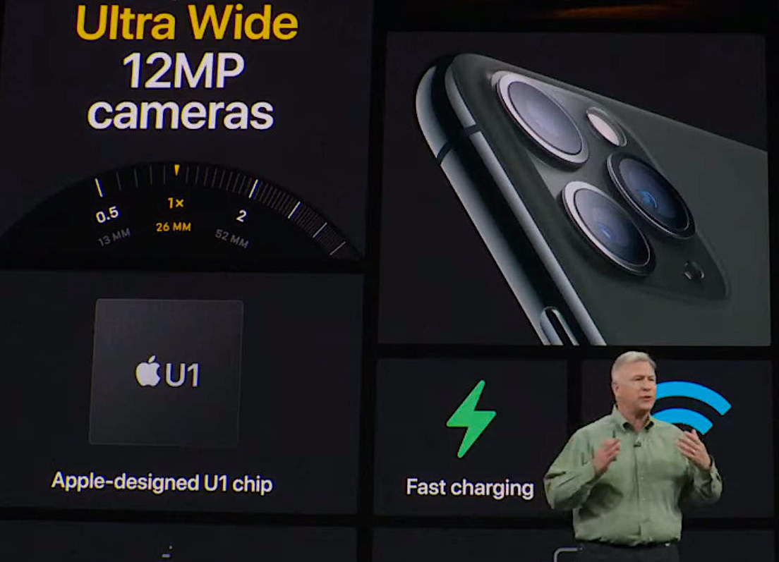
Apple did introduce new Ultra WideBand technology in its latest iPhone 11 models using custom U1 silicon but didn't announce any news related to device tracking tiles. It seems apparent that the U1 chip wasn't merely developed to make AirDrop transfers location-aware, the only feature Apple has articulated for it so far.
There have also been rumors that Apple is working on Catalyst versions of Shortcuts and Messages for the Mac, unifying the code that supports such features across its platforms. Shortcuts would bring iOS-style automation, and Messages would unify the Messages features Apple supports on iOS, including "send with" effects and potentially even the Messages Apps platform used to support Photos and Music integration, Animoji stickers, and even third-party messaging apps.
Screen Time for Catalina
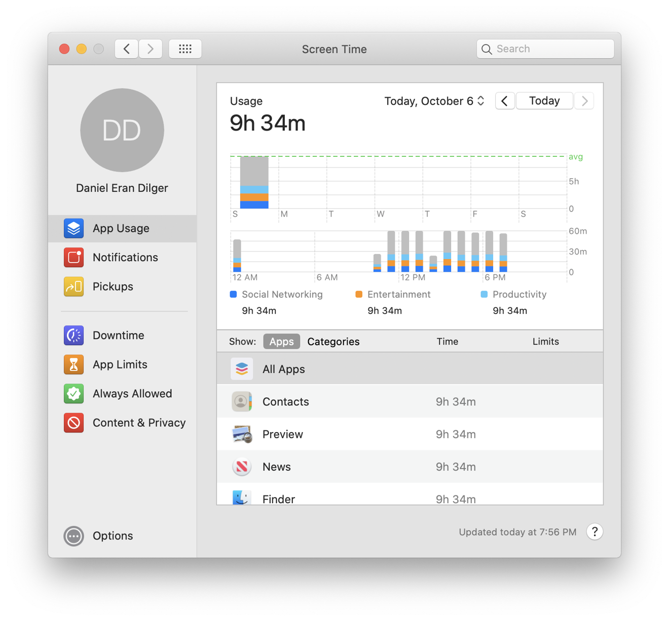
Another area of functionality that Catalina brings over from iOS is Screen Time, Apple's usage tracker that reports of how much time you're spending looking at a device each day. Rather than being an app, Screen Time is presented as a System Preference. It presents easy to read usage reports that show you how much time you've spent on your Mac throughout the day, which apps you have open, how many notifications you've received, and "pickups," which I'm not sure what exactly means in the context of a Mac. On iOS, it is intended to indicate how many times you pick up your phone.
Because it's common to have multiple apps open at once on a Mac, as opposed to mostly a single app open at once on iOS, the statistics I see in Catalina's Screen Time reflect that I have a lot of windows open, not how much time I'm actively working in a given app. So simply having Screen Time active won't necessarily generate accurate reports detailing exactly what you're doing— such as for client billing purposes— unless you give some thought to how you manage which apps are left open.
Screen Time can optionally be set to sync via iCloud— under Options— to combine all your usage information across your devices. You can also set a passcode to secure your Screen Time settings, and activate Family Sharing to enforce Screen Time settings across your family's devices. Note that if you turn Screen Time off, all of your usage data dissapears.
You can schedule Downtime at certain hours as a reminder to give yourself or family members a break, and set up App Limits that restrict the amount of time available to access specific apps and websites, or categories of apps such as games, social networks, education, productivity, or creative apps. When a limit is reached, you can enable "one more minute" to allow time to save your work or end a chat.
You can also use Screen Time to enforce content and privacy restrictions, limiting what apps can be used, installed, removed, or what In App Purchases can be made. You can also limit content from the App Store and movies and TVs by ratings, limit explicit books, music, podcasts, and news, limit adult websites, turn off explicit language in Siri, limit Siri from presenting web search results, and limit adding friends in Game Center. There are even options to limit volume limits and other settings that only apply to iOS devices, such as cellular data limits, do not disturb while driving settings, and background app activities.
Communication limits, a new category in Screen Time intended to give parents the ability to configure who their children can communicate with— everyone, people in contacts, or specific groups— both throughout the day and during Downtime is planned for release in an upcoming update. Apple says this will work across Phone, Messages, and FaceTime, and is billed as "coming soon."
Continuity Sketch now works on iPad and iPhone
Alongside Catalyst apps and all of the other features that have flowed from iOS to the Mac, there's another type of tight integration that expands significantly in Catalina: Continuity between your Mac and iOS devices.
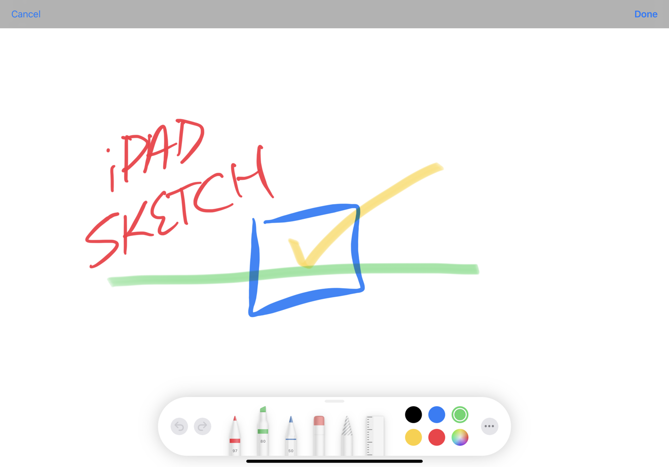
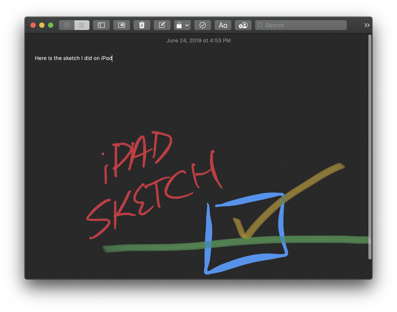
Last year, Apple introduced Continuity Camera, a feature that lets you turn your iOS device into a convenient camera or document scanner with automatic edge straightening. This year, Apple is adding Continuity Sketch, which lets you similarly use a nearby iPad— running iPadOS 13— to create anything you can draw with your finger or an Apple Pencil and instantly insert the sketch into your document.
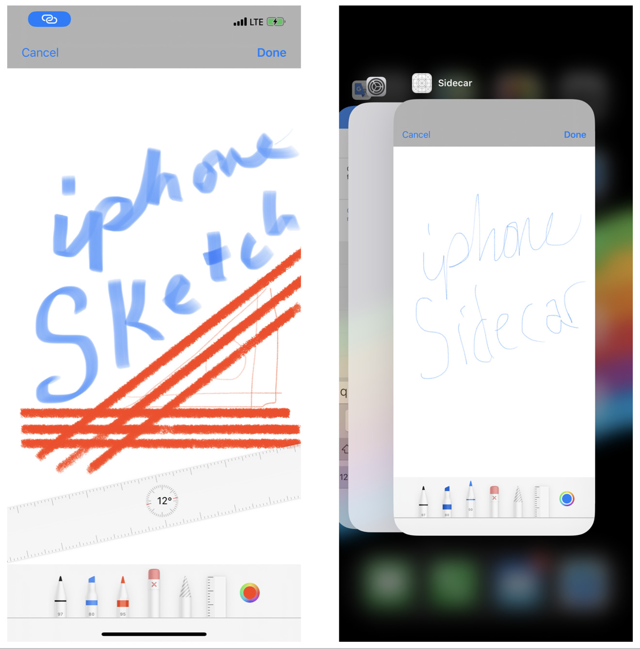
This works in Notes, Mail and anywhere else that supports Continuity imports. Just as with Continuity Camera, you can select Sketch and your iPad enters sketch mode with the new drawing tools (below top). Click Done and your sketch is dropped directly into your document (below bottom, Notes in Dark Mode).
In the early Catalina betas, "Sketch" also appeared as an import option for my iPhone, but didn't actually work. It turns out that— hurray!— Sketch import now also works from an iOS 13 iPhone in the GM release of Catalina. Continuity Camera is such a great feature that I was hoping iPhones would eventually be supported as a simple sketch pad for inserting quick drawings into documents as well, so it's great to see Apple agreed.
On iPhone, Continuity Sketch lets you draw with the same simple markup tools, including the ruler and smart eraser, that appear in Notes when you click the Markup icon. Due to the smaller display, there isn't room for undo and redo buttons that appear on the tool palette of an iPad Sketch screen, but you can still shake to undo or tap with three fingers to pull up iOS 13's new gesture edit menu. You can also doodle an iPhone sketch in its wide orientation, although the toolbar takes up a fairly wide swath of the display.
On both iPhone and iPad, Sketch occurs within a Sidecar app on the device, but this app doesn't appear to be launchable on its own on iPhone, and doesn't even have an app icon. There is also no provision for selecting elements of a sketch (you can't copy, paste or duplicate elements in your sketch) nor for saving sketches as a local document on your iPhone; it works only when connected to a Mac that's requesting a Continuity Sketch.
Also note that if you interrupt that connection or dismiss the "Add a Sketch" button on your Mac (which can be done inadvertently by clicking anywhere during your Sketch session), the session will abruptly end and your sketch will be lost. The only way to use your sketch is to click Done on your iOS device, which causes it to be inserted in your Mac document as a PNG image. It then ends your sketch session.
Also note that Continuity Sketch requires both your Mac and iOS device to have WiFi and Bluetooth turned on. Your two devices don't have to be attached to the same WiFi network (it uses Bluetooth to discover nearby devices, and WiFi to talk to them), but WiFi does have to be free to communicate; turning on IOS WiFi Personal Hotspot or Mac Internet Sharing will prevent Continuity from being able to connect the two devices.
iPad Sidecar
Beyond Continuity Sketch, modern iPads can also be used as a Sidecar display with Apple Pencil support, both wirelessly via Bluetooth (Apple says up to 10 meters or about 30 feet) or connected via a USB cable.
I paired a new iPad Pro with a 2018 MacBook Pro — each representing ideal WiFi and Bluetooth connectivity — and was easily able to use Sidecar smoothly when 32 feet across the room with an unimpaired line of sight. I could also walk around the corner and continue using it in another room through a solid brick wall, and most of the way out the door and up the stairs. Sidecar had no problem even smoothly playing back video over this distance.
When I finally ran out of signal, the iPad display stopped responding but could successfully reconnect and continue working normally when I turned around. Older Macs and iPads may have more limited connectivity, but Sidecar seems to be pretty robust even when walking far away from your host Mac. It seems like it works great for normal use cases, even when walking around in a very large conference room. When paired using USB cable, the screen didn't seem to be any more responsive compared to wirelessly walking around, an impressive improvement over the first demonstrations we saw when the feature was first shown at WWDC19.
If you are working over a USB cable and unplug the iPad, the screen with pop up a button saying it's been disconnected and is waiting to reconnect. Plugging it back in restored the connection and it continued to work. This is a bit different than Continuity Camera or Sketch, where a termination dumps the entire session and anything you have captured on the mobile device. Ending a Sidecar session is like unplugging a secondary display; the Mac just reconfigures its display and returns any remote windows to the main screen without losing any state.
There's a System Preference panel for Sidecar on the Mac that lets you connect your iPad, and once you do your tablet appears to be a secondary display that either mirrors or extends your Mac desktop. Only one iPad at a time can be wired or wirelessly tethered to a Mac at once using Sidecar.
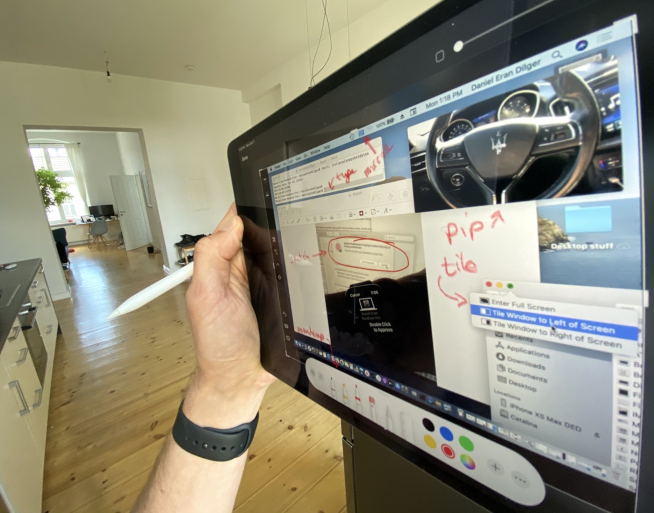
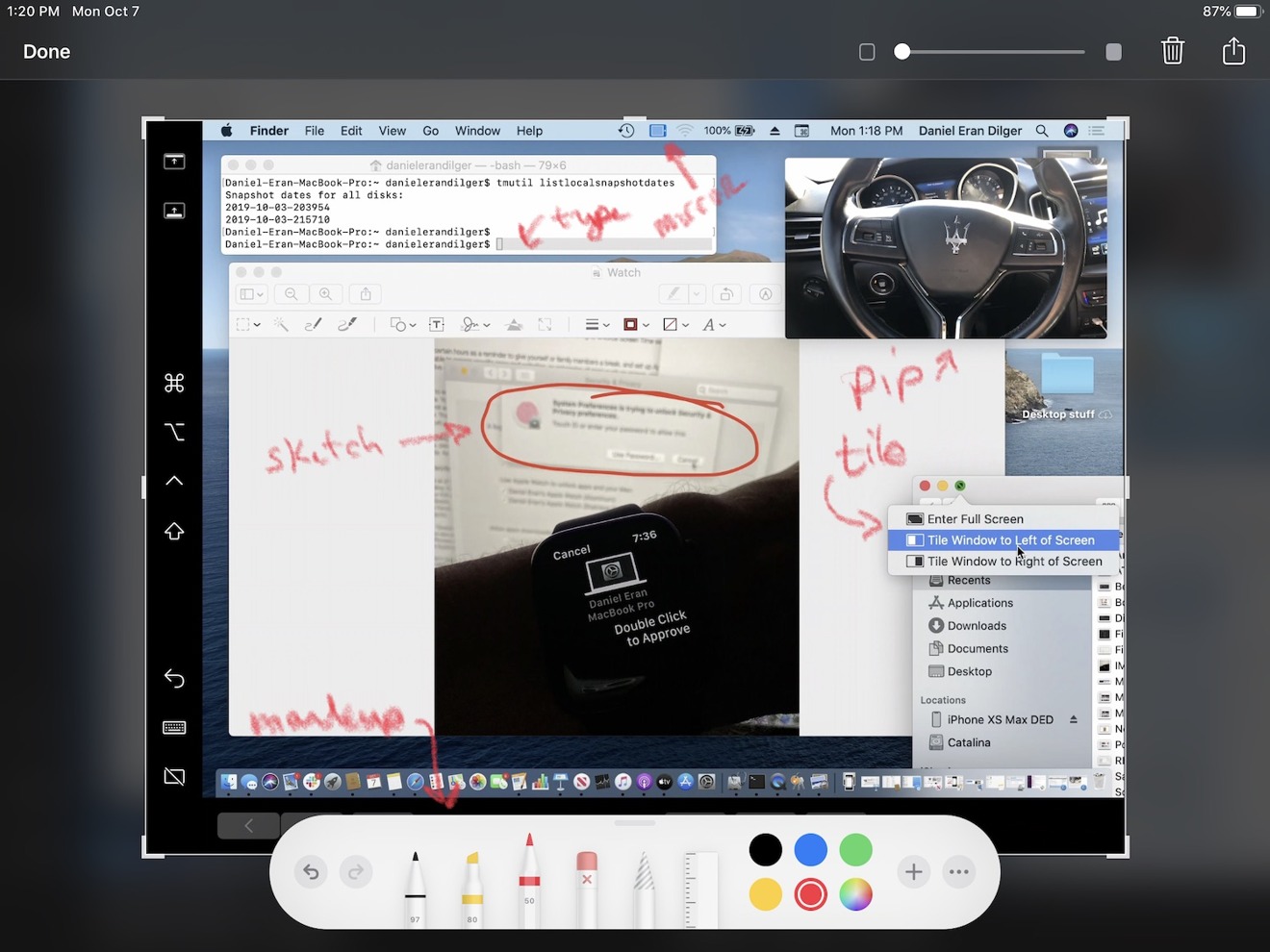
Working as an extended desktop, you can drag Mac windows to your iPad and control anything the iPad screen via Apple Pencil. You can tap the Pencil to click on buttons or select text, tap, and drag to move around windows, and you can select text as if using a highlighter. You can also touch the Sidecar sidebar buttons to perform shift-click or command-click selections with the Pencil.
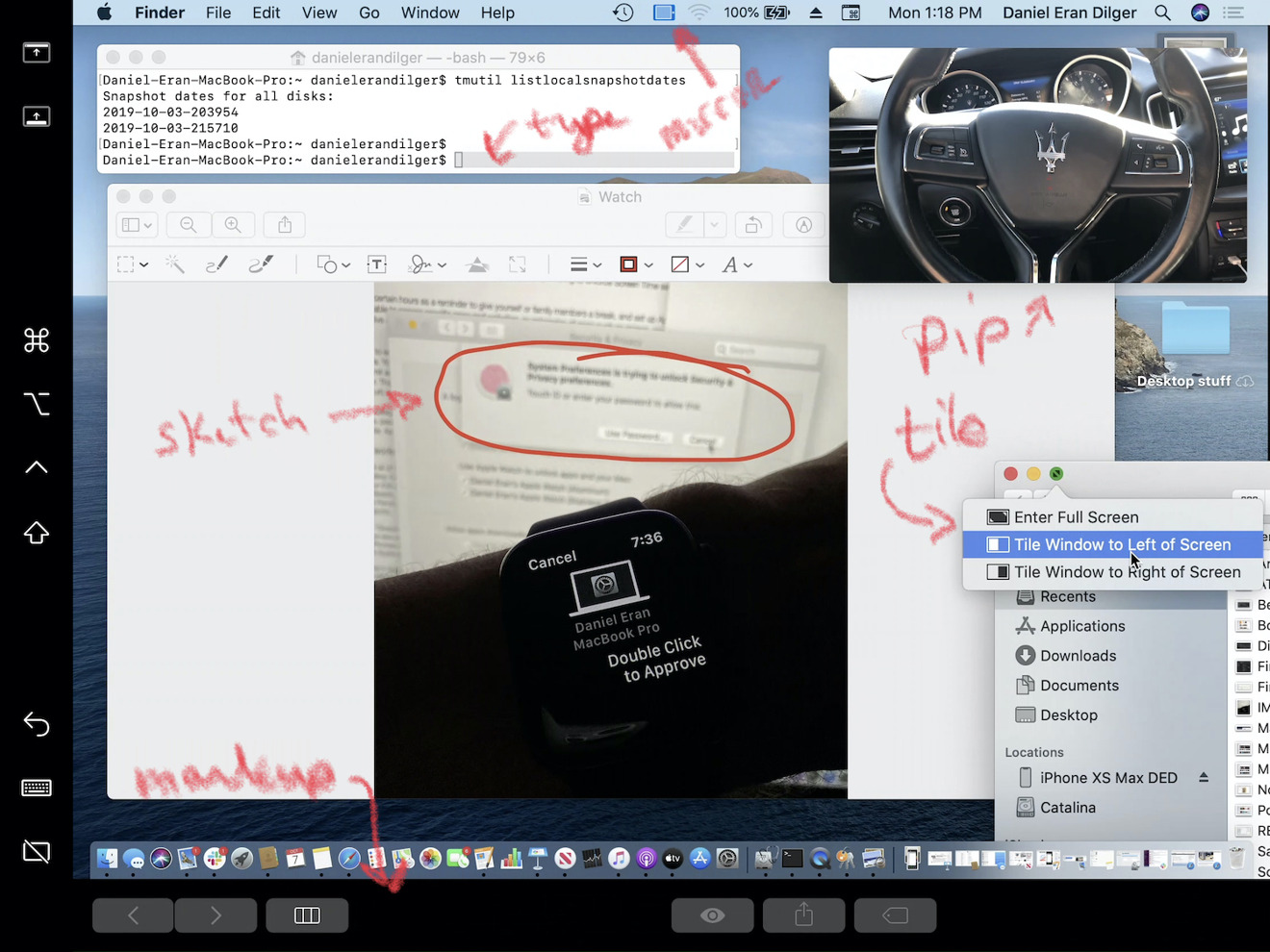
With Sidecar, you can type to the Mac using the onscreen keyboard or a Bluetooth iPad keyboard; you can play videos, including PIP; you can tile your windows or take Mac apps full screen; you can sketch on images or PDFs, and you can markup features like the TouchBar at the bottom
While Apple Pencil on Sidecar works effectively like a precise mouse input device, it can be tricky to perform some basic navigation tasks such as window resizing or view scrolling. A pen isn't really a very natural alternative to a mouse or trackpad, because there isn't an obvious way to distinguish between hovering over a target with the pointer, and clicking or dragging an element around. That's why Apple presents the Pencil as a precision drawing tool, not really a primary way of navigating the iPad UI.
If you're dreaming of a touchscreen Mac, wake up. There's no iPad touch functionality within any Mac windows you drag to your iPad. As you work with Sidecar, you begin to realize why: touch and mouse control are radically different in ways that may not be obvious. It's a bit frustrating that you can't touch any hosted Mac windows or menus on the iPad to control them because you can both touch and Pencil click on the iPad buttons placed around the extended or mirrored Mac desktop view.
Adding touch support for Mac UI elements appearing on an iPad would require a significant rethinking of how Mac UI elements— developed for a precise pointer such as a mouse or trackpad— are selected and manipulated by the much larger target area of multitouch finger gestures. Apple avoided this by creating iOS graphical elements optimized for touch from the beginning, with no attempts to hybridize a touch/tap environment that sort-of works any way you want.
Sidecar's sidebar of special buttons can be placed on either the left or right side of the Mac screen hosted on your iPad. The sidebar sports buttons to display or hide the Mac's Menu Bar and Dock on your iPad; four special keyboard keys— command, option, control, and shift— that let you type keyboard shortcut chords; an undo button; a button to show a floating, virtual keyboard on your iPad; and a button that ends your Sidecar session.
Across the bottom of your iPad — or optionally at the top — you get a Touch Bar. This works both on MacBooks with a physical Touch Bar as well as Macs that don't have one. Just like the physical Touch Bar, the virtual one presented on a Sidecar iPad presents a dynamic set of buttons and controls relevant to the app you're working on. To everyone who complained that Touch Bar was a waste of time and space, maybe you should have waited a bit to better understand where else Apple intended to use it. It makes a lot of sense on the iPad's external Sidecar layout and takes advantage of all of the efforts developers have made to support Touch Bar in their apps.
As a mirrored desktop, Sidecar lets you share a view of what's on your Mac with clients across a table. Think of it like a VNC client that delivers an animated view of your Mac's desktop; as you move the mouse or trackpad, you can see your pointer on the Sidecar iPad, but only within the Mac window. You can't mouse down and click on the iPad's Touch Bar, or any of the buttons in the iPad sidebar— although you can tap the sidebar and Touch Bar buttons and navigate with an Apple Pencil on the iPad.
Think of it as a Pencil-interactive AirPlay presentation. In fact, the Mac's AirPlay menu presents Sidecar with the options to "mirror AirPlay display," which scales down your Mac resolution to match your iPad, or "Mirror Built-in Retina Display," which keeps your Mac resolution and shows just the region that fits on your iPad. If you mirror the display, keep in mind that a smaller iPad will cause your Mac to scale down its resolution to the point of not looking great. Mirroring works best when your iPad and Mac display are roughly the same size.
As an extended desktop, Sidecar lets you work with your iPad as if it's a second monitor. You can drag Mac windows over to your iPad, although unlike a standard extended desktop screen, windows can't straddle the line between the Mac and iPad; they snap inside one or the other. Once placed, you can view and type directly into Mac documents on the iPad.
Using the new Continuity Markup feature (below, marking up the screenshot of a Sidecar session), you can also directly sketch on or otherwise markup documents using your iPad. In apps that support Pencil, it works to draw and paint directly on photos, graphics, and PDFs. And any Mac app that supports AppKit's Tablet Events should also work with Apple Pencil on a Sidecar iPad, correctly recording pressure and tilt just like a conventional drawing tablet.
You can even use the Mac to import a Continuity Sketch into a document while using that Sidecar-attached iPad. This opens up a new iPad sketch window; your sketch is then dropped into your Mac document, reverting the iPad back your existing Sidecar session. What you see on the Sidecar iPad is still running on top of iPadOS, so you can also use the new three-finger tap gestures for cut, copy, paste, and undo. And the view of the Mac is basically running as a full-screen app view in its own iPad screen, so you can swipe up to see the iPad Dock, switch to another app on your iPad, then return the same way to resume working in Sidecar.
Controlling the Mac screen and its windows and controls with your iPad Pencil might initially feel a bit unfamiliar, although you can pretty easily navigate the Mac menu bar and the Mac Dock, and both selecting text and typing from the iPad into Mac apps using its virtual keyboard seems to work pretty well. When you use the Pencil to drag a Mac window back onto your Mac desktop, you might find yourself trying to use your Pencil or your finger on your Mac display. That doesn't work, of course.
Note that using Sidecar appears to requires a newer Mac: at least a Late 2015 27-inch iMac, Early 2016 MacBook, Mid 2016 MacBook Pro, Late 2018 MacBook Air, 2017 iMac Pro, Late 2018 Mac mini, or a 2019 Mac Pro. Using Sidecar also requires an iPad that supports the first or second-generation Apple Pencil, meaning the new 2019 3rd generation iPad Air or 5th generation iPad mini, the 2018 6th or 2019 7th generation iPad, or any model of iPad Pro.
More under the hood
As previously noted, one final way that iOS devices are contributing to the Mac is that a lot of the custom silicon created for Apple's A-series chips is being used in new Macs to deliver similar features. Apple's custom T2 silicon provides hardware-accelerated encryption that is used both to secure your stored data and to verify trusted software. Developers sign their apps and then get them notarized by Apple, even when distributed outside the App Store, so you can be assured their code has not been maliciously tampered or corrupted.
T2 Macs also have media support for Dolby Atmos and secure authentication with Touch ID and secure payments for Apple Pay. New in macOS Catalina is support for iOS-like Activation Lock on T2-equipped Macs, enabling you to require your Apple ID before an erased machine can be reactivated. Just as with iOS devices, that should help thwart theft, or at least destroy the business model that profits from stealing your gear.
Catalina Accessibility enhancements
Extensive support for new Accessibility features includes the all-new Voice Control (below top), which is delivered as an expansion of Enhanced Dictation. That means it uses Apple's Siri speech recognition engine, leveraging machine learning to deliver high-quality speech-to-text, and doing it all on-device for privacy. Voice Control provides a list of the commands it supports (below bottom) also lets you add custom words to its vocabulary to better recognize technical, legal, slang, or other specialized jargon.
Voice Control also supports sophisticated text editing by voice, you so can use natural commands, such as "Select previous word. Capitalize it," or "Replace Today with Tuesday." Users can navigate the user interface intelligently using the accessibility labels that developers add to their apps' controls, or say "Show Numbers" (shown here when using Photos) to provide numbered labels to address on all the controls on the screen, which can then be voice identified by their number badge.
You can also say "Show Grid" to navigate around the display using coordinate numbers (shown below in Maps). You can zoom into a grid number and additional levels of grid numbers will appear, down to the point where you can define a precise target that can then be used to verbally select, click, or drag items to a new location.
When using Voice Control, it is really amazing to see how powerful your voice can be with this new tool, but it is also a reminder of how those of us without motor issues take for granted our ability to casually and effortlessly mouse around the UI to perform complex tasks without even thinking about it. And that makes me appreciate the pioneering work Apple is doing in Accessibility for those who desperately need it.
The VoiceOver screen reader also now enables an option to use a high-quality Siri voice for users who prefer it. And Apple is now enhancing its own support for VoiceOver in Xcode, reading out warnings, line numbers, and breakpoints in the Xcode text editor. VoiceOver users who personalize how punctuation marks are spoken will also now see their preference settings synched across all their devices via iCloud.
The future, and present, on display
Take a closer look at Catalina and you'll realize that Apple clearly wants to preserve the unique platform features of "Mac-like" computing rather than trying to merge its platforms into an iOS-Mac hybrid. Apple's Mac Human Interface Guidelines state four "primary themes" that differentiate macOS apps from iOS, tvOS, and watchOS apps: "flexible, expansive, capable, and focused."
This year, Apple further differentiated even its one-handed iOS experience from the new tablet-optimized iPadOS, while still keeping both distinct from the conventional Mac. That's the same strategy it has pursued with Apple TV and Apple Watch — each of which has a customized experience that's tailored to be appropriate to its form factor and how it's used, not just an effort in stretching a brand as broadly as possible.
Both iPhone and iPad rapidly eclipsed — tremendously — the global reach and scale that conventional Macintoshes could ever have hoped to achieve. However, with the slowing potential for iPhone sales growth — there are no more China-sized markets with an American-sized middle class waiting to suddenly jump into the market for smartphones — Apple is now in a position to leverage more of the work it's already done for iOS in a way that benefits its desktop computing platform.
The only folks who shouldn't jump into Catalina are those with old hardware, unsupported peripherals, or old software you just can't surrender. Everybody else can see where Apple's been, and where it's going — and should upgrade when they can.
