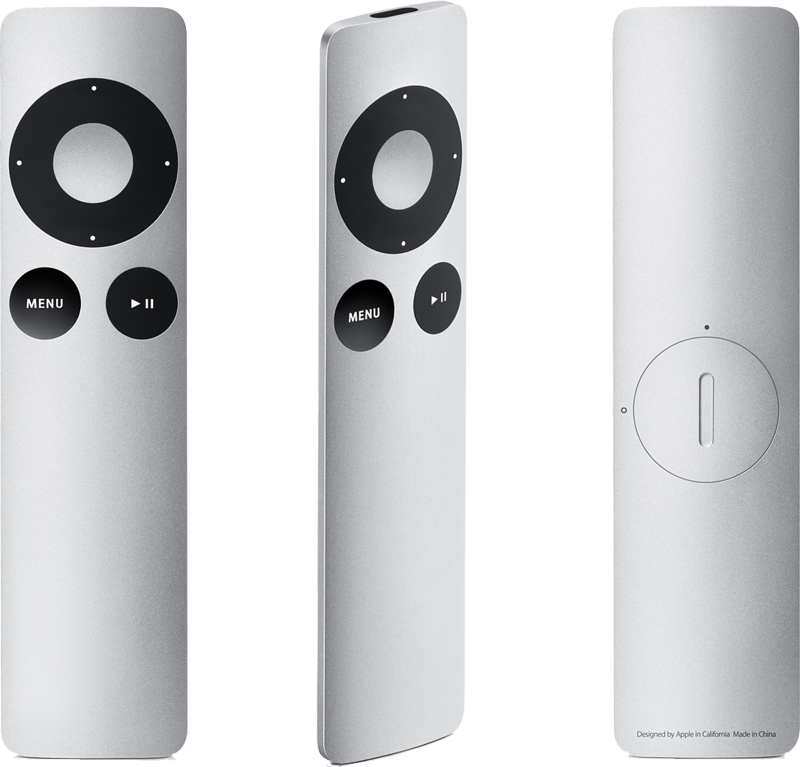
The new Apple Remote eschews the iPod shuffle-like buttons of the previous product. Instead, it has changed the circular controls, menu and play buttons to black. In addition, the play button has been moved from the center of the circle. It is now located just below it.
On the back of the aluminum enclosure is a new, easier battery access for replacing the device's power supply. The $19 hardware has a current ship time of two to four weeks.
Apple's product page states that the new remote is backward compatible with products that worked with the previous Apple Remote. It requires hardware introduced in 2005 or later that has a built-in infrared receiver, including Macs.
"The Apple Remote gives you total command of your music, photos, videos, and DVDs from anywhere in the room," Apple said. "It works with Front Row —- a menu-based, full-screen interface —- to make accessing the digital content on your Mac as simple as navigating your iPod. When you press the Menu button, your desktop fades and the sleek Front Row interface takes its place to give you control over your music in iTunes, your photos in iPhoto, the videos in your Movies folder, and your DVDs. Turn up the volume. Shuffle. Skip to the next chapter on your DVD. Play a slideshow, a home movie you made in iMovie, even a movie trailer."
The remote also works with an iPod or iPhone, if it is connected to an iPod Universal Dock.
"If you connect your iPod to a home stereo, powered speakers, or TV set, the Apple Remote lets you experience your songs, slideshows, and more from across the room," Apple said. "Plug your iPod into the Universal Dock and choose a playlist, slideshow, or video. Then sit back, relax, and enjoy. Ready to move on to the next song? No need to get up. Just press the Next button on the Apple Remote. Getting a call on your iPhone? Press Pause, then pick up where you left off."
 AppleInsider Staff



-m.jpg)


 Charles Martin
 Christine McKee
 Wesley Hilliard
 Malcolm Owen
 Andrew Orr
 William Gallagher
 Sponsored Content




27 Comments
[quote] In addition, the play button has been moved from the center of the circle. It is now located just below it.[quote]
I use my remote with my entertainment center and I'd love for it to be cooler looking: If all else were equal I'd jump at an aluminum version. But, unless there is some really cool new feature button at the center of the donut, the pause/play placement is a serious F-up.
Also, while it may be so slick that it takes a while to figure out. The mechanism for changing batteries on the old white remote is very easy: push in the little dimple and a battery tray slides out. place a new battery on the tray and it slides and snaps into place. If there is a fault (and I think it's a feature), it's that the access to the battery is so well concealed it almost appears there is none-- much better than having a man hole cover.
I was looking at the photo of this remote and I thought about the new supposed tablet... I can imagine it looking a lot like a larger version of this (with a touch screen of course). The edge design of this thing is very stricking... and since it is practically the only product released today that is actually visually "new" I wonder if this may be the new direction they may go??? just a thought anyway.
my mistake
Interesting that there is no mention of the AppleTV in Apple's blurb of compatible hardware, though I'm sure the new remote is fully compatible with the AppleTV.
I just find it interesting that Apple chose to highlight Front Row compatibility and not highlight AppleTV compatibility. I think this says something about Apple's attitude toward the AppleTV, especially since they go out of their way to cite compatibility with iPod Docks and iMacs, etc. The absence of AppleTV I think is telling.
Omg i really like this - looks kinda like the ipod nano