As part of his Macworld 2009 predictions earlier this month, Daring Fireball's John Gruber suggested that Apple was likely to demo a new build of the operating system at the conference that would "make old features look new, by updating the system-wide appearance theme."
"I’ve made this prediction several times in the past and been wrong, but eventually I’ll be right: it’s time for the last vestiges of the original Mac OS X 10.0 'Aqua' theme to go," he wrote.
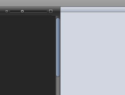
Specifically, Gruber said that scrollbars and push buttons that have remained largely unchanged since the Mac OS X public beta in 2000 would adopt the smoother, darker style iTunes-style scrollbars, while application windows would move to a darker chrome motif alongside an inverted menubar with light text on a dark background.
Although Gruber, who said the new interface theme was rumored to go by the code-name Marble, admits that his prediction was wrong again, his general claim is being backed up this week by MacRumors.
Interface elements and colors of the rumored "Marble" theme.
The rumor site claims to have independently heard of the Marble-dubbed theme, which "will likely involve tweaks to the existing design and perhaps a 'flattening' of Aqua in-line with Apple's iTunes and iPhoto interface elements."
No further details are available given that builds of Snow Leopard reported to include the update theme have yet to see distribution outside Apple's walls.
 Katie Marsal




 Malcolm Owen
 William Gallagher



 Charles Martin
 Marko Zivkovic
 Mike Wuerthele



83 Comments
It would be nice to finally get rid of Aqua. It is such an ugly interface.
Jep, it's ugly, partially. Hate the buttons and scrollbars.
Seems to come from the past.
Seems like a logical step, when you look at Apples' latest apps, their website, and so forth.
I expected a change when Leopard arrived. Luckely all interface elements can be tweaked with hacks and terminal commands.
Let's also hope the Apple gets rid of the 3D dock, which sucks, as well as the ugly transparent menu bar. Ow, and the "space themed background".
An OS should not get in your face!
... Specifically, Gruber said that scrollbars and push buttons that have remained largely unchanged since the Mac OS X public beta in 2000 would adopt the smoother, darker style iTunes-style scrollbars, while application windows would move to a darker chrome motif alongside an inverted menubar with light text on a dark background. ...
While it's always interesting to hear of the rude genius of John Gruber, (not) this one sentence is the only thing that actually describes the interface, and it does an especially awful and confusing job of it.
Anyone care to explain what "... darker chrome motif alongside an inverted menubar with light text on a dark background" actually means? The picture you include doesn't seem to show anything of the sort, so it's either a poor illustration, or a poor description of the illustration provided.
Pinstripes were a little tacky.
Brushed Aluminum was okay for a while, but I'm over it.
So far I like Leopard's grayness for things.
"Marble" as based on iTunes, would be an interesting UI choice. Personally, though, I think they should just modify the Appearances system pane to let you choose between all the different themes we've seen in OSX releases, complete with the appropriate Aqua Blue or Graphite wallpapers for the chosen release.
An OS should not get in your face!
No, but it should make it easy to find the controls you need. I hate iTunes interface style and the sample shown in this article because everything looks the same. Just different shades of gray and blue/gray. The worse is the Coverflow slider which is black on a black background. The controls need better contrast. I always hated iTunes embossed buttons since they were so easy to overlook.
Whether or not you like their appearance or not, it's hard to deny that's it really easy to tell where the buttons, scroll bars and other control widgets are in Aqua.
If they decide to unify, I hope they give the choice to unify around either Aqua or this Marble crap.