A much smaller box
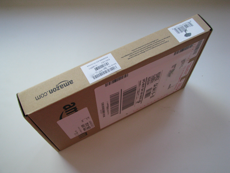
Compared to the giant box that the original Kindle came in, the Kindle 2 ships in a tiny package the size of a textbook. To slim down, Amazon dropped the large hard-bound book volume case it shipped with the original model.
The smaller packaging will also save Amazon money in materials and shipping. The company already streamlines the ordering process to associate the unit's serial number with an Amazon user account so that the device is ready to go as soon as it is received. It's in the company's interests to push its readers to adopt the Kindle because sending digital books to their Kindle incurs none of the warehousing and shipping of heavy books. Amazon CEO Jeff Bezos said that Kindle e-books now make up 10 percent of the online retailer's total book sales for the books that are available in kindle format (statement clarified - ed).
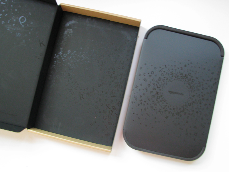
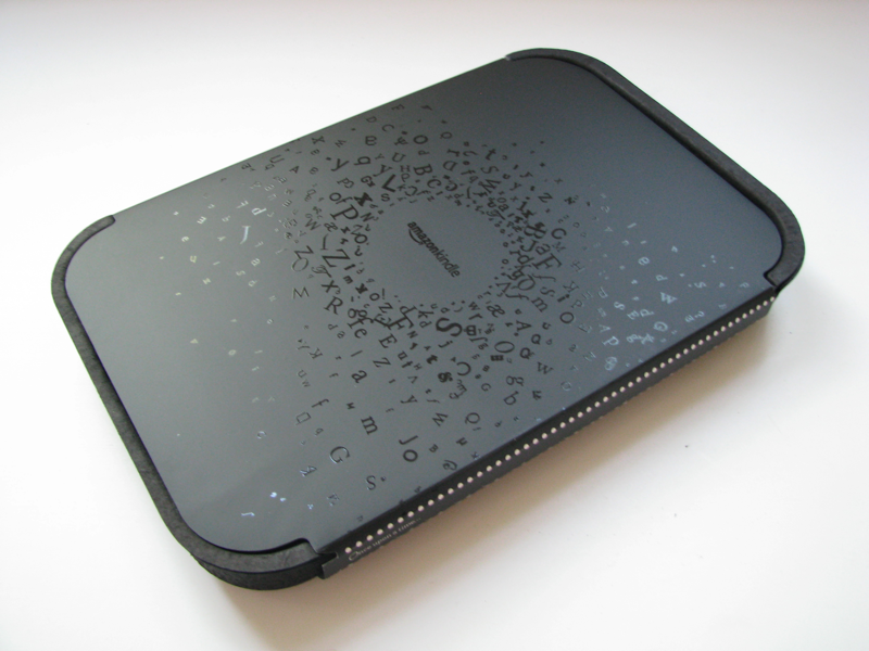
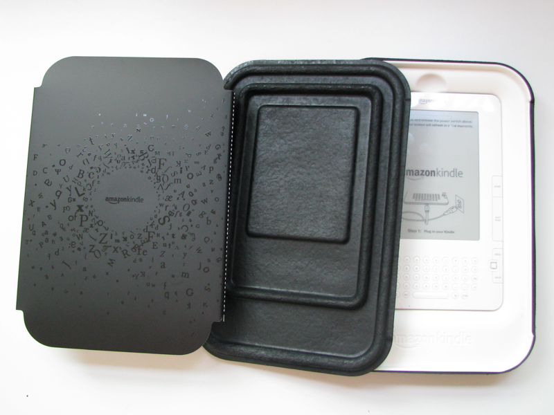
Inside the box, the Kindle 2 device sits in a paperboard tray resembling a microwavable meal. It and the inside of the exterior box are both covered in what looks like Harry Potter-inspired magical black text.
Both the exterior box and the magical meal tray appear designed to get users to rip the packaging open so as to leave it more difficult to return. However, it's still pretty easy to open up the box and leave all the wrappings intact, just in case you want to leave yourself the option of returning it later.
Easy to set up and use
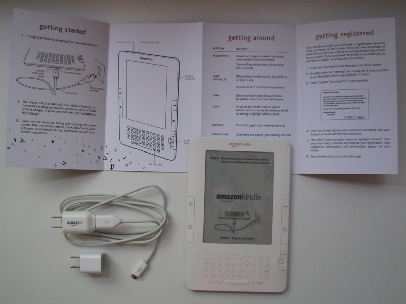
The unit itself sits on a white plastic tray just like the iPhone's, with a thin getting started manual and a USB power cable tucked behind it.
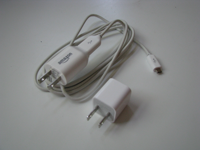
The power cable is nearly identical to the one Apple ships with its iPods, although it users a plain mini-USB connector to connect to the device rather than Apple's Dock connector, which also supplies audio and video output and remote controls that are not necessary for the Kindle.
The USB cable unplugs from the power adapter, allowing it to serve as a sync cable for a computer (which is wholly optional; Amazon designed it to not need to sync with a computer at all), and also charge from any standard USB port (including an iPod power adapter).
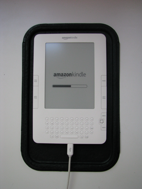
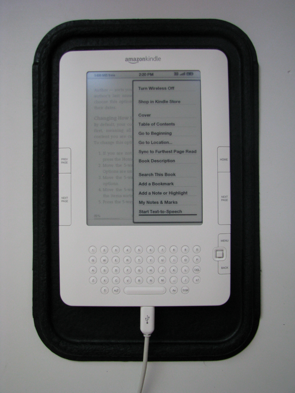
Once plugged in, the Kindle 2 starts charging, and is immediately usable while being charged. It boots up fairly quickly and starts with a manual on how to use the device.
iPod-style industrial design
The new version is not just thinner and more attractive (the original model looked like a Pontiac Aztec), but is built better all around, with a fit an finish similar to Apple's consumer products.
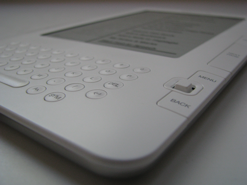
The oddball, former separate silvery menu track for navigation is now replaced by a much simpler menu system controlled by the "five way" mini joystick controller. Page buttons make more sense, and the keyboard, while cramped and challenging to use for more than a few words, is adequate and not excessively in the way.
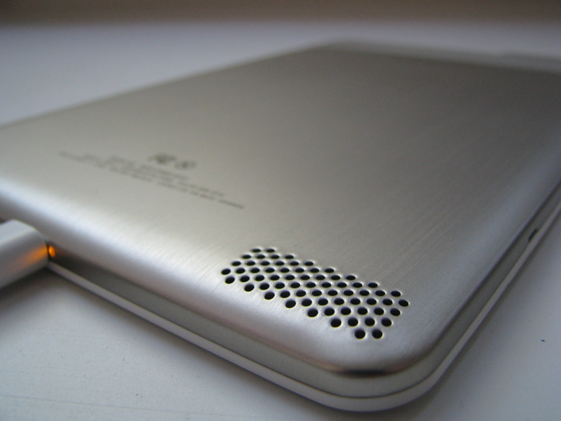
The unit resembles an iPod touch scaled up to accommodate a larger screen, with a plain white front and a silvery metal back. The unit incorporates serviceable speakers that work well enough to hear the new text-to-speech reading system without needing to use headphones, as long as you are somewhere that reading off text won't cause others around you to swing evil looks or punches in your direction.
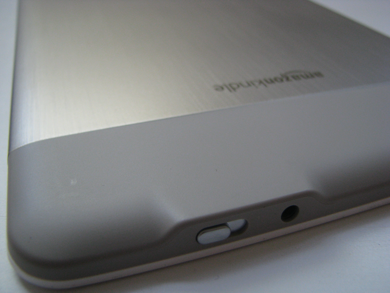
The power/wake switch at the top of the unit makes it easy to power up the unit after it falls to sleep to conserve power (it can sleep with an image on the display). The neighboring headphone jack is the only other ports on the device apart from the mini USB jack on the bottom. There is no longer an SD storage card or a removable battery, following the footsteps of the iPhone and Apple's iPod family.
Same eInk but faster and smarter
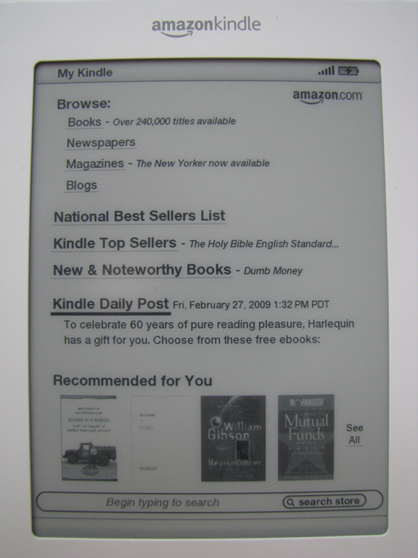
The screen retains all the pros and cons of the original's eInk technology. On the pro side, the screen barely sips power, is easy to read, and is cost effective enough to make the unit $359, the same price as a higher-end iPod, despite having a larger 600x800 display.
The downsides of the eInk screen being that it refreshes very slowly (although slightly faster than the original), can't support color (although it now does 16 shades of grey, making the display look quite a bit smoother), and has no backlight, making it impossible to read without ambient lighting.
The Kindle 2's significant upgrade in physical packaging, a boost to 2GB of storage, longer battery life (on top of what was already plenty for regular use without regular charging), the continued availability of free EVDO 3G wireless access for on-demand content from nearly anywhere, the addition of text to speech synthesis, and Amazon's increasingly large supply of digital book titles, all at a price slightly lower than the original models, will undoubtedly make the new ebook reader even more attractive to the relatively tiny audience of early adopters.
What remains to be seen is how popular Amazon's new device can become following its iPod-style makeover. The answer will say a lot about the eBook market, which hasn't caught on over the past decade despite parallel efforts by Sony and other makers, as well as the potential for devices larger than the pocket sized iPhone.
After all, if Amazon can't sell a book sized, $360 ebook reader to book lovers, Apple probably won't be able to sell an oversized iPod touch to gadget lovers for significantly more (a large, color multitouch LCD display would cost many times more than the eInk screen does). That makes Kindle's future a matter of interest to much wider audience than just avid bookworms.
The Kindle 2 is now available for immediate order.
