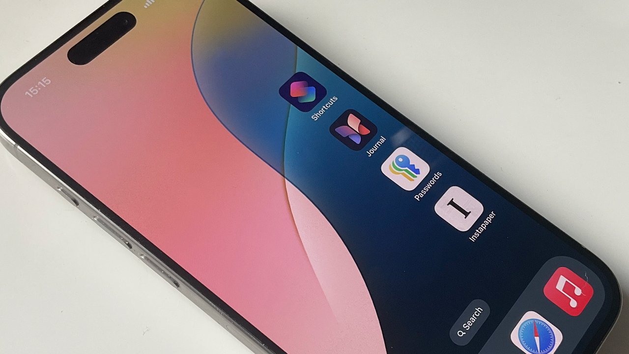
Apple hasn't really got rid of its regular iOS home screen grid, but with iOS 18 it lets you customize it much more. Here's what it looks like.
As expected, iOS 18 has greatly increased just how much users can customize their home screen. There was never really a chance, though, that Apple would allow users to make a mess.
So while home screens appear to be no longer limited to four columns of apps and seven rows (including the dock), actually, they still are. The difference is that users can decide where to place apps in that grid, and while Apple guides them, it doesn't force apps into the next available slot in the grid.
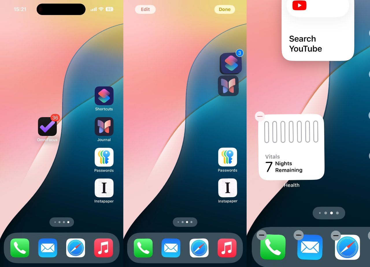
To rearrange icons, press on an app and hold, as ever. When a pop up menu appears, you can choose Edit Home Screen, or just wait for a moment longer.
In either case, all of the apps on your iPhone start wiggling and gain a minus-sign icon at top left. To move the apps around, you can again press and hold while it's wiggling, and drag it wherever you want.
That now means to any position on the screen, or rather to any position in Apple's invisible grid. Drag the app to any point and when you let go, it snaps to the nearest neat spot.
Moving lots of apps around at once is a little more fiddly, but it can be done and it lets you whole sets of them to new positions, or new home screen pages.
This time when you let go of multiple apps, they again fall into neat slots, but fill out rows starting from wherever your first app lands.
How to rearrange multiple apps at once
- Press and hold on an app until they are all wiggling
- Keep pressing on that first app
- With a different finger, quickly tap on each of the other apps
- Now drag the original app to where you want
- Let go and the apps will fall into place
When you tap the other apps, while holding the first one, those apps fly to underneath your finger. When you let go, all of them fly back out, but now landing in the nearest empty places in the grid.
The same can be done with widgets on the page. If one is already there, it can be dragged to a new position.
There's also an Edit button that lets you add new widgets.
However, you can't press and hold to drag more than one widget around. Nor can you drag apps and widgets together.
Note that this was tested in the initial developer beta of iOS 18 and so steps may be changed later.
