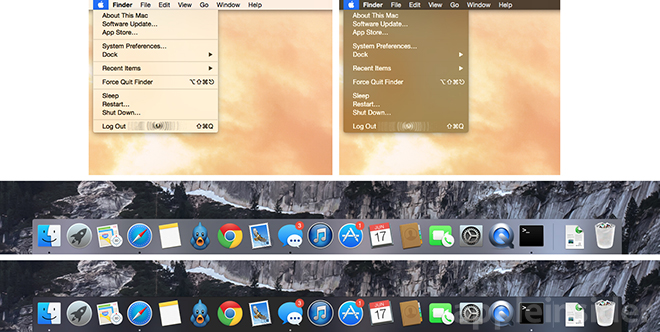
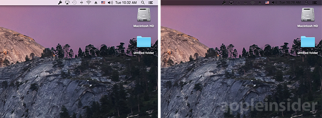
It was discovered on Tuesday that the second OS X 10.10 Yosemite beta contains code to activate an early version of "dark mode," which changes the translucent light gray menu graphics to a darker shade closer to black.
Some two weeks after Apple issued the first Yosemite beta at WWDC, developer Hamza Sood discovered that today's update contains code for dark mode, which can be activated through a simple Terminal command.
Developers can test out the new capability by entering the following code into Terminal, logging out and logging back in: sudo defaults write /Library/Preferences/.GlobalPreferences AppleInterfaceTheme Dark. To return to the default light gray graphics, change "Dark" to "Light" and perform a login cycle.
As seen above, dark mode is most definitely a work in progress as borders of icons shown in the menu bar are not correctly displayed.
Apple will introduce dark mode when Yosemite launches this fall as an alternative view for users who prefer not to be distracted by OS X's menu and dock. The new functionality may be most important for imaging professionals.
 AppleInsider Staff


-xl-m.jpg)


 Malcolm Owen
 William Gallagher
 Amber Neely
 Andrew Orr








36 Comments
Thank God! I've been dreaming of a subtle, clean, dark, OS interface ever since Copland debuted on Mac OS 8. A few more months wait can't hurt.
I don't know why they don't make Dark Mode the default of the OS anyways. I think it looks so much better. I've always adored the UI of Apple's Pro Apps because of the dark interface.
You can do pretty much the same thing with the Accessibility pane right now; so what's the deal?
You can do pretty much the same thing with the Accessibility pane right now; so what's the deal?
No, you can't. You can make a negative of the whole screen--which gives you black menus, along with messed up video, photos, graphics you're working on, icons, album art, games, Finder tags, wallpaper.... every aspect of color on the whole system.
Now we can have a dark theme for the UI without messing up non-UI elements. Looking forward to it!
I don't know why they don't make Dark Mode the default of the OS anyways. I think it looks so much better. I've always adored the UI of Apple's Pro Apps because of the dark interface.
I don't know why they don't make Dark Mode the default of the OS anyways. I think it looks so much better. I've always adored the UI of Apple's Pro Apps because of the dark interface.