Apple leaks new scroll bar UI details in Mac OS X 10.7 Lion
Jobs' presentation focused on a few incremental evolutions, ranging from a more iPad-like implementation of full screen apps (Preview and iPhoto, specifically) to an enhanced version of Exposé named "Mission Control" that better integrates with the Dashboard and Desktop views, and also does a better job of clustering apps' windows together.
Apps' clustered windows in Mission Control behave more like groups of photos on the iPad, another example of the cross pollination going on between iOS and the Mac OS X desktop. The new interface also blends Spaces' virtual desktops into the user interface more cohesively in a way that will likely be accessible to a wider audience.
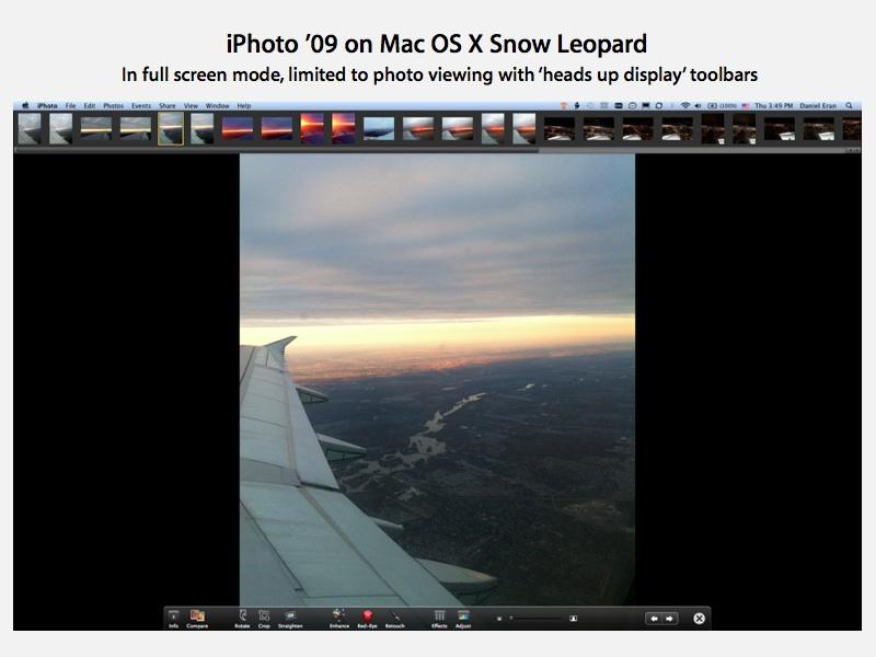
The concept of full screen apps goes beyond the "heads up display" full screen views the company has been experimenting with. Rather than presenting a single document full screen, with a normal menu bar, navigation controls and tool bar palettes that slide into view when the user mouses over the top and bottom of the screen, the new full screen view of iPhoto 11 presents a simplified, windowless interface with an iPad-like toolbar that's always visible. There's also subtle grey scroll bars.
What Jobs didn't address: vanishing scroll bars
Curiously, Jobs didn't make any mention of another significant interface element that appears to be undergoing a rather radical rethinking in Mac OS X Lion: the scroll bar, which now appears to vanish whenever its not in active use.
Jobs similarly presented iTunes 10 recently without even mentioning the rather radical vertical repositioning of its title bar window controls, as if such a change were not that big of a deal. To many Mac users however, any changes to the user interface guidelines are very noteworthy, and often even arouse controversy.
Screen shots taken during the "Back to the Mac" presentation— and particularly enhanced shots Apple has provided to the media— reveal that apps modernized by Apple as part of Lion do not present scroll bars until the user begins scrolling, similar to the iOS.
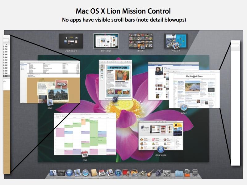
Specifically, the Mission Control screen shot (below, click to download the full size graphic) indicates that Mac OS X Lion's new Mail, iCal, Mac App Store, Safari, and the iWork Pages app all present their documents and content without active scroll bars at all.
On page 2 of 3: Lion's contextual scroll bars.
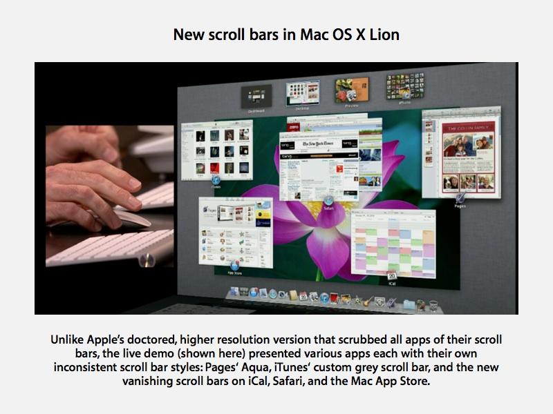
The higher resolution image of Mission Control isn't entirely consistent with the apps Apple demonstrated however. Craig Federighi, Apple's vice president of Mac OS X engineering, demonstrated a brief glimpse of Mac OS X Lion features where a mishmash of scroll bars intermingled.
Incidentally, Federighi formerly led Apple's WebObjects server development before leaving the company in 1999 to serve as the chief technology officer for Ariba. Last year, Federighi was recruited back to Apple by Bertrand Serlet, the company's senior vice president of software engineering. Back in the 90s, Federighi worked as a protege of Serlet at Apple and before that at NeXT, where he served as a key architect of the company's object-oriented frameworks for enterprise application development.
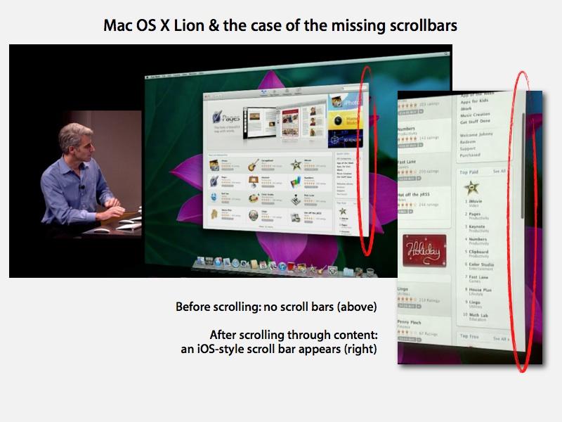
In his sneak peak at Mac OS X Lion, Federighi first opened the new Mac App Store, which at launch displayed no scroll bar, despite having more content than could fit in the window. However, after scrolling into the app listings, a dark grey iOS-style menu bar appeared with no scroll arrows nor any menu bar track. After a moment of inactivity, the scroll bars vanish again. This appears to be the new look of scroll bars in Lion, or at least the preferred option.
The Mac App Store is also unique in that it centers the window button controls with the tool bar buttons, eschewing the use of a window title bar at all. Presumably, if you have the Mac App Store open, you don't need a line of text telling you that's what it is. This divergence from the Mac OS X human interface guidelines is interesting, and again, tends to result in a more iPad-like experience, despite the app existing as a free floating window on the desktop and not a full screen app.
In fact, the Mac App Store appears to be designed not to enter full screen app mode, as its green Zoom button is dimmed. In the presentation, Federighi also explicitly noted in passing that the green button is now considered a full screen app button rather than the "zoom to the largest window size that makes sense" that it always has been on the Mac.
On page 3 of 3: Still a work in progress.
In addition to the new Mac App Store, Federighi's demonstration also revealed the new scroll bar behavior in less exciting apps, including Dictionary, which he briefly opened up while showing LaunchPad. Dictionary opened with the same new tiny, trackless iOS-like grey scroll bar that then disappeared after a moment.
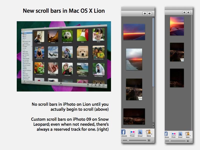
iPhoto 11 also launched with no visible scroll bar, despite having more than a single window of content. When taken full screen, the app continued to have no visible scroll bar. The existing version of iPhoto running on Mac OS X Snow Leopard always reserves a column for the scroll bar, even when there's no need for one (below). Safari and iCal also both appeared without scroll bars in the demo.
At the same time, while apps such as Pages are depicted in the Mission Control artwork (above) without using a scroll bar, the app was demonstrated on screen by Federighi with a bright blue Aqua style scroll bar visible at all times. This is probably because Pages hasn't yet been updated to the new Lion look and feel as other bundled apps (and the recently revised iPhoto 11) have. iTunes 11 was also portrayed with its current, custom grey scroll bar.
The beta version of FaceTime for Mac that Apple released to Snow Leopard users makes a half-step in this direction, presenting a non-standard, dark colored scroll bar that gets a slight highlight when the user mouses over it. However, its scroll bar never completely disappears as it does in the desktop Lion apps, or in today's iOS apps.
The disappearance of scroll bars when not in use follows Apple's history of experiments with getting rid of other window elements, notably the title bar. In Snow Leopard's QuickTime X, the title bar of the video-playing window vanishes to reveal a larger playback area, and then reappears when the user mouses over.
The new FaceTime app also has a vanishing title bar in the same shiny black finish as QuickTime X, although it only disappears during an actual call. That app is still in beta, so its user interface is still a work in progress. Its security model is also rough around the edges, initially presenting all of the signed-in user's MobileMe account information before the oversight was noticed and Apple began to block users from accessing their account details from within the app.
 Daniel Eran Dilger



 William Gallagher
 Andrew Orr
 Sponsored Content
 Malcolm Owen


 Mike Wuerthele