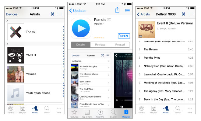
Apple on Monday released an update to its iTunes remote control app for iOS devices, bringing a new visual design and adding support for iTunes 11.1.
First spied — Â in the form of a redesigned icon — Â last month, Apple's Remote app has been updated to version 4.0, just the second refresh for the app this year. Apple says the update requires iOS 7, and is optimized for iPhone 5.
Apple chose to keep the feature list for Remote the same, aside from the version-bumped iTunes support, but rather focused on updating the app's user interface. Users can still control every aspect of iTunes playback on their Mac, and those with an Apple TV maintain the ability to use their iOS device as a remote control and keyboard for the living room media streamer.
The new visual direction matches that of Apple's other iOS media playback apps, namely Music and Videos, and sports a slightly darker blue hue for buttons and list controls. The app also features the same new, flatter icon seen earlier.
Remote's update leaves iBooks, iTunes U, Find My Friends, and Keynote Remote as the only first-party App Store apps that have yet to receive a visual overhaul for iOS 7, release just over one month ago. Keynote Remote is particularly neglected, having not seen an update of any kind since 2011.
Update: Apple on Monday also updated its AirPort Utility app with 64-bit support to take advantage of the iPhone 5s' A7 processor.
 Shane Cole



 Marko Zivkovic
 Wesley Hilliard
 Christine McKee
 Malcolm Owen
 William Gallagher
 Andrew O'Hara



32 Comments
Why the darker hue of blue? Are they still experimenting with the new UI design? Interesting. I hope this isn't just a matter of the left hand ignoring the right hand.
There's a lot wrong and missing in this version.
1. I can't find iTunes Radio. It still controls iTunes Radio if I start it from my computer, but there's no way to start it from my iPod Touch.
2. The colors for the track information and the time remaining bar are very odd. They are somehow based on the album cover, but they also fade from one color to another. This makes the information much harder to read.
3. AirPlay icon next to the volume control? I thought that they were banishing that icon to the Control Center?
I hope Find My Friends is next. It was ugly when it first came out but it's now it's just so much worse in comparison to the clean and modern iOS 7.
It's alpha! Extremely buggy.
There's a lot wrong and missing in this version.
3. AirPlay icon next to the volume control? I thought that they were banishing that icon to the Control Center?
That Airplay icon is to control the remote device's (e.g. the Mac your are controlling) AirPlay setting. It's not for setting Airplay on the iOS device you are currently using. It's a remote app, remember.