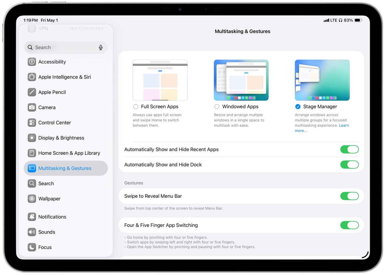
iPadOS 26 is the first iPad update in years that makes the device feel meaningfully closer to a real primary computer, even if it still isn't consistent enough to fully replace a Mac.
Apple has continually enhanced the iPad's hardware, yet the software remains tethered to an iPhone-like design. The design has always imposed strict sandboxing, limits background activity, and restricted multitasking capabilities.
Those choices prioritize security and efficiency but prevent apps from behaving like they do on a Mac, which has long limited the iPad in more complex work. With iPadOS 26, Apple addresses some of those limits, as well as giving it a facelift with its new Liquid Glass design.
As part of that new design, the update introduces a new windowing system and a refreshed interface that push the iPad closer to desktop-style workflows without turning it into macOS.
I used my iPad Pro as my primary computer before iPadOS 26, even with a MacBook Air nearby. The iPad fits how I prefer to work, but iPadOS has often forced compromises that macOS does not, and this update reduces some of those gaps without fully eliminating them.
iPadOS 26 review - Liquid Glass offers a new look
Liquid Glass certainly gives iPadOS 26 a distinctive look, and I like it overall, but it matters less than the workflow changes and occasionally it even gets in the way. Liquid Glass is predominantly a visual style and emphasizes translucency, depth, and motion.
So controls adjust their color and contrast based on what's behind them, meaning that the same buttons can appear lighter over dark content and darker over bright areas. There are also changes to how menus and options appear, some of which is definitely a positive:
- Common actions move closer to where you interact
- Icons, widgets, and panels adapt to your wallpaper
That last is best exemplified by the Weather app, which is a particularly attractive design. However, even in that case, there is a tradeoff in simple readability with Liquid Glass.
For instance, with iPadOS 26 you are much more likely to have overlapping windows, because you can, and because it is definitely a boon to be able to see multiple apps. But the readability issues were enough that Apple added more controls in the iPadOS 26.1 update, that let you choose between Clear and Tinted appearances.
There's also Reduce Transparency, an option that is tucked away under Settings, Accessibility, and Display & Text Size. That removes most translucency across the interface, improving contrast when Liquid Glass becomes distracting.
Liquid Glass definitely does enhances the iPad's appearance by adding depth and motion to the interface. Yet some elements can even distract when scrolling through content because the glassy distortion effect moves across the material underneath.
Consequently, those improved controls in iPadOS 26.1 are needed to tone down when Liquid Glass gets in the way.
But then Liquid Glass, for all the attention paid to its visual style, is also a productivity aid. It's the overall Liquid Glass look and feel that makes the iPad just that much more like a Mac.
iPadOS 26 review - The iPad works more like a Mac
Most significantly, iPadOS 26's Liquid Glass redesign introduces resizable, movable windows that finally let you arrange apps around the task instead of forcing the task into the system's layout. You can now open multiple windows at once and keep everything in view.
Safari can sit next to Pages, Notes, Messages, and Files without forcing everything into a fixed Split View layout or a Stage Manager group.
So apps and their windows can be arranged around the task instead of the other way around. Plus iPadOS 26 remembers where each window was placed, so your layout stays intact across tasks.
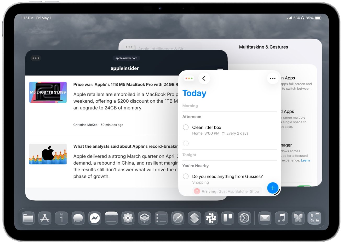 Windows can be arranged around the task instead of the other way around
Returning to a project brings back the same workspace instead of forcing you to rebuild it. The best part for me is drag and drop, because moving text, images, or files from one app to another feels much more natural when both apps can stay visible.
Apple also adds more direct ways to organize windows. Apps can snap into halves and quarters instead of being locked into the previous Split View or Slide Over options. Then, too, an Expose-style view now shows every open window at once instead of your having to group them together in Stage Manager.
As good as all of this is, I use the 11-inch iPad Pro, and the smaller screen makes the new windowing feel cramped faster than you'd expect. Smaller iPads don't benefit from freeform windowing as much as larger models, so tiling often works better than trying to manage several floating windows.
But then windows can also minimize when you want to clear screen to concentrate on something. That alone makes the iPad feel closer to a traditional desktop.
You'll need time to learn how to place, resize, and manage multiple windows, though, and early on it's easy to misplace apps, trigger the wrong layout, or fight resizing behavior that isn't always consistent.
Arranging apps is still less smooth than on macOS, especially when you're trying to maintain a clean layout across tasks. Resizing isn't consistent, and it's one of the first things you notice when you start working this way.
Plus all these months after iPadOS 26 came out, you will still run into apps that jump between sizes, break layouts, or don't fully support the new system.
Nonetheless, daily work is more flexible with this windowing because opening a document from Files or Mail simply creates a new window on screen instead of entirely replacing the previous app. You can keep your existing layout intact and return to it after checking a document, rather than rebuilding your workspace each time.
As a result, the iPad finally supports more complex work without constantly reminding you that the operating system is in the way.
Windowing gets most of the attention, but ultimately it's only as good as it is, though, because the rest of the system finally starts catching up with the Mac.
iPadOS 26 review - desktop-style workflows finally mature
The new menu bar adds a Mac-style layer on top of existing app controls rather than replacing them. I like it because it surfaces controls you may have forgotten about or never even knew existed, and the Help menu is especially useful when you want to search for an action instead of hunting through the interface.
Older iPad apps often hid commands in toolbars, popovers, and gestures, which made them harder to find. Command search fixes that by letting you type what you want to do instead of hunting through the interface.
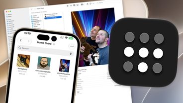
Then, too, the Dock now plays a larger role in iPadOS 26 by acting more like a workspace than a simple app launcher. You can pin folders from the Files app, including locations like On My iPad, iCloud Drive, or external storage, then open them and drag files directly into apps like Mail, Messages, or Notes.
You can also drag apps from the Dock to tile them on screen or place them into Slide Over. This makes multitasking feel more direct and useful than before. It means you can keep documents, conversations, and reference material within reach during active work and not have to constantly think about switching apps.
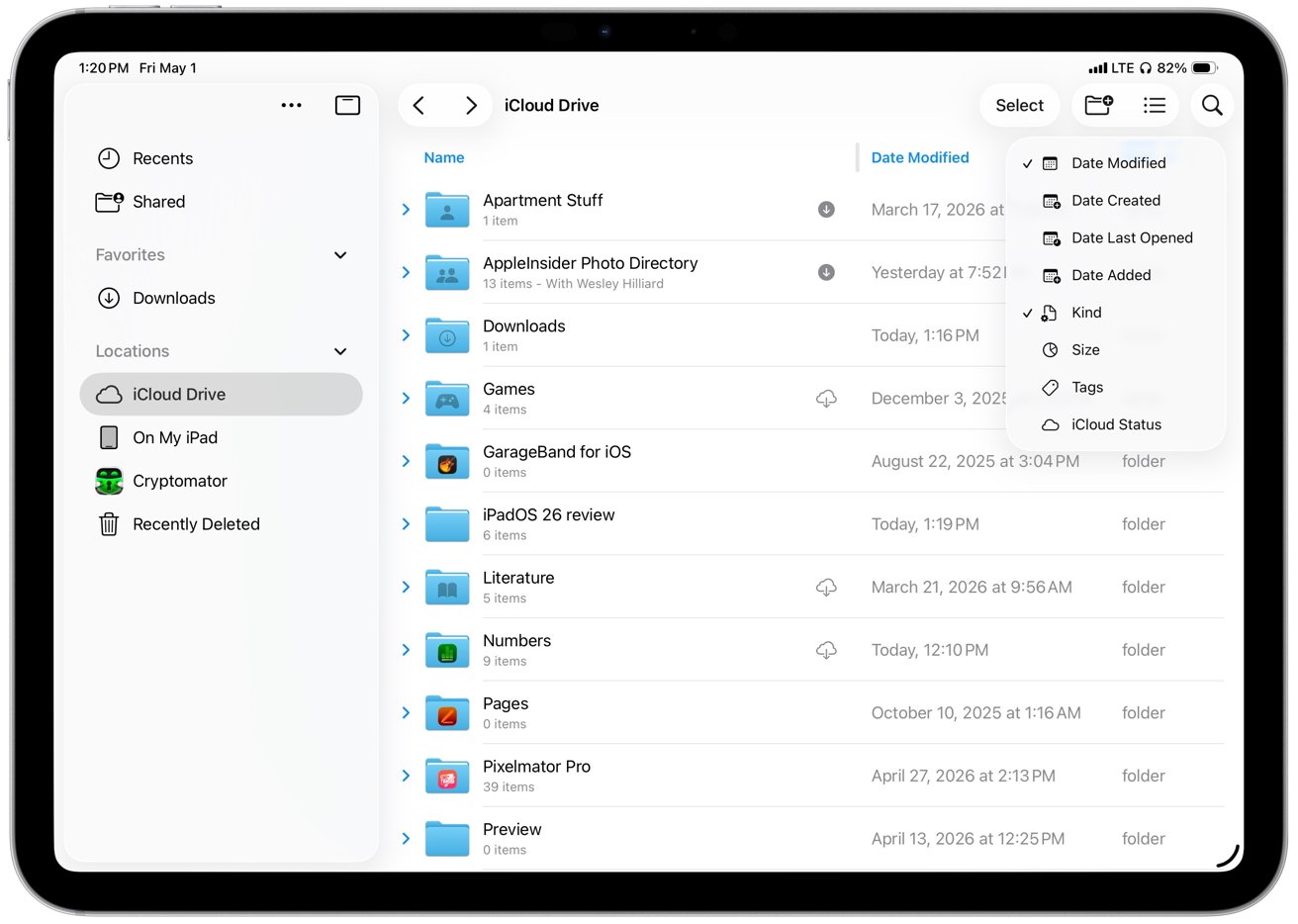 Files in iPadOS 26 expands its list view to show more metadata
In another way that the iPad now benefits from Mac-like features, there's the updated Files app. In iPadOS 26, Files becomes much more useful by expanding its old list view to show more metadata at a glance, including file size, kind, date modified, and tags.
You can also sort by each column directly from the header, which makes Files feel less frustrating when you are working through a large folder.
Plus collapsible folders expand inline, so you can click a disclosure triangle next to one folder and see its contents without having to open it first. Consequently, it's now possible to look through nested directories without ever leaving your current location.
It makes large project structures easier to navigate, because you are no longer constantly going into and out of folders. Then, too, resizable columns let you prioritize names, dates, or sizes, meaning you can see more, and you can drill down into just what you need.
That's a boon by itself, but then there's how the new Files app remembers my layout and sort order for each location. Returning to the same folders no longer requires resetting how files are displayed.
iPadOS 26 also makes background work more visible and dependable, especially for file transfers, exports, and downloads. The update introduces persistent progress indicators in the Files app and system UI, such as real-time transfer bars and status badges.
Previously, large exports, copies, or downloads would feel tied to the app that started them. If you've ever exported a video from Final Cut Pro for iPad, you know that you simply have to walk away until it's done, because there was nothing else you could do.
Now operations like that can continue in the background — if the app supports this feature — while you move between apps, open documents, or rearrange windows.
So now, at last, I can start a file transfer, jump into Messages, and come back without losing progress. It removes an annoyance more than it radically changes my workflow, but, still, if you're a Mac user, this is something that seems so basic.
Also, to facilitate this new flexibility, completed tasks surface clear confirmations or notifications. So now you immediately know when large operations finish and you're not left having to check manually.
In another Mac-like move, the iPad's cursor now behaves more like a standard pointer, with more precise control and familiar interactions across buttons, menus, and text fields. iPadOS 26 moves away from the circular, morphing cursor used in earlier versions and adopts a more traditional pointer model.
 Background tasks in iPadOS 26 show persistent progress indicators in the Files app and system UI
Moving that pointer quickly back and forth enlarges the pointer so it's easier to find on larger displays, just as it does on the Mac.
It's not that the iPad should become a Mac, though. There are still iPad-specific features and a particularly welcome new one concerns the menus that apps can now display. A system-wide menu bar appears at the top of the screen when using a keyboard and trackpad, giving you consistent access to app commands.
It all makes longer workflows more practical.
iPadOS 26 review - external displays show progress and remaining gaps
If you are going to be using your iPad for extended work, though, you've long been able to use an external monitor and that has seen an improvement too. iPadOS 26 extends the new windowing system across displays and lets each screen host its own set of apps with independent window placement.
Now windows can be moved between displays, and each screen keeps its layout instead of resetting when you switch focus.
So you can easily keep a document on one display and reference material on the other, which cuts down on how often you have to bounce between apps.
Earlier versions of iPadOS could do something of this with Stage Manager, but it was limited and it forced you into building groups of apps. Those setups often fell back to mirroring or constrained resolutions depending on the display.
iPadOS 26 removes those constraints and makes multi-display use more flexible.
 Earlier versions of iPadOS relied on Stage Manager for extended display support
However, external display support still has limitations that affect how the system works across screens.
System controls like Control Center, notifications, and certain system menus, for instance, remain on the iPad's built-in display. So there's no equivalent of the way with a MacBook Pro that you can shut the laptop's lid while you work.
You still have to keep the iPad screen to hand in order to accessing system menus or managing certain actions.
Plus external display behavior still depends on app support. So some apps will still open at fixed sizes, ignore certain layouts, or jump between sizes when you move them between displays.
Placement and resizing still feel inconsistent in practice. So there are improvements and they are good, but it's inconsistent. Which is also something you can say about how Apple Intelligence now works in iPadOS 26.
iPadOS 26 review - Apple Intelligence adds capability, but not consistency
Apple Intelligence adds useful features across iPadOS 26, but it's variable enough that you still can't rely on it the way you might expect.
Just as on the Mac and the iPhone, there isn't an Apple Intelligence app. Instead, it powers specific tasks inside all other apps, and that means it can be more limited than full-blown third-party software.
But then that means that Apple Intelligence's Live Translation can provide real-time text translation right inside in Messages. It can provide spoken translation within a FaceTime call.
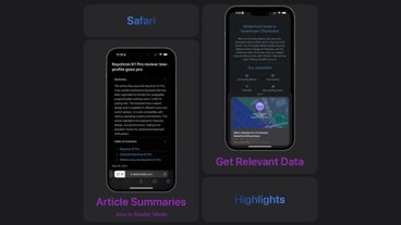
Similarly, Apple Intelligence can summarize text, and do so within other apps. In Mail, for instance, I can scan a long thread and get a quick overview before deciding whether to dig into the full conversation, which saves time when messages stack up.
 In Safari, summaries are more deliberate
In Safari, summaries are more deliberate, since you have to choose to turn them on when you open a site. But they still help when I only need the gist of an article before moving on.
Summaries handle straightforward content well, though they can miss nuance or gloss over specifics in longer or more complex threads. I don't rely on summaries for detail, but they're good enough to decide whether something is worth reading in full.
The system processes many requests on the device, so tasks like rewriting text, summarizing messages, and responding to on-screen content happen quickly and without sending that data off your iPad. Local models keep everyday interactions fast and avoid pushing drafts, emails, or documents to external servers by default.
More demanding requests move to Private Cloud Compute, which runs on Apple-managed servers when the iPad can't handle the task locally. The handoff happens automatically, so simple tasks stay fast on-device while more complex ones depend on that shift and can take longer to complete.
This means that Apple Intelligence can handle those more complex tasks, but it does not mean that Apple Intelligence suddenly becomes less secure. Instead, through Apple's Private Cloud Compute, your prompts are sent with only the minimum necessary data in encrypted form to Apple-run servers built on Apple Silicon.
That then processes prompts and responses in memory without retaining it. It's all designed so that even Apple cannot access user data.
Apple also publishes verifiable system images, which means that security researchers can inspect how the servers operate. You don't see this process directly, but it gives those outside experts a way to absolutely confirm that your data isn't being improperly stored or misused.
Note, though, that access to Apple Intelligence depends heavily on hardware and configuration. Most features, for instance, require iPads with Apple Silicon such as M1 and newer chips, along with devices like the iPad mini with A17 Pro.
Many Apple Intelligence features run directly on the device, including Writing Tools, summarization, Siri's on-screen awareness, and parts of Live Translation. Those features rely on the memory and neural performance those chips provide.
Capabilities vary based on language support and regional availability. For example, features like on-device Siri requests and Apple Intelligence summaries can be limited or delayed in certain regions, and Apple Intelligence features in China face additional regulatory hurdles that affect how and when they launch.
Differences in language support also affect accuracy and feature availability, especially for tools like Live Translation and Writing Tools.
Even within US English, though, there are differences depending on what iPad you have. On-device models take up storage space and may require additional downloads, so availability and performance can vary.
In practice, this means some features arrive later, don't appear at all, or behave differently depending on where and how you're using the iPad. Writing Tools is a good example of how that plays out in daily use.
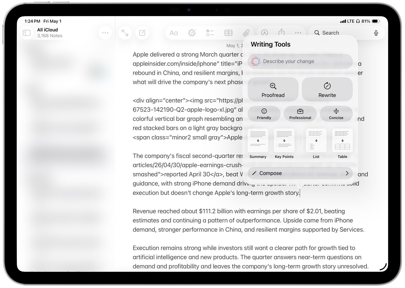
Writing Tools
Writing Tools, one of Apple Intelligence's most prominent features, doesn't generate content like other large language models. Instead, it helps you refine and enhance you existing writing, rather than creating new text from scratch.
 Writing Tools, one of Apple Intelligence's most prominent features
Short edits like proof-reading a sentence or a paragraph, are processed instantly, while longer rewrites take a few seconds to process. Despite that noticeable delay, the editing experience still feels local, and the speed ensures that you don't lose your place while working.
Proof-reading is the part I trust most. The rewrite and tone tools might be useful as optional helpers, but I don't rely on them for anything that needs a strong point of view.
Writing Tools arguably works best as refinement, an option that tightens sentences, smooths awkward phrasing, and cuts repetition. The "Concise" option is the most useful in practice, while tone presets like "Professional" and "Friendly" tend to overcorrect and flatten the voice.
That's where the limits show, since rewrites often lose nuance in longer or more opinionated passages and I don't trust it with original writing or complex arguments. I still check every change, which limits how useful it actually is for real writing.
Writing Tools isn't better than dedicated AI tools because it focuses on short edits and refinements rather than generating or restructuring longer pieces of content. It's useful because it's built into the system and always within reach, even if it doesn't replace more capable tools for complex writing.
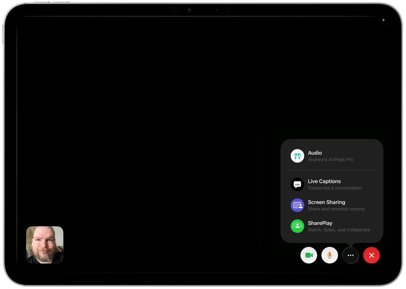
Live Translation
Whereas Live Translation is startling. It extends Apple Intelligence into real-time communication across Messages, FaceTime, and calls.
The feature works directly inside these apps, so conversations translate in place without switching tools. So you can talk or message across languages without breaking the flow or copying text between apps.
It's in Messages that Live Translation offers the most immediate benefit in daily use because incoming and outgoing text appears translated inline. The interface keeps the original message visible below the translation, which makes it easier to follow longer conversations and verify meaning when phrasing is ambiguous.
 Live Translation extends Apple Intelligence into real-time communication
FaceTime and calls bring the same idea to spoken language. The system generates live captions on screen as people talk, translating speech in real time so each side can follow along in their preferred language.
Some scenarios also support spoken output for translated audio, though availability depends on language support. Live Translation handles language detection automatically in most cases.
The system identifies the language each person uses during a conversation. It adjusts translation direction automatically and removes the need to switch languages manually.
I don't need use Live Translation in my daily workflow, but the value is obvious for people who regularly message or call across languages. In my experience, accuracy holds up well for simple exchanges, but it does breaks down once conversations get more complex.
Strong accents, background noise, and technical language make mistakes more likely, too. So the feature works best for casual communication rather than precise or specialized discussions.
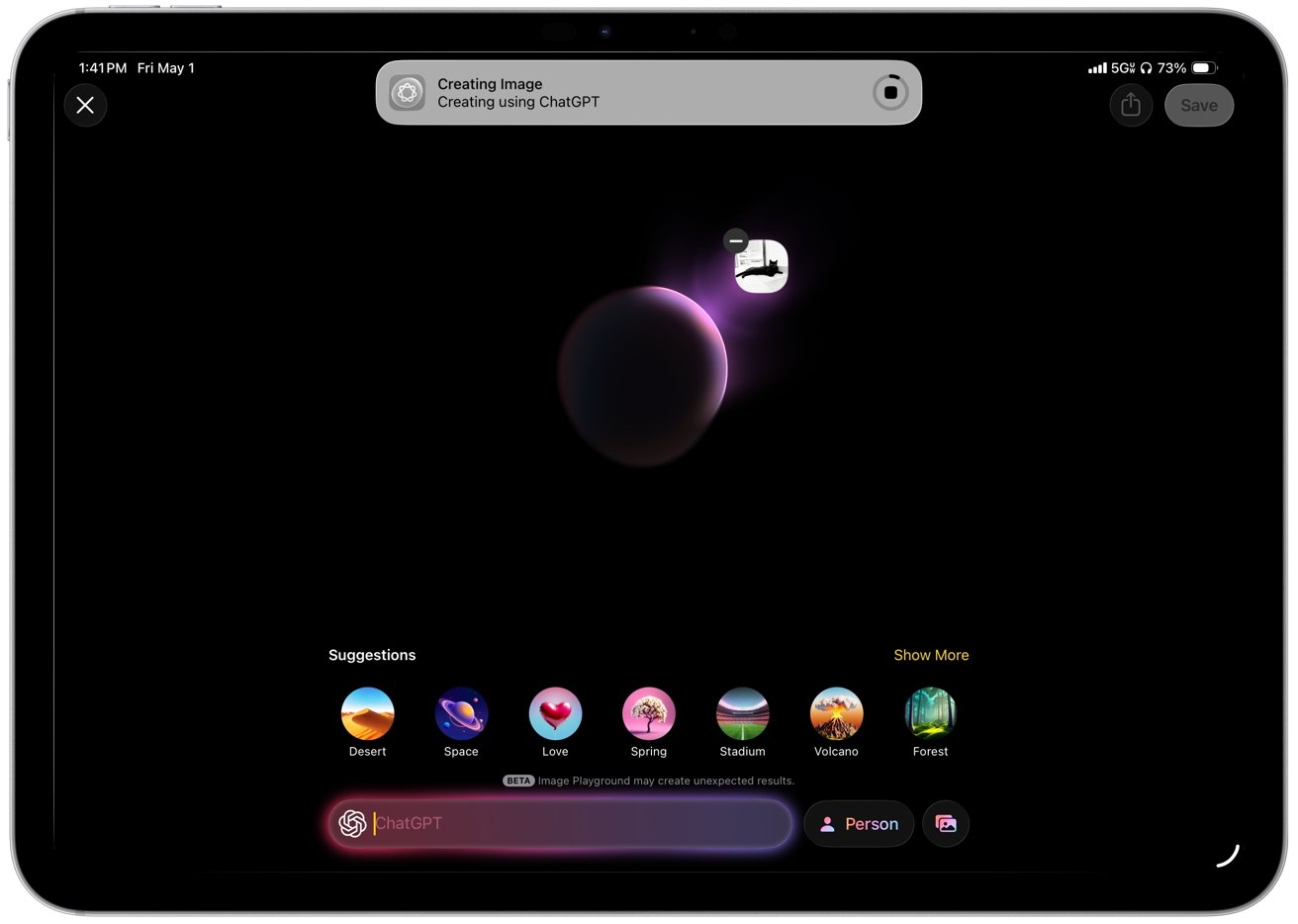
Genmoji and Image Playground
That's also true for Genmoji and Image Playground, which aren't entirely new to iPadOS 26, but are expanded. They are still for lighter, more casual use like messages, reactions, and quick visuals, but now Apple has expanded both with more customization options and deeper integration into system apps.
I rarely use Genmoji or Image Playground, and they feel more like occasional novelties than tools that change how I use the iPad. Still, the changes make them easier to access, although they remain incremental rather than defining additions to the update.
You'll soon find limitations, too. Imaging limitations in particular become clear when I try more specific requests that require detail, tone, or realism. Image Playground relies on a narrow set of styles and produces flattened results with minimal variation.
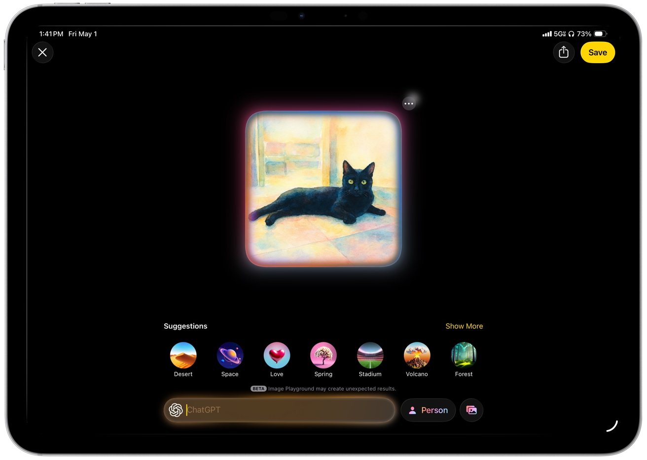 Image Playground relies on a narrow set of styles
Genmoji follows the same pattern in everyday use. I can generate personalized emoji on demand, though the results rarely capture subtle expressions or context with accuracy.
Apple prioritizes safety, speed, and system-level integration across these features, but that approach limits flexibility and output quality.
Genmoji and Image Playground offer visible examples of Apple's AI strategy, though they play a smaller role in sustained work. Apple focuses on integrating AI into familiar system features instead of introducing a single dominant interface.
Although you might think that Siri would be the perfect example of a single, dominant interface for everything.
Siri
Siri has not had its promised radical improvements yet, but it does now understand and respond to what's on your screen. So you can ask it to summarize an email thread, pull details from a message, or answer questions about a document without switching apps. Apple calls this on-screen awareness.
It works best in apps like Mail, Notes, and Safari where content is clearly structured, and it's less reliable in more complex or dynamic interfaces.
Siri no longer takes over the full screen and instead uses a soft, multicolor gradient glow around the edges of the display, with shifting tones like blue, purple, and pink. I like it better than the old interface because it keeps the app in view and makes interactions feel quicker and less disruptive.
The interface also shows a compact response panel that keeps the current app visible. Results show inline, which keeps the original content visible and makes it easier to reference what you are asking about in real time.
 Siri no longer takes over the full screen and instead uses a soft, multicolor gradient glow around the edges
Typing plays a larger role alongside voice input, with a persistent text field that lets users enter requests at any time. The interface supports typing and speaking in the same place.
That means Siri becomes easier to use in shared spaces or situations where speaking out loud is not practical. And then whichever way you use it, Siri can hand off more complex or open-ended requests to ChatGPT when it isn't able to provide answers directly.
Just as with all of Apple Intelligence remaining secure even when it uses ChatGPT, Siri prompts you for permission before it sends anything externally.
Simple requests run on-device, and more demanding tasks route to Private Cloud Compute. The transition happens automatically with faster responses for basic actions and no visible indication when a request moves to cloud processing.
All of this means that Siri is less annoying in iPadOS 26, but it still needs a lot of work. Most of the improvement comes from better context awareness and presentation rather than a fundamental shift in how much Siri can actually do, and hopefully iPadOS 27 will push that further.
iPadOS 26 review - apps and additions fill overdue gaps
Siri, and especially windowing are noticeably improved in iPadOS 26, but this update also focuses on closing long-standing gaps that have limited the iPad in everyday workflows. New apps and system features bring native support for tasks like PDF editing, phone calls, journaling, gaming management, and structured content consumption.
Many of these tasks previously required workarounds or third-party apps, so these additions reduce friction across common tasks. More work happens without relying on external tools, and that makes the iPad feel more complete as a primary computing device.
Preview
The iPad now gets a dedicated Preview app, bringing Apple's macOS PDF viewer and editor to iPadOS 26. It can open documents directly from Files and replaces Quick Look as the default viewer for supported file types.
Performance can be slower than Quick Look, Apple's instant file preview feature, when opening files for viewing, especially when speed matters more than editing. You can change the default behavior by right-clicking a PDF in Files and selecting a different viewer for faster access.
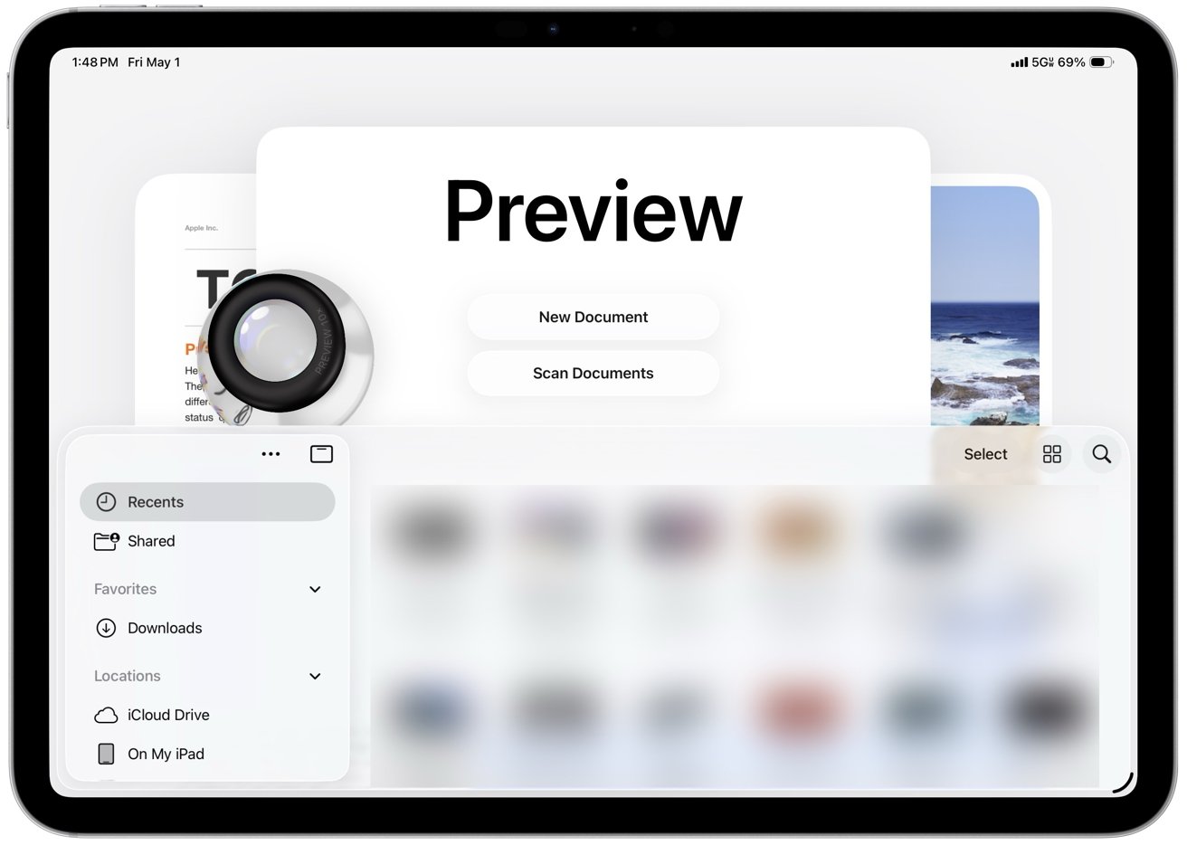 The iPad's Preview app now integrates a native PDF viewer and editor
You can open PDFs directly, add annotations with Apple Pencil or touch, highlight text, insert signatures, and fill out forms within the same workflow.
Preview includes an autofill system for PDF forms that cuts down on repetitive data entry across documents. It recognizes common fields like name, address, email, and phone number and fills them in using your saved contact information.
However, Preview can sometimes misread form fields and suggest autofill where it doesn't belong. You may need to clear or override those suggestions and enter information manually when the layout isn't recognized correctly.
You can review and adjust each field before confirming, though, which keeps the process accurate without slowing it down. Autofill works best with standard form layouts and becomes less reliable with complex or poorly structured PDFs.
The interface resembles the Mac version in a simplified form, with a sidebar for page thumbnails and a markup toolbar for drawing, shapes, text boxes, and signatures. You can open a PDF from the Files app, make edits like annotating, filling forms, or signing documents, and save changes in place without switching apps.
Preview is good enough for most people because it covers the PDF jobs that come up most often. It replaces several common third-party workflows by handling tasks like signing forms, marking up documents, and making quick edits, even if it doesn't attempt to match the advanced tools and depth found in full desktop apps.
Phone
The Phone app comes to iPad through Continuity and mirrors calls from a nearby iPhone using the same Apple ID and Wi-Fi network. Calls, voicemail, contacts, and recent activity appear in a unified interface alongside Messages and FaceTime, though reliability still depends on your connection and proximity to the iPhone.
Incoming calls ring on the iPad, and you can answer, decline, or start new calls directly from the app or from contact cards across the system. The interface mirrors the iPhone with tabs for Favorites, Recents, Contacts, and Voicemail.
Then, too, Visual Voicemail shows messages with playback controls and transcriptions. Contact integration pulls names, photos, and linked information directly from the system address book.
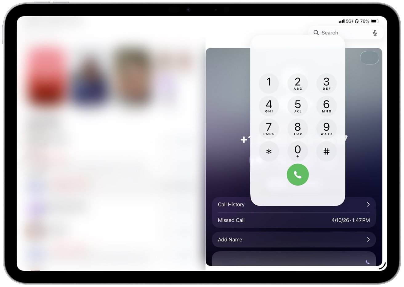 Incoming calls ring on the iPad, and users can answer, decline, or start new calls
Call Screening is a great feature that can answer unknown callers, prompt them to identify themselves, and show a live transcript before you choose whether to pick up or not. Hold Assist can stay on a call, detect when a live agent returns, and send a notification so you can rejoin without listening to hold music.
Live Translation offers real-time translation of conversations during supported calls, providing practical value for multilingual communication. While I don't personally use this feature, I appreciate its availability.
The app still depends on an iPhone nearby because the iPad doesn't place cellular calls on its own, so all activity routes through the paired device. Consequently, for me, it is nice to have rather than essential, but it does make the tablet feel more like a general-purpose computer.
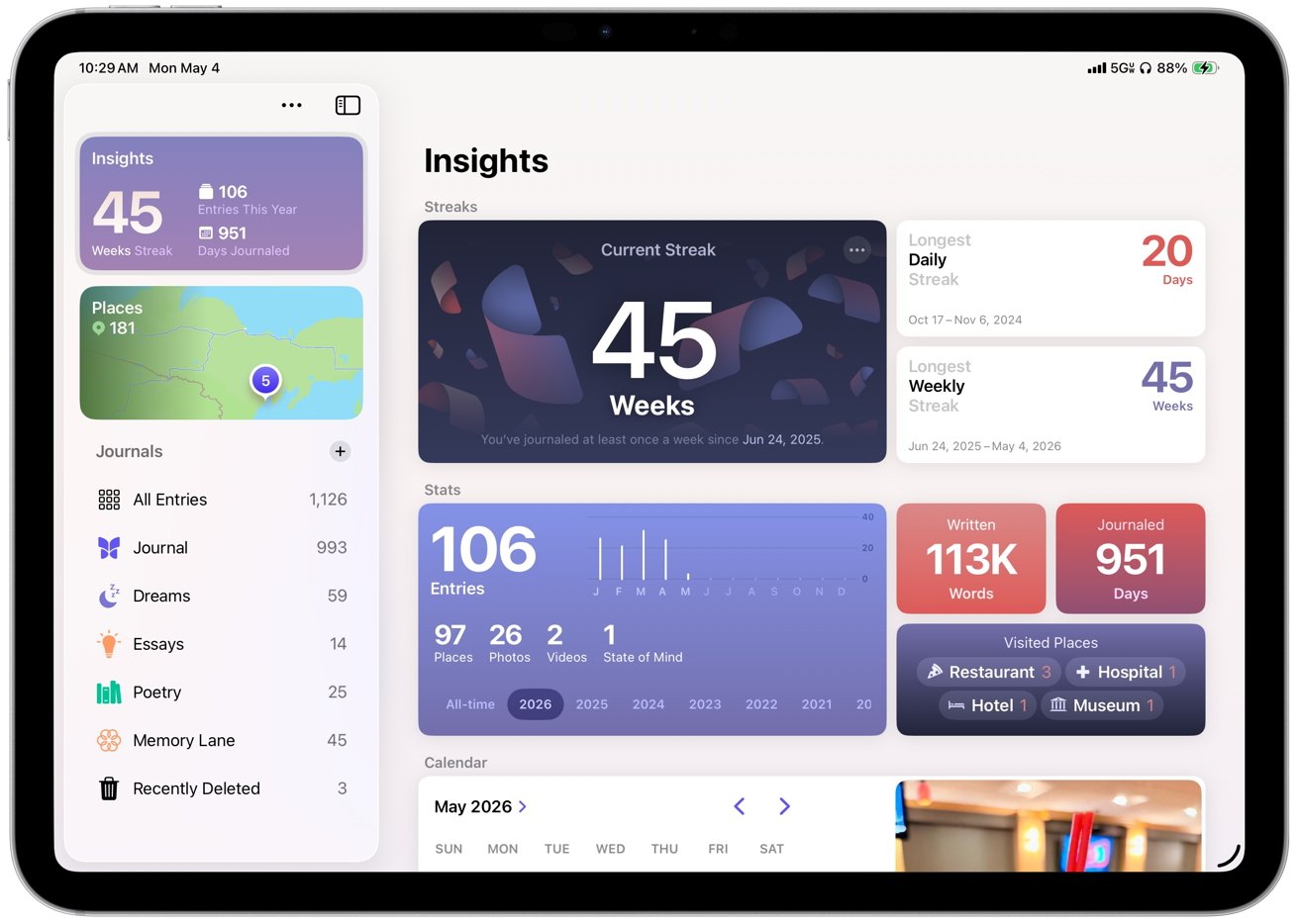
Journal
Journal, one of my favorite Apple apps, arrives on iPad with iPadOS 26 after launching on iPhone and takes advantage of the larger display and Apple Pencil support. The layout gives entries more room to expand, which makes it easier to combine typed text, handwriting, photos, videos, locations, and mood logs in a single view.
Entries build as a continuous timeline with media embedded inline instead of attached separately. Photos and videos sit alongside text, location data appears as maps within the entry, and handwriting can be added directly between paragraphs.
Journal surfaces prompts and suggested moments based on recent photos, places, and activity captured on the device. Suggestions appear directly in the interface and can turn into new entries with minimal effort, making it easier to start writing without needing to come up with an idea.
 Journal creates a dedicated space for personal writing that encourages regular use
Journal on iPad makes me use the app more often because long-form writing is easier with a hardware keyboard than it is on the iPhone. Organization also plays a larger role than it does in Apple Notes, which is where I previously stored journal entries.
Multiple journals, timeline navigation, map views, and insights like streaks and totals make it easier to sort entries and revisit them later.
Apple Pencil support gives handwriting and sketching a natural place inside entries instead of forcing everything through a keyboard. You can write, draw, or annotate media within the same entry.
Journal creates a dedicated space for personal writing that encourages regular use through prompts, structure, and tracking. The app supports longer, more intentional entries and turns journaling into a more consistent habit instead of an occasional task.
Games
Another new app introduced in iPadOS 26 is Games, giving the iPad a central gaming hub that Apple never really had before. It shows a full library, including past downloads, and lets you launch titles directly while sorting by category, size, or install status.
Since I'm not a heavy gamer, I don't use Games often. However, having a central place for the library makes much more sense than burying Game Center in Settings.
A Continue Playing section brings recent games back to the surface, while achievements and leaderboards track progress across titles. Notifications can highlight when a friend beats your score or completes a challenge, which gives Game Center activity more visibility than before.
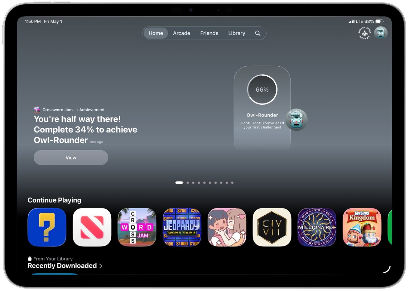 Another new app introduced in iPadOS 26 is Games
Games mostly organizes what was already there, but that still helps. It suggests titles based on your and your friends' gaming habits, highlights new releases, shows top charts and upcoming games, and includes demos so you can try some games before purchasing.
The social layer runs through Game Center. You can track friend activity, take part in challenges, and compete through leaderboards, even in games that are not built around multiplayer.
Invites and challenge prompts make gaming more active without requiring a full multiplayer session. Apple Arcade has its own dedicated space with easier access to its catalog and updates.
Controller support improves the experience in games that support it, with iPadOS recognizing external controllers and allowing navigation without touch. However, support is inconsistent across titles, and some games still ship with incomplete mappings or control quirks.
Apple News
Apple News also sees refinement in iPadOS 26, especially in News+ Food, which Apple introduced earlier as part of its expansion into recipes and cooking content. The core experience remains the same, but it feels more polished and better suited to the iPad's larger screen and multitasking workflow.
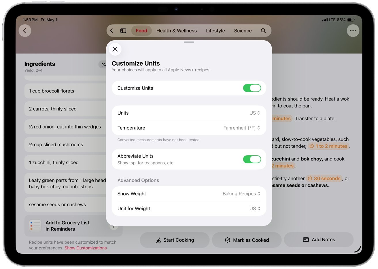 Each recipe includes ingredients, directions, nutrition facts, and ratings
Recipes function as interactive tools rather than static pages, with features like Cook mode, recipe scaling, unit conversion, timers, and saved notes working together in a more fluid way. Those features aren't new, but they feel more usable here, especially when moving between steps or keeping a recipe open alongside other apps.
The result is a feature that finally works like a practical cooking tool instead of just a reading experience.
Apple Music
Apple Music in iPadOS 26 focuses on refinement rather than major structural changes. The app introduces AutoMix, which builds on crossfade to blend songs together with more dynamic transitions that adjust to each track.
I like AutoMix, and it works best with electronic music and other steady beats. It can fall apart or fail to trigger with more traditional songs built around vocals, guitars, drums, or more varied rhythms.
Apple Music's new features also include lyrics translation and pronunciation, allowing you to follow along with songs in various languages directly from the Now Playing view. Library management has seen practical improvements.
You can now pin albums, playlists, artists, or songs to the top of the Library tab for quicker access. Playlists can also be organized into folders directly on the iPad without needing a Mac.
The interface shifts to full-screen artwork that mirrors album and playlist art. It replaces the flat white backgrounds with something that feels more connected to the music you are playing.
Apple Music's design fits into Apple's visual direction across iPadOS 26 and keeps the focus on content. The company also expands discovery and utility features around the edges.
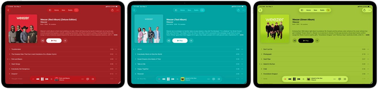 Boring white backgrounds are replaced by full-screen artwork on album and playlist pages that mirror the cover art
Next, you can now find nearby concerts for artists in your library directly within the app, with tour dates, venue details, and ticket links tied to your listening history. Apple Music highlights shows based on your location, but coverage can be uneven, and listings don't always reflect what's actually closest or most relevant in your area.
The feature links listening activity to live events, letting you view details, get directions, or open ticket links without leaving the app.
Music Haptics adds optional tactile feedback that maps elements of a track like rhythm, bass, and intensity to vibration patterns on the device. The system syncs those vibrations in real time with playback and gives users who are deaf or hard of hearing a way to experience music through touch.
Settings let users adjust or disable the haptics, and it works automatically with supported tracks in Apple Music.
iPadOS 26 review - more capable, still inconsistent
There's a lot to say about iPadOS 26 because it does deliver meaningful improvements across multitasking, system design, and core apps, and it handles more everyday tasks without workarounds. However, some of the same issues that have limited the iPad as a primary computer still show up in daily use.
- Connectivity is uneven for a device positioned as a primary computer, with Photos pausing sync over cellular and claiming a poor connection even on strong 5G
- iCloud Backup can require manual intervention after long gaps, even when all cellular settings are enabled
- Third-party apps still lag, with missing or inconsistent keyboard shortcuts
- Window resizing and layouts vary between apps, and some still don't adapt well to landscape or multi-window use
Nonetheless, iPadOS 26 finally makes the iPad feel like the computer it has been trying to be, even if it still breaks down in some familiar places. It's the most usable version of iPadOS yet, and I would use it as my only computer, but it still relies on Apple and third-party developers to close gaps that shouldn't exist anymore.
iPadOS 26 review - Pros
- New windowing system makes multitasking more flexible
- Liquid Glass modernizes the interface
- Preview adds a native PDF editor
- Phone and Continuity expand communication
- Journal provides a dedicated space for writing
- iPad handles more daily tasks as a primary computer
iPadOS 26 review - Cons
- Apple Intelligence features remain inconsistent across apps and tasks
- Liquid Glass can reduce readability in complex or high-contrast layouts
- Third-party apps lack consistent support for keyboard shortcuts and layouts