OS X Yosemite — the next version of Apple's venerable desktop operating system — will bring a major visual overhaul to OS X for the first time in the software's history. AppleInsider takes a look at some of the changes coming this fall.
First impressions
Overall, OS X Yosemite sits in an uncanny valley between its more detailed heritage and the spartan adornment of iOS under Jony Ive. Some icons have an odd mix of flat and three-dimensional elements, for instance, and new form control animations — such as the new slide/blink combination when switching radio buttons — are slow and give an impression of lag in the operating system.
This is not particularly surprising, given the huge amount of baggage OS X carries and the monumental task of rebuilding the entire user experience of two flagship operating systems back to back, but the Apple human interface group has a long road ahead.
Finder
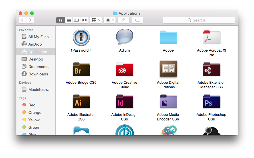
Finder maintains a familiar layout, but all of the icons and controls have been redesigned. Icons are slightly thinner and sharper, while controls are now a stark white-grey gradient. The side bar and toolbar are now translucent, allowing the background to show through.
Spotlight
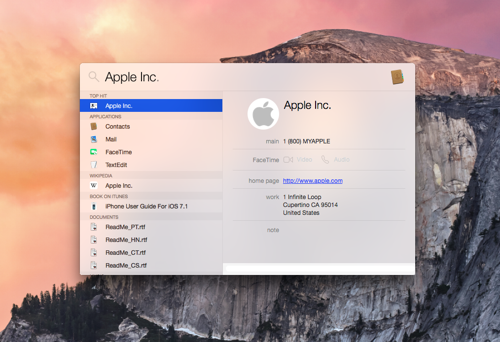
Spotlight has been given the most radical makeover. No longer confined to its spot in the upper-right corner of the display, it will now show up as a translucent overlay in the middle of the screen. It also gains a built-in preview pane, making searching much easier.
Dock

The dock eschews the recent three-dimensionality and returns to its flat roots. The icons for default apps have been reimagined, but many of them retain elements of depth, unlike their more stark iOS counterparts.
Notification Center
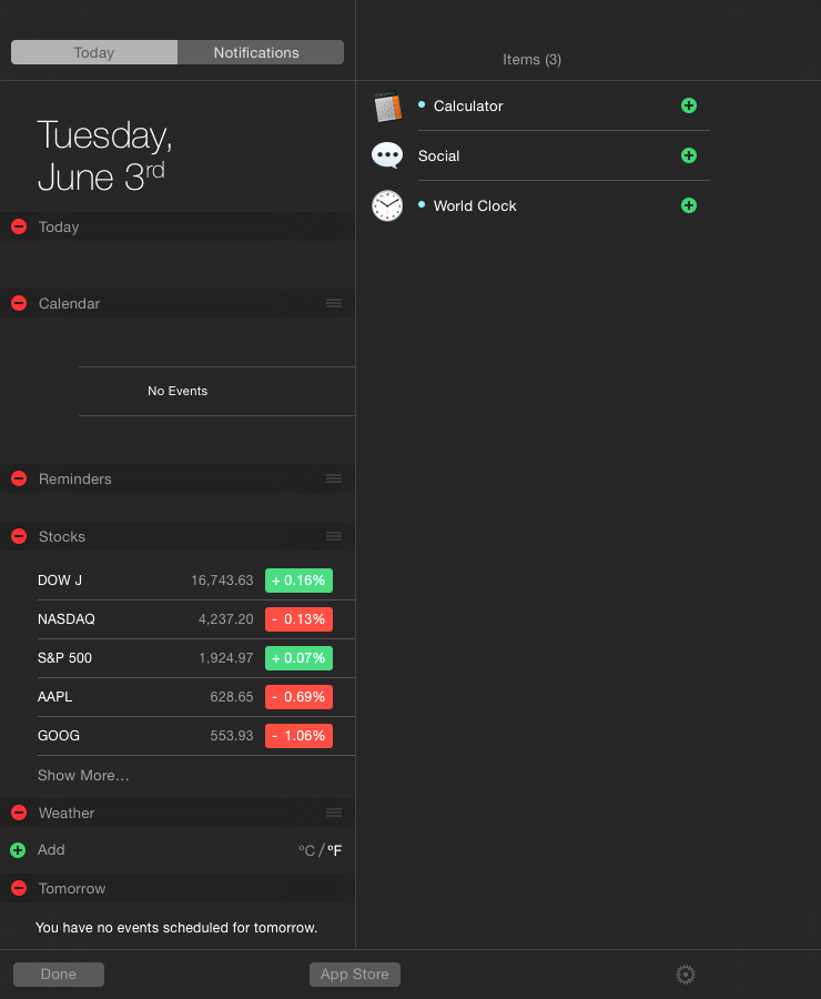
Notification Center is now far more information-dense than it was in the past, and migrating widgets from the dashboard — which still exists in the early Yosemite previews — to Notification Center looks to be a welcome change. Notably, Notification Center is by far the most iOS-like design on the desktop, with virtually zero depth.
Safari
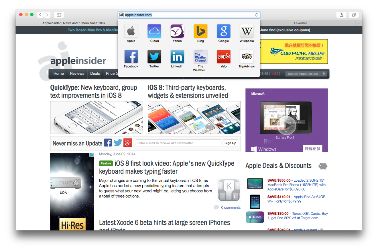
Much of Safari's functionality remains the same, but it comes in a far more compact layout. The favorites bar dropdown is jarring, and Apple would be wise to give users the option to disable it.
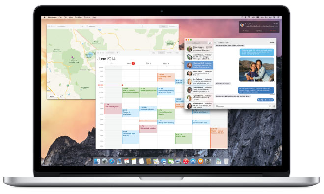
Notes & Reminders
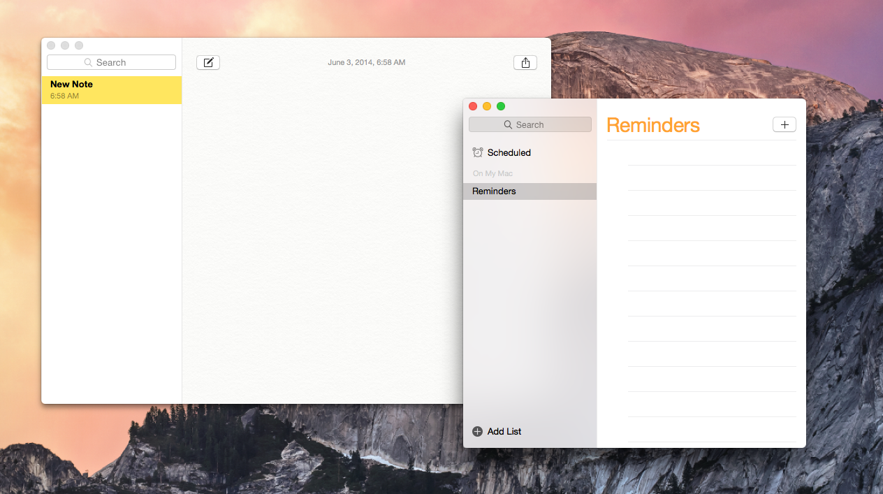
Notes maintains its faux paper background, a glaring anomaly in the larger design concept, while Reminders now matches its iOS counterpart. Strangely, the Notes sidebar is not translucent — the Reminders sidebar is — and it remains to be seen whether this was a conscious choice or a mistake.