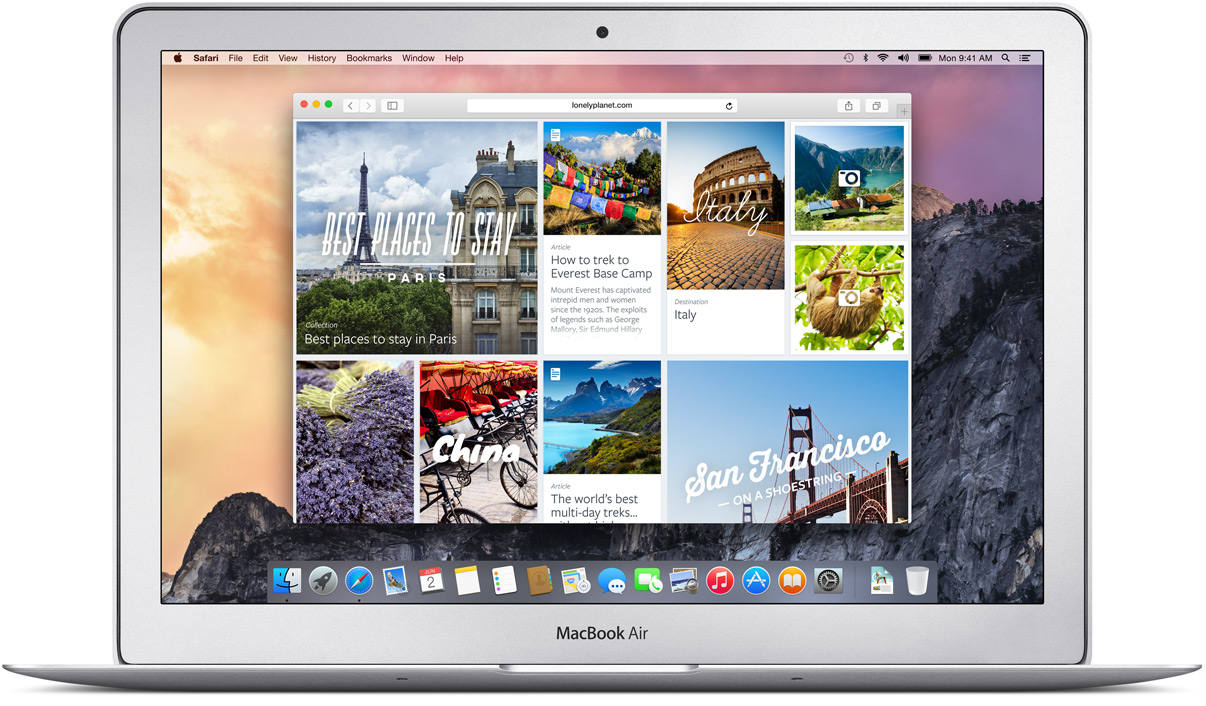
Safari remains largely the same in OS X Yosemite, but Apple has added a number of features and made a few key tweaks that make the venerable web browser more intelligent and a little easier to use.
Smart Search Bar
The Smart Search Bar, née Address Bar, is where the majority of Safari 8's new features and improvements can be found. Most noticeably, desktop Safari now follows the mobile Safari convention of hiding all but the root domain of a URL — users need to give the search bar focus by clicking in it to reveal the full URL.
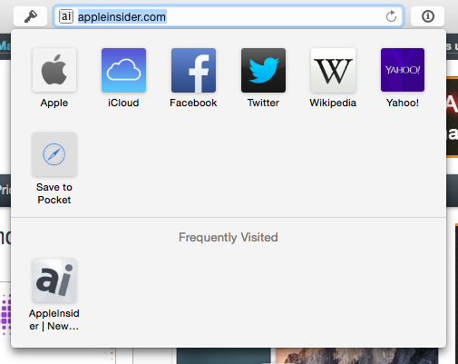
A number of changes come into play once users being to type in the search bar. If the user is currently on a web page, clicking in the search bar will result in an icon-stuffed dropdown menu of the users' favorite and most frequently visited sites. If the user is already at the Favorites or Top Sites screens, however, nothing will happen until the user begins typing.
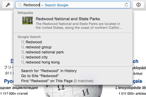
In either case, once some text has been entered, the bar will default to a Mavericks-style dropdown of Google suggestions and history shortcuts. One notable addition in this view is a new quick links feature that integrates Spotlight suggestions, such as Wikipedia entries, directly into the dropdown.
Tabs
The most glaring addition to Safari 8's tabbed browsing is the new Mission Control-like tab overview. Activated from a dedicated button in the upper-right hand corner, the new look gives a birds-eye view of every tab currently open in that Safari window, grouped by website.
Safari 8's tab bar also has a slightly different behavior when there are a large number of tabs open, altering the width of tabs on either end, depending on where the currently-focused tab resides. Users can scroll through the bunched-up tabs by swiping side-to-side on their trackpad or Magic Mouse, allowing them to see tabs which are out of view — Â this replaces the pulldown menu that previous appeared on the right-hand side when too many tabs were open.
Private Browsing
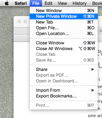
Private Browsing has been expanded in Safari 8, with users now able to create Chrome-like private windows while allowing other windows to remain open. Previously, going private meant taking every window private at the same time, an inconvenience for many users.
Opening a private window causes the smart search bar to turn a dark gray, similar to the paradigm used in iOS. A short message confirms that any visited pages, search history, or AutoFill information used in a private window won't be retained.
History
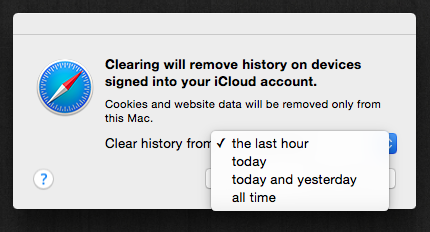
Safari's Clear History function is the beneficiary of a significant makeover. In another move reminiscent of Chrome, users can now choose to clear their history for the past hour, today, today and yesterday, or all time. Interestingly, it appears that Apple is set to synchronize browsing history on every device by default — clearing history on a Mac will also clear history on any other device signed in to the same iCloud account.
Sharing
Safari 8 brings a huge expansion of sharing options, many of which can be customized using OS X's new systemwide Extensions functionality. Additionally, sharing is now done in translucent overlays — choosing a sharing option will cause the Safari window to "swell" slightly as a screenshot is taken, which will then make its way into the sharing overlay while the rest of the window is darkened.
