Months after Google rolled out a redesigned YouTube app for Android, the Internet search giant released a similarly revamped version for iOS on Monday with new gesture controls, video editing tools and more.
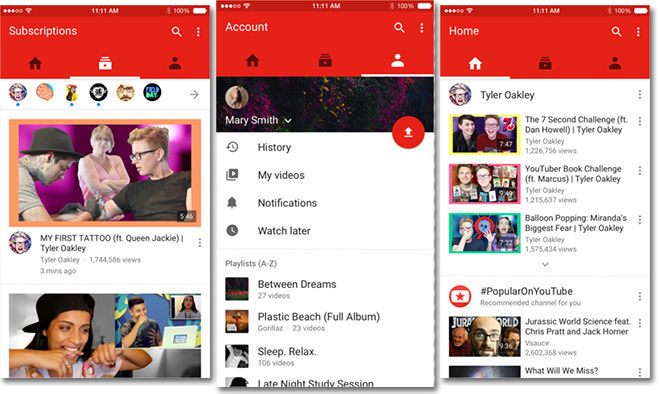
The new YouTube app sports a completely redesigned interface built with Google's "material design" aesthetic, matching the firm's most recent iOS offerings like Google Maps. Most apparent to users will be liberal use of bold colors, neatly integrated contextual menu buttons and a layered UI divided into three sections: Home, Subscriptions and Account.
Also part of material design are newly integrated gesture controls first introduced with apps like Chrome. In the case of YouTube, swipe gestures allow users to navigate between sections and menu items.
Included in today's update are a set of in-app video editing tools, pushing users toward a one-app film creation solution.
YouTube for iOS is a free 40.7MB download from the iOS App Store. The new UI is currently rolling out and may not be immediately available for all users.
