Apple is said to be working on a vast overhaul of its up-and-coming music streaming service, one that will reportedly include a new monochromatic user interface and a streamlined experience for users who prefer to read lyrics.
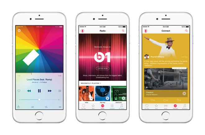
The company is said to have chosen a black-and-white color scheme for the application's controls and framework, moving away from the more playful design that includes heavy use of color and translucency, according to 9to5Mac. This would be a big step for Apple, as it would represent a fundamental departure from the "adaptive" design language introduced with iOS 7.
Apple won't eschew color entirely, however, opting to make album art a larger and overall more impactful part of the experience.
Discoverability is believed to be a primary goal for Apple, and in that vein the company is thought to be planning major updates for the "For You" and "New" tabs. In the latter's case, those changes will likely include a name change — to "Browse" — and a new information architecture to make it easier to find various functions.
Also said to be part of the revamp is a wider application of Apple's San Francisco font. The in-house typeface will play a bigger role in defining hierarchy and navigation.
In addition to the visual overhaul, Apple is expected to reveal an expansion to its Beats 1 streaming radio service at its Worldwide Developers Conference next month. The new design and functionality could be propped up by a "marketing blitz" designed to accelerate Apple Music's already impressive growth.