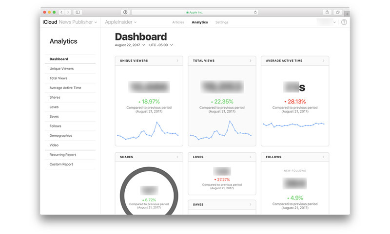
Apple on Wednesday rolled out updates to its iCloud-based News Publisher, featuring a number of user interface enhancements and a completely redesigned dashboard.
In its reshuffling, Apple now lumps available tools and features into three tabs at the top of the screen. Articles displays a list of published stories available to readers, including promoted articles, while Analytics provides an in-depth look at page performance. Settings, as its name suggests, includes a host of general News Publisher settings.
The biggest change to the web-based publication tool comes in the form of a revamped dashboard. Available under the Analytics tab, the at-a-glance tool boasts a refreshed layout that collects and displays vital publication information in card format, complete with relevant graphs and data points.
A brand new navigation pane sits on the left side of the screen for quick access to metrics like unique viewers, total views, shares, follows and demographics data, among others. Separated from the dashboard cards are options for recurring and custom analytics reports, which provide publishers access to reader details on a weekly or monthly basis.
The navigation window is also active in other News Publisher sections including Articles, where it serves as an easy method of jumping from drafts to stories published in News or other Apple News sections.
The Apple Post spotted the iCloud News Publisher changes earlier today.
Beyond the revamped user interface, Apple's iCloud News Publisher text is now rendered in the San Francisco typeface.
Overall, the redesign brings News Publisher in line with other Apple web properties like the Developer Portal, which received a similar revamp early last year. The company has over the past two years worked to update existing web assets with a more user friendly design, meaning more white space, navigation bars and other useful UI elements.


