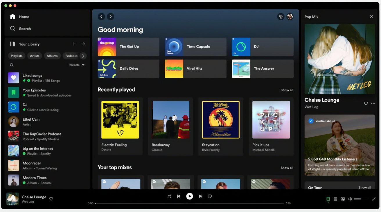
Spotify is rolling out a new desktop experience for the Mac version of its music streaming app, with updates including redesigns of the Your Library and Now Playing screens.
Billed by Spotify as "one of its biggest revamps," the update to the Spotify Desktop experience is said to make it the best way to explore and organize Spotify on a computer or web browser.
As part of the overhaul, the main content area will remain unchanged and will serve as a main hub for activity. However, new additions bring the desktop app in line with the mobile counterparts.
On the left is an anchored Your Library panel, which provides access to saved music and podcast collections. This is meant to save users time, provide them a better overview of their collection, and to easily switch playlists.
To the right is a Now Playing panel, which shows the current song or podcast the user is playing. The panel also offers more details about artists and songs, along with items like tour dates and merchandise.
The Friend Activity feed has been moved to the "friends" icon next to the user's profile picture. A compact view is also available that hides the library, which is done by clicking "Your Library" in the top-right corner of the screen.
While you could previously find playlists only through the search bar, the new Library design allows users to toggle through dedicated music, podcast, and audio feeds, and for searches just within the user's library.
Spotify has started the rollout of the updated interface as of Tuesday, with it eventually being made available to all users.


