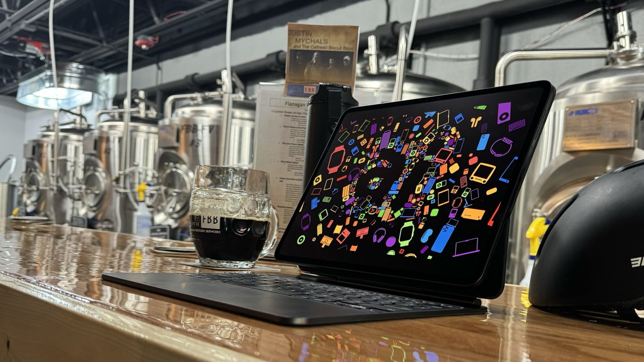
Apple's 13-inch iPad Pro is a testament to the power and efficiency of Apple Silicon, but WWDC has to address at least some of the shortcomings of iPadOS for those hardware upgrades to mean anything.
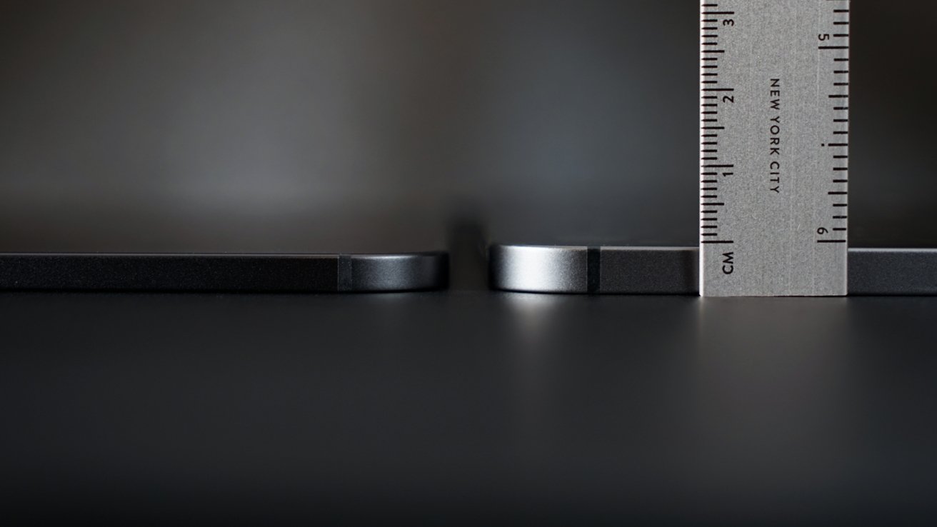
As Apple shaves away every millimeter from the iPad, it gets closer to realizing the dream of offering information on a sheet of glass. At 5.1 millimeters, there's not much else Apple can do to the hardware without physics getting in the way.
However, the only thing in the way of improving iPad software is Apple and its philosophy surrounding the tablet. While iPad is the perfect work device for some, there are obvious limitations and shortcomings that need to be addressed.
This review is a snapshot of the state of iPad Pro, with new hardware and good-enough software on June 4, 2024. At publication time, WWDC is just days away. There is some hope that Apple will be able to push past good enough and prove why M4 is in iPad Pro.
If these statements feel like deja vu, it's because they are nearly identical to statements made about the iPad Pro when it first received M1. Despite the initial fumble, Apple took a big leap with Stage Manager, but little else.
Window management is table stakes in an operating system running on a so-called pro device.
An iPad Pro conundrum
On review here is the 13-inch iPad Pro with 1TB storage, which includes 16GB of RAM. I chose to add Nano Texture and Cellular.
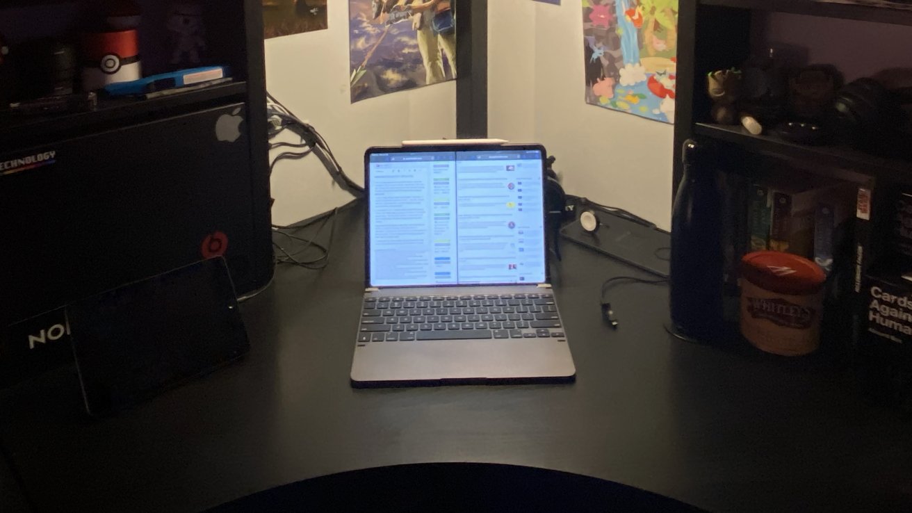
Let's get one thing straight and incredibly clear at the top — I love iPad Pro. I've worked primarily from iPad since I got this job in 2019, with a brief stint working from a 14-inch MacBook Pro.
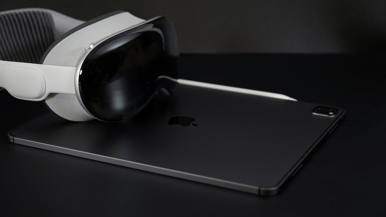
13-inch iPad Pro review: iPad Pro remains a favorite in spite of Apple Vision Pro's futuristic promises
Apple Vision Pro introduces a new bit of complication to my computing lifestyle. One thing is clear — iPad Pro is my go-to computer for my work, play, and everything in between.
The criticisms I share about iPadOS are from a good place, hoping Apple will one day eliminate these issues. I'd love to see the day when I don't need a Mac for anything beyond screenshots of macOS.
Many people already find themselves in this position with iPad. They can get everything done and don't even notice what may be missing from the platform because it isn't part of their workflows from the start.
The list of things missing gets smaller every year, but it does seem odd which features Apple decides to prioritize and which are ignored perpetually. Podcasting, for example, feels like one that should have been there from the start, given its importance to the Apple brand.
The lack of true desktop-class Safari, a reliable plus hierarchical file system, and background task execution all feel like obvious next steps.
Every iPad Pro release has accompanied a series of cries for macOS on iPad. Across the entire AppleInsider staff, even the Mac-devout, we don't think that's a good idea. Instead, we all want iPadOS to be better, and its own thing.
We want this instead of macOS shoehorned onto a platform that will lead to a sub-par experience not just for macOS, but for the iPad too. That would be the worst of both worlds.
You can't divorce the software from the hardware when you review a new iPad. More on iPadOS in a while, though.
13-inch iPad Pro review - Design & Features
Obviously, nothing had changed in design and features since my initial impressions that I shared in the 13-inch iPad Pro hands on. It remains an impossibly thin and light device that's all-new while remaining familiar.
If you look at the 13-inch iPad Pro head-on, there's little chance you could tell the difference between it and the 12.9-inch models that came before. As usual, a small bezel surrounds the all-screen display.
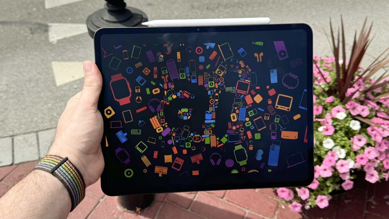
Three aspects might give it away — OLED, the front-facing camera, and Nano Texture if you've opted for it. The relocated camera, lack of bloom, and a slight film-like texture are apparent when viewed side-by-side with any other iPad.
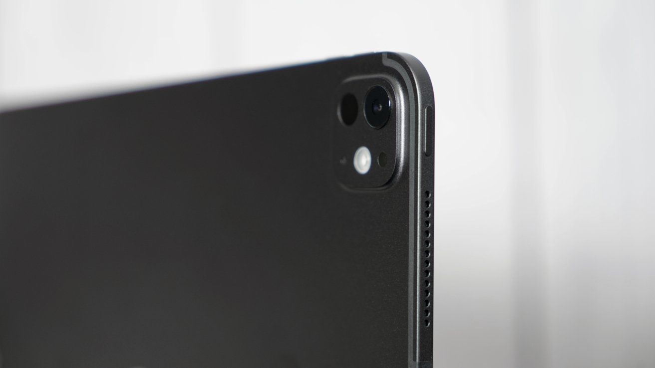
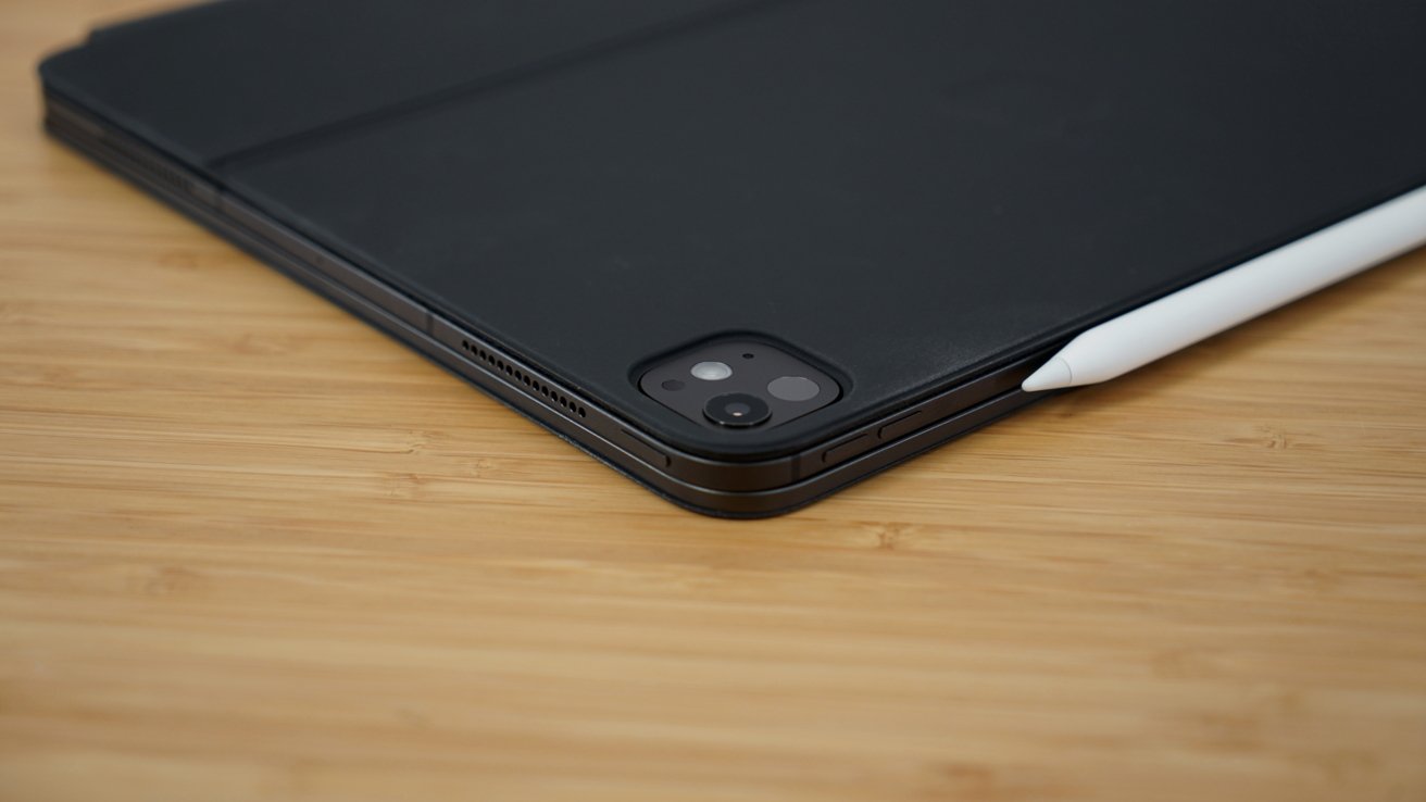
Apple's 13-inch iPad Pro is 5.1 mm thick, weighs 1.28 pounds, and has a thin camera bump that reduces wobble when lying flat. The design changes required new magnet arrangements, so none of the previous accessories are compatible.
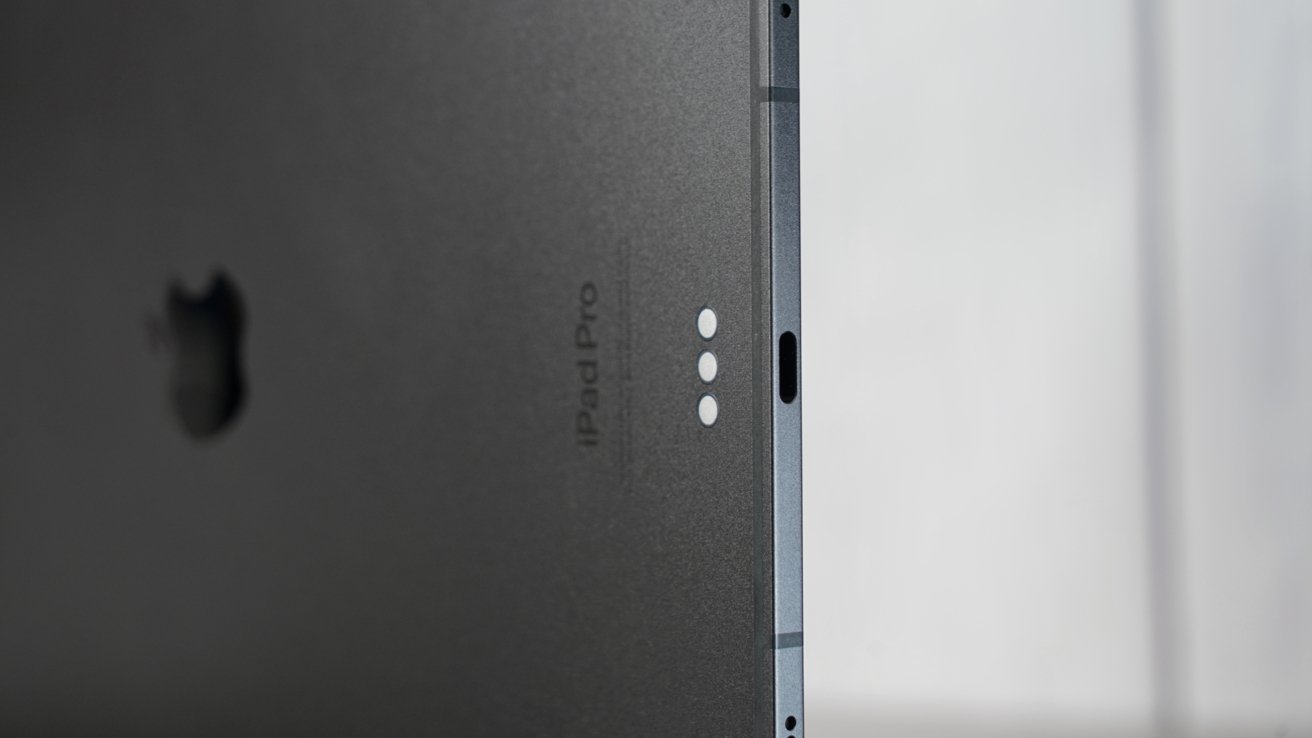
I am quite happy to have learned that Apple changed the internal design of the iPad Pro to account for heat dissipation and resistance to bending. Apple says the central skeleton helps prevent bends along the landscape side, and it also houses the logic board.
That means the M4 processor is directly below the Apple logo, which acts as a better heat sink now, thanks to copper infusion. Having the hot chip in the center also gives heat more space to dissipate and keeps heat away from your hands.
OLED display
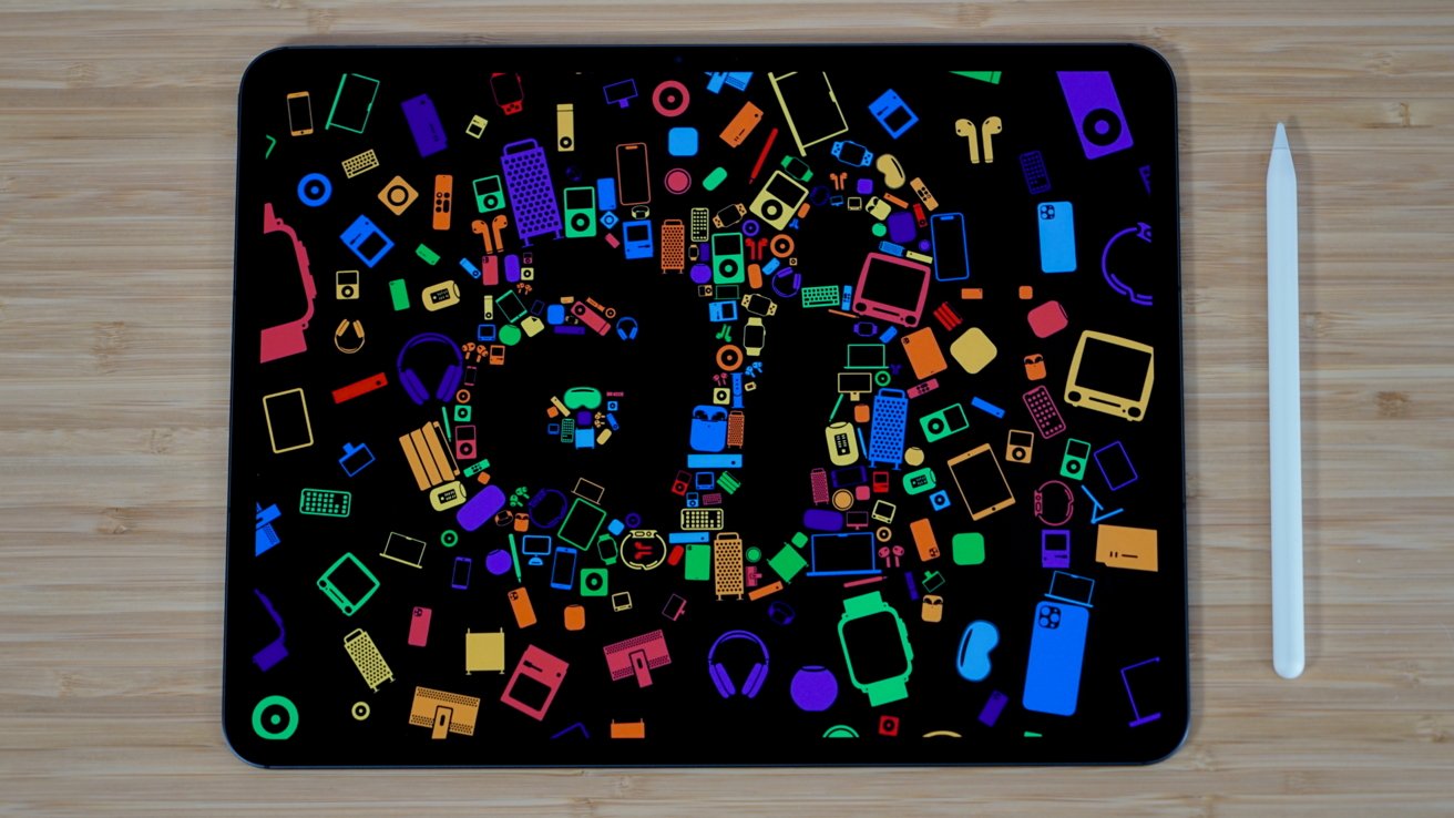
One of the best things that has happened to the iPad since cursor support is OLED. The display is just gorgeous in how it reproduces color and black levels. Creative users will benefit greatly from the upgrade from mini-LED backlighting.
13-inch iPad Pro has a 2,752p by 2,064p display. That's the expected 264 ppi density. Tandem OLED panels enable up to 1,000 nits of sustained brightness for SDR and HDR content.
The display can reach 1,600 nits for specific areas of HDR content. The super bright OLED is stunning in all lighting conditions, even direct sunlight.
Apple shifted to OLED panels with iPhone X, and people have been begging for OLED in iPad ever since. A half-step arrived in 2021 with min-LED backlighting in the 12.9-inch model. It still produced bloom around bright objects with black backgrounds, so people weren't too impressed.
Tandem OLED addresses every complaint by offering superior blacks and incredible sustained brightness. The 2,000,000 to 1 contrast ratio is very noticeable with some content.
OLED still isn't ubiquitous, so some content and video games aren't designed with near infinite contrast and perfect black in mind. Like with the iPhone, I favor true-black UI in apps that allow it, like Ivory.
The new panel doesn't just look great — it's more power efficient. Any true black element on the display is just pixels that aren't turned on. The more black pixels on the display, the better it impacts battery life.
For example, if you're reading a book and have it in the true black mode with white text, you will likely maximize battery life. However, since the display can get incredibly bright, you will likely counteract the energy savings if the brightness stays too high.
That said, our testing bears out Apple's estimations of about 10 hours of battery life. After jumping from the M1 iPad Pro, I haven't noticed my charging habits change.
Nano Texture
The Nano Texture option was always going to be controversial, especially on a portable device. After years of Apple selling Pro Display XDR and Studio Display with a "do not touch" Nano Texture, suddenly it's fine on iPad.
Confusion reigns sometimes when Apple uses the same term for two different processes. The Nano Texture on the Pro Display XDR is a mechanical process, where it's a chemical one on the iPad.
Apple recommends using the included polishing cloth to clean the display, but otherwise, it's just a normal iPad display. You can touch it without noticing any difference in feel, and it's easy enough to clean with the cloth.
Drawing with the Apple Pencil Pro on the Nano Texture display doesn't feel different to my hand. The tip glides along the glass without any resistance — I believe any suggestion otherwise might be a placebo.
That's the point of the Nano Texture for iPad Pro. That chemical etching I alluded to before that is done on a microscopic scale is less of a series of grooves like on Pro Display XDR, and more of a surface-level optical characteristics change. This is why you don't feel it with your finger or when you run an Apple Pencil across the surface. It's "etched" just enough to diffuse glare.
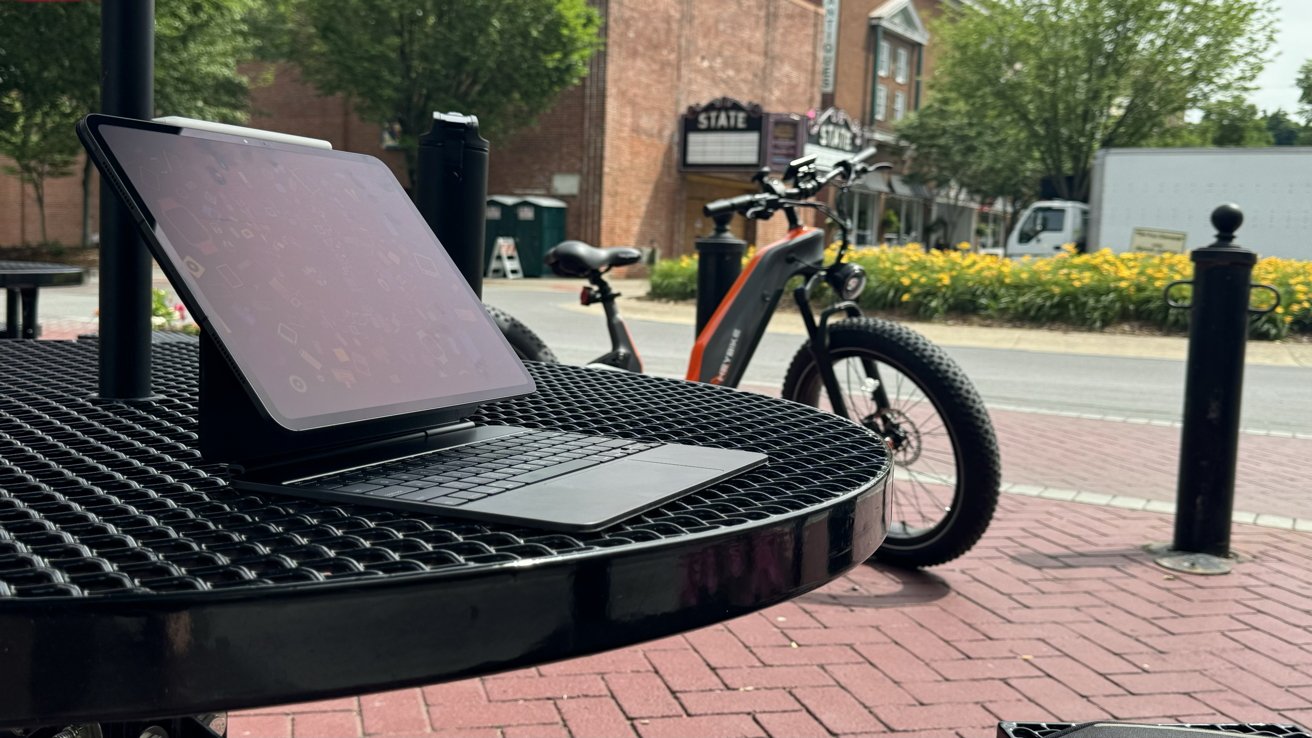
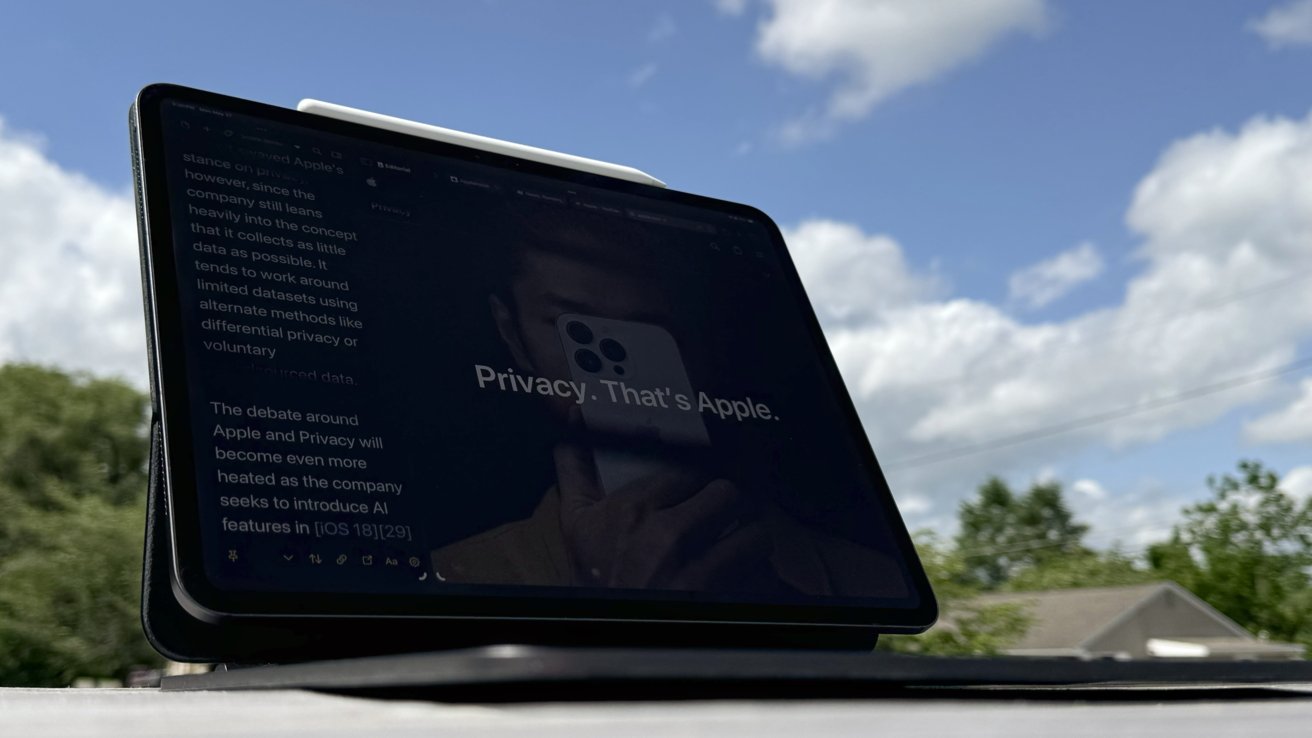
The Nano Texture works amazingly. Since getting this option, I always note that there aren't any visible reflections or light sources, no matter where I sit — even in direct sunlight.
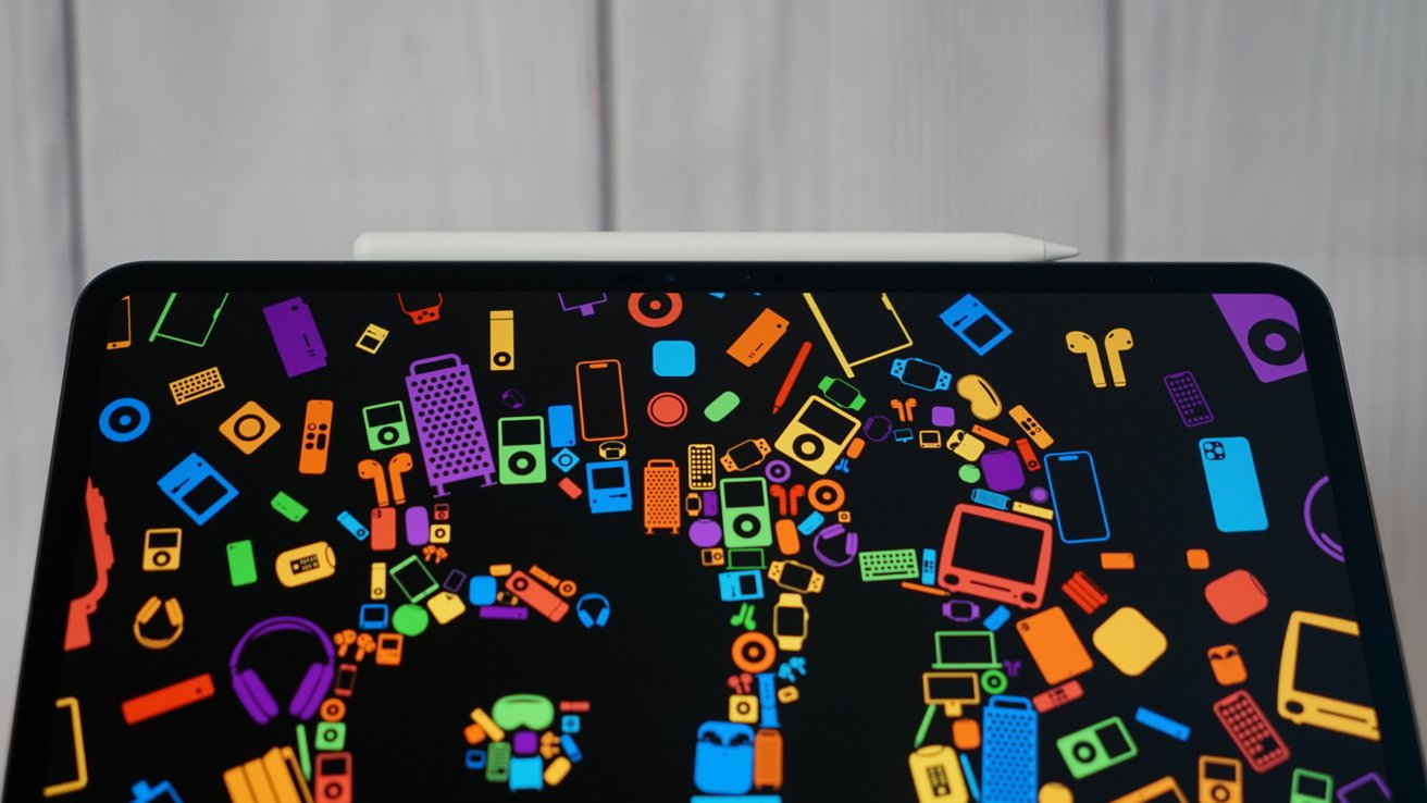
But, there is a "film" effect that's exaggerated by direct light sources where the light being refracted inward causes colors and black levels to wash out. The effect is pronounced in places like the Apple Store or direct sunlight when viewing the device outside of a natural angle.
It is pretty challenging to capture the effect properly with a camera, and it doesn't exist at all on the Pro Display XDR surface. Product photos are often taken at extreme angles, not from natural viewing angles. I have shown various examples of direct light sources reflected by the different display types, but these images still don't do the effect justice.
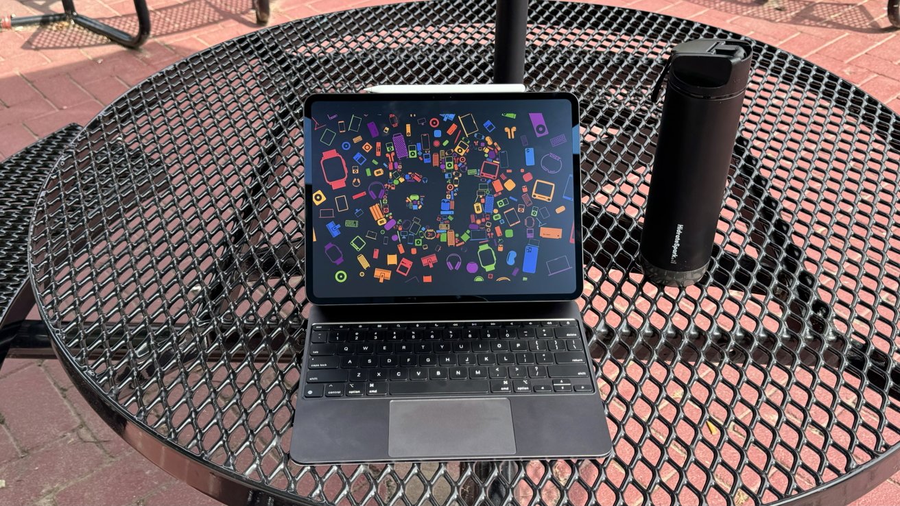
13-inch iPad Pro review: the 'fog' effect made by reflecting light isn't as drastic in real life at normal viewing angles
The camera will capture light with a more pronounced effect than the naked eye, showing the Nano Texture in exaggerated detail. It is a display you'll have to see in person to understand whether Nano Texture is a good option for you.
The tandem OLED is bright enough on its own to compensate for sunlight and other harsh lighting conditions. However, intense light means any black surface on the display will become a reflective mirror, which is why Nano Texture is useful. In some situations, you might sacrifice black levels ever so slightly, but the result is a perfectly visible display.
I love the Nano Texture, but it is clearly a highly subjective feature — and we have difference of opinions across the staff. Mike Wuerthele, our managing editor, is not a fan, as he prefers those blacks on the screen to be fully black. Those deep blacks are one of the main tenets of OLED, and blunting that makes no sense, according to him.
He's also mostly an indoor-user, and his "bunker" as he calls it, has little natural light.
This all said, you'll know if you need it or not, and if you're in doubt at all, the only way to know for sure is to try it at home. Photos, videos, anecdotes from reviewers, and in-person viewings at the Apple Store won't tell you what it's like to use in practice.
There are some concerns about the Nano Texture's longevity, as it is a surface treatment. It is something I'll revisit in future reviews.
New camera systems
Apple rearranged the 13-inch iPad Pro cameras to account for the new thinner device and default orientation. The Ultra Wide Camera was removed, and the front-facing camera is now on the landscape side of the device.
Both the front-facing camera and the Main Camera are 12MP. The front-facing camera has an ultra-wide field of view and uses Center Stage to focus on subjects.
There isn't much to say about the rear camera. It hasn't changed, though the image signal processor is likely more powerful in the M4. Apple also showed off a special document scanner upgrade that helps eliminate shadows using the flash and multiple exposures.
So far, we haven't seen much — if any — difference in what the new document scanner tech provides in most environments that you should scan books in, versus how it worked before. We'll be looking at this closer in the future, and including sub-optimal conditions for book scanning.
The front-facing camera is paired with the True Depth system for Face ID. All the components are centered to the landscape side, but the front facing camera is slightly off center on the left.
The change in camera position makes FaceTime calls feel much more natural when the iPad is docked. The camera is in a much better position, whether it is being used with the Magic Keyboard, in a magnetic stand, or simply held in landscape mode.
I also love the new position for the True Depth system. When it was on the landscape side of the iPad, I found it would often be obscured by my hand.
The new orientation is also better for angling the tablet for Face ID, like when lying down. The True Depth system would be at an awkwardly high position when on the portrait side and require a much more dramatic shift to bring the camera level with my face.
Speakers, connectivity, and more
Outside of the obvious flagship features, not much else has changed. There are four speakers, four microphones, a Wi-Fi 6e radio, and 5G cellular.
Apple didn't opt for the nascent Wi-Fi 7 radio as expected. It's hardly a loss as many users, even pros, are likely still running Wi-Fi 6 or even Wi-Fi 5.
This may be an issue for future-proofing, but we'll see exactly when. Wi-Fi 7 systems are still ludicrously expensive and not worth it for the foreseeable future for nearly everybody.
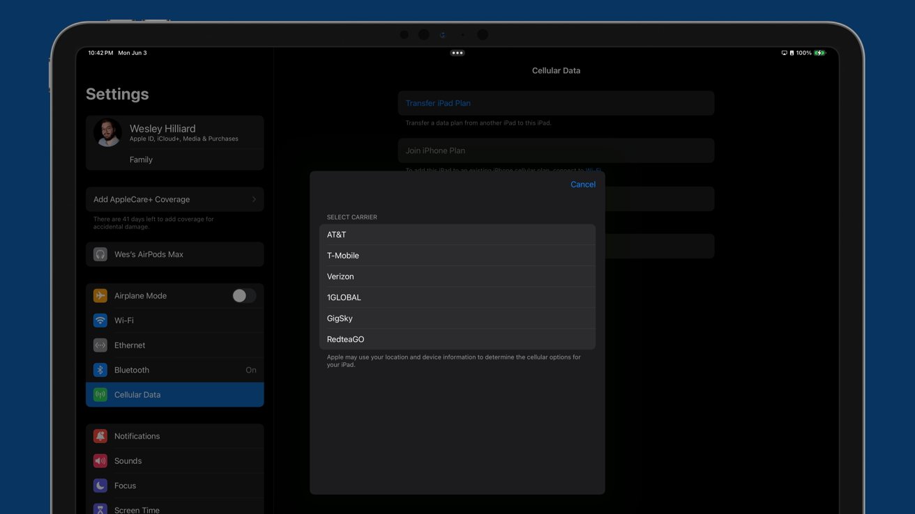
The cellular 5G option only has sub-6GHz, not mmWave, but I doubt anyone will notice given the technical limitations of mmWave. Apple's use case of finding empty football stadiums to play multiplayer games never made much sense.
The exclusion of mmWave may be more of a testament to poor carrier rollout and availability versus usefulness.
13-inch iPad Pro review - accessories
The new device design and magnet layout renders many existing accessories incompatible. Any magnetic mount, keyboard, case, stylus, or other device purpose-built for previous iPad Pros won't work on the newer generation.
The Thunderbolt/USB-4 port works identically, connecting to my existing setup without any problems, with the same speed delivery from the port as before, and nothing has changed one iota about those specs. Drives, displays, and other tools will work identically.
Apple Pencil Pro
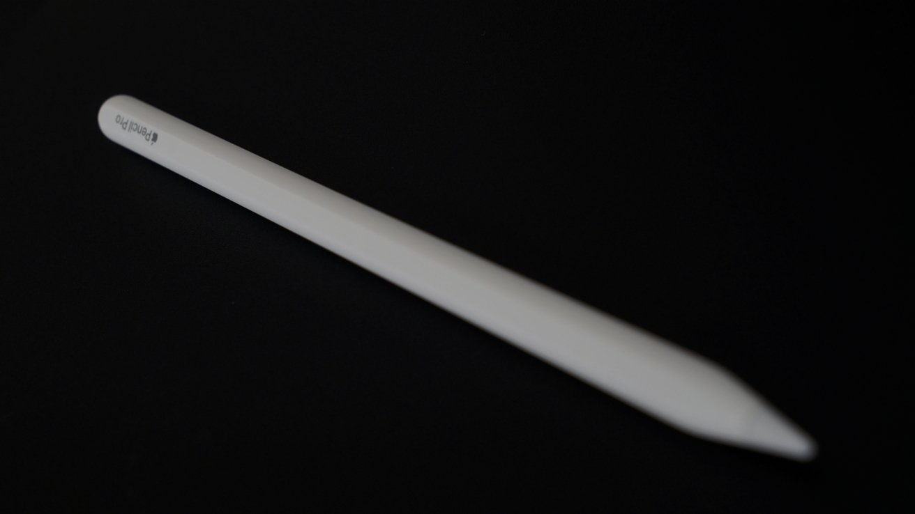
Apple Pencil Pro may as well be called Apple Pencil 3. The external casing is indistinguishable except for the "pro" text at the end.
There's nothing more pro that makes it earn the name. Even its compatibility isn't limited to the iPad Pro — it works with the 2024 iPad Airs and likely future iPads with landscape front-facing cameras.
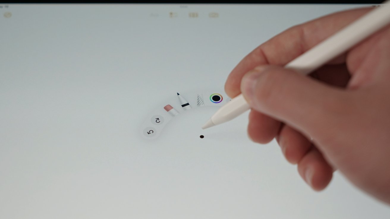
That said, Apple Pencil Pro is likely Apple's most magical version of the stylus yet. Every feature builds on the other, so drawing, writing, or navigating the operating system all feels fresh and exciting.
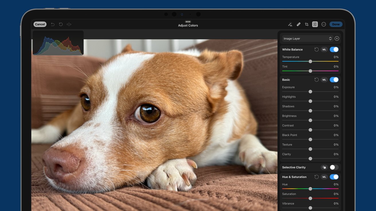
My use case for Apple Pencil skews more towards photo editing and production for AppleInsider than it does Amber Neely's use for art. All along, I've found that Apple Pencil is excellent when doing detailed edits of photos. Navigating UI that reaches up to the Pencil tip as you tap, haptics for different interactions, and tool previews rendered in 3D all give the illusion that this isn't a digital interaction.
Apple Pencil Pro's hardware, combined with iPadOS, does a great job of making you feel like you're truly interacting with digital objects as if they were physical. The closest allegory I can give is it feels similar to the look and pinch gestures in Apple Vision Pro — an extension of yourself.
To reiterate, Nano Texture has no effect on using Apple Pencil. It feels like glass.
Apple's attention to detail is also incredible. In Apple Notes, you'll see a 3D-rendered shadow of whatever tool you're using when you are close to the display.
Other apps may be implement this feature, but that's not at all clear yet. And even if possible, there is immense overhead for apps like Procreate, which has dozens of tools.
Magic Keyboard for iPad Pro
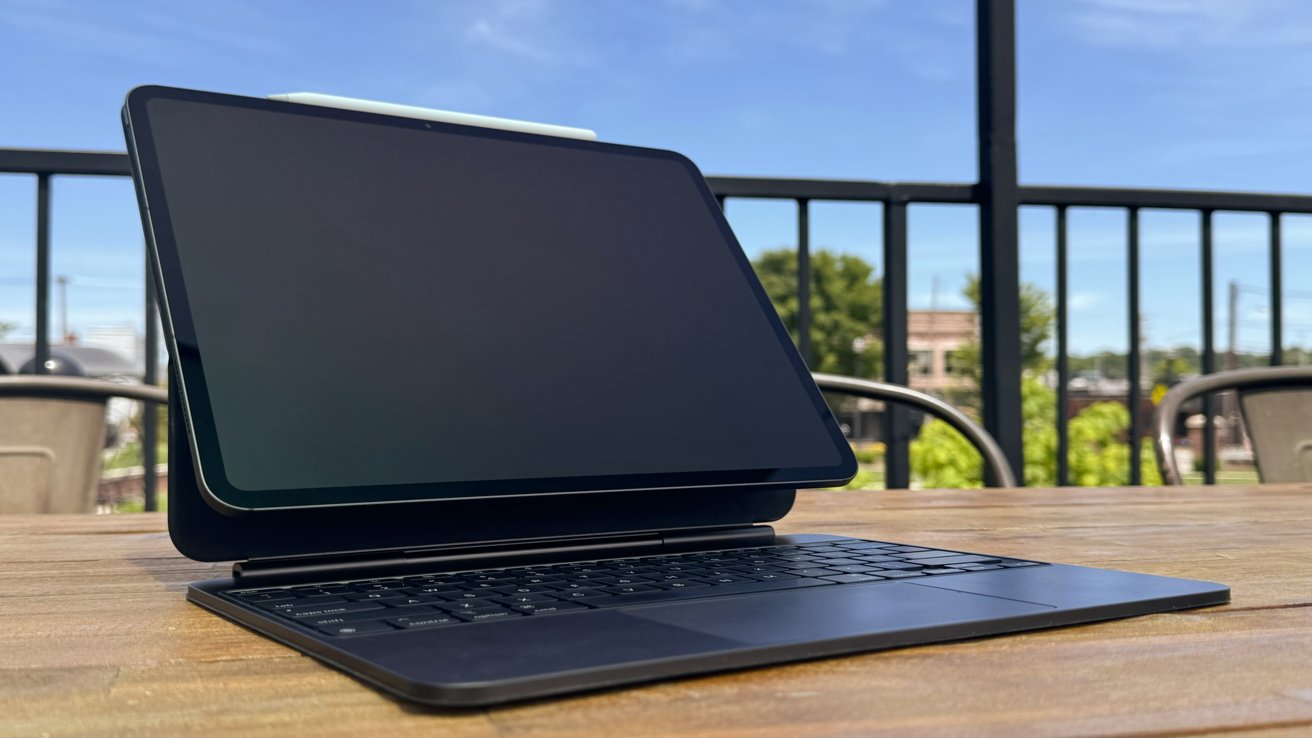
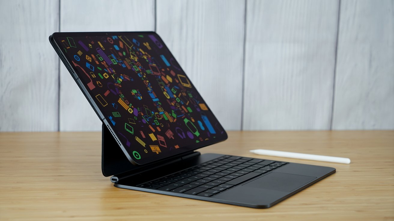
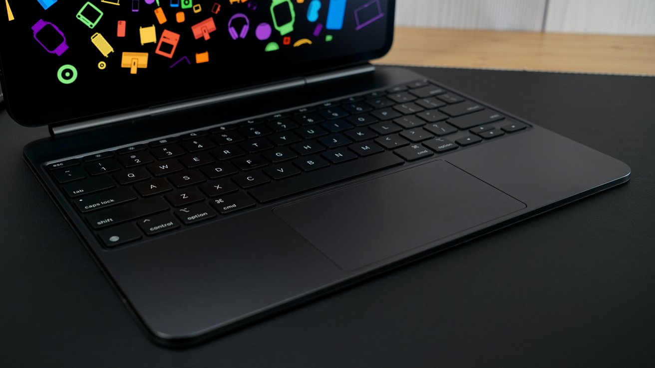
The Magic Keyboard for iPad Pro is an impressive upgrade with a thinner, lighter, more sleek design. It includes a function row, a larger trackpad with haptics, and an aluminum wrist wrest.
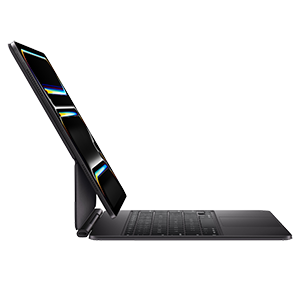
The cantilever hinge appears to have different balancing compared to the previous model. When compared to the previous Magic Keyboard, the new model sits the iPad further back and has different viewing angles, likely to account for the function row.
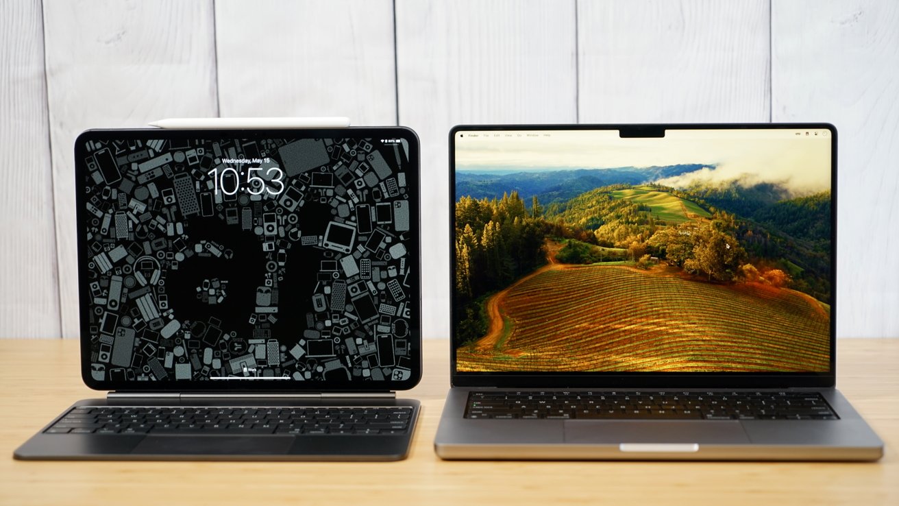
Regardless, it is impressive that Apple can add more keys to the keyboard, significantly increase the trackpad size, and still end up with a thinner and lighter case. The aluminum disguises the iPad as an odd-looking inverted MacBook where all the weight is in the lid.
Even with the iPad fully open and extended, it won't block the function row. If you're skilled enough as a touch typist to hit the function keys without looking, there's a chance you'll hit the bottom of the display, but otherwise, the keys are visible and accessible.
The rubber exterior is back, and I'm not sure I like it. I wish Apple could have kept leather around and clad this model in it, because it would have made for a much more premium feeling option.
The material just soaks up fingerprints, and there's already a permanent mark on the top of the case that I can't explain. While it isn't a deal breaker, it seems like Apple would do better than whatever this soft material is on the outside. Perhaps Dbrand or something similar might have a solution at some point.
The keyboard itself is unchanged. It retains the same chiclet keys with minimal travel and white backlighting.
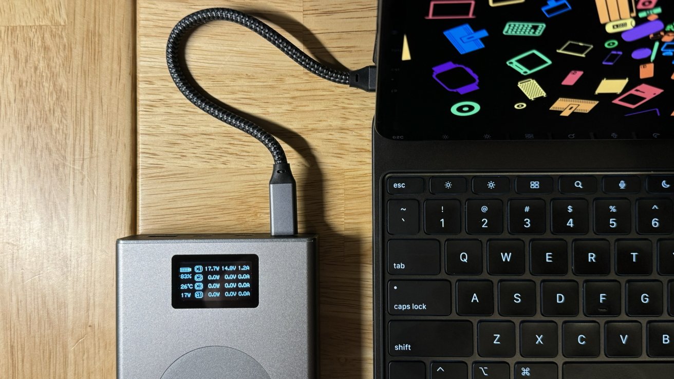
The USB-C port in the keyboard's base will provide enough power to keep the iPad Pro charged while in use. It provides power through the Smart Connector Passthrough, which consistently showed about 20W of draw from our battery, peaking at 22.5W. That's consistent with the previous Magic Keyboard's USB-C port.
Magnetic stands and cases
Apple had to rearrange the magnets in the iPad Pro to make it thinner and lighter. That means all previous magnetic accessories aren't compatible.
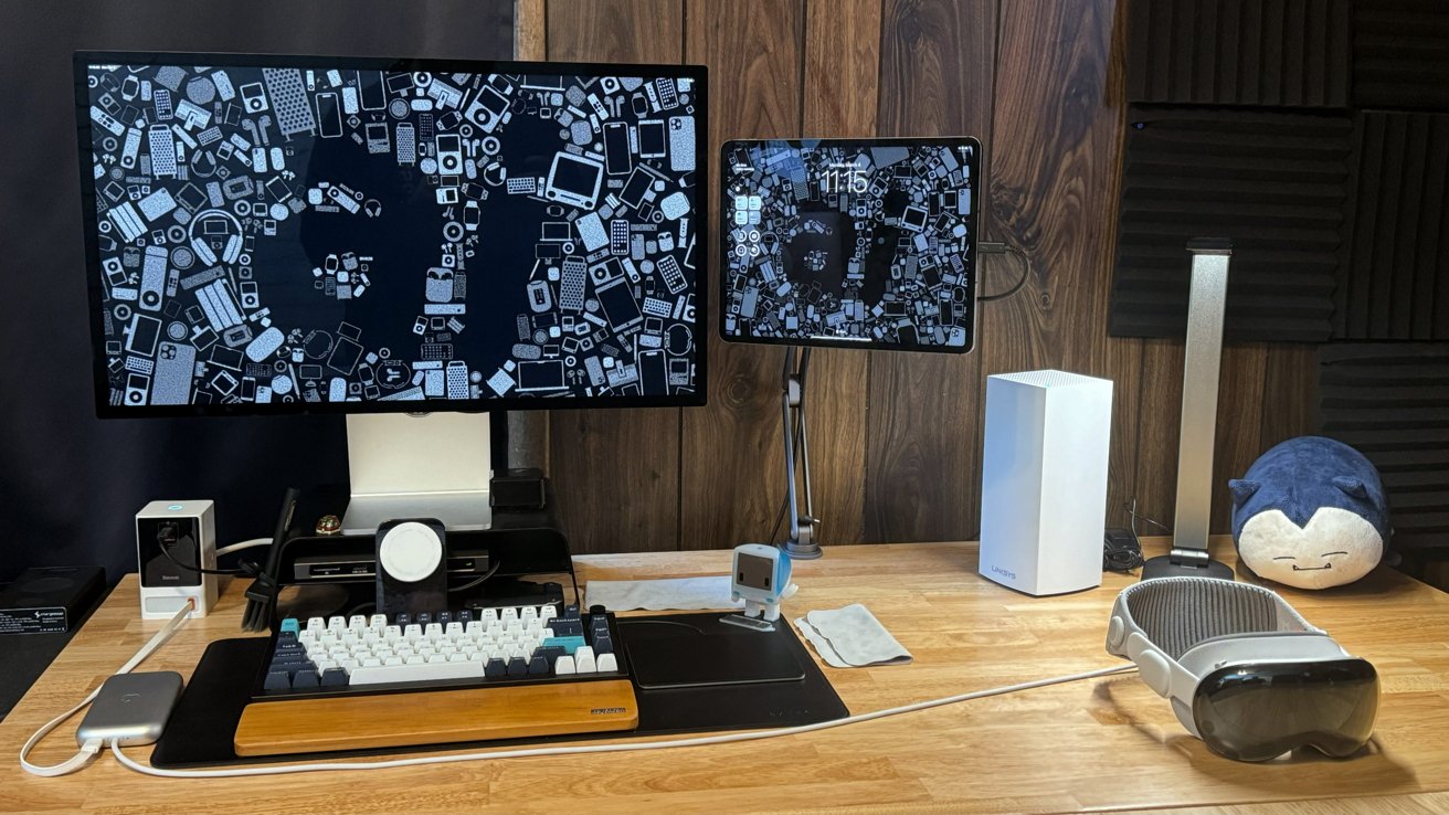
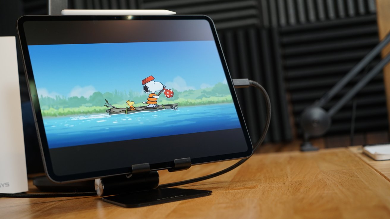
13-inch iPad Pro review: replacing the old magnetic stands for iPad Pro is a pain, but understandable
Going six years with the same magnets and accessories is a decent enough run. However, it does introduce some level of unexpected and surprise complexity. As a power user, I accumulated a lot of these magnetic stands to place where the iPad is used in the home, all of which now need replacing.
I passed my M1 iPad Pro down in a cascade upgrade, meaning two different magnetic stand types are used in our home. This is incredibly clearly a first-world problem that few will face.
In practicality, though, it does mean common areas like the kitchen will need device-agnostic stands. In houses with multiple iPads, spanning Pro and non-Pro, this is probably already in effect, though.
We're pretty sure that it's impossible for device makers to stuff the needed magnets for both kinds of iPad Pros into one stand. They would likely create polarity issues and misalign the iPad either way.
Before release I hadn't considered the magnet arrangement as something that could or would change. Thinking about it now, it's about the most obvious thing that could have happened given the re-engineering of the device to make it thinner and move the camera.
Let's hope Apple can hold onto this arrangement going forward. Magnetic mounting options for the iPad are part of what makes it feel like a magical piece of glass.
13-inch iPad Pro review - M4
I had hoped that by waiting a few weeks to publish a review, there would be something available to push the M4. It's easy to think that the M4 in iPad Pro caught everyone by surprise and left developers scrambling to support an entirely new system.
In reality, it's more of the same we've seen since M1 hit iPad Pro. There's just not that much that can push the iPad Pro that hard.
By the time developers get around to optimizing for the latest and greatest chipset, there's already something new being announced. That's an even bigger problem on a platform like iPad since iPadOS has some odd restrictions.
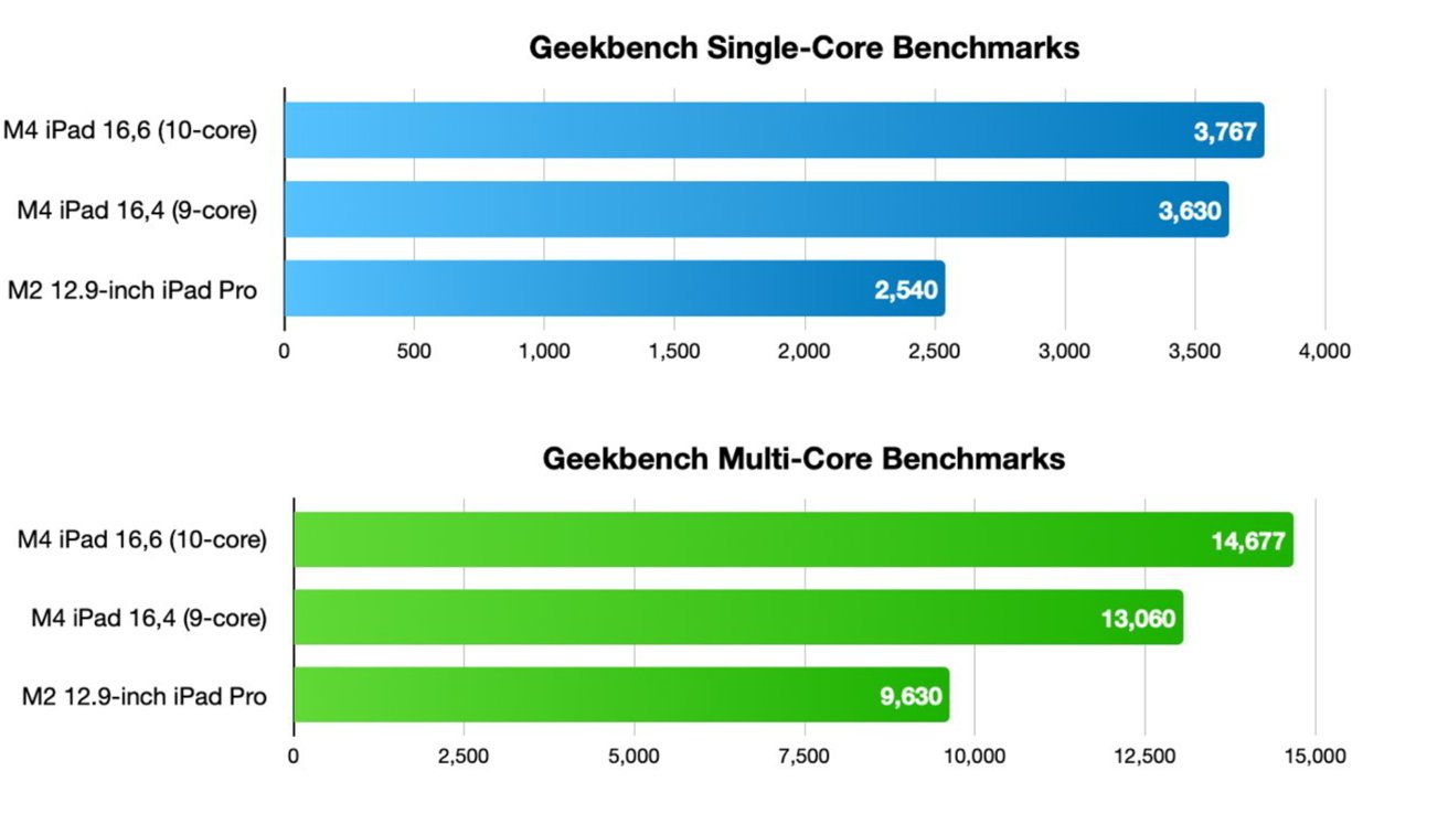
There's no reason to dive deep into benchmark scores. The M4 is faster with a 3590 single, 13353 multi, and 52183 GPU score. Compare that to the 2395 single, 8838 multi, and 32958 GPU on the M1 iPad Pro I replaced.
Everything I threw at the M4 iPad Pro didn't slow it down. Other reviewers seemed to have some luck tipping over the edge running complex 4K video exports from Final Cut Pro, but that may be due to the length of time it takes to export and not peak performance causing too much heat.
There is already a pro app story for iPad, and it's getting better with each iteration as Apple opens up more options for developers. However, it seems very few people are discussing the iPad Pro as a powerful gaming platform.
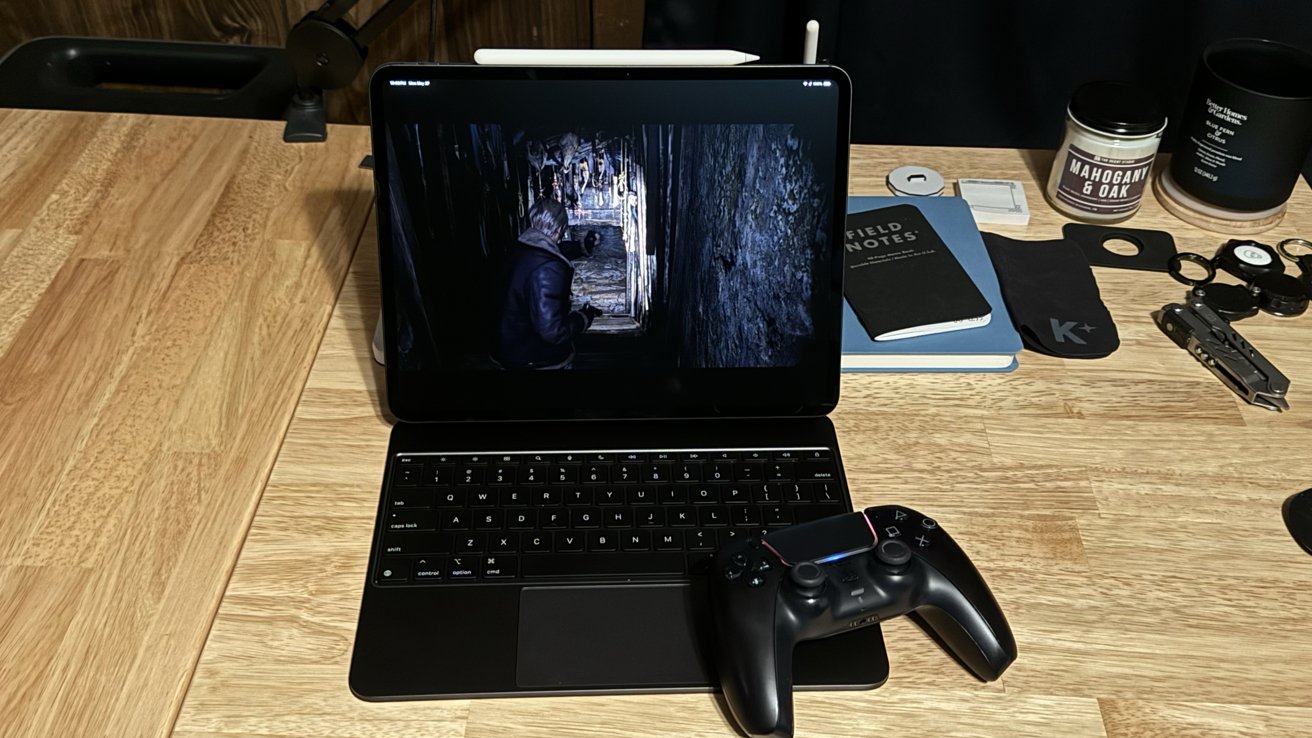
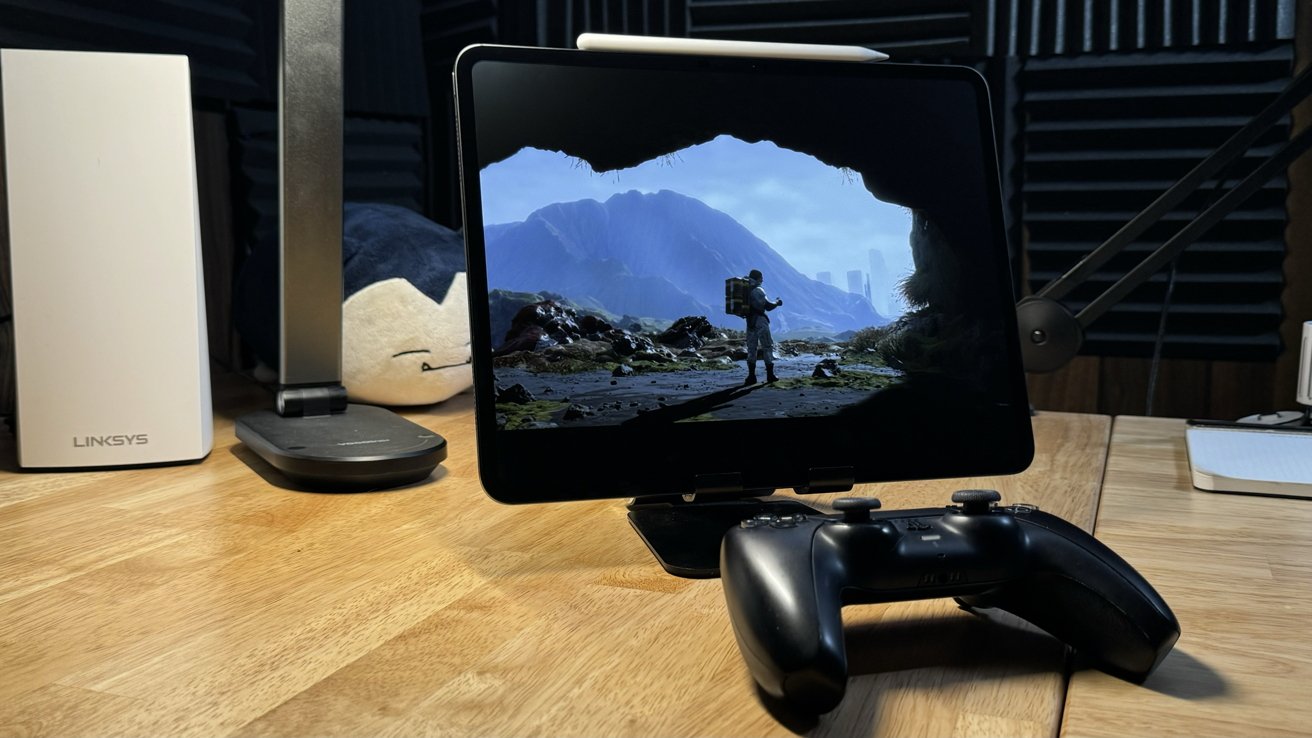
I tested all of the M-series optimized games like Resident Evil 4 and Death Stranding. There aren't any performance sliders in these games, and I'm certain they're aimed at M2, not M4, so they lack optimizations for hardware-accelerated ray tracing and mesh mapping.
Sure, the iPhone versions of these games likely account for those processes available in A17 Pro, but there's no way to know what that means for M4, given the lack of graphics options in settings.
There is a notable difference in overall performance on the M4. Despite running more pixels on a larger display, Resident Evil 4 ran smoothly without any lag or screen tears that appear regularly on the iPhone version.
Apple's push for more AAA titles and console-grade releases may pan out into a more robust catalog of games that tax the M4. We'll see, though. We want Apple's game porting toolkit to be more than lip service to gamers using Apple hardware, but so far, that's all it is.
But App Store titles aren't the end of the gaming discussion. Emulation and streaming open up many more gaming options on iPad.
Game streaming is quite straightforward, like playing games run from a gaming PC or PlayStation 5 on iPad. I still haven't had much luck getting good enough streams with services like GeForceNow, but local streaming has been a great stopgap if I don't have access to the living room TV for any reason.
I'm particularly excited about the future of game emulation and the power M4 provides. If Apple decides to allow a special exception for JIT compilation and emulation, consoles like the Nintendo Gamecube could be run easily from an iPad Pro.
To be clear, we're not expecting that exception, though. Apple has made it clear that it will support retro gaming with emulators, and it seems to be enforcing that line by disallowing JIT in emulation in the name of security.
I suppose there's always sideloading through Xcode for these non-compliant emulators. I'd still prefer an App Store-only existence where Apple allows developers to use things like JIT safely.
All told, though, options that exist today are still adequate, assuming you want to play games from the very early 21st century and before. I would never have imagined playing Pokemon Snap from N64 on an OLED display in 2024, but here we are.
There hasn't been a flood of big-game developers flocking to Apple hardware, but there are a few showing more interest in delivering AAA titles in a timely manner. We're not ready to say that things are looking up for AAA gaming on Apple platforms, and it's cold comfort that the company is an absolute powerhouse in casual gaming.
The M4 is brand new, though. We'll have to revisit what capabilities it can provide and optimized gaming experiences at a later date.
13-inch iPad Pro review - iPadOS
I'll start things off by saying I love iPadOS. It has gained a lot of important features since splitting from iOS while remaining familiar and easy to use for non-power users. Yes, the code base is still basically iOS with additional stuff on top, but I'm not sure that's the core issue.
Pick anywhere in the past fourteen years of the iPad's existence, and you can find a moment where you can say "I can't believe you can't do this on iPad." It has come a long way, especially since the introduction of iPad Pro in 2015 and iPadOS in 2019.
When I started my job at AppleInsider in 2019, I worked from a 12.9-inch iPad Pro with an A12Z processor. It was mounted in a Brydge keyboard and attached to a USB-C dock with an external mouse attached.
No real cursor support arrived until months after working with that setup, and it was a godsend. Since then, Apple has improved certain parts of the Files app with better editing and app integration support, added Stage Manager with external display support, and introduced Focus Modes with incredible customization controls.
Those updates aren't much, but still made working from iPad Pro more and more viable.
For a while, I took a break from being iPad only and moved to a 14-inch MacBook Pro to test out macOS and everything Apple was doing with Apple Silicon. While that was a fun experiment, I couldn't help but want to go back to iPad, and Stage Manager was what pulled me back full-time.
That said, some obvious parts of iPadOS need work, and some niches will never be able to go iPad-only, no matter what Apple does. I want to use this review to capture some of the pain points that still exist today before Apple reveals iPadOS 18 on June 10.
Producing a definitive list of problems with iPadOS isn't that straightforward. Many iPad users will say they're happy with it today, while others run into edge cases that create annoyance. Others — like Mike — still find that there are just too many compromises to accept to be happy with getting all work done on the iPad.
So, I've rounded up a few more obvious problems affecting users. I'm among the middle crowd — able to get work done, but the edge cases are quite frustrating nearly a decade into iPad Pro.
Controlling and recording audio on iPad
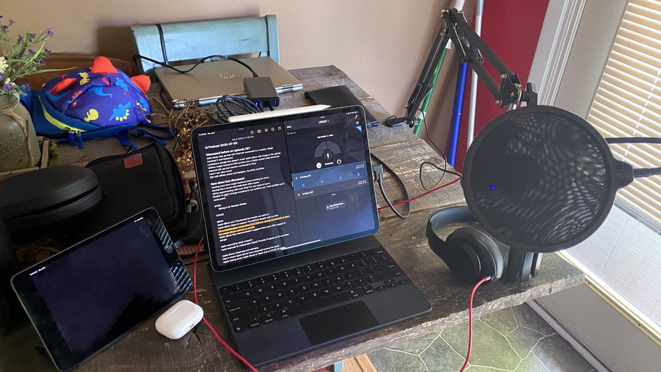
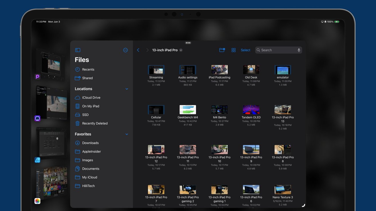
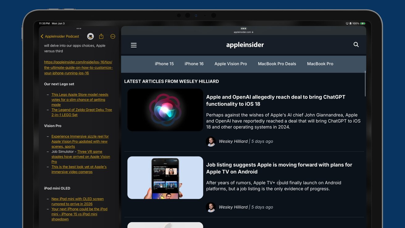
I'm an iPad-first podcaster. Even so, it's frustrating to record a show on the iPad, at least not without jumping through some hoops.
Either I have to pay for an expensive service that records calls, have two calls going on different devices with iPad recording, or buy hundreds of dollars in equipment to record local audio to an SD card. None of this is necessary on a Mac, where the user can simultaneously make a call and record audio in two apps.
The problem goes further than just podcasting. Anyone who's ever used an iPad or iPhone has encountered it at least once — apps stealing audio.
Since I can't have more than one audio app active on iPad, I can be listening to music and have a video ad in Safari stop playback. System audio sounds like notifications interrupt audio, too.
Apple needs to get out of its own way with audio on iPhone and iPad. Give users the ability to control audio intents and handle multiple audio streams at once.
It's time Apple enabled users to produce podcasts entirely on an iPad. It seems like the perfect place for it as a modular platform.
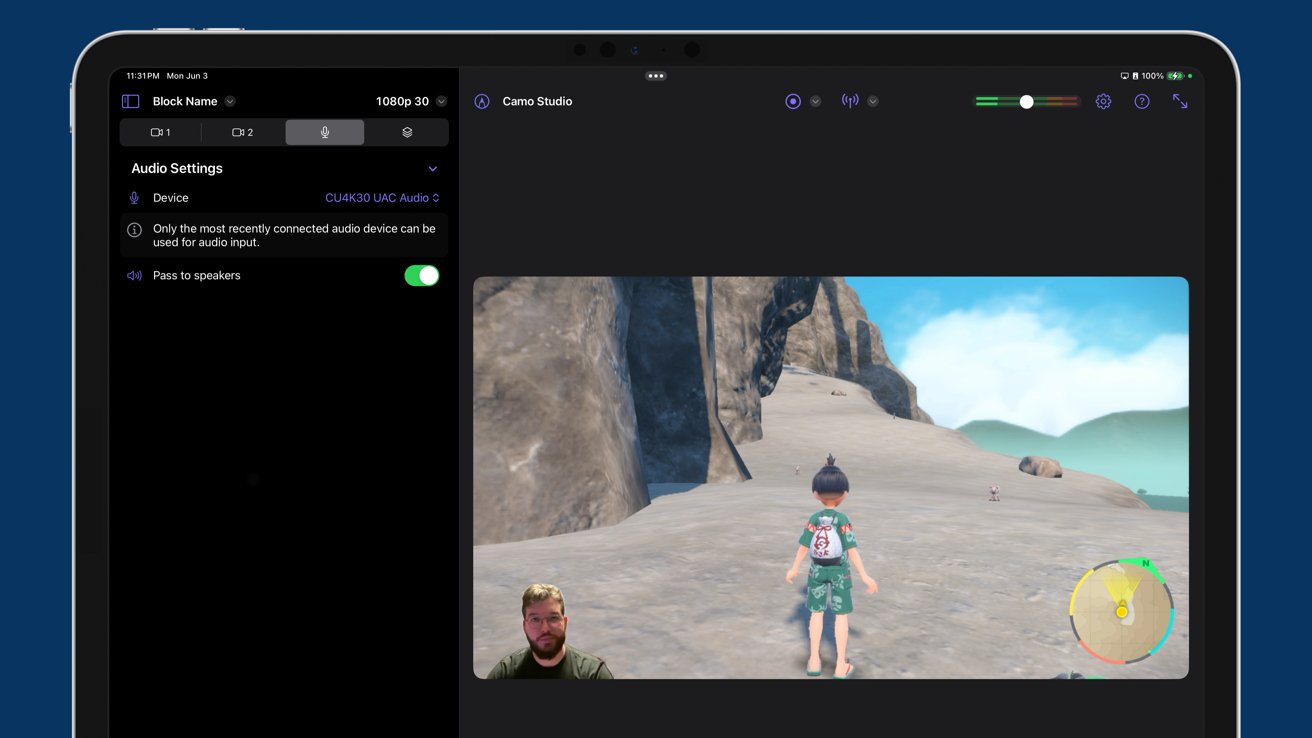
I've encountered this limitation in a completely different kind of content production — game streaming. The release of iPadOS 17 enabled video capture from external capture cards, allowing game streaming from consoles like Nintendo Switch.
It is nearly impossible to get this working without audio intent controls.
Everything else is in place. I can record my face with the Studio Display webcam, record the Nintendo Switch video, capture my voice over a microphone, and listen to playback. Still, I cannot have game audio and voice tracks appear in the stream without some configuration.
I had to program the streaming box with a Mac application to mix my voice and incoming game audio into one track. That shouldn't be necessary.
Multitasking on iPad Pro
Don't get me wrong, iPad has had some interesting ideas for multitasking. I was such a fan of Slide Over that I installed an app that replicated the function on Mac.
It was a big celebration when the Stage Manager arrived because it finally meant windowing and external display support on iPad. I could finally make use of the Studio Display outside of a 4:3 box. It was the biggest reason I returned from my short time using Mac.
After a bumpy launch and a big refinement in iPadOS 17, I'm still left wanting more. We're almost there with multitasking, but some obvious issues exist that need addressing.
First, developers have no way of telling an app to react to different windowing modes. Apple relies entirely on scalable size classes for window resizing, so an app has no idea if Stage Manager is active. This is incredibly frustrating.
If Apple provided an API for windowing states, apps could get creative in how they react to different sizes and positions. It would also allow Shortcuts to exist that would create preset stages.
Stage Manager also has an odd problem with presenting windows in full screen. A single full-screen app looks great, but drag another window in, and it becomes two windows, leaving a lot of empty space around the edges. Allow a "full-screen mode" where if I stretch an app to fill the display, it returns to the old Split View style with a size slider in the middle.
I'm not a UI designer, so I won't pretend to know how Apple should solve its iPadOS multitasking issues. What I want is a commitment to Stage Manager to make it the best system, not mild interest for three years before inevitably introducing a new windowing paradigm.
System level tools
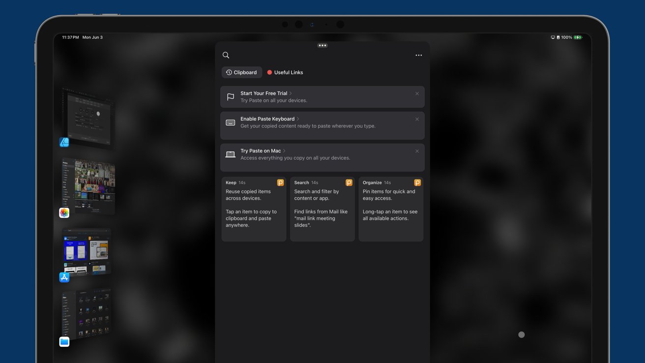
There are two indispensable tools that I love on my 14-inch MacBook Pro that do not exist in full-powered form on my iPad — Paste and Cleanshot X.
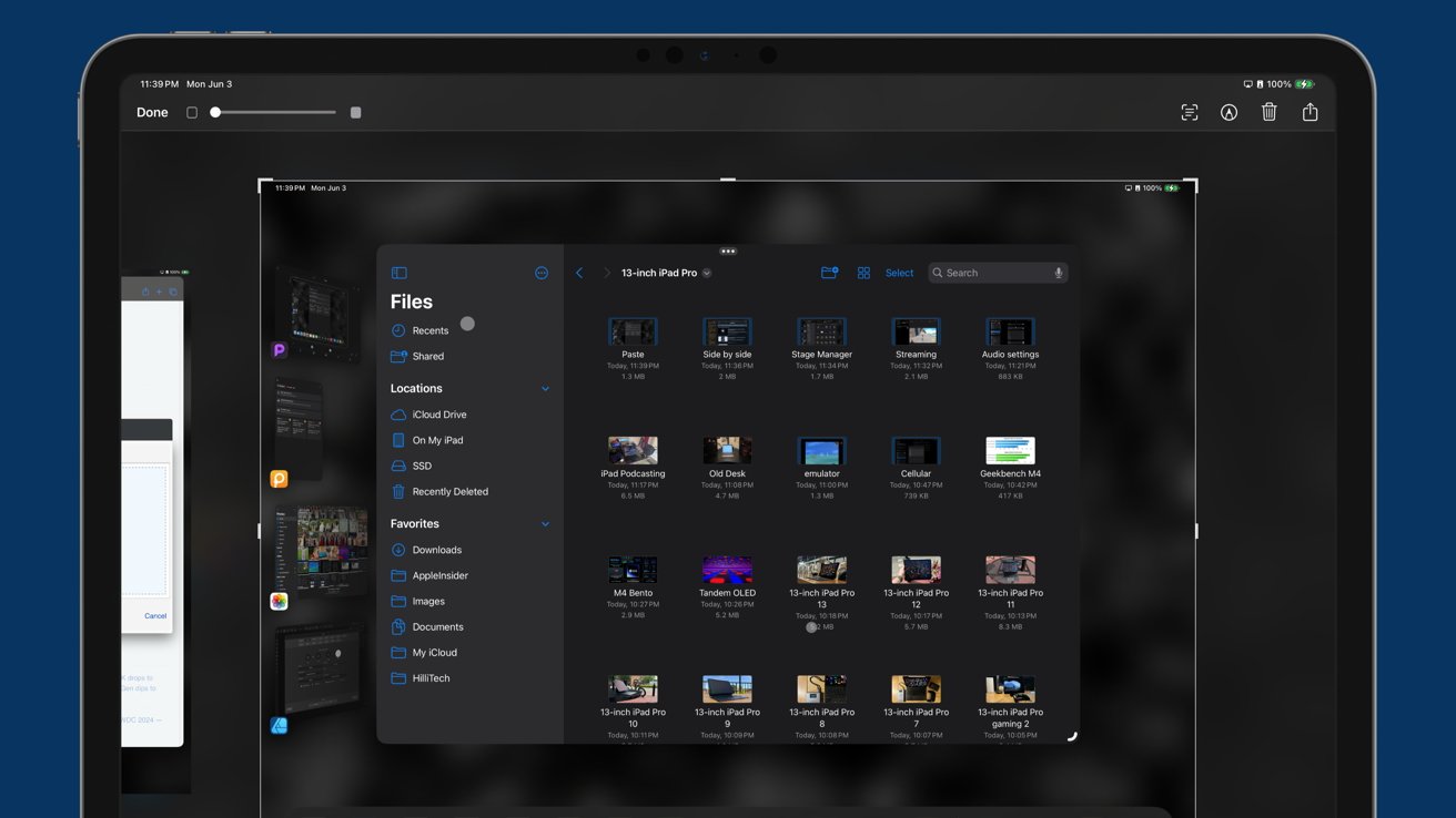
Paste is a universal app that can be installed on the iPad, but it doesn't work unless it is running in the foreground. That's the problem — Apple doesn't allow system-wide tools that can run in the background to exist.
Clipboard managers are incredibly important to writers. We're all human, and despite it being a bad idea, sometimes there might be text that only exists on your clipboard. Forget to paste it and copy something else, and it's gone forever.
I can hit a keyboard shortcut on my Mac anywhere and see everything I've copied that day. There's nothing about iPadOS that says this shouldn't be possible beyond Apple's built-in limitations.
The same goes for Cleanshot X, a screenshot app. While Apple's built-in screenshot tool on iPad is adequate, Cleanshot X is a superpower for Mac that just can't exist on iPad. I can capture transparent elements like menus and individual windows with a click, and that's really hard on iPad.
It's time to bring true system utilities and extensions to iPadOS. That includes tools that enable windowing automation, grammar checks, and menu bar customization.
Shoutout to the developers — Paste is free with in-app purchases. It is also cross-platform for Mac, iPad, and iPhone, but like I said, is far, far better on the Mac. Cleanshot X for Mac is a $29 one-time purchase for just about everything you need, and $8 a month for some pro features.
Background tasks
Another annoyance with iPadOS is how it handles tasks. Leaving an app is as good as quitting it in some cases since active tasks will be dumped in favor of whatever else is active.
Apple has an Activity Monitor on macOS, allowing users to see and kill active processes as needed. There's no such thing on iPadOS because it wouldn't show anything except whatever app was in the foreground.
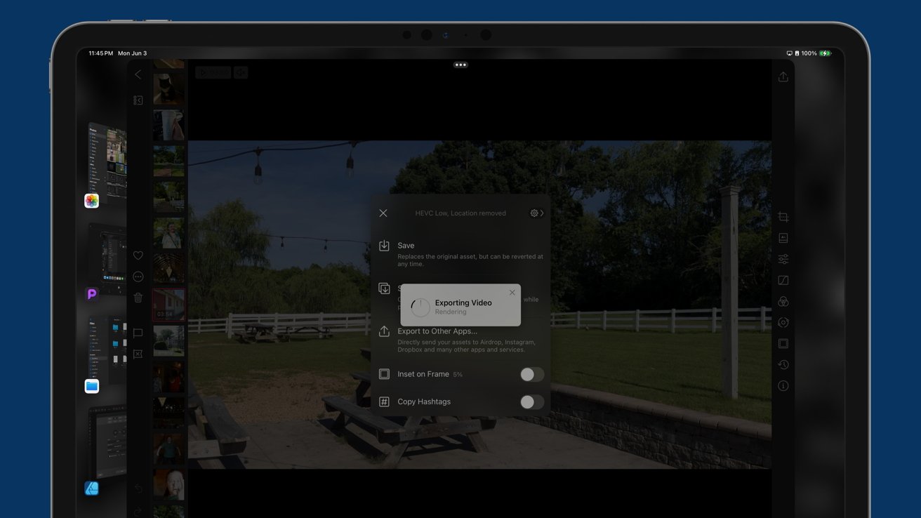
The iOS and iPadOS multitasking system is clever in that it can instantly resume an app from where you last left it, but that's different from background tasks. Users shouldn't fear dropping an export from Final Cut Pro just because they want to answer an iMessage.
Power is available to do this, clearly, because it can be done on Mac with the same processor — but the system just isn't built for it. A lot of the problems with iPadOS are inherited from the old one-app-at-a-time mentality from iPad's beginning.
First-class apps
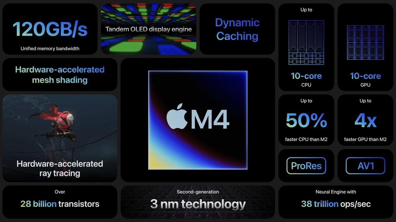
13-inch iPad Pro with the M4 processor is currently benchmarked as having the fastest single-core performance in any consumer product. It is the first Apple device with the M4 processor, has the same next-generation GPU found in M3 Macs, and has 16GB of RAM.
Yet, for some reason, the App Store is still filled with "iPad versions" of apps. I can't run Pixelmator Pro on my iPad Pro despite it being a better computer than my M1 Pro 14-inch MacBook Pro.
This isn't because developers are treating it as a second-class platform. The problem is how Apple restricts developers when building apps. Artificial restrictions on API use and chipset performance ensure some apps only exist on macOS.
I'm aware what I want isn't a small ask. Apple would have to change some of the underlying frameworks in iPadOS to enable more powerful apps.
But as a product with so much power and the "pro" name, I believe it needs to be done.
No way to satisfy everyone
No matter how you try, you won't make a Honda Civic into a 10-wheel truck. There are some tasks that you'll just need a Mac for, especially those that require a Terminal.
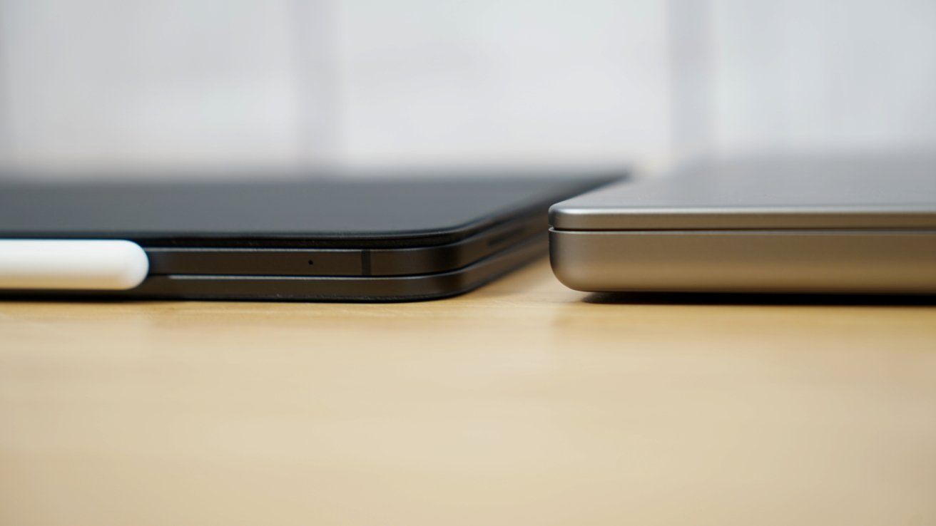
13-inch iPad Pro review: iPad Pro is a more versatile hardware platform versus Mac, but not software
While I believe Apple may eventually make it possible to do web development on iPad, true app development like what's done in Xcode on Mac won't be done with an iPad, because Apple doesn't want it to be. The iPad isn't meant to kill the Mac, it is just a suitable alternative for many traditional computer users.
The key to discussing iPadOS and the iPad is this — it isn't a Mac, it shouldn't run macOS, and it deserves to be better. That's it. We can all love the iPad and hope Apple continues improving it by adding obvious features we're clamoring for.
WWDC could address some of my concerns, but certainly not all of them. Though, it seems Apple AI may play a crucial part in the future of iPad.
But we obviously can't talk about that today.
13-inch iPad Pro review - potential as an AI-first device
Despite the usual leaks about the next operating system updates, there's no way of truly knowing the extent of Apple's AI plans and how far it will seep into the operating systems. However, hints everywhere suggest the buzzword will be a big part of Apple's 2024 strategy.
In one interview, Apple's SVP of Worldwide Marketing Greg Joswiak said iPad Pro with M4 is a powerful AI computer. That quick passing statement could hint at what iPadOS 18 will mean for iPad users.
The Mac has always been a workhorse capable of doing whatever you threw at it, provided it had the specs. The iPad started life as a consumption device, and remains so for most iPad users.
For a select few, it evolved into a multi-faceted productivity tool. However, it has never been able to shake its origin.
I love iPad because it feels like a new and futuristic paradigm compared to Macs with desktops and menu bars. However, it has always sat as kind of a middle ground where only niche users would find it worthy of being a full PC replacement.
That could change with iPadOS 18 and Apple's AI push. If Apple pivots iPad Pro with M4 as an AI-first machine, it could mean a significant strategy shift in future updates.
Of course, this 13-inch iPad Pro review is about what exists today. It has to be. Apple hit it out of the park with hardware, but that's never been the problem with the iPad.
We've all said it before, but let's say it again — a lot rests on WWDC. We'll be back very soon to discuss iPadOS 18 in detail, and a future months-on review will cover exactly what changed with the iPad Pro and what didn't.
Meanwhile, if you need an iPad and have the money, you'll find nothing but good with the 13-inch iPad Pro. It is an excellent option for anyone, whether they're looking to go iPad-only or have a companion for their Mac.
This is, of course, provided you have the cash.
13-inch iPad Pro review - Pros
- Impossibly thin and light design
- Tandem OLED is a game changer for iPad
- Nano Texture adds a useful option for outdoor use
- Modular computing with magnets
- Thunderbolt port, 5G, Wi-Fi 6E
- Magic Keyboard and Apple Pencil Pro expand on an already impressive product
- M4 processor offers a lot of untapped potential...
13-inch iPad Pro review - Cons
- But, iPadOS holds back otherwise capable hardware
- Magic Keyboard could have better external material options
- Nano Texture is an unknown regarding long-term durability
- No backward compatibility with accessories
- MacBook Pro prices without the guarantee of fitting every workflow
Rating: 3.5 out of 5
From a pure hardware standpoint, in a vacuum, not considering software, the 13-inch iPad Pro deserves a 5.0. It is thinner, lighter, and more powerful than ever.
That power is wasted, though. It gets a 3.5 out of 5 today, because there is so much clear and obvious room for improvement based on steep and Apple-enforced limitations of software and operating system.
While I love the iPad Pro and use it as my primary work device, it isn't perfect.
Google effectively requires a numerical score for reviews. All of the writers at AppleInsider agree that picking a number lacks nuance.
Here's no nuance: Read my review, see what I said. The device is amazing and is worth buying. Don't get stuck on the score.
There's lots of headroom for improvement in the operating system that you can't replace with an alternate. To be clear, we don't want to do that, we're not interested in Linux on iPad, or the like.
It is so clear that Apple could do more with iPadOS. To date, though, it just doesn't want to. It's fine with near-annual hardware updates eclipsing the operating system, and the gap today is so large, it's become a problem.
I'll be revisiting this device and score sometime after WWDC. As long as iPadOS is in its current state, and the hardware keeps outpacing the glacial software advancements in iPadOS, iPad Pro can't reach the perfect score.
Where to buy Apple's M4 13-inch iPad Pro
Apple's 13-inch iPad Pro with M4 is on sale now, with the lowest prices in our 13-inch iPad Pro Price Guide.
At the time of this review, Apple resellers are discounting the 2024 models by up to $155. Apple Authorized Reseller Adorama, in particular, is knocking up to $100 off every single model with promo code APINSIDER in addition to bonus savings on AppleCare. To activate the savings, enter the coupon code during Step 4 of checkout.
In our roundup of the best iPad deals, you can also find the steepest markdowns on tablets from the entire range, including the iPad Air 6 and 10th Generation iPad.
