While far from everyone can see this, a number of people are reporting that iPhone app icons on iOS 26 are appearing slanted, making some even feel dizzy.
It's not one of the features of Liquid Glass that Apple promotes, but nonetheless it is real for some users. As first spotted on Reddit, turning on dark mode in iOS 26 can make it appear as if app icons are strangely slanted.
This is entirely an optical illusion. Take the following side-by-side comparison of the same app icon — where the right one has grid lines superimposed.
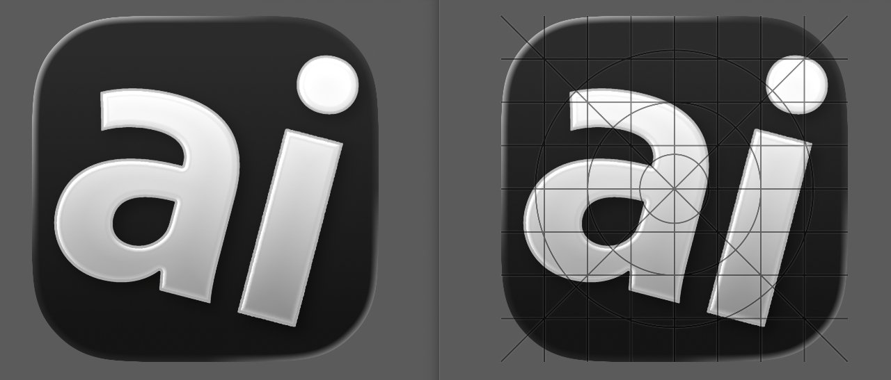
The same app icon with and without gridlines showing the apparent slant is really straight.
It's quite clear that there is no slanting whatsoever.
What there is, though, is a lighting change. This is something that is under the control of developers, as Apple allows a range of lighting to give the effect of 3D icons.
Yet the slant can be seen consistently across all of the app icons in the Reddit poster's image. It's also not solely that this is down to neurological differences, as AppleInsider staff can see it in the Reddit shots yet not reproduce it on their own iPhones.
It does appear that certain styles of wallpaper background can accentuate or mask the effect. Plus it seems to be least when the default app icons are used, it is generally only noticeable when using the Clear, Dark, or Tinted appearance options.
If you are someone who sees this apparent slant, though, it's more significant than a curiosity. The original Reddit poster even reports it making him or her feel dizzy.
Apple does provide a feature in iOS to combat motion sickness, but it does not appear to have any effect on this issue.
In testing
It's curious that no one publicly reported seeing this during the extensive beta testing phrase. But the once an iOS update has been fully released, it will be immediately be being used by millions more people than ever tested it.
The effect part of Apple's Liquid Glass design aesthetic, which uses the concept of glass layers throughout Apple's operating systems.
One element of Liquid Glass is light and shadow to give a 3D effect to the various layers. This is handled by shining a virtual light at an angle, and generating highlights and shadows on icons to match.
Typically, this light is shone from the top-left corner of the screen. Highlights appear at the top left of each glass layer, and the top-left corner of app icons, and spreads out across the flat sides before disappearing.
Since icons are made from glass layers, the light can pass through and affect the opposite edge. That means the bottom right corner will also be illuminated alongside the top left, for example.
Apple has also built in a kinetic element, in that the angle of the light changes as the user moves their iPhone around. Changing the angle of the screen changes the angle of light, and therefore highlights and shadows move too.
Using Apple's Icon Composer to recreate the effect
To test how the change in light effect works, we created a basic icon using Apple's Icon Composer app. It is a tool that can be used to create icons for use across Apple's ecosystem, simply by importing images and positioning them.
For this test, a PNG of the AppleInsider logo in white text and a transparent background was imported to a blank template, and a solid almost-black background applied.
Icon Composer is made to function in a way that it applies all of the principles of Liquid Glass design to the icon. That includes having "layers" of glass and dealing with lights and shadows on each of them.
In this case, the AI logo is one layer on top of the background. While the background and main shape of the icon itself is the important bit, this second layer helps demonstrates the lighting effects on other layers as the angle changes.
Icon Composer has a control that allows the developer to change the angle of lighting, so they can see how the layers appear depending on how the light moves.
Our test images have the light at -45 degrees, shining from top left, and -139 degrees, shining from bottom left.
The problem is that the light and dark areas can give an appearance of things slanting. Think of it similar to the Cafe Wall Illusion, an optical trick that makes parallel lines appear to be at differing angles.