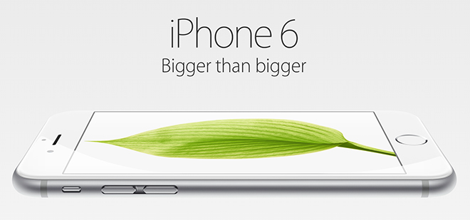
Rumors were confirmed on Tuesday when Apple launched the new iPhone lineup, with the 5.5-inch iPhone 6 Plus landing squarely in "phablet" territory. But the company included some special user interface tweaks to make the added real estate manageable.
When Apple first moved away from the original 3.5-inch iPhone screen size with the iPhone 5's 4-inch display, the company made sure to keep the device narrow enough to facilitate one-handed use. Now, with 4.7-inch and 5.5-inch models set to release next week, sheer physics called for compromises, but with a bit of hardware and software modification, Apple was able to keep the larger iPhones fairly user friendly.
The most obvious tweak is a relocated sleep/wake button, which has moved from the top right of the device to the right-hand edge. By shifting the button further down the phone's body and closer to the user's thumb, it can be reached without forcing a change in grip.
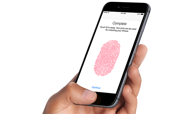
As presented onstage by Apple marketing chief Phil Schiller, the iPhone 6 and 6 Plus also have special gesture support in iOS 8 called Reachability. Adding to the "swipe-left, swipe-right" gestures already available in iOS 7, Reachability's trick is a double-tap on the Touch ID-equipped home button, which drops the user interface down closer to the thumb.
As seen in AppleInsider's exclusive first look at the new iPhones, tapping — not pressing — twice on Touch ID pulls the active display area closer to a user's hand, allowing them to reach the top of webpage panes, icons and other graphical assets.
Apple's Touch ID fingerprint sensing technology incorporates a high-density pixel-based sensor, meaning it can be used for more than just reading biometrics. Movement, presses and taps can all be recognized by the home button, as is the case with Reachability.
Reachability is built into iOS 8, meaning the feature works with third-party apps just as well as it does Apple's own software.
In the same vein of adjusting for size, Apple has also included what it calls a "desktop scaler" to correctly render webpages and other on-screen content without requiring intervention from developers. Schiller showed off the handset's scaling capabilities by displaying an unoptimized The Wall Street Journal's webpage on the iPhone 5s, 6 and 6 Plus, which sized up well on each device.