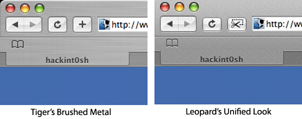
While most of the test versions of the future operating system have so far handled only the many bugs still left in its code, this week's edition allegedly contains the first signs of obvious visual differences between itself and 2005's Mac OS X Tiger.
The brushed-metal look that first appeared in earnest with Panther has almost completely faded away, according to reports. Well-known holdouts for the style, including Finder, Photo Booth, and Safari, have purportedly abandoned the metallic sheen in favor of the simpler, gradiated style that first appeared in Apple Mail 2.0 and later transferred to Leopard's version of iChat and the more widely available iTunes 7.
A frequent sticking point with critics of Apple's user interface has been its tendency to use different visual elements for program windows without a clear shift in purpose, such as the use of the gradient style for System Preferences versus the metal of Finder or the Aqua style of generic windows.