Lost among the flurry of speculation surrounding new MacBooks are a number of noteworthy observations about the portables that may lend insight into their design.
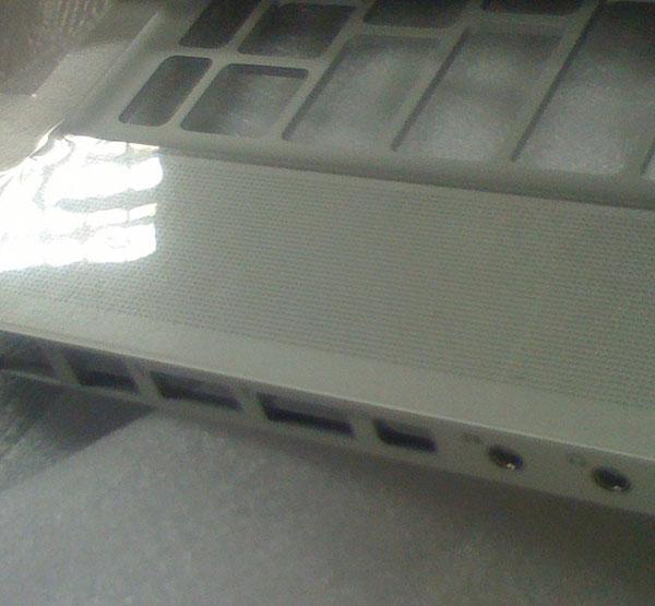
Both the MacBook and MacBook Pro that appear to have been photographed have extremely thin side areas which are just large enough to contain the ports themselves — thin enough that Apple has had to shunt the port labels to the side. While neither system will be quite as thin as this, as Apple is believed to be using a tapered bottom that will add slightly to the height, the reengineering may contribute to a design which is predicted by some to be thinner overall than earlier models.
Port layouts have also changed, though without better photos and a view of both sides it's difficult to tell how many elements have been added or removed. Again, the MacBook Pro has potentially switched to mini-DVI output instead of the full connector from Apple's professional notebooks of the past several years, though why this would be chosen remains a mystery. Historically, Apple has opted for proprietary connections for its displays when space for other ports is an issue; the quintessential example of this has been the micro-DVI connector necessitated by the thin, small expansion door of the MacBook Air.
The next MacBook Pro's top and left sides.

Apple's rumored 13-inch MacBook as seen from its top and sides.
But while the 13-inch MacBook's top layout is widely expected to match that of its similarly-sized ultraportable sibling, extending to a larger trackpad, the MacBook Pro will carry more tangibly unique design changes besides the new keyboard tray. The speaker grilles bordering the keyboard are more finely perforated than today's system and, notably, no longer run to the edge of the notebook as they do now — though whether these differences are for practical size purposes or simply a stylistic change isn't evident at this stage.
What may be clearer, however, is Apple's design direction for the top of its notebooks, which may have been tipped off by the company's own invitation for the introduction on its corporate campus. An observation at Boing Boing notes both that the edge of the display isn't that of the MacBook Air but also that the logo isn't necessarily proportioned correctly for the shadowed image to represent a 15-inch MacBook Pro.
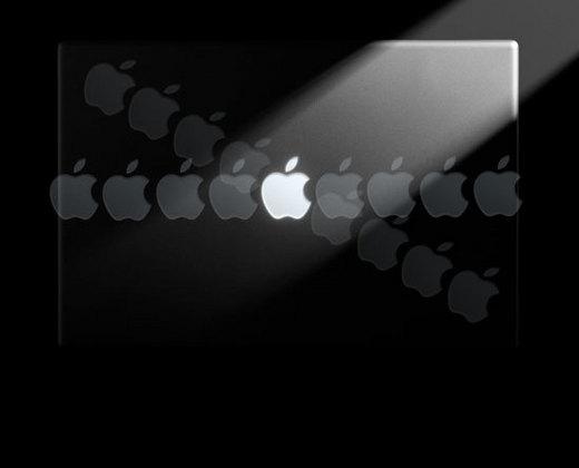
The MacBook in Apple's press invitation, with the logo used as a guide for size. | Credit Boing Boing
Using the size of the logo on a present-day MacBook Pro as a reference, the site estimates that the logo is too large relative to the borders of the lid to represent a system with a screen larger than the 13.3 inches of the standard MacBook.
Apple in the past has changed the size of its logo and isn't necessarily using an actual future system as a template, giving some leeway for its teaser image to represent a different model or none at all. Still, the image is potentially the Mac maker's most direct hint yet of its upcoming design direction.
 Aidan Malley




-m.jpg)



 Christine McKee
 Malcolm Owen


 Sponsored Content

 Amber Neely







108 Comments
... Using the size of the logo on a present-day MacBook Pro as a reference, the site estimates that the logo is too large relative to the borders of the lid to represent a system with a screen larger than the 13.3 inches of the standard MacBook. ....
I think this speculation on size is a bit thin.
When I saw the invitation image for the fist time I did the same calculation by overlaying an image of my 12" Powerbook as a comparison. Based on the logo being the same size (the same assumption I made) it came out to 14.173 inches wide for me which is the perfect size for a standard 13" screen on the other side.
There's also a margin of error that is probably going to be in the quarter to a half of an inch range for all of these jpeg based calculations, and there is (as you yourself note) no surety that the logo is going to be the same size anyway.
edit: I may have misunderstood what you are getting at. You are saying the image represents a smaller than 13" screen or larger?
edit 2: NM I just realised how stupid I am as a 12" user I forgot that they don't make them this small currently. This is the new 13" MacBook Pro! (maybe)
Well, if anyone thought that the short lead time to the 14th was going to lesson the frenzy, I guess we can forget that!
I expect to see the same 5 images in 30 or 40 more articles between now and then...
(Not that I'm complaining. But it would be nice if Apple leaked a few more for varieties sake. )
First of all, the image shown on the invitation doesn't look like an actual product shot. The edges look like fake 3D created in Adobe Photoshop, so I wouldn't assume this is an actual product.
Again, the MacBook Pro has potentially switched to mini-DVI output instead of the full connector from Apple's professional notebooks of the past several years, though why this would be chosen remains a mystery.
1) There is no evidence that Mini-DVI can support DL-DVI so this can't me a MBP or 30" displays will note function.
2) Hasn't there been plenty of discussion already that show that port size fits a 4-pin 1394a (FireWire 400) port, not a Mini-DVI port that bevels a the bottom?
If the logo is actually really, really big, then this might be the NetBook!