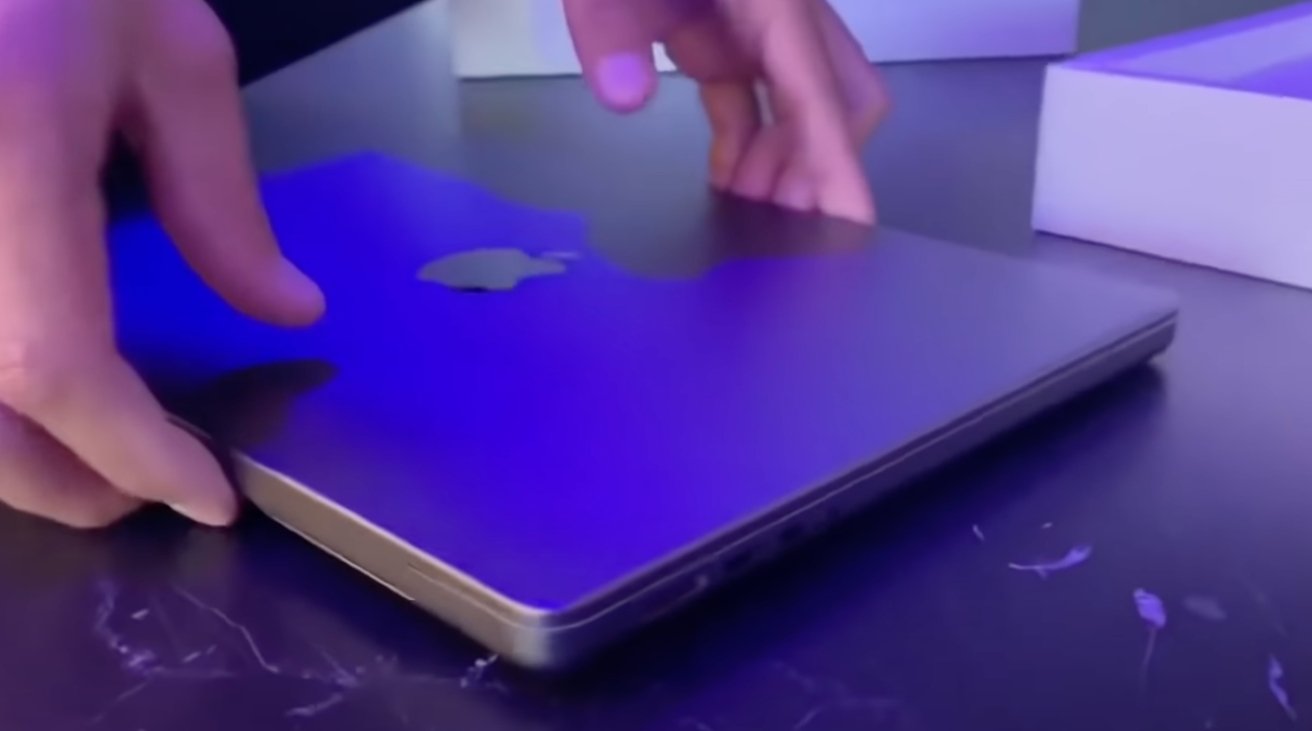
While the new M1 Pro and M1 Max MacBook Pro models are expected to arrive in customer hands on October 26, unboxing videos are starting to surface ahead of the street date.
Apple's delivery partners will be handing over the new 14-inch MacBook Pro and 16-inch MacBook Pro to customers who preordered early starting from Tuesday. While consumers wait for the hardware to arrive, unboxing videos have started to appear online, indicating some retailers may be handing out the notebooks earlier than Apple planned.
One eight-minute video posted to YouTube offers a thorough close look at the 16-inch model, albeit in Vietnamese. This includes the side ports, complete with the all-new MagSafe 3 connection, SD card slot, and HDMI port.
When compared against a previous MacBook Pro, the new model is shown to have rounded edges, as opposed to the more distinct and angular predecessor. Close-up views of all important angles are shown, including the keyboard, which loses the Touch Bar in favor of full-size function keys.
The notch, a point of contention for the new model, is shown to occupy enough space to cut into the menu bar, but not onto the macOS desktop itself. When in full-screen mode in Safari, a black bar hides the notch, making the top bezel appear reminiscent of earlier MacBook Pro models in terms of general size.
A second unboxing, just over a minute in length, offers more of a glimpse of the unboxing experience itself. After lifting the lid, customers can pull a tab to lift the MacBook Pro's protective casing out of the box.
After unsheathing the MacBook Pro, opening it up will start the traditional initial startup for the MacBook Pro, ahead of its configuration.
 Malcolm Owen





 Charles Martin

 William Gallagher
 Christine McKee
 Marko Zivkovic
 Mike Wuerthele




5 Comments
Wow that's way thicker than I thought 0.06cm would be!
I'm all for longer battery life but the ports and styling makes it feels like we're going backward.
I don't think I mind the notch but what happens when the cursor tries to travel over it? Does it vanish behind the notch (bad) or warp to the other side (good)? What does it do in the corners? Hopefully it bumps into them. If MacOS handles the cursor correctly the notch could be a nice feature by giving you more room on the screen for the menu. You would not need to have the menu hide itself any more to get more screen real estate.
Don’t like the rounded edges (and some stats like Bluetooth 5.1, HDMI 2.1 and Wi-Fi 6E missing), but else near perfection?
I’m sure it’s a parts issue and quality issue