Skeuomorphism appears to be on the way out in the newest version of Apple's iOS platform, as a new screenshot claims to show iOS 7 with aspects of the much anticipated "flat" design aesthetic brought in by Sir Jony Ive.
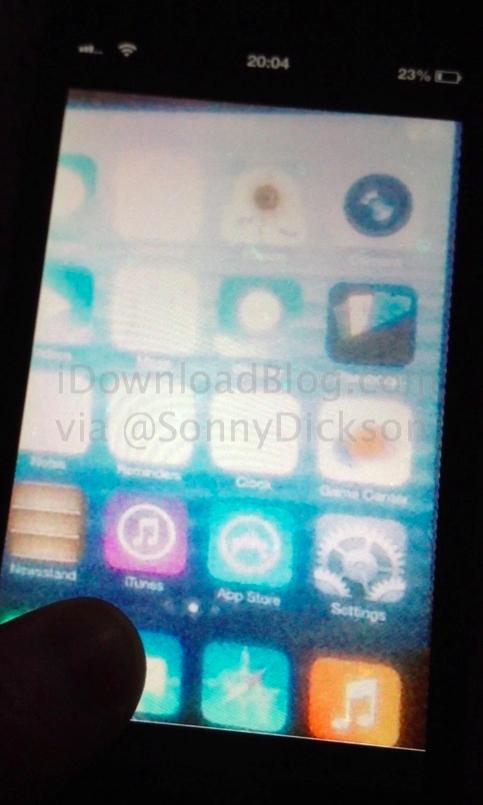
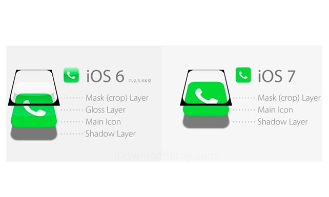
The shot, while blurry, shows what is alleged to be an unreleased version of iOS running on likely an iPhone 4S or iPhone 4. The build does not appear to bear any massive changes to the user interface, but a close look shows that the icons are less complicated than they are in current builds of iOS, and a reconstruction of the images by iDownloadBlog shows why: they are missing a layer of gloss.
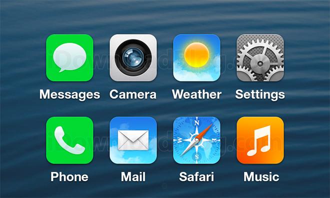
Many app icons in current builds of iOS — including the App Store, Music, iTunes, Compass, Clock, Safari, and others — feature a layer of gloss, a translucent layer over part of the icon that makes it appear to "pop" with a three-dimensional effect. The purported new build of iOS, though, abandons this effect, giving all of Apple's stock icons a unified, "flat" look.
The flat look is said to be one of the pet projects for Apple design head Jony Ive. Made head of not only hardware design but interface design in the wake of Scott Forstall's ouster, Ive is reported to have immediately begun pushing the software and hardware teams at Apple to begin working more closely.
Supposedly one of the first things up for reworking was the "skeuomorphic" aesthetic — epitomized by things like the Calendar app's faux stitched leather interface or the green felt table in Game Center — seen throughout iOS. Ive's guidance, though, has also led to the disappearance of some other aspects of the operating system.
The Weather icon appears to no longer have a static display of 73 degrees as its temperature. Also, the Settings and Reminders app icons may lose their borders, as they are the only two among Apple's 24 stock icons that include a defined border. The Game Center icon, too, has seen significant changes, and now appears to feature a much simpler design.
Apple is scheduled to reveal the newest versions of not only iOS but also Mac OS X at next week's WWDC.
