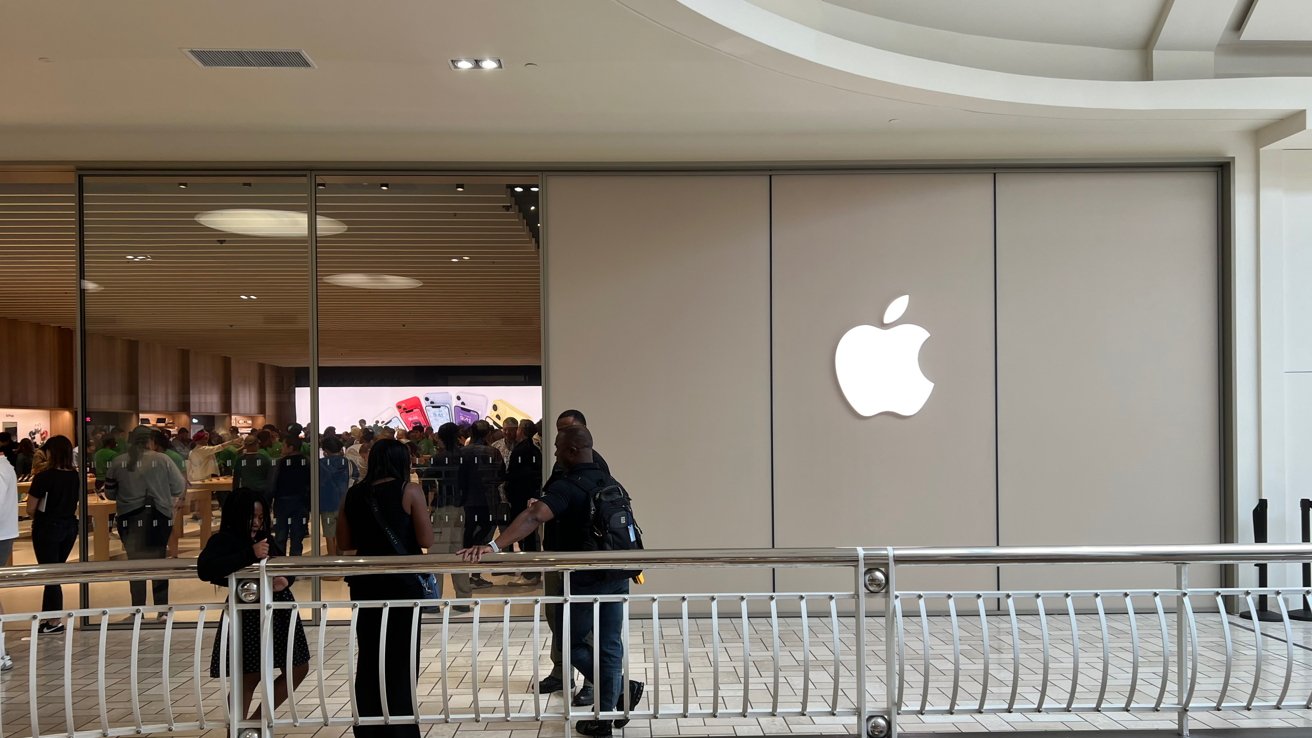
Tysons Corner was the location of the very first Apple Store to open, and on its 22-year anniversary it opens again in a larger venue. Here's what it looks like inside — and out.
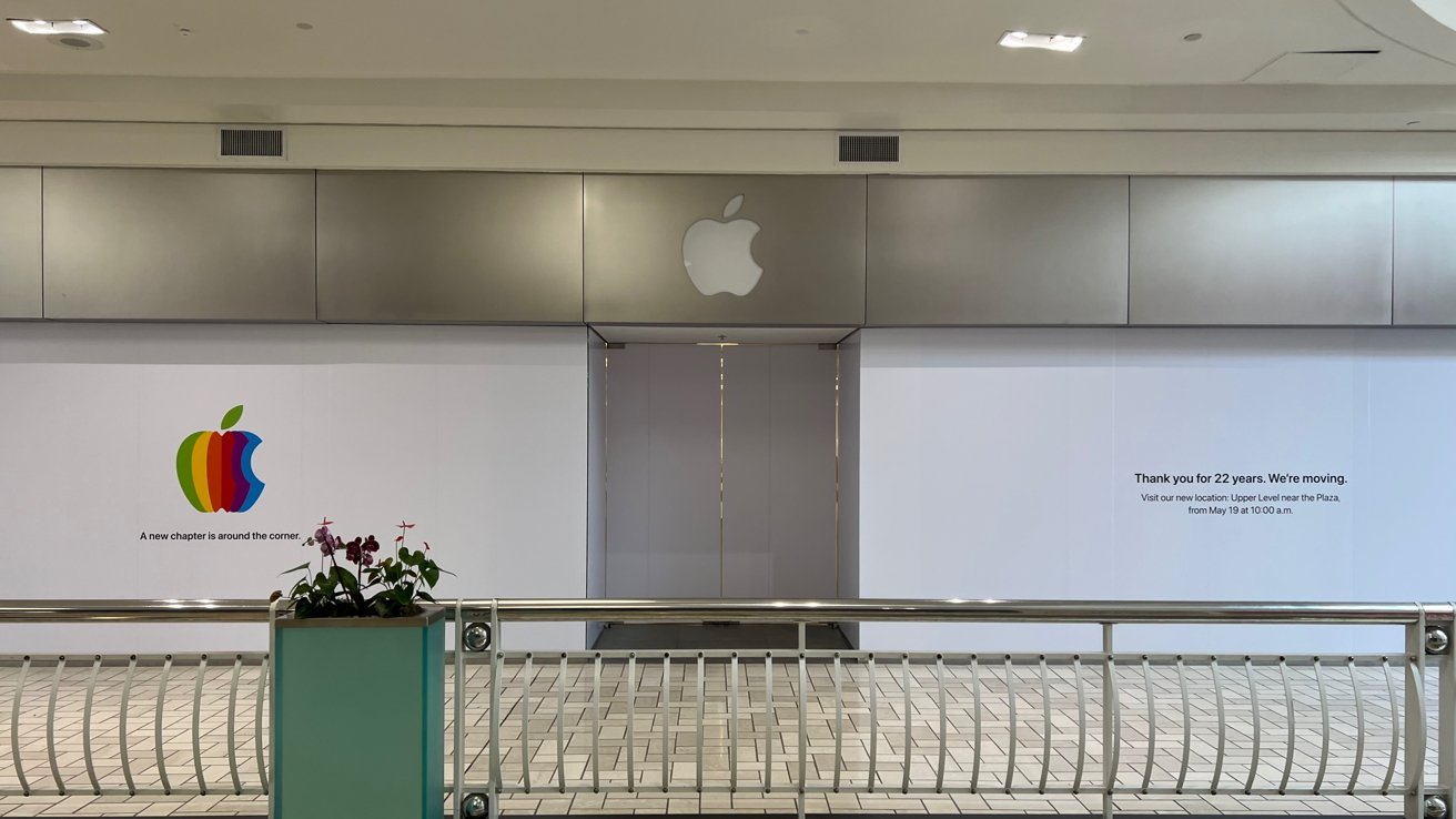
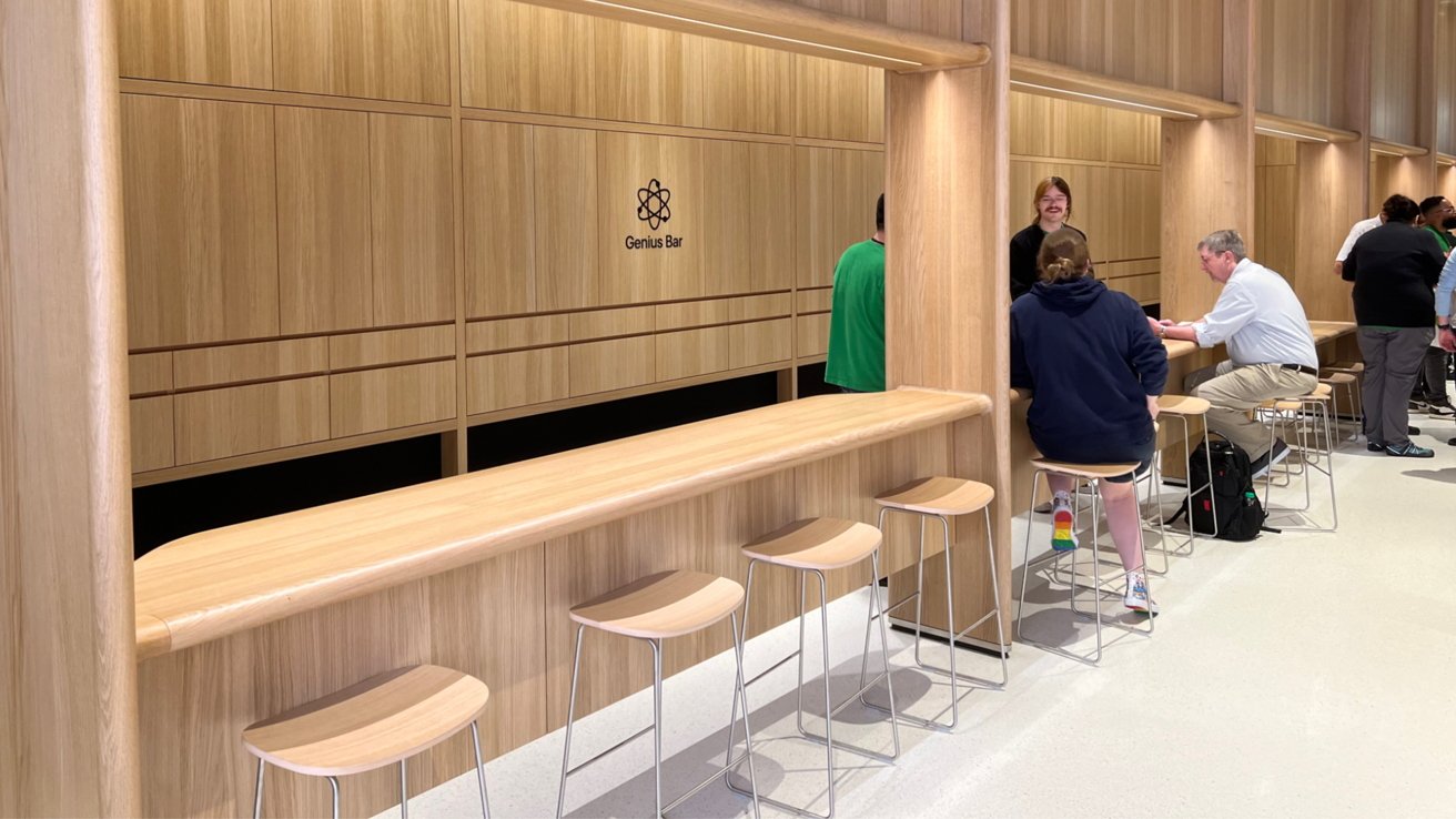
Apple Tysons Corner has reopened a short distance away from its original location, which first opened on May 15, 2001. The new venue is much larger and features the modern Apple Store design with long wooden tables, but adds some unique flair with cut-out alcoves for the Genius Bar and pickup areas.
The original store closed on Tuesday for the final time in preparation for the new location opening.
AppleInsider's Managing Editor Mike Wuerthele managed to visit Apple Tysons Corner not only on the original opening day in 2001 but also in 2023. We've gathered several photos and first impressions of the store's new location.
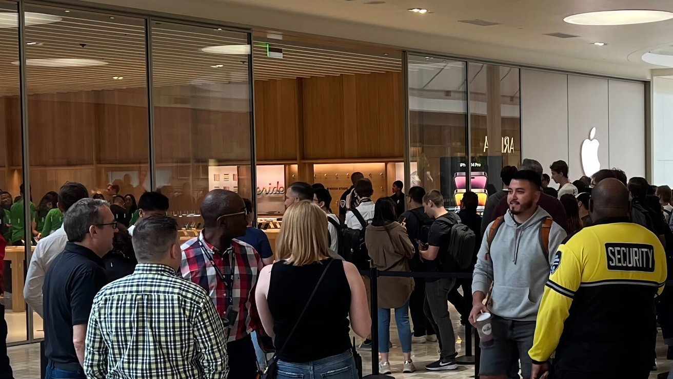
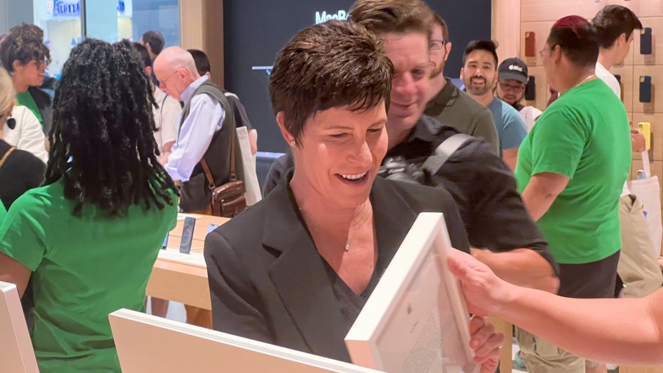
It's a bit crowded on opening day, but Mike managed to weave through the crowd and even spotted Apple SVP of Retail Deirdre O'Brien. No Tim Cook appeared for this opening, at least not as of our visit at 10:30 a.m. EST.
Apple Tysons Corner is a piece of Apple history
Apple Tysons Corner originally opened in 2001 as one of Apple's first brick-and-mortar retail stores. Steve Jobs introduced Apple Stores, saying, "this is our store."
The original stores functioned similarly to how they do today. Products were placed in the front to draw customers in and tinker with them while helpful staff and "Geniuses" waited to help.
Apple wasn't the first to try bringing its computers to retail, nor was it the last. However, it has been an iconic representation of modern retail that changed the landscape forever.
In 2001, when the store opened, American malls had much better foot traffic than today. The iPod wasn't yet a thing, and the iMac was still in its G3 incarnation.
Apple moved into Tysons because of what and where it was.
Flash-forward 20-plus years and Apple Stores anchor the malls that some of them remain in. Entire wings of malls are rejuvenated, and the dollar per square foot that malls charge and stores earn is increased by the mere presence of Apple.
We're not sure what the case is for Tysons, but it's not as busy a mall overall as it was 20 years ago — even after a massive renovation and expansion in the in-between years.
Going in. pic.twitter.com/CsGkh9wGQQ
— Mike Wuerthele (@Mike_Wuerthele) May 19, 2023
22 years later
The new location is about three times the retail square footage that the old location maintained. We (obviously) weren't allowed to go behind the scenes, but based on mall blueprints, the "backstage" area is probably about 50% larger.
It's also nearer an exit to the exterior of the mall. Back in the day, hauling a G5 into the mall was an exercise in patience for not just the owner but also the nearest big-box store, unless you wanted to shlep it from a garage the long way.
There was a back-service door, but it was infrequently used. We purchased an eMac once upon a time and got it through that door, but never before and never again. With the new location, there's no need for a convoluted route into or out of the store.
On the interior, the design carries most of the ethos of the previous design and inside-mall stores. It still has its own identity, but there's no question that you're in an Ive-adjacent designed store.
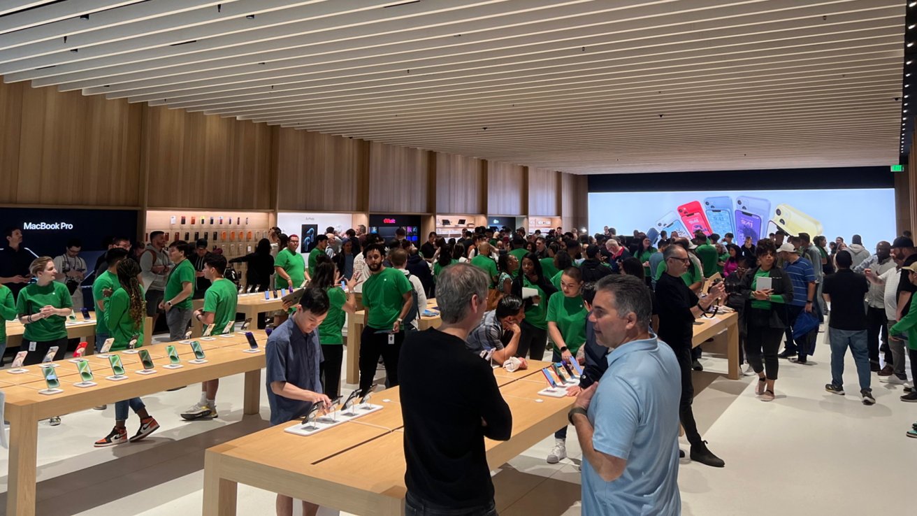
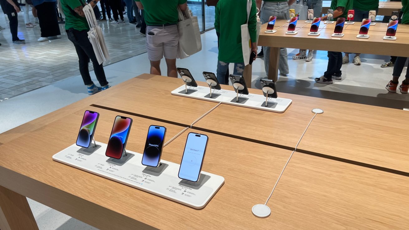
Walk up to Apple Tysons Corner, and you'll be greeted with large glass walls and an Apple logo sticking out from a matte wall. The openness of the interior space is immediately apparent with three rows of large, wooden product tables that extend to the rear wall.
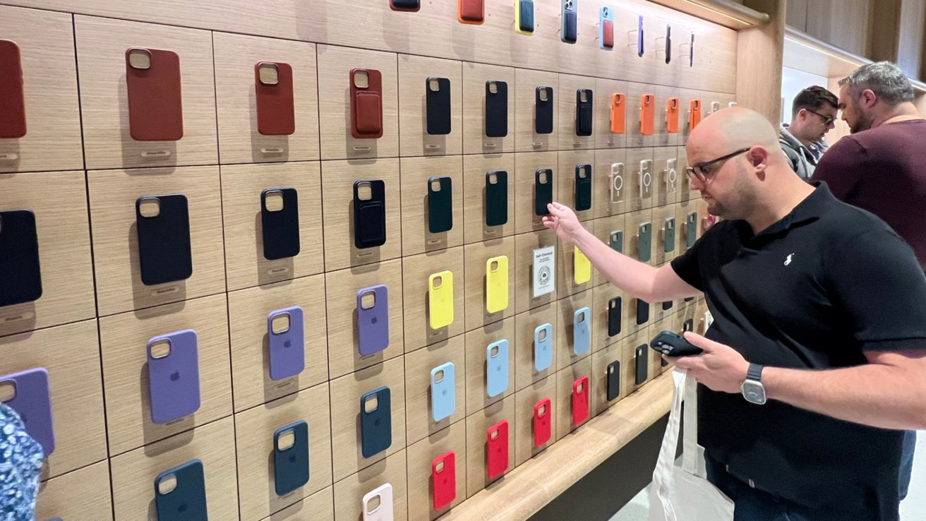
The usual product displays run along the left wall. Each section is dedicated to a different product similar to how Apple Stores are set up elsewhere.
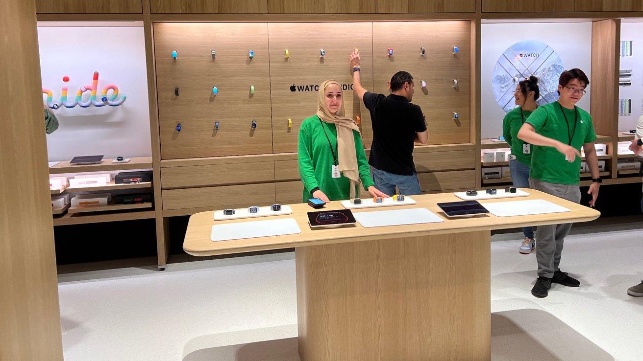
The right side of the store features a series of alcoves. A newly-designed Genius Bar sits in the back right corner, a section of it lower for improved wheelchair access. A product pickup area is in the center, then a specialized alcove is near the store entrance.
The special alcove features a large walk-in area with a center table. It is currently set up with a real-life version of the Apple Watch Studio, but Apple says it can be changed to be used for other products in the future.
The central wooden tables are filled with the usual iPhone and Mac displays. A table in the back corner is set up for Today at Apple sessions.
Apple's design philosophy for the store reflects a classic format that just works for retail while introducing new ideas that make Tysons Corner unique. We expect that Apple could begin implementing some of these changes to other mall-based stores.
The floors are still made from terrazzo, large white oak tables line the center, wood paneling on the walls match the tables, and a fabric graphic panel takes up the entire rear wall. The ceiling is made with a new linear baffle ceiling structure that should aid with acoustics — but there is often a sea of humanity in the Tysons store, so we'll see with time.
In a world where malls are dying, and retail is becoming more online every day, it is refreshing to see Apple continue to push for the human element of in-person shopping. Everything in the brightly-lit store accounts for humanity, accessibility, sustainability, and of course, commerce.
And, maybe it won't be shoulder-to-shoulder in Apple Tysons anymore.
